There are ‘doing’ days and there are ‘absorbing/thinking’ days. Today was the latter.
{ Here } is a wonderful Ted talk from the author of ‘Eat, Pray,Love’ on inspiration and its transcendence (thankyou to my friend Momen for sharing this). I must admit I was wary of the book, and of ‘jumping on the band wagon’, but through this talk I could see Elizabeth Gilbert, sans-hype: a brilliant thinker, enlighting, humorous, with not an ounce of self-importance. She reminded me of an academic, and I wonder if she ever taught: her caring and accessibility would make her a formidable teacher. I like to think, in another life, I would have met her, and we’d be fast friends.
It’s been couple of days filled with love, music, colors, soulful food, words, friendship. Eyes exposed to new sights, hands holding crafts and design objects, papers, manufactured desires. I have basked in the scent of hand-picked books, curated lives, and held manuscripts I know I will never have the time or chance to read.
May all your days be full of enchantment, wonder, and the humble realization that we are, all of us, forever perched on the edge of knowledge. We can only gaze at this sea, be open to it- arms wide.
Trust that all that is meant for you to see, read, discover,and, yes, love will no doubt alight your path.
Instances of Surrealist Architecture and Urban Design:
Click on the images for more details and to see source.
"39GeorgeV" is an urban surrealism manifesto. It sheltered the renovation of an Hausmannian building in Paris, during year 2007. It's a life-size photographic work based on the original building, printed on canvas, enhanced with bas-relief.
The Manifesto of the 39GeorgeV project.
Royal Museums of Fine Arts of Belgium, Brussels. Installation of the new Magritte Museum 2008/09
From the exhibition:Painting the Glass House: Artists Revisit Modern Architecture.The Aldrich Contemporary Art Museum,Ridgefield, CT.
“]“]
Frankfurt's Bockenheimer Warte Subway Station. From '10 Of The World’s Most Impressive Subway Stations'
Iphone painting by Steve John.
Son Of Mac. Magritte-inspired Apple Macbook art vinyl decal.
Magritte-ispired art vinyl decal for Apple Macbook.
So you already know I heart Japanese Stationery stores.
Here are more lovely pens and things from Jetpens.
Some of these, like rubber stamps – or writing letters sealed with rubber stamps- don’t exactly fit my life right now, but isn’t it fun to imagine such settings?
Thanks go to my (enabling) friend Andy who shared Jetpens with me.
Click on the images for more details.
Brush Pens
Lamy Mechanical Pencil
Midori Animal Shape D-Clips
Woman-shaped clips by Sun-Star
Rubber Stamp by Kodomo no Kao Ouchi Mininature House : A Chair and Ciao!
The beautiful packages of Kodomo no Kao Ouchi Miniature House Rubber Stamps.
Round index tabs by Metaphis
Sun-Star 7-Blade Shredder Scissors
Acid-free, refillable adhesive tape from Tombow- for the gluing perfectionist (wow).
I've had Magritte (and collages) on my mind. Digital Manipulation on a photograph by Vijay Raghavendiran.
I am also thinking about watercolor these days: in both Freehand Drawing and Rendering and Delineation classes we are working with loose techniques. Here are some images that stopped me in my track during my quest.
Winter in Florence-La Pioggia- Watercolor and Ink. Professor George S. Loli, Dept. of Architecture, University of Louisiana-Lafayette.
Starry Night over the Rhone. Vincent Van Gogh. 1888.
So Powerful. I believe in ‘As a (w)oman thinketh so is (s)he’, and in the power of intention, but sometimes us thinking types need a call to be spurred into action. This is it. { thankyou Student}
Something eye-opening occurred at my school yesterday.
I attended the exhibit for SoCal -Ex : Exploratory Design Workshop, completed by Professor Hector Perez and his students.
Here are the specific of the Workshop:
6Explorers
Andrea Benavides/Alfredo Melly/Henry Palomino/Charles Santamaria/Nancy Tariga
25 Days
July 12-August 5
10 Field Trips
San Diego/La Jolla/Del Mar/San Juan Capistrano/Los Angeles/Santa Monica/Culver City/Venice/Pasadena/Palm Springs
9 Progressive Practices
Daly Genik Architects/Eric Owen Moss/Estudio Teddy Cruz/Gehry Technologies/Luce Et Studio/Michael Maltzan Architecture/Morphosis/Sebastian Mariscal Studio/Smith and Others
15 Extraordinary Residences
Charles and Ray Eames/Craig Ellwood/Christine & Russell Forester/Albert Frey/Frank Gehry/Greene and Greene/Coop Himmelblau/Alberto Kalach/Ed Killingsworth/Sebastian Mariscal/Kathy McCormick & Ted Smith/Richard NeutraRudolph Schindler/Don Wexler
I spoke with Professor Perez and he told me that the analysis of the case study residences and projects were concentrated on the ‘crown’, ‘body’ and ‘feet’ of the aedifices.
Through collages, reminiscent of Superstudio and Archigram, the field trips become a venue for envisioning alternative architectural and urban scenarios (Design Workshops). I hope you’ll enjoy these images just as much as I did; each collage read like a miniature work of art, and the juxtaposition of architectural drawings and bold hand-drawn colors created fantastic, detailed, abstract constructs. What a wonderful way to illustrate architectural drawings, and bring to life photographs. The collages, done by hand, using cutouts, colored pencils and paint had a physical presence, a texture that a purely digital (photoshopped) images invariably lack.
I am inspired to create some more collages of my own and…can’t wait for the book 😉
Freehand Drawing- In Class exercise. After rendering with Espresso, we use the leftover coffee to draw chair combinations, or rather, the void around the chairs, in a figure-ground setting.
Another exercise with ‘Drawing on the Righ Side of the Brain’. By drawing the space, not the chair, the proportions were incredibly accurate in all drawings. The drawings can be read as Nolli Maps of imaginary cities, we can see piazzas, palazzi…we can see perspective, spatial configurations/plans, abstract paintings… I love the ambivalent water medium, the subtle, duplicitous, always multilayered sepia tone.
From 'Drawing on the Right Side of the Brain' by Betty Edwards
From Page 54:
Look at the drawings on the right-hand side of Figure 4-11. Studens 1 and 2 copied Picasso’s drawing right side up. As you can see, their drawings did not improve, and they use the same stereotypic, symbolic forms in their copies of the Picasso Stravinsky as they used in their Draw-a-Person drawings. In the drawings done by Student 2, you can see the confusion caused by the foreshortened chair and Stravinsky crossed legs.
In contrast, the second two students, starting out at about the same level of skill, copied the Picasso upside down, just as you did. The Student 3 and the Student 4 drawings show the results. Surprisingly, the drawings done upside down reflect much greater accuracy of perception and appear to be much more skillfully drawn.
How can we explain this?
The results run counter to common sense. You simply would not expect that a figure observed and drawn upside down could possibly be easier to draw, with superior results, than one viewed and drawn in the normal right-side-up way. The lines, after all, are the same lines. Turning the Picasso drawing upside down doesn’t in any way rearrange the lines or make them easier to draw. And the students did not suddenly acquire “talent”.
out of the blackness,
every morning,
on the other side of the world,
like a red flower
streaming upward on its heavenly oils,
say, on a morning in early summer,
at its perfect imperial distance–
and have you ever felt for anything
such wild love–
do you think there is anywhere, in any language,
a word billowing enough
for the pleasure
that fills you,
as the sun
reaches out,
as it warms you
as you stand there,
empty-handed–
or have you too
turned from this world–
I have had a fascination with pens (and office supplies) since I was 4, when I would help organize my mother’s supply center at work. I was very scrupolous 🙂 In college, buying pens at the Varsity Store on Campus, or better yet, at Mathison’s, was therapy. Above you see my sine qua non pen.
I hope everyone’s having a fabulous beginning of August.
I am really trying.
How are you doing, fabulous?
I plan to go to some movie under the stars, or at the park, or on a roof, like Cinema Paradiso. A good black and white movie, preferably a noir Hitchcock, would be the cat’s meow.
I am officially suffering from wanderlust. If I could be in five places at once I would be home in Calabria (Southern Italy), in Cuba, Ibiza and Greece and of course right where I am, having a Summer of Art with my students. They really need to get this teleportation thing going, so I could just zip away for the weekend, or we could just do three days of plein air sketching in Florence!
Le Corbusier said that we need to see with new eyes. How true; in Architecture, drawing, and, most of all, in life. Looking is not seeing. SO part of the renewal is to give your eyes something different to contemplate (i.e. do something new!). I pledge to pick up my local weekly and get out of my comfort zone (even my beloved neighborhood! I know, hard to believe). Yesterday, to start the month right, I trekked couple of hours to the beach (with my sketchbook, of course!)
Pacific Beach. August1,2010. Ink on paper.
To develop new eyes, and to stretch different parts of the brain, we have been working in class from “Drawing on The Right Side of the Brain.” One of its famous exercises is to draw an object without looking at the paper, preferably without lifting your pen or pencil. I tried it out with my hand.
Ever the optimist, here is the first post of the month. I’m giving a shot at posting daily (again), we’ll see how it goes.
Here is the happy Nablopomo August Badge. The theme of this month is ‘Green’. For me, it will mean renewal more than sustainability (a sort of spa for the mind), but I might find some interesting green homes to feature. Of course green is the color of envy, but we shan’t talk about that 😉 Here are couple of badges for good measure.
So as promised, here is my surprising discovery in the environs of Newport Beach (Costa Mesa): The LAB Anti-Mall.
I loved it! Local public art, local businesses and public spaces.
The Gipsy Den, which I covered in a previous post (it’s updated with photos now, yay), lies therein.
Enjoy, and I hope you get the chance to visit.
By the way thank you for all the views (dear readers :)), I am striving to post more often and it’s great to know this thing I do is being followed and shared.
"How fine you look when dressed in rage. Your enemies are fortunate your condition is not permanent. You're lucky, too. Red eyes suit so few. " Cheshire Cat 2.1. Ink on tracing paper. June 30, 2010
From Disney’s Alice in Wonderland (1951).
Cheshire Cat: Oh, by the way, if you’d really like to know, he went that way.
Alice: Who did?
Cheshire Cat: The White Rabbit.
Alice: He did?
Cheshire Cat: He did what?
Alice: Went that way.
Cheshire Cat: Who did?
Alice: The White Rabbit.
Cheshire Cat: What rabbit?
Alice: But didn’t you just say – I mean – Oh, dear.
I have material for three new posts and some serious retroactive editing to do; have been drawing, reading short fiction, poetry, and fascinating stories about forensic art curating- all of which I will share with related art. But let me start with saying that at times intense reading (input) for the ambitious –or obsession-prone– designer/visual artist can be considered a passive-aggressive behavior, when so much needs to be in output mode, expressed, exorcised. Indeed, Julia Cameron in her Artist’s Way asks us to refrain from reading for one week, as we need to temporarily pause others’ voices and opinions to recognize and strengthen our own.
Lately my work, alas, has been hindered: I had to hunt (and was haunted[1] by) a ghost with sixty-four teeth. The wheels of karma turned and I , who once called someone-undeservedly- a ghost, have had to suffer one.
Hello, setbacks.
So for today’s art, folks, this page is my canvas and my collage. This is where the work is done. Let me tell you about the Cheshire cat. He appears to di-sappear only to re-appear!
All this to say (and yes, Art is process, it is a filter, it exorcises…it is a strainer, a sieve. She is a savior):
Ink on Paper and digital collage. June 29, 2010
I have been walking under a black cloud for three months
v.tr.1. To inhabit, visit, or appear to in the form of a ghost or other supernatural being.
2. To visit often; frequent: haunted the movie theaters.3. To come to the mind of continually; obsess: a riddle that haunted me all morning.4. To be continually present in; pervade: the melancholy that haunts the composer’s music.
v.intr. To recur or visit often, especially as a ghost.
haunt
vb1. (Myth & Legend / European Myth & Legend) to visit (a person or place) in the form of a ghost
2.(tr) to intrude upon or recur to (the memory, thoughts, etc.) he was haunted by the fear of insanity3. to visit (a place) frequently4. to associate with (someone) frequently
n1.(often plural) a place visited frequently an old haunt of hers.
I found these architectural lamps at Ikea today. Reminiscent of origami and folding facades, these inspired me to explore layering simple forms and materials into complex compositions. I heart Ikea…and here’s to democratic design!
Love Beyond the Seen. Amina Alkandari. Ink on Paper. July 2010
Posting from the road, The Gipsy Cafe’ in Los Angeles. The surrealist drawing is by Amina Alkandari, part of her series ‘Love behind the Seen’. This bohemian cafe’ is located within the alternative Anti Mall in Costa Mesa.. a place uniting local businesses, local artists and designers and clever public space. Love at first sight- and more on this soon.
Two weeks zipped by since my last from San Francisco and I have been reveling in summer outdoor activities, traveling, and getting ready for the new summer quarter. California blooms in this season, and the living is easy.
Days with art-dates, writing, and regularly producing and posting new work, though, always make me feel on purpose and less as if I am swimming in that Great-Gasbyesque ennui and stasis that permeates Southern California. Manana Syndrome.
In that famous ‘graduation speech’, not Kurt Vonnegut, but Mary Schmich wrote:
” Live in California once, but leave before it makes you soft”
The more I live here, the more I find myself contemplating the gravity of this advice, its sweet cruelty. It is easy to lose oneself in perfection. We must continue to fight those windmills, rage against the dying of the light…
I have kept my eyes and mind open and have been compiling my findings and urban adventures…in other words…I am back. But I don’t think I will be up for trying the one-post-a-day Nablopomo contest just yet, it is the sea-beach-sun-plenair-art season after all…
This summer is all about Drawing, as I am teaching Freehand Drawing and Rendering and Delineation, along with the Summer Architecture Studio, which this year is dedicated to Visual Communication. Let the shading begin.
During the break I was fortunate enough to steal few days in Yosemite, and I wanted to share what I saw. I sneaked in a charcoal sketch [above] and few shots -but next time I intend to bring easel and watercolor and devote more time to drawing and painting. The novelty of being in a tent, hiking and roughing it (I tend to enjoy the great indoors) was delightful but left little energy and time for art. That said, the hike to May Lake and the sights I saw (a field filled with butterflies, tall grass dancing gently in the wind ) will forever sing of a time and of innocence not lost as long as Yosemite is there.
Here is the first batch of photos I processed. Check back soon.
This slideshow requires JavaScript.
Not to make excuses, but I have also been held captive by a delicious seventies’ paperback, which involved an architect and a cursed house ( I know, architecture seems to follow everywhere I go). This was a perfect summer read, extremely well written, and an un-put-downable book. I highly recommend it. It goes well with another mystery novel featuring an architect, Death By Design.
A Real Chill! The House Next Door, 1974
For all the architecture aficionados and aspiring literati, though, the sublime Fountainhead is a prerequisite, as the Architect’s story par excellence and the foundation of all literary and social myth about what an architect is, does, and thinks. Is it still mandatory reading for all architecture students? I hope so.
Curling up with ‘The House Next Door’ brought back the pure joy of reading, and had a calming effect. I vowed to read more this summer and spend less time on the computer. Unfortunately, during the three days it took me to finish ‘The House Next Door’, the deadline for an (online) contest I meant to participate eluded me by few hours. [More of that later]. But isn’t what a good book is supposed to do, steal you away from the world? No regrets, then.
Reading Gemini. Half-Price Bookstore, Berkeley, California. Photography, June 28, 2010.
All the following images have been taken at City Lights Booktore in North Beach (Little Italy) , San Francisco, on June 29, 2010. I dedicate this post to my dear English and Literature Professor at NDSU, Steve Ward. Long live The Beats.
McClure, Bob Dylan and Allen Ginsburg at the last Beats gathering, 1965.Outside City Lights Bookstore, North Beach, San Francisco.
Perhaps if we all had, every day, time for art and for poetry, just a daily dose, perhaps our lives would feel a little less hurried, a little less hectic, and time would slow down for that cup of tea in front of a vintage art book. Perhaps we could squeeze more out of our day by letting the mind lull a bit, recharge, empty itself so that we could squeeze more info, memories, ideas. How do we download the weight of each day, how do we discharge- our mind like a sieve- retaining only lessons that could benefit us, letting go of the inconsequential? Perhaps with few moments under the sun, or with nature, few breaths and a prayer.
Today I was listening to NPR and I heard a man say that it is the job of human beings to learn to let go of large quantities, and hold on to the precious little.
Antonio Machado’s poetry, according to Antelitteram, evolved to acquire with time the personal aspects of reevaluation of time, nature and feelings, until it reachead a poetry influenced by a profound interest in philosophy.
Bruce Matthes, a fellow artist and humanist , told me over coffee (what else?) about his illustrations of Antonio Machado’s poetry. I was immediately piqued, having completed a similar project- which I hope to share here soon. Bruce was kind enough to let me showcase his beautiful, lyrical work.
Click on each image to enlarge and read the poetry.
There is nothing that God hath established in a constant course of nature, and which therefore is done every day, but would seem a Miracle, and exercise our admiration, if it were done but once.
John Donne
The Roots of Violence
Wealth without work,
Pleasure without conscience,
Knowledge without character,
Commerce without morality,
Science without humanity,
Worship without sacrifice,
Politics without principles.
Mahatma Gandhi
As quoted by Dean Gil Cooke in his keynote address.
Yoga is moving meditation. Feel your body melt on the ground. Feel your muscles, your bones dissolving into the ground. Be thankful for this time. The gratitude you feel spreads from your heart to your entire being, and radiates towards everyone around you.
Mercedes, Yoga instructor and, apparently, Rockstar in a band- I attended her class for the first time today.
I went to yoga today to plug out: I have been spending too many hours tethered to my computer and needed a retreat. The gym worked for that today, but I am hoping to spend some times, soon, away from technology in places like Yosemite, Sequoia National Park and, perhaps, Napa Valley. It is apparent that I failed at the NaBloPoMo self-challenge, missed too many days -like this weekend- and yet realize that blogging everyday is not my style, and have come to accept the fact that pauses result in epiphanies which can push inspiration forward. Nevertheless I do like to post aoften to show up to my day, art, intellect, just as I would like to make a habit of yoga to practice the mindfulness of the body. The solitude after yoga practice makes me realize many things, for example how infinitely precious moments with loved ones are, moments we take for granted. As I walked home tonight, looking at the night sky I thought about Pablo Neruda, and his lines :
And I, infinitesimal being,
drunk with the great starry void,
likeness, image of mystery,
I felt myself a pure part of the abyss.
I wheeled with the stars;
my heart broke loose on the open sky.
From ‘Poetry’
How the sky would be with no stars, because that is how life is without the love of the people we care about….
So i frightened myself, and I can hear my friend Lamees that ‘frightening’ ourselves is good, for it wakes us up. Awake means aware. I resolve every day, like most of us, I’m sure, to be a better person, yet fail and sometimes lose myself in petty feelings. A friend of mine told me that he heard from a wise, humble man to ‘just do one thing better today than you did yesterday’. So today I went to Yoga, my way to tune in, because I am not there yet as far as daily meditation. Tuning in means more sun, but, sometimes, more rain.
I chanced upon a quote I like very much (I am kind of ashamed to say where I got it)
“And those who were seen dancing were thought to be insane by those who could not hear the music.”
My client gave me this card and asked me to create a composition based on the flower/butterfly graphics.
I first mixed in the colors for the purple background my client wanted, then drew the graphic motifs with black grease pencil, went over with white pastels, only to realize that the black was not going to be easily cleaned at the end. So I had to wash away all the black lines, and lost most of the white drawing. I used the second drawing as a basis for the painting.
This slideshow requires JavaScript.
Floral Composition with Butterflies (3'x 3'). Acrylic on Canvas. June 12, 2010.
Explaining (imperfectly) the joy of sketching/vignette and perspective making to a student. Graphite on paper June 11, 2010
Drawing is thinking. Hand-eye coordination is essential not only to accurately render what you see, but to bring forth and execute what you see in your mind’s eye, i.e designing. I read once that we should use the word ‘draw’ as in ‘drawing information’, as from a well. To draw a building or space is to understand it, to make it our own –to impress it on our brain’s matrix. Photography, while wonderful and an art form in itself, leaves the lessons of buildings on the camera’s hard drive, not on ours.
Not to mention the warmth and ‘tactability’ , as my friend Luisa says, of a sketch or a vignette, the volumes it adds to a presentation, the process it unveils. Revit has the capability to render photorealistic imagery, with incredible texture and lighting. But it is in the process that a project is appreciated in all its nuances, that poetry can happen, that the design and the architect eye, mind and hand can be sipped, like fine, expensive wine. Without process architecture becomes a shot of cheap wiskey, vulgar. Design, like diamonds, has no mercy… “They will show up the wearer if they can,” says one character in The Sandcastle, an early novel by the famous British author, Iris Murdoch. (I borrowed this bit on diamonds here).
Drawing is analysis. It is a deliberate act of interpretation, and abstraction (as in capturing the essential). In the book ‘Compositions in Architecture’, Dan Hanlon says:
‘I have found that since the act of drawing requires a high degree of graphic editing, each drawing emphasizes a particular quality of composition. Therefore, the information in each drawing is highly selective. This is what I mean by a work of interpretation.’
A drawing can be tuned to reveal and emphasize certain characteristics, and not others. It is a process of selection, of sharpening the way our brain takes notes of details. It is never alienating, never mindless, never automatic (unless as automatic art/ flow of consciousness), never repetitive, never listless as drawing on a computer can be.
In the introduction of book Non-places: Introduction to an anthropology of supermodernity, Marc Augé mentions the many devices that, by keeping us ‘connected’ at all times, alienate and separate us from the place we physically occupy. Drawing keeps us grounded (in the here and now?), and is an exercise in fully experiencing our surroundings, of mindfulness.
And after the alarming The Shallows: This is Your Brain Online , on the ability to train our brain (and affect its physical make-up) by our daily habits, anything that can help with the collective scattered focus we are ‘learning’ from too much technology should be a worthwhile endeavor.
So yes, the Zen of Drawing, or drawing as meditation (architectural therapy not just art?). Like yoga, unplugging and plugging in at the same time. By drawing we fully inhabit this place, this body, as architect and artists.
These are drawings and photos of actual ships of the US Navy during WWI. To mislead German U-Boats (who shot torpedos in the direction the ship was thought to be going to), the Fleet Admiral used British Artist Norman Wilkinson’s Dazzle Camouflage or Razzle Dazzle. The war ship become huge canvases for abstract art. I love it. I found the original post here, where you can find more info and photos. All images via TwistedSifter.
Gordon Matta Clark (son of an artist, trained as an architect in Cornell) Splitting 32, 1975 Five gelatin silver prints, cut and collaged 40 3/4 x 30 3/4 (103.5 x 78.1) framed Collection of Jane Crawford and Bob Fiore Courtesy the Estate of Gordon Matta-Clark and David Zwirner, New York
Gordon Matta-Clark Conical Intersect (detail) 1975 27-29, rue Beaubourg, Paris courtesy of David Zwirner, NY and the Estate of Gordon Matta-Clark
Two roads diverged in a yellow wood,
And sorry I could not travel both
And be one traveler, long I stood
And looked down one as far as I could
To where it bent in the undergrowth;
Then took the other, as just as fair,
And having perhaps the better claim
Because it was grassy and wanted wear,
Though as for that the passing there
Had worn them really about the same,
And both that morning equally lay
In leaves no step had trodden black.
Oh, I marked the first for another day!
Yet knowing how way leads on to way
I doubted if I should ever come back.
I shall be telling this with a sigh
Somewhere ages and ages hence:
Two roads diverged in a wood, and I,
I took the one less traveled by,
And that has made all the difference.
Dr. Gregory House. Watercolor on Paper. June 3, 2010
I am a huge fan of House, MD, not only because the writing is refreshing and clever (Cuddy: I have a case! House: Beer? )and the ‘hero’ is an anti-herowith serious flaws but a rugged, sarcastic way of caring — I love the show because there is a link between House and Sherlock Holmes – and you all know how much I love the British sleuth (no, not the recent ‘action’ movie…eek). Sir Arthur Conan Doyle fashioned the character of Sherlock after his mentor, an eminent surgeon in Britain: with House, MD (whose name reminds us of Ho(l)mes) we come full circle.
As I watched the Season Finale last night (go Huddy :)) I caught a bit of the making of the stage of the collapsed building. MMM…models! You can never get away from architecture.
PS. If you have never seen House in your life ignore the writing and enjoy the painting of the strange man above.
The Set Design in House’s Season Finale
Image via official website of House, MD. Is that a model??
Image via official website of House, MD. Yes, that's a crane. It would be fun to recreate movie or show sets in studio.
Image via official website of House, MD. Building the set.
Image via official website of House, MD. The final disaster scene.
If you like this sort of thing, here is a fantastic book, or three, on the relationshio between architecture and TV and movie set design.
I hope the long weekend was restful and re-newing for all. I was fortunate enough to enjoy the beautiful weather in San Diego, and explore the Torrey Pines coast and beaches, and hike a cliff (!) For someone like me , a city creature, who believes in the great indoors, this is no small feat. I love seeing the water, just wish I had a Vespa to do this more often.
Torrey Piney Cliff. La Jolla. Photograph, digital manipulation. June 31, 2020
Today I got some good, official news from my University, NewSchool of Architecture and Design: I have been appointed full-time lecturer. I am incredibly excited to continue teaching on a more permanent basis, and to progress in my academic career, to continue sharing and learning with my students. This summer I am slated to teach First Year Studio, a combination of advanced architectural drawing and visual communication techniques, along with Rendering and Delineation and [roll of drums] Freehand Drawing. Needless to say, incredible opportunities to continue drawing, rendering, watercolor and coffee paintings…all of which I will share here. As some of you may know, there is still some paperwork to go through in regards to my visa, the support of everyone at my school has been incredible, but , like every good movie, there is suspense at the end. Keep sending good energy.
I want to start June with NaBloPoMo, which is short for ‘National Blog Posting Month’. This is a fabolous site for bloggers, with lots of resources and networking opportunities; it is also associated with BlogHer. The official National Blog Posting Month is November (and prizes are given!), but every month members can be part of mini-nablopomo…which means I will do my best to post art and writings every day this month.
This month’s theme is ‘NOW’…a great reminder to ‘take life in one day packages’ as I recently read in a quote.
NaBloPoMo also offers interesting writing prompts for this month, Monday to Friday. Today’s prompt is:
When you were little, what did you want to be when you grew up?
Well, it may not surprise you that I used to gather my friends in the cortile of my house in Milano, a small band of four and five year-olds and set up storytelling classes…I was the ‘teacher’ of course:). I remember planning for each class and thinking of what story I would create for my ‘students’. We only met like four times (it is hard to keep a schedule when you are five and there are so many games and toys to play with). I distinctly remember looking at books in elementary school and wanting to be a ‘researcher of legends’.
PS: This is my 100th post, a year and three months after I first started SketchBloom, and exactly seven months after its official launch. Here’s to many more!
This is the first of what hopes to be a series of posts featuring inspiring work of artist friends and friendly artists I meet online. I would love for SketchBloom to be that magical place a recent reader mentioned, a place for art, poetry and Beauty- found and created. This aims to be refuge from the nonsense and pettiness of the world ( yes, of course my nonsense and pettiness too…), a celebratory lens that focuses on the visual bounty all around us, the aesthetic choice: to, yes, stop and admire, even smell those white roses and jasmine…remember how it used to be…look not just see the jacaranda trees….small moments of mindfulness.
Tonight I would like to share the work of Maha Bazzari Comianos, a designer, photographer and painter currently residing in San Diego, with a background that encompasses Northern California, Palestine and Saudi Arabia. I only shared a coffee with this effervescent woman, fully engaged with life as only talented people can, and can tell you: here is a beautiful person, a soul fully alive.
Maha’s art, in her words: visual creativity and self expression – synthesizing painting, photography and design to express and cultivate emotion – thriving to intrigue your inner self.
Here are just a few of my favorite pieces of hers.
She has an extensive collection of works online, you can find Studio MAHA on Facebook and on JPG Magazine. Enjoy.
Image via Studio MAHA. 2010
Ladder. Painting via Studio MAHA. 2010
Image via Studio MAHA. 2010
Image via Studio MAHA. 2010
Maha Bazzari Comianos. Image via Studio MAHA. 2010
This slideshow requires JavaScript.
All images in this post under copyright by Studio MAHA and are published with permission of the artist.
Here is a flower for you from my new phone.
I usually would not mention such details, except for the fact that I will be able to post from the road now and the 5 megapix camera is spectacular. You can say that I am happy today.
Bankers' Hill, San Diego. Photograph from HTC Hd2 Phone. May 20, 2010
There are huge, full-bodied roses around the corner, yellow in yesterday’s moonlight.Their scent was a a promise of a life untroubled, full of beauty, and grace. I wanted to show them to you, but today they were gone. And the finality of life hit me.
Coffee is my aeroplane (The Mondays). Ink on paper. May 2010
I too am having one of those days weeks. Monday with Les Misérables. Something about the number 17, a confounded number that brings misfortune and mishaps in Italian lore.
Coffee is one of those rituals that encourages pondering, aids concentration–perhaps even mindfulness– and never fails, at least for this aficionada, to lift the spirit.
Sometimes, some days, a trusty coffee travel mug may just be your aeroplane.
(Follow the) Butterfly, Bone, Koa, String(s). Ink on trace paper. May 2010
Koa and Bone. Graphite and Watercolor. May 16, 2010
Some of you may remember my koa and bone set; here it is in ink and watercolor. The ink version is the one that surprised me the most: I noticed that by scanning the back of the drawing, the bracelet/string become more realistic, acquire thickness. The translucent properties of the trace paper and the shadows/distance/spaces created in the crevices lend this effect…something to keep in mind for the future.
I have been thinking and reading about Situationism: there was once a time in which we were all Situationists. I remember, as a teenager, roaming in the deserted streets of my neighborhood, on the ‘marina’ side of a small Calabria town. The whole neighborhood was a seasonal development and, in winter, my family (comprised of my mom, dad, and yours truly) was the only one living by the sea. Sometimes I would take off with my moped, the latest Stephen King tome and explore the abandoned villas, hide in construction sites, or walk over dried river beds– before exams, I would memorize historical dates while jumping from summer cabin to summer cabin, in the spring, when the grey beach and the deep sea were laying dormant, awaiting the summer sun, awaiting the brilliant cobalt colors and the golden heat…like they are probably doing now.
The Situationists would be proud of this roaming, untouched as it were by what they called ‘the consumer experience’.
Today I was an urban bedouin again, gathered in my scarves, on my pilgrimage (when you travel by bus it does feel like a pilgrimage, especially on Sundays) to the sea. Only grey waters reflecting grey skies today, but the sound was what I sought: this is my church and this is where I worship.
Some may say words are swords, of the most insidious kind, and that that which is uttered – or written- has a potential for far more damage than a weapon meant to plunge in an enemy’s body. In Italian there is a saying, its origins in the Gospel, ‘ Chi di spada ferisce, di spada perisce’ [Qui gladio ferit gladio perit] . In English it is translated as ‘He who lives by the sword, perishes by the sword’. As for those who live by the words, we also (must) suffer by words.
As a writer, a wordsmith, a poet – and more importantly, as a sentient human being – I have pondered today the reach of words, their lasting impact as means of communication in the analog and digital age.
Wounds are healed yet words remain. It is a theme that I will continue to explore, as more images are conjured up on the topic as I am posting this.
I wish I could watch that movie with my students, at the beginning of each quarter: it is veiled under architecture, and art, and history…but the meaning and the message is always poetry, always life.
I have been making lists, and will get there…someday…somewhere. …work in progress…
I have been listening to Dan Brown’s ‘The Lost Symbol” and marveled about how close the initial message is to Wayne Dyer’s. The image above is inspired by a passage in the book: incidentally today I had coffee with a true-to-life Myth and Symbols professor.
Life has been serendipitous.
Bracelet, ring and necklace made of koa wood, bone, string. May 4, 2010
Still thinking about the versatility of wood, building material and jeweler’s materia prima.
This is the drawing (soon watercolor) I mentioned, long time coming, but, also, lots of slanted plumerias…I had to keep at this drawing , for some reason I kept leaving it and coming back to it, and carrying this wooden artifacts in my messenger bag everywhere, looking to finish the work. Perhaps I felt it like an ‘assignment’ and part of me rebelled to it, working on other drawings and ideas instead (which I am happy to say gave me material to now go back and post more regularly.) Perhaps it was the repetition that disturbed me, or it taking longer than i thought. Do you ever give yourself artistic assignment you regret but complete out of discipline–or stubbornness? It is very strange how art is a dichotomy between what is enjoyable and what is necessary, or what we arbitrarily consider necessary. I guess it is a way to give some sense of structure to our work.
I did not allow myself to post anything until I finished this blessed necklace, so you might see a series of plumerias, but I see a struggle XD.
Some say you should not do it once it ceases being fun. I think I would like to set a record for finishing what I started, and this is just an outward offering.
Speaking of flowers, here is walking around Mission Hills in San Diego, with my friend Theresa. Beautiful homes, canyons (we do live in an enchanted land- afternoon light through leaves-shimmering like a blessing), juxtaposed to sceneries right out of the incorporated town of Majestic/Agrestic. Passing by an It’s a Grind at the bottom of a horrific ‘Mediterrenean-Style’ condo on the way to Hillcrest made me chuckle and made me sad at the same time. I am sure the name contains the word ‘Tuscan’ somewhere.
The walk was a spontaneous one, not one of my photo expeditions, so here some unorthodox shots from my cell.
These here are bentwood rings, wedge-shaped bands made with contrasting Benge and Maple layers. Also made with reclaimed architectural veneer offcuts glued cross grain for strength -from Contexture
The Art wall I assembled last night, right in front of Adam's Futo Coffee Cart. Sit, sip a chilled coffee and enjoy.
I spent the better part of last night ‘curating’ and putting up a small show of my students’ work.
Last quarter I promised my Neoclassic to Modern Art students I would organize an exhibit of their art in the main foyer of our school and I am happy to announce that that’s one promise kept:)
My students had the choice to either write an essay or pick a painting of their choice, research its symbolical meaning and attempt to blow up a detail reproducing it in the same media of the original. It was a way I thought students of an art lecture course could get closer to the art.
You can see the results of their efforts here. My objective was not to have a typical gallery show, but combine all the work as in a collage, interspersing the canvases with the prints of the full scale work the students provided. It was a challenge to combine different shapes, colors (art curating and gallery display being an artform of their own) and be true to some sort of grid. The wall is bursting with energy. This was an Art intervention/injection for our architecture school!
I especially loved the documentation of the process. One student wrote what looked like a blog entry, taking photos of his painting at different stages:
‘It is so strange, I found, once I started painting,
I could not put the brush down.’
Well, my work here is done.
This slideshow requires JavaScript.
What you see here is a prime spot, the little urban ‘piazzetta’ we have for drinking coffee @Futo’s, hearing Adam playing guitar (or his always interesting music selection), talking, scheming etc…..
As my professor Francisco Sanin would say, this is a place for moments of urbanity.
It’s a bit of a clandestine show, art that just shows up during the night….as I did not clear all the red tape forehand, but I am hoping we are going to be able to enjoy these for one or two weeks.
So here, to all the students that asked me in the hallway, or staircases, or doorfront : When is our show?
Here you go:)
Oh, I will be at the San Diego ArtWalk in Little Italy (where else) this weekend, with artists, musician, street performers. My kind of people.
Want to come along?
It is already the middle of the month and what do I have to show for April? Only two posts! Argh.
And very little art.
Granted, my Hawai’i reportage took a bit of time to prepare–and I guess I was in Hawai’i to take a break–but I have, once again, succumbed to my usual Spring funk. While in parts of the world with actual seasons (not that I am complaining, absolument, non) Mother Nature wakes up from the winter torpor, I go through the slowest time of the year during the months of April, May and June. I do not know why (well, April, is, after all, the cruellest month) but every year, without fail, spring finds me off, with no energy: my days are simply too much yin and not enough yang. Call them the Spring Blues.
School started again after my trip, and San Diego saw a lot of rain and days colder than average which resulted in me coming down with the nth something this year. And, excuse me, did I mention the earthquake? Oh yes, now when I am up late I glance from time to time, with paranoia, at the chains/switches hanging from my chandelier/fan (not my choice) and check if they are doing the swing dance like the night of the aftershocks.
Oh yes. What a rolling good time that was.
I also broke my camera (yes the unbreakable one, I was soo good for 3 years) in a freak accident with a bathroom floor in the Hawai’i airport, as soon as I landed. So, of course I am seeing beautiful things I cannot capture all the time now, please send me good vibes as I am getting the camera checked tomorrow.
I am trying to counteract the slump by making lists, decluttering and going back to the gym–but I must get back to doing art daily. There’s been some architorture and some writing these past couple of weeks, but my mechanical pencil is feeling neglected and giving me the eye.
Very excited to announce I received a small painting commission, and I will post my progress in these pages 🙂
I must say this rocked my socks and moved me to write today. I know this map will def. motivate me…I had no idea I was read so far and wide (starry eyes). Um, hello random google search clicks from Australia;)
I have been working on a post on Wood and hope to publish it tomorrow, and get back into the swing of things, because when I get my art in daily everything else seem to run smoother. Do you still love and need me?
My little wonderings took me to Italian literary blogs, so forgive if there is no art in this here post, just my writing. I have been recently (finally) taking advantage of my Netflix subscription to watch cerebral movies (and get addicted to the show Weeds, and its quite incredible music …like how i feel right now). During Spring Break I very much enjoyed the Tudors (i know, total nonsequitur…I’m jussaying)
I am noticing and appreciating more good writing and well timed dialogues amongst all the visual candy I have indulged in. And they seem to all come from the Showtime shop. Mmm..
Well this is my daily dispatch from the fog zone, hopefully see you tomorrow.
Time to get back to the shop, this time with a decluttered home (loveyou flylady) and a clear(er) mind!
Back in California, back from the aqua, verdant heaven-on-earth that is Hawai’i.
I learned about the Birthing Rocks, the most sacred site in O’ahu, the mystical place where the Alii, the Kings and Queens of Hawaii, were born. At the spectacular Bishop Museum a storyteller sang and cried the story of the Hawaiian people and the forced annexation of a proud and sovereign nation. We learned the meaning of a ceremonial hula dance- which was once practiced underground- andthe symbolism of the dance movements. The words in the Hawai’i language are an ode to the stewardship of the natural bounty of the Isles.
Most of all I basked in the sun, played in the water, and saw all I could of the Island, by foot, vespa (in two-no helmet!) and PT Cruiser… I filled my eyes with these views–two things really, sea and water, the most amazing thing about the latter being its changing color depending on what side of Oahu we were.
It took me a few days after I got back to go through the circa 3000 photos from the trip (the convenience of digital camera being both a blessing and a curse). At last, here are few shots -raw- of pretty, pretty water…my postcards from paradise.
I am in Hawai’i for a week, in the beautiful island of O’ahu, ‘The Gathering Place’. I will compile an album of my favorite shots upon my return; for now, I just want to share this view of Sandy Beach Park, a true-to-life Luminist painting. The water was of at least five shades of blue, and where it turned aqua the golden sand mixed with the shallow shore, to create soft sandy tones…a live watercolor. I never saw sand so yellow, granular, perfect.
We reached this beach after a scooter ride following the coastal roads, from our starting point of Waikiki, Honolulu. I can now say I rode a scooter through the mountains of Hawai’i: the road was pretty Montecarlo-like, but the journey was worth it.
Since the last iteration I refined ground and sky, went over the watercolor with Prismacolor pencils to give the homes some texture, bumped up the contrast, pushed the darks a bit and, finally, worked on the vegetation and added the framing branches. You can see the first and second step here. C’est fini.
The topic of these first three Artuesdays has been watercolor, and I would like to share the work of some very talented folks who are inspiring me for future paintings, in subject matter or technique:
Sea Fruit. Watercolor, charcoal and white Prismacolor pencil. March 13, 2010
This is a mental recollection of an exquisite painting, smaller than 8 X 10, that I once saw in my friend Sophia’s place. It was an oil painting, varnished, and the raspberry on the beach looked so large, lustrous and luminous. You could tell the translucent quality of the skin. This is my humble attemp at recreating that piece in watercolor: oil paint allows for more luster, and maybe one day I will try that as well, even though most of my painting are done in acrylic .
What symbolism this piece recalls, and what do you see, I wonder…
I had a wonderful art session with my favorite artistes today, a lunch at my favorite French Bistro and a stroll through Little Italy’s Farmer’s Market, where we picked up fruit and vegetables (our models). A good, full day, not untouched by worries ( hard times to be had by all) rather, a respite…and realizing that, in the words of a fellow New York Times reader:
‘A good academic degree pays for itself in a flexible mind and an ability to adapt as well as the richness of inner resources to survive hard times without despair.’
Sitting in Cafe’ Italia, with my watercolors, and my ‘model’ perched on a napkin, envisioning faraway beaches and the quality of the water in Calabria– and feeling glances from patrons–I realize Art is a wonderful privilege, an ability to lose one’s self and a giving of kind, compassionate time to one’s self. Like every privilege, to me at least, art is also a responsibility. Of course the endless list of chores awaits, yet I felt what art offers is more than escapism or absorbing creativity produced by others , as in savoring a book or basking in a glorious movie ( I love both): with art we create our own narrative, as in writing a book vs. reading one. Does it make sense to be then a bit exhausted after a creative session? Perhaps it is all about resistance…learning to teach the wrist and mind to embody ‘effortlessness’.
Not to mention the refinement of the medium. This was the fourth serious attemp/experiment with watercolor I have done.
I will never forget, while following ‘The Artist’s Way’, one was to go for a week without reading. Reading has been in the past a way to procrastinate creating in the first person, a way to be vicariously creative . We must watch that.
I always used to say to my students ‘Architecture is constructed politics’, but lately, after (re) reading Le Corb’s Vers Une Architecture, I have been known to spur on my students with my rallying whispher of ‘Architecture is built poetry’. As in Le Corbusier’s assertion that the plan is an expression of the spirit, as in architecture with the capital A, as in not mere construction (ok. I think by now you know my very own windmills, which I am battling, no need to get riled up again – except to dream of a tee which says Technicians, maybe someone over at Archinect is listening)
Tees Designs. March 08, 2010. The 'tyranny of the straight line'.
In my quest to find a link between poetry and architecture, I came across some gems, and wanted to pass on my finds. As I mentioned, I have been reading Gaston’s Bachelard ‘Poetics of Space’, and there seems to be a certain zeitgeist focused on poetry and its relationship to created (architectural) space.
William Stout, the reknown historical bookstore in San Francisco dedicated to Architecture, recently published Poems for Architects: An Anthology, by Jill Stoner.
From William Stout Publishers:
This unusual anthology of twentieth century poetry is arranged into sections of poems that address issues of domesticity, urbanism, formal concepts and form itself. Each section is introduced with a provocative essay by Stoner, an associate Professor of Architecture at UC Berkeley (where else?), that develops the argument for the relevance of poetry to architecture today. Twenty-nine varied authors such as Mark Strand, Wallace Stevens, Eavan Boland, Adrienne Rich and Rita Dove, help to illustrate the point.
This is definitely on my wishlist…maybe they desk copies for faculty available ?
Make buildings that are poems.
Antoni Gaudi
I also came across this gem of a book: Le Corbusier: The Artist The Writer, by Lucien Herve (1970).
As the story goes, Le Corb was an artist in the morning, an architect in the afternoon and, at night, he would write poetry.
” I believe in the social contract therefore I teach. I believe that the University is one of the last places that protects and preserves freedom, therefore teaching is also a socio/political act, among other things. I believe in books and the written word, therefore I fabricate works with the hope that they will be recorded in books. I am pragmatic and believe in keeping records. I believe to record is to bear witness. The book I wrote, Victims is to bear witness and to remember. I believe in the density of the sparse. I believe in place and the spirit of place.”
Speaking of writing, I am going to my first ever writers’ workshop and will report back 🙂
(thankyou Karen for giving me The Times Magazine every month, full of literary/art pearls-see pg.147)
It has been a rainy, blustery weekend–albeit mentally invigorating.
I noticed my posts come after some sort of revelation, or rumination, or happenstance. It is almost as though I cannot wait to have ephiphanies, or discover new things and share them here. But one needs to live life before commenting on it, thus the days of silence. When I am not here, I am charging, like a battery, and keeping my eyes and ears open for interesting stories, art, individuals.
Friday night I meet an oceanographer/historian of Maltese origins with a penchant for adventure, who shared a video from his version of ‘Motorcycle Diaries’. In 2001 (or 2002, I do not remember exactly, there was wine involved) he and few companions rode from San Diego to the end of Baja California, crossing a stretch of land, called Punta San Carlo, which has never been crossed before, by literally asking some fishermen to load their bikes on their little boats. The fishermen in the boat proceeded to wear lifesaver jackets and I thought about what my father’s reaction would be if someone asked to load a motorbike on his fishing boat. Even though he has a Suzuki street bike, I chuckle at his reaction. He would take on the challenge for sure. We discussed how the oceanographer (now living in La Spezia, Italy, with his gracious wife) should put the video online: if he indeed went ‘where no man rode before’ I am sure hundreds of fellow bikers would be interested. His video was titled ‘Lawrence of Baja’ (from the oceanographer’s love of Lawrence of Arabia) and set to some pretty interesting music. Through him I also learned about Malta, the Knights, the Crusades and a book that Lawrence of Arabia wrote for his thesis ‘ The Influence of the Crusades on European Military Architecture‘ (see, architecture follows me everywhere, no rest for the weary, along with discussions about Arab architecture, civilization in Spain etc.). I had the occasion to meet some other Maltese citizens here in San Diego and I always love to discuss how Malta is so close to Italy, yet the language contains lots of Arabic words. A land truly between two worlds.
Something to ponder upon : Gibraltar (in Italian made into the latin-sounding Ghibilterra) actually comes from the Arab word Gib’ Al- Tareq, or Mountain of Tareq, who was a condottiero, or conqueror, responsible of the ‘Opening of Spain’, or the cultural invasion of Spain which lasted for 800 years and left us some of the most beautiful Moorish architecture in the world, such as Grenada and Alhambra.
SO you might think that a motorcycle journeythrough the deserts of Baja, in a completely self-sustaining fashion (and I am talking about plastic bottles containing gasoline strapped on bikes), inspired by Lawrence of Arabia (who himself died in a motorcycle accident) is pretty adventurous, right? Well on the very same night I also met a visiting British comedian who decided to move back to England from Australia, with his girlfriend, by biking (as in bicycle) across this land, camping (as in tent) on RV camps and refilling on fuel for the gas stove by asking RV’s to share their gas —since it was sold in five-gallon canisters and impossible to carry on bikes. I do meet the most interesting people and now officially feel the need for some adventures of my own.
My own brush with Motorcycle Diaries (my long dreamed-of trip to Cuba) did not happen this Spring, due to creative accounting on the part of the IRS– apparently I made just enough money to pay more and not receive a refund, call my tax bracket a financial Bermuda Triangle…So I have been pondering how it would be to walk throughout California, from San Diego to San Francisco…and what would be my cause?
These are the thoughts that go through my head as I walk home from school, usually in the evening, usually a 45-minute quiet, starry walk, full of dreams, prayers and stories.
These days we are fed imagination through the media. We are not really given a lot of opportunity in our day-to-day lives to exercise our imagination– most of us aren’t–and dreams are purer imagination, pure creation: it’s as if we are producing a movie every single night, all of our own, it is completely self-created and instantly created..
It has been a year and a month (almost) since I started Sketchbloom, and five months since it bloomed.
So happy 1st yr. Birthday to me.
It’s also been about a year since I gave up my physical studio @ Brokers Building in Gaslamp; miss the extra space but, ironically I produce way more creative output (even though I never finished The Artist’s Way) and am proud, proud, proud to be a card carrying…
Thank you for this beautiful badge, artists @Brokers. I wear it with pride. I wish you all the best, Compañeros.
One of the most mesmerizing collection of works I have ever seen, Tara Donovan’s opus has left San Diego this past weekend, but I for one will find her wherever she will show next. And don’t buy the book, or even look at my link, which is here for reference only. No reproduction could ever even attempt to duplicate the sense of wonder experienced in front of one of her works. This is phenomenological art at its best, an art that cannot be reproduced, but must be experienced and uncovered tactically, body-in-the-room, primordially.
You can find a podcast that will guide you through her works here on Itunes. And, while you are there, you can check out Artists on Art.
The shock of understanding will rock you. You will see why Tara was awarded the 2008 MacArthur ‘genius’ award.
No virtuality , no screens. How refreshing. Hers is one of the faces of Art, and I will refer to her, over and over, when I am asked :”What is Art”?
I can't wait to design a home with a sunken garden and a wind tower. Or the italian tradition of operable windows. Both would be ideal for San Diego's breezy and sunny summer weather. Look ma, no HVAC!
Last week I had the privilege to attend two remarkable lectures. The first, on Vernacular Architecture in Persia by the Architect Simi Razavian of MSA&Associates, Inc. Architecture, was a guest lecture part of my Non-Western Traditions seminar class. Simi masterfully shared with us passive-solar techniques used in her native Iran, the lyrical wind towers of Tabas and the use of natural elements in residential design, such as adobe for construction, wet straw and water for convective cooling (in conjunction with wind towers) and gardens and fountains as evaporative cooling channels and elements of sensorial delight.
I wonder how Leed points would work for buildings that seek to return to Nature, since Simi commented that , in all the Leed lectures she attended, Passive Solar was not even mentioned (but the lates triple glazed glass was, along with ways to maneuver the artificially calculated Leed ‘points’).
Through this lecture I was reminded of of my interest in school in adobe and Pueblo construction, and of two of my favorite books, Thermal Delight in Architecture (which incidentally contains an incredible description of a Persian hanging garden) and Earth to Spirit : In Search of Natural Architecture. Notions such as these, plus genius loci and architecture as humanities-based discipline is what initially drew me to Architecture (this and Antoni Gaudi). Yet I found in practice, with very few precious exceptions, what Le Corbusier calls ‘Construction. Not Architecture’ .
Where is the poetry?
Which brings me to the other lecture I attended later that day: James Brown of Public, one of the most ‘soulful’ architecture firms in San Diego ( I have been aware of the reputation of Public for years, and James had me at hello with his phrase on ‘spirituality of material‘, his graceful demeanor and humble approach to defining architecture and process). The courage of design conviction, the dedication to values such as meaning and pushing, nay, nudging boundaries is the best cure for the Nothing (yes, as in Neverending Story) that is swallowing the practice here in the US.
The exterior of Glashaus in the Barrio Logan neighborhood of San Diego, home of a growing number of art+design hubs.
Some of you, as I write this, are partaking of the festivities (and revelries) at Glashaus in Barrio Logan , San Diego for the Moustache Masquerade – Anniversary Party . Last week, Jamie Huffman of Surface Furniture was so kind to let me roam around the studio with my camera, arrange his tools and wooden cars and play with rusty, coppery dust.
I have in mind to try rust watercolors in a future session, and to film the vents turning intermittently with the haphazard breeze, a’ la American Beauty. There was so much to see at Glashaus, the Beauty of things made, the poetry of craft.
I am reading Gaston Bachelard’s Poetics of Space, of which John Stilgoe writes in his foreword:
The Poetics of Space is a prism through which all worlds from literary creation to housework to aesthetics to carpentry take on enhanced–and enchanted– significances.Every reader of it will never again see ordinary spaces in ordinary ways. Instead the reader will see with the soul or the eye, the glint of Gaston Bachelard.
Indeed, whatever spirituality we can imbue dwellings with starts with the choosing, crafting, and careful shaping of materials.
The resin vapors and the tools reminded me of my father’s and my uncle’s boat and motor repair/workshop in Calabria, Southern Italy, a place that I can only now appreciate in memory–as a kid I saw it as a bit random, a bit dangerous, a bit of a world foreign to me, perhaps unknowable as a little girl, a place of working men, wood shavings, tools and grease. I was drawn to the dogs that were kept there, the boats, big and small, that were stored under the sheds. My favorite parts was the orchard of fig trees in the back, the grape vines, the fields beyond the property wall.
Visiting Jamie’s studio reminded me of ‘the work of honest men’ and the Wabi Sabi principles of the aesthetics of rugged things. Running my hands on rough surfaces brought me closer to the material aspect of architecture, delighting in details, something that was definitely a learned trait for me.
Thank you so much for having me over, and Happy Anniversary to everyone at Glashaus.
The working space of Surface Furniture Studio and Make in the Glashaus.
Wooden cars designed and crafted by Jamie Huffman, a statement on mass production and commonplace of outsourced manufacturing products.
Surface Furniture Teardrop Travel Trailer
Materia Prima.
Jamie Huffman and some ubercool Army Surplus -reclaimed filing cabinets.
Skateboard bases cafted by Surface Studio in collaboration with a high-end maker of customized skateboards. On the left, model of a door for an architecture project.
Wood Shavings. I think they were Maple. They smelled like honey and amber…Jamie gave me some, and i put them, loose as they were, in my messenger bag. I wonder how they would fare in sachets, to preserve their fragrance and to be used as scented tokens.
Sculpture by Matt Devine. Three Hundred and Eighty Seven Five Eights of an Inch Steel Rods. 2008. The sculpture is a physical representation of the sentence ” three hundred and eighty seven five eights of an inch steel rods.”
Third Street Homes. Graphite and Watercolor. Feb. 25, 2010.
Well, here is the finished (first) watercolor layer. One more iteration is needed, as much as I am ready to move on to the next project.
Contrast and shade and shadow, ink and lineweight, and perhaps a layer of color pencil for texture. What I am looking for is for these homes to ‘pop’, and come alive – just as the first house on the left begins to do; perhaps one more targeted watercolor wash is needed (just on the areas of shade and shadow), perhaps just going over with ink. Perhaps more art, less architecture. I am proceeding with caution as there is a hair of a difference between a watercolor and a muddy mess. Somewhere in between there is a rendering that satisfies. I will keep you tuned.
Speaking about the Impressionists in class last Thursday, we discussed how they believed that an object, painted in a different light, becomes a different object altogether, imbued with a changing feeling, a changing ‘impression’.
Perhaps we, as viewers become different people too.
As I was completing the watercolor I met Wanda, a neighbor, who kept me company for my plen-air session. I told her how Monet painted the same cathedral and haystacks about a hundred times, and we pondered how much persistence and dedication it would take. Would familiarity become comfort after a while, a sort of therapeutic, zen-like activity?
Third Street Homes- Ink on trace. February 24, 2010
Third Street Homes - Graphite and watercolor. February 25, 2010
I have been squeezing some plein air drawing/watercolor-ing in between classes, lectures and sketchbook exchanges.
This is the continuation of the project started last week. I inked the pencil drawing to use for a future marker rendering, and started to give it some lineweight, while I continued with some washes on the original- now finished- pencil drawing. Hope to finish to the watercolor tomorrow.
Last week I was reeling from hearing a contractor repeatedly referring to Architecture projects as ‘products’ (can you please stop talking about Architecture as a manufacturing industry? thankyou) and from seeing this noble profession hijacked by what one student referred to as ‘technicians‘.
Vitruvius, Le Corbu, are your tired bones spinning in your graves? They will soon design a software that, given site parameters and local codes will design the building by itself (look ma, no architect!). If they are not about to launch it already. As my friend Andrew Duncan said, we are looking at a software company deciding the future of architecture projects in this country, in form of who owns the -increasingly more sophisticated- computer models/simulations of buildings. And thus the nail in the coffin, the relevance of our profession is eroded, while we just sit and watch, and clap at the latest computer wizardry. What is it called when people clap at their impending demise?
I am so tired of seeing the creativity of our young architects being sapped by the grueling process it takes to be a ‘licensed architect’ here in U.S. And yes, it is just here and Canada, because everywhere else in the world you are an architect after having proven worthy of an architecture degree and after a standard, brief, state exam. So we/you are all architects in my eyes.
So as I was saying, I was a bit demoralized. But then, during our Le Corbusier’s seminars, my students put these quotes up (underlining is mine):
I repeat: a work of art must have its own special character.
Clear statement, the giving of a living unity to the work, the giving it a fundamental attitude and a character: all this is a pure creation of the mind.
This is everywhere allowed in the case of painting and music; but archtiecture is lowered to the level of its utilitarian purposes: boudoirs, W.C’s, radiators, ferro-concrete, vaults or pointed arches, etc., etc.
This is construction, this is not architecture.
Architecture only exists when there is a poetic emotion.
…
Art is poetry: the emotion of the senses, the joy of the mind as it measures and appreciates, the recognition of an axial principle which touches the depth of our being. Art is this pure creation of the spirit which shows us, at certain heights, the summit of the creation to which man is capable of attaining.
And man is conscious of great happiness when he feels that he is creating.
Le Corbusier, Towards a New Architecture. English Ed. 1931
Is it a coincidence that Le Corbusier uses the term Art and Architecture interchangeably?
Construction is for an architect what grammar is for a thinker; the architect should not vegetate there, Le Corb reminds us.
The desired effect is not a mass of grammatical rules, but prose, or even better, poetry, which not only uses grammar, but trascends it.
Now look around you and tell me how many pedestrian masses of periods and exclamation points surround you, and where does poetry happen (does it at all)?
In class we talked about art being the product of the heart, and architecture the product of the mind. I knew then these young men and women believe in Architecture, with the capital ‘A’ – not to be confused with building- and everything that it stands for, everything that our ‘architectural heroes’ tell us through the echoes of time, and whispher with their art, their sketches and drawings, their buildings, their irreverent portraits (just as Keating’s poets in Dead Poets Society).
More importantly, these students believe in themselves. Everything then went right in my world.
MeghAnn and Sean Drawing. Self-Portrait of my hand. Ink and Graphite on Paper. Feb. 20, 2010
Graphite and Ink on paper. February 20, 2010
I spent Saturday afternoon drawing with my favorite artist buddies|budding artists, Meghann and Sean. We drew each other, they drew me (see below) and did self-portraits of our hands.
Night Tree. Untouched Photograph. San Diego. February 18, 2010
Photography means ‘writing with light’.
Tonight the sky is lit up, and I took one of my ‘apnea photos’ as I was walking home. I set the camera on the night setting, then, since I don’t have a tripod, hold still and don’t breathe until the camera finishes computing all available light.
Earlier in class (History of Art Neoclassic-Modern) we discussed the concept of ‘organic photography’, that is photography that is not retouched or enhanced digitally (Photoshopped). Well, what you see above is a direct dump from my camera. I read the recent review of ‘Werewolves’ and our very own Duncan Sheperd mentioned a David Caspar Friedrich light throughout the movie.
The sky tonight reminds me of German Romantic poetry.
David Caspar Friedrich. Mann und Frau Den Mond Betrachtend. Oil. 1819
The one true source of art is our heart, the language of a soul infallibly pure.
A work that is not begotten from this source can only be an artifice. Every authentic work of art is conceived in a sacred hour, and borne in a happy hour, often without the artist’s knowing, by the inner impulse of the heart.
Happy Tuesday. Throughout my four years of teaching Tuesday has always been my ‘work at home’ day, the one costant in the changing tides of quarters, classes and schedules. Today I thought I’d start a special Tuesday section, when I have more time to start new projects. So here is the first artuesday: this is the view I wake up everyday to, small happy townhomes in earth colors. I always wanted to do a watercolor of these homes on the edge of urbanity and nature (they sit on a canyon in uptown San Diego). Yup, I live near a canyon, yet in the city, more on this later. So here is my progress, I started with some guiding lines and this is as far as I got today. The watercolor will be a simple wash.
[click to enlarge. Unfortunately, soft graphite drawings are infamous for not scanning well]
Starting the drawing with tree shadows, to warm up the hand. From stationary point on the ground, the proportions are lightly drawn.
Vertical guiding lines.
Vertical and horizontal guidinglines of doors and windows-
Drawing and leaning on car, then sitting on the curb or grass in front of each house in my neighborhood was fun, and different cause I *never* hang out near my house. I even met a neighbor who was an artist! Doing art outdoors can tell you so much about where you live, and I am so glad no paranoid people called neighborhood watch on me (:P)
I used a Derwent Sketching for roughing in the proportions, the (only) tree and the tree shadows. You can see my new Faber Castell mechanical pencil, bought in Kuwait. What a dream drawing tool, see how ergonomic it is? (ok I will stop showing off now).
Derwent Sketching 2B, Faber Castell Grip Matic 0.5, Staedler eraser, Kneading eraser (to tone down lines).
A thing of beauty. The eraser part twists to reveal the eraser stick.
Sometimes I see my students sketching from photos, and it breaks my heart: there is nothing like the training of the hand to succeed as a designer and architect. I like to tell them to use the verb ‘draw’ as in ‘drawing information’.
Don’t get me wrong, I am not a dinosaur. I love Sketchup, as a 3D modeler use 3D Max, have done my fair share of CAD and Revit and Photoshop is my religion, but, as this article says, if you don’t know how to draw and sketch, and quickly convey your ideas through hand-eye coordination, your role as an architect will be very limited. Thank you to Andrew Duncan for sending me this.
Should rulers be outlawed when sketching? I believe in training your hand to be a plumb weight, creating straight yet ‘human’ lines.
In December, I designed my new business cards so I could share my online work and vision with artists and professionals I met (do you like them? – ordered with Vista = very happy)
I also found a way to have a digital V-Card as a gmail signature so that people could visit my art and architecture websites when I sent them an email- we will talk about this next.
But I believe the best way to reach out to people is to be an answer to their problem, i.e tutorials ( like I’m doing now…this is so meta). In other words, if you couldn’t find something online and had to build it yourself , save the struggle to other people and you will gain aficionados. In my case, I wanted to have a customized ‘Buy Me Coffee/Micro-Donation’ button for my WordPress blog, linked to Paypal, just in case someone wanted to take me out for coffee cause they loved my blog and art so much:) A sort of digital tip jar.
What I found online did not fit my blog or design needs, and there were problems linking my button my free Paypal account. So i did a bit of code magic. I hope it helps you.
And if it does and you want to tip me…well… that would be just swell!
How to make a customized ‘Buy me Coffee’ Paypal micro-donation button
Premise: You have a free PayPal (not-merchant) account, and a free WordPress.com blog.
Goal: You want to be able to place an attractive button where folks who enjoy your posts can drop couple of bucks to sustain your caffeine
addition (or other, who am I to judge?).
Problem:
A. You have tried to generate the button code from your Paypal account but, once it is placed in your blog, it does not link to your
Paypal donation page. You tried messing with the code, and it still doesn’t work.
B. You need help with placing your own image on the Paypal button, or with creating the button on WordPress.
Solution:
Well, I struggled so you don’t have to.
1.If you are here, I am assuming you have a blog. If you don’t have one, go to wordpress.com and sign up for one. It is beyond the scope of this tutorial to enumerate the qualities of WordPress, but people who have shopped around invariably choose to host their [free] blog here. You will be well-cared for. For the WordPress.org [paid domain] folks, there is a Paypal plugin, so no need to go further.
2. After accessing your blog, sign up or sign on to your Paypal account. Look at the tabs on top of the page: under ‘Products and Services’, click ‘Website Payment Standards’
You will land on ‘Website Payments Standards Overview’ >Payment Button tab.
Go to ‘Accept donations anywhere on the web’ and click on ‘Create one now’
Fill out the fields (skip Step 2 and 3 unless you want to upgrade your PayPal account). You can customize your button now, but you probably want to substitute the ‘donate’ image with something more appealing at a later time. I did not customize for this tutorial, and did not fill the ‘Company’ or ‘Donation ID’ fields.
When you are done, click ‘Create Button’ at the bottom of the page.
This will generate the button’s code. Remove ‘Code Protection’, on the top right of the box (very important) and click ‘Select Code’.
Copy (ctrl+c) the code. On your desktop, right-click anywhere, select ‘New’ and create a new text (.txt) document, or you can use your usual html editor as well. Paste (ctrl+v) the code.
You will get something like this (where the red X’s are your id numbers):
3. Normally you would now go to your WordPress blog dashboard, choose Widgets, drag a ‘Text- Arbitrary text or HTML” widget to your sidebar and and paste the above code to obtain a button. This time though, this would result in an empty field, and we need a workaround.
You will use the ‘Image-Display an image in your side bar’ Widget
Drag it in the sidebar and open it:
A. Widget Title: You can name your button ‘Donate’ or ‘Feed the Starving Artist’ etc.
B. In the ‘Image URL’ place the URL address of any image that is hosted on image hosting websites such as Flickr, Photobucket etc.
(I always recommend hosting your own images). You can usually find this code under a ‘Share’ button by the hosted image in these sites.
The address will look something like this (where ‘yourhostingsite’ and ‘youraccountname’ are a substitute for your actual code):
C. In the ‘Link URL’ (where you want visitors to land when you click your button) you will paste this code, derived from the PayPal code above (with a sprinkle of magic).
Here are some card designs I have been playing with, let me know if you would like a hi-res version, and which one I should put in my future etsy print shop.
Finally, I have been listening to my Buddha Bar CD’s today, and in Buddha Bar II there is a Rumi poem recited by Deepak Chopra and Demi Moore, set to beautiful, haunting music. If you are interested in the CD, here you go. Here is the text, and may all your days, like this one, be filled with love.
A lover knows only humility,
He has no choice.
He steals into your alley at night,
He has no choice.
He longs to kiss every lock of your hair,
Don’t fret,
He has no choice.
In his frenzied love for you,
He longs to break the chains of his imprisonment,
He has no choice.
A lover asked his beloved,
“Do you love yourself more than you love me?”
And the loved replied:
“I have died to myself and I live for you,
I’ve disappeared from myself and my attributes,
I am present only for you.
I have forgotten all my learnings,
But from knowing you I have become a scholar.
I have lost all my strength,
But from your power I am able.
I love myself,
I love you.
I love you,
I love myself.”
I am your lover,
Come to my side,
I will open the gate to your love.
Come settle with me,
Let us be neighbors in the stars.
You have been hiding so long,
Endlessly drifting in the sea of my love.
Even so, you have always been connected to me.
Concealed, revealed, in the norm, in the un-manifest.
I am life itself.
You have been a prisoner of a little pond,
I am the ocean and it’s turbulent flood.
Come merge with me.
Leave this world behind us.
Be with me,
I will open the gate to your love.
I desire you more than food or drink.
My body, my senses, my mind,
Hunger for your taste.
I can sense your presense in my heart.
Although you belong to all the world,
I wait in silent passion,
For one guesture, one glance.
Rumi
Rumi’s words are often mysterious, yet often refer to his personal search and passionate, intimate connection with the Divine Presence within.
From: Love: The Joy that Wounds. Love poems by Rumi
PREFACE BY
Jean Claude Carriere
CALLIGRAPHY BY
Lassaâd Metoui
Everything – strength, joy and knowledge – comes to us through love.
Love burns and devours, love destroys life and it gives life.
Love is both secretive and revelatory.
This is how it was for Jelalaldin Rumi, the thirteenth-century Persian
poet, grand master of the Sufi tradition and founder of the brotherhood
of Whirling Dervishes.
Born in what is now Afghanistan, then settling in Konya, in Turkey,
shielded from the invading Mongol hordes, he was a venerated teacher,
an unrivalled scholar. People from everywhere came to listen to him.
Then one day he met a wandering dervish, a man who was very
sensitive to the cold, and older than Rumi was. He spoke in riddles,
was insolent and irritable, and his name was Shams al-Din of Tabriz.
Love blossomed between the two men. They stayed together, locked
away, for forty days and forty nights.
When they went their separate ways, Rumi was no longer the
academic whom everyone had known. He danced, laughed, made up
poems. He had been illuminated, as though from within.
In a lightning flash he had become a poet.
And for the rest of his days, he forgot his professorial chair and his
teaching, and, instead, sang of this metamorphosis to the whole world,
with unforgettable elan.
In all he wrote some 50,000 lines of poetry, much of it collected
together in The Book of Shams al-Din of Tabriz and in the Masnari, two
jewels in the world’s history of poetry.
Love is a grace, Rumi tells us over and over. It is a fire, it is
intoxication, an unceasing turning, a breath from heaven. It is a way
for all lost people and a cure for every fever.
And love is limitless, for it excludes nothing and no one. Here, lovers
are not alone in the world.
Quite the opposite. To love someone is to love the whole world. Jean-Claude Carrière
The following poems were writtenby Jelaluddin Rumiin the 13th Century A.D. His words are often mysterious, yet often refer to his personal search and passionate, intimate connection with the Divine Presence within.
The following poems were writtenby Jelaluddin Rumiin the 13th Century A.D. His words are often mysterious, yet often refer to his personal search and passionate, intimate connection with the Divine Presence within.
Mubkhar (Bokhoor Holder). Bokhoor charcoal on paper. February, 2010.
Bukhoor made from sandalwood. via alharamainperfumes.co.uk
The charcoal is heated on the stove or fire and the bukhoor is placed on top. The resulting scented smoke can be found in Arab airports, home, stores, offices.
I received a container of bokhoor, the rare scented wood whose fragrance is used in Arab tradition to perfume rooms, clothes, and hair.
One evening, while listening to Gipsy Kings, I thought of using the bokhoor charcoal left in the mubkhar to draw. Actual charcoal is more challenging yet has a smokey, tactile, fragrant quality that I really enjoyed.
Françoise Gilot. Self-Portrait. Copy, ink on paper. January, 2010. Françoise was Picasso's long-time mistress, an accomplished artist in her own right. I saw this piece at the San Diego Museum of Art.
The original drawing. I couldn't find it anywhere online, so hope it helps someone. No photos allowed on this one *cough*
Somebody bought me blue roses....Watercolor and Graphite. January, 2010.
Photograph edited in Photoshop. February, 2010.
Coffee Carrier (delle). Graphite on paper. Kuwait. January, 2010.
Miniature Pomegranate. Watercolor on chocolate wrap. Kuwait. January, 2010.
What I’ve been buying: My only shopping in Kuwait consisted of pens, pens, pens. I received a bounty of gifts, so that anything I could have wanted to buy, was given to me. And for this I will be forever grateful. But my contribution to the Kuwaiti economy can be seen below:
Pens such as these can be found in regular, small office/school supplies stores in Kuwait. In Italy they would be called 'Cartolerie'.
So I gave myself a belated Christmas present by buying a much-needed 1.5 TeraBytes External Memory (It’s a thing of Beauty), and shopped at NaraCamicie, an Italian brand known for the best shirt design in the world. I was so delighted to find it in San Francisco. I visited their Firenze store three years ago, and have been pining for Nara since then. Apparently there are only two U.S stores and when I saw the San Francisco one, I promised myself a visit for a special occasion.
What I have been watching: Art:21, a series of PBS (Public Television) documentaries on contemporary American artists, mostly alternative, independent ones.
What I have been pondering (on Photography):
Joe Nicholson, the First Year coordinator at my school, a veteran academic, who brings a Yale-borne rigour to our class and an incredible dose of warmth, fun and passion for art and architecture (and who I consider my mentor) shared with us this anecdote:
Ink on tracing paper. Kuwait, January 2010. The scene at the bottom is what I saw-or decided to see- at The Avenues, the most popular mall in Kuwait City. There is nothing like seeing photography and drawings from a trip abroad to let it sink in that all reality is subjective, and we choose to see what we want to. We just don't realize it in our own backyard.
This was my small parting gift to my art-sister Ghadah. I went to Kuwait without a proper gift for her, so I thought I would leave her with a low-tech collage, on tracing paper, of my trip. In keeping with the theme of censorship, which fascinated me- and was the basis for a project of a good friend of Ghada’s-I smudged the personal writing. Censorship frustrates me, and in some cases, puzzles me (especially the haphazard application of it); in other it surprises me- when the censor shows some obvious artistic abilities and inclinations- and I wanted to explore this in something I made. Seeing blurred information makes me feel denied.
(Mis)Using the name of a british band, Does It Offend You, Yeah?
The local ‘Souq’ is called Mubarakiya, named after Mubarak, a leader who was the sheik (‘shehk’, family ruler) from the Al-Sabah family, which is still the ruling family of modern Kuwait. Kuwait combines ancient tradition with a democratic political system (Parliament), and is a melting pot of past and present, as I was able to see in the Mubarakiya.
Lights from Kuwait City. Just before the new year, overlooking the Arabian Gulf.
Happy New Year.
I welcomed 2010 on a beach, overlooking the Arabian Gulf.
In Italy we say that what you do the first day of the year you will do all year, and I would love to continue doing art -and posting it- all of 2010. I am in Kuwait for the holidays and, feeling like a foreign correspondant, I offer these sights. I do not have my usual computer- and Photoshop, so here are these images, raw, unedited, uncropped, uncaptioned. I hope you will enjoy them.
This is the Al-Boom and surrounding areas, my first sighting of Kuwait and its history. It is also called the Hashemi, a recent reproduction of the ancient vessel (Kuwaitis were sea-people, like my father, merchants and pearl collectors).
The Al- Boom is the biggest man made vessel constructed out of wood , its interior is used as a reception hall. I found it magnificent, and the details were exquisite, something to revel on.
I have been observing and pondering the gossamer pieces, and more and more forms appear to be floating, swaying as if under water. A benign medusa of sort.
I would like to try my hand at creating a video with this images, and simulate motion. The only videos I’ve done are 3D animations, so working with stills should be interesting, the variety created by different scales, colors, and degrees of transparency/layering.
I also thought about these pieces being installed at such an overwhelming scale so that the image would encompass/engulf the viewer, and the illusion of being underwater or floating -or lost in a good way -could be more complete.
I had in the back of my mind to try out at some point a digital mock-up using SketchUP (since last time I used it I am simply astounded by the variety of resources available and realistic human figures- no more carton man). Then I thought, why not just do it now, and eliminate one item from the long list of ideas for my art and this blog. So here it is. How would it look in a club? It could substitute a whole wall and perhaps be lit from behind to preserve the luminous qualities seen on a computer screen. Perhaps these lights could change color and intensity with the mood, the time, the music.
You may say I’m a dreamer. But I am not the only one.
I actually completed my ‘project’ last week, but wanted to wait till Jennifer received my sketchbook by mail so not to spoil the surprise!
The cover, before and after….. (yes I was not authorized to operate on the sketchbook cover…I did it anyway):
A blank sketchbook cover...an invitation to mischief!
Front Cover- inspired by various things among whom (is this how you say it?) Death in Venice
Back cover
And who knows what it might turn thanks to this. (More on Renga)
I know, I am so demanding.
SO my assigment was Typewriters… Yes, these are all my drawings and photos! What do you think?
Typewriters - Page 1
Typewriters - Page 2...and that's why my fountain pen matters.
Typewriters - Page 3
Typewriters - Page 4
Typewriters - Page 5
This was a wonderful experience- to be soon repeated.
Thank you Jennifer for the Brilliant idea!
I have to thank Professor Booker…Back in my Undergraduate days @ NDSU, he introduced us to Renga Arts and the stunning, surreal, Moorish-inspired “Forgetting Room’ by Nick Bantock.
About Renga and Renga art…[and here it’s to future Renga poetry and art collaborations]
Influenced by my new find, Applied Arts – Canada’s Visual Communication Magazine I wanted to try my hand at product placing, color iterations and offsetting, a great Photoshop tool that I am sure all of you in Graphic and Interior Design know and love, but that is seldom used in Architecture applications (we specialize in skies, people and -yawn- cars).
The issue I perused was all about the winners of Canadian print, media and radio ads. This territory is completely new to me, but was fun to explore, in a sort of ‘provocative foreign art gallery’ kind of way. The creativity and innovation out there is astounding. Some of these advert are pure genius. Go Canada!
So here are some things that definitely piqued my interest:
1. Insane Spots (for you yankees, ads) for Milk:
These are short (sometimes micro), irreverent and bizarre videos on the virtues of milk, each shot with a different animation technique and visual style. You can find them here and here.
Personally, i prefer soy milk, but wanted to share the artistic innovation.
Cigarettes always win, in fact, "cigarettes smoke people". Campaign for the Canadian Cancer Patients Aid Association, created by bleublancrouge.ca
Cigarettes Smoke People II
Amy Winehouse en crochet. Dose. ca campaign by rethinkcommunication, image via their website
Paris Hilton made of chewing gum. Dose. ca campaign by rethinkcommunication, image via their website
Lego Tom. Dose. ca campaign by rethinkcommunication, image via stillad.com
For a great commentary on this campaign, read here
And lastly, this ad which I stumbled upon- a very dear message to me –as a lover of letters, books and all things paper.
Campaign By the Australian Post, by Saatchi Melbourne. Image via pixelpastahome.blogspot.com
It says “If you really want to touch someone, send them a letter.”
I am actually sending a letter to my mamma sunday, with some of my art, since she never saw my blog – and probably never will. She doesn’t have a computer and loathes the internet. She does however,prefer texts to phone calls. Please, Santa Web, come to my mother’s house!
In my craft or sullen art
Exercised in the still night
When only the moon rages
And the lovers lie abed
With all their griefs in their arms
I labour by singing light
Not for ambition or bread
Or the strut and trade of charms
On the ivory stages
But for the common wages
Of their most secret heart.
Not for the proud man apart
From the raging moon I write
On these spindrift pages
Nor for the towering dead
With their nightingales and psalms
But for the lovers, their arms
Round the griefs of the ages,
Who pay no praise or wages
Nor heed my craft or art.
D-Evolution of Suburban 'Dream Home'- San Diego. Digital Manipulation. 2005
D-Evolution of Suburban 'Dream Home' III- San Diego. Digital Manipulation. 2005
I hope everyone was able to enjoy domesticity during the just past holiday. I indulged my inner domestic goddess by cooking a pretty good ‘Pasta al Forno’, which actually gets better two days after baking, keeps well in the fridge and will feed you for half a week!
I have also been surfing the web and handpicking the best architecture and design sites the world over, thanks to the World Architecture Community– do check out the new blogroll .:Global Architecture:.
Must-See:
1. Architecture Lab, a fresh, young, visually captivating and insightful international online architecture and urban design magazine edited by Aline Chahine, an architect living and working in Beirut, Lebanon.
The Architecture bites offered here are just the right size, as a prelude to your favorite periodical or taken on their own.
Can Architecture be delicious? Well, check out Architecture Lab and let me know. Made me fall in love with A. all over again.
I love Aline’s chosen quote:
” A great architect is not made by way of a brain nearly so much as he is made by way of a cultivated, enriched heart.”- Frank Lloyd Wright
2. NotCot. They believe in ideas, aesthetics, and amusement. And they do it with stunning graphics and provocative by-lines. I’m a believer, too.
If this building was music, what song/genre would it be?
Sir Barry says that some architects of the Baroque era literally applied to their designs harmonic ratios learned from musical intervals and harmonic relations between notes.
I always thought Baroque was the music closest to the act of creating, to perfect mathematical equations, the music of the cosmos. Fractals’ music. Baroque and its clavichords is what I am listening to right now, as I finish a 3D digital model. The model dances and takes form. Digital sculpture.
You must pardon if I wax poetic. I just finished ‘Death in Venice’ and my heart is full of poetry tonight.
In other news, some housekeeping:
[pay no attention to the man behind the curtain]
In order to be qualified to enter the Technorati universe I am obliged to post these codes.
Legendary Literary Cafe’ a stone’s throw from the French Embassy. The staff’s uniforms were très French, the atmosphere European, and the cappuccino was ….flawless.
Collage, Pilot Pen on Paper
Pilot Pen on Paper. November 2009
All photographs taken with Lumix (Panasonic) camera, Leica wide lens.
San Diego: Newschool of Architecture and Design – Cafe’ A la Carte
Bringing coffee, culture and ‘moments of urbanity ‘, as Francisco Sanin, a dear professor in Syracuse|Florence, used to say.
The passage/hallway is transformed in a piazzetta; Adam, the owner, strums his guitar, chats with customers.
Brings book such as ‘Reading Lolita in Tehran’, and Russian lit.
.
Our very own coffee cart @ NewSchool: Cafe' A la Carte. Pilot pen, Graphite and Prismacolor white pencil on paper. November 2009
It was never too strong for us:
make it blacker, Papa,
thick in the bottom,
tell again how the years will gather
in small white cups,
how luck lives in a spot of grounds.
Leaning over the stove, he let it
boil to the top, and down again.
Two times. No sugar in his pot.
And the place where men and women
break off from one another
was not present in that room.
The hundred disappointments,
fire swallowing olive-wood beads
at the warehouse, and the dreams
tucked like pocket handkerchiefs
into each day, took their places
on the table, near the half-empty
dish of corn. And none was
more important than the others,
and all were guests. When
he carried the tray into the room,
high and balanced in his hands,
it was an offering to all of them,
stay, be seated, follow the talk
wherever it goes. The coffee was
the center of the flower.
Like clothes on a line saying You will live long enough to wear me,
a motion of faith. There is this,
and there is more.
Yesterday I attended Leon Krier’s lecture at NewSchool of Architecture and Design.
I thought it was very interesting when he said the ruins of the World Trade Center resembled a Frank Gehry building (! things that make me go mmm…), so here is my 30 second Frank Gehry assignment, given to me by a student.
I really wanted to ask Mr. Krier about Seaside and the Truman Show, but decided not to.
Thought-provoking concepts in the lecture, even though not fully demonstrated in practice.
Architects are members of an elite. Otherwise, we have no raison d’etre.
Persimmon- very quick pastel rendering. November 12, 2009.
Got out my pastels today after a long, long time.
I have a wonderful book on pastels bought when I used to have a studio, but no time to do art:/ Time to dig it up, experiment, and get messy.
I have been on a ‘fruit’ roll lately, and here is a poem on vegetables. I have been toying with the idea of making this blog into an (almost) daily offering of art, accompanied by a poem or quote (art and poetry being ‘my thing’, as they say), along with the occasional writing and random posts. What do you think? Is consistency inherently good, and does a ‘theme’ make a blog stronger? The poems would be the ‘dream’ part of SketchBloom. Are poems dreams? Oh My, I am starting to sound like the Log Lady form Twin Peaks!
Anyways, few months ago ‘Writers’ Almanac’ , on NPR , featured a poem titled ‘ Vegetable Love’.
I ran into ‘ Vegetable Love in Texas‘, which contains some lines resonating with my current state of mind.
So here is for serendipity.
Vegetable Love in Texas
by Carol Coffee Reposa Texas Poetry Calendar: 2008
Farmers say
There are two things
Money can’t buy:
Love and homegrown tomatoes.
I pick them carefully.
They glow in my hands, shimmer
Beneath their patina of warm dust
Like talismen.
Perhaps they are.
Summer here is a crucible
That melts us down
Each day,
The sky a sheet of metal
Baking cars, houses, streets.
Out in the country
Water-starved maize
Shrivels into artifacts.
A desiccated cache
Of shredded life.
Farmers study archeology
In limp straw hats.
But still I have
This feeble harvest,
Serendipity in red:
Red like a favorite dress,
Warm like a dance,
Lush like a kiss long desired,
Firm like a vow, the hope of rain.
Go to Your Studio and Make Stuff- The Fred Babb Poster Book
Sure, I too consider The Artist’s Handbook of Materials and Techniques a veritable oracle for the blossoming artist, but I have to say, Go to Your Studio and Make Stuff is simply the best art book…ever. One of my favorite art/inspiration books, it’s full of what the author calls ‘Art Propaganda’, quirky posters with humorous, inspiring art quotes.
When I was a senior, finishing my Art Baccalaureate Show, I plastered the oversized poster pages all over my studio.
I will never forget the poster for ‘Don’t Drink and Draw’, and my students love this saying.
I hope you will be able to find and peruse this beautiful book —which uses humour for a powerful message: Art will save you.
In the meantime, take a look here.
I‘m back.
I have been asked to write a post on my sketching tools, and it took a while to organize my ‘shooting session’.
Also, less than ten days ago, the unthinkable happened: my artist pouch went missing. This was followed by a period of ‘mourning’ and this drawing to put on a sign (yes, I am crazy like this- especially about my art instruments).
Thanks be to God I found my art pouch, but only after compiling a detailed list of its contents and extensive research to replace everything (yes, I know, very OCD of me). I also found out I am carrying quite a treasure.
So here is my post on my art pouch and its contents, and a celebration for things found! Yay!
The inner zipper is great to keep eraser, mini-scales, lead refills and small objects safe from graphite. The writing instruments here are the ones used most often.
The side zipper is great to keep extra Pilot pens and my Parker fountain pen. The case has a velcro strap plus snap button for safety, it can be worn on a belt, attached to a bike etc. On the far side a beautiful detail: a small red bead, reminiscent of Andean artifacts.
I found this perfect pouch/pencilcase at Whole Foods (of all places). It is made by Livity Outernational. You can find it in their store (it is the Rip-Tide, Hemp Organic Cotton Canvas Pencil Case).
So here all my instruments, ink, graphite, brushes for spontaneous coffee watercolors and scissors/glue for impromptu collages. And yes, they all fit in the pouch pictured above.
As for sketchbook(s), here is what I carry with me everywhere I go (one tucked inside the other):
Reflexions Medium Sketchbook and Moleskine Notebook (made by modo&modo in Italy)
I try to use the notebook for lists and to-do’s, and keep the sketchbook for sketches (all that you have seen lately here in the blog) writings and quotes. It has not quite worked that way, and I am almost done with the sketchbook. We’ll see with the next one.
As it usually happens, while composing this post, i stumbled upon fascinating websites for fellow lovers of writing instruments and cases.
Here they are: Leadholder– if you love drafting pencils, you have to see this.
Courtyard @ The Getty. Los Angeles. Pilot Pen on paper. November 1, 2009
On Sunday November 1, I was graciously invited by students from my school to join in a field trip to the Getty Museum in Los Angeles.
On the way there, we watched a video about the design and construction of the museum, and the controversy between the architect, Richard Meier, and the artist, Robert Irwin. I had already been to to the Getty couple of times, but I was not fully aware of the ‘creative’ conflict which embroiled Meier, who thought he would have complete control of the design of the museum buidings and the entire site, and Irwin, who was engaged to create a sculpture for the site but then went on to propose – and be assigned- the design of the area now known as the garden. Of course it was not just about the ‘architect’ and ‘the artist’, but all the key decision makers, from the Getty board, to the Museum curator. Through an exhaustive architectural tour and key insights on the project– by none other than Andy Spurlock, the landscape architect of Robert Irwin’s garden– I came home with many thoughts on the ramification of the Meier-Irwin, Architecture/Art diatribe.
Here are some of them:
1. Perception
The project does seem to have a split personality. Obviously the linear axis was important, nay, fundamental for Meier. Robert Irwin had an approach that, he said, would give importance to all of the views of and from the building, not just the main axis. So we see a difference of approach between a ‘ritual’ on the architect side (by no means indicative of all architects’ approach) and a ‘sculpture in the round’ approach on the artist side (not necessarily a typical or expected’ reading’ of a site from an artist’s point of view). Are both approaches equally valid?
2. Here’s looking (back) at you, kid.
Both projects are self-referential. Perhaps Irwin is more so, as it ends looking back at itself. Meier’s ‘triumph’ would have celebrated the view, but also, of course, the museum. I wonder how much ego figures in the equation , and, not knowing the artist and the architect personally, I can only speculate.
3. Letting Go.
The issue of control (or lack-of- thereof) was very painful to see, on the architect side. The ‘plaza’ or ‘triumph’ that Meier envisioned (albeit a very short one due to site configuration), can be seen as a period to his exclamation point, and Irwin stole that thunder. Did the project benefit from the diversity of Irwin approach? And–sounding like a reader’s guide– how so? Are we married to ‘unity of design’?
3.5 The spiral.
People who know me know that I am very partial to spirals. It struck me as really beautiful , and convincing, that Meier at the opening of the video mentioned how he wanted to create a spiral because that is a shape ‘which embraces’ the site. Irwin too used a spiral. When I asked Mr. Spurlock about it , he said that, in fact, the spiral shape Meier used was limited to a central stairway. I liked to think the two were more similar than they let on. On an unrelated note, Meier also said something really poetic about the color white. White reflects, contains, and becomes all of the colors around it. So in this setting the buildings change hue with the light of the day. It is a magnificent sight, one which makes you realize that white, so beloved by the Modernists, is, after all, a lot more organic and sensual that one may think. Not cold at all.
4. Ambivalence, and Art/Architecture
I can see myself playing devil’s advocate (and his devil’s advocate), because I still have not decided what I think of the project, whether I ‘like’ it, or ‘buy’ it. It is a great, real example of the art /architecture dychotomy, of different design approaches, and of the challenges in trying to define artists or architects. Meier does have an art backgrounad and considers himself (also) an artist. My experience is that architects are artists when they want to be, but more often than not, they are proud to be architects. So don’t go calling them artists. As for me, as they say, it is an entirely different story.
Is Architecture art? I thought so. But Architects can be artists, whereas the opposite is not true. Artists do not have the responsibility of creating a human habitat, as Andy Spurlock said. But what about artists like Robert Irwin , who created sculptures which become part of the built environment, or urban landscape –to use a trendy term? His responsibility is not – and cannot be- just aesthetic. So here the lines between art and architecture are blurred.
When I was in college, with an architecture degree almost under my belt and taking art classes to complete a fine arts degree, I composed a collage ‘Everyone can be an artist Not everyone can be an architect’. Perhaps that explains some of it.
5. I am probably adding to the mythology, or myth-building of the Getty controversy by these suppositions of mine. Andy Spurlock really needs to write his own version of the story:). He said something that still resonates with me, the idea, or the perception that ‘Gardens are about change, landscape design is about predictability’.
This time around I did not have much time for drawing or photography, just the quick sketch above. Feel free to see my previous Getty work under the ‘Photography’ tab.
What I did have time for, though, was a wonderful, leisurely luncheon al fresco, lively conversation and a background of lavender mountains.
Jennifer has started a wonderful project called ‘ A Study In…’ This is a sketchbook exchange where two artist pick a topic for each other -to fill few pages of the sketchbook, and send the work back and forth. Jennifer started with ‘Trees” and below you see what she chose for me (so excited!)
A new Sketchbook. Tabula Rasa!
The Instructions.
Jennifer chose this topic for me : Typewriters. Guess I am going to research that next...and I DO love them!
The beginning of "A Study In..' Project Designed by Jennifer Reece
Mies Van De Rohe's Barcelona Chairs @ the College of Environmental Design in Berkeley. Oct. 2009
Reading Lounge at CED Library, Berkeley. Oct. 2009
My absolutely favorite part of Wurster Hall building is the CED library- which is so up to date it has its own facebook and twitter page.
In it, we find large, custom-designed tables with great lighting and comfortable wooden chairs.
Plenty of room to spread out and a wonderful atmosphere for working and studying.
I also love the sitting area with Mies Van De Rohe’s Barcelona chairs, which lends a hint of sophistication to the space and makes it really inviting. You can learn more about chairs’ design here.
A library should feel like a special place, and this one definitely celebrates knowledge and books.
These days, much is said about the future of libraries (and books), in a digital age of downloads and Kindle. Print newspapers are disappearing or undergoing big cuts, and one of my favorite Op Ed contributor at the New York Times covered the issue, saying that desperate times call for desperate measures. Last week the Times also wrote about libraries who are embracing digital lending (albeit on a reservation system).
As an avid book lover and collector, I am intrigued by debate of the future of books (and e-books- does the brain like them?) and ponder about a future in which books will be obsolete or prized collections, such as records are today.
It seems like this topic is covered everyday in one form or another, and now even art has contributed to the fetishism of the book. Do we celebrate a form of communication right at the moment when that form is losing its relevance? Recently, I have started the whole contents of my library on LibraryThing, and , through this process, I am appreciating my books all over again.
Considering they have made the trip across the pond several times, they are all very expensive books by now, too. A point has to be made that, with the advent of e-books, I would not have to pay hundreds of dollars each time to ship my body of knowledge. I still remember how cumbersome it was to try to bring all my CDs on trip and I am, it’s true, ever-so-thankful for my 120GB Ipod.
Of course book lovers will say that books will never lose its relevance, but when the new generation is getting the book contents via the internet (legally or illegally), and even the University of California Libraries have been collaborating with Google on its mega-scanning project, we need to accept the fait accompli: a paradigm shift is taking place, whether we like it or not. The enviromental cost of printing on paper needs to also be taken in consideration.
The dream is an old one to unify all books ever printed, , in every language, and make that body of knowledge easily accessible. A sort of modern-day version of the Alexandria Library. Sure everyone knows about Google books, but do you know that the Boston Public Library will scan on demand any public domain books you request? And send you a link to download it? That is, I have to admit, incredible.
I will throw my two pennies in the fray: I spend lots of time in front of the screen, and so far, I have found the experience of reading a book (in my case, Death in Venice) online the equivalent of eating junk food. Sure it can fill your stomach, but the quick and easy fix, notwithstanding the empty calories, robs you of the ritual of eating a meal. In Italy there is a movement that is trying to save movie theathers, and it studied the difference between watching a movie in the big screen as opposed to downloading it and watching it on the computer. It surveyed young viewers who were asked to make a drawing after seeing a movie in the movie theather and once again, in the computer screen at home. The difference in the creative output is outstanding. Watching a movie on your laptop does not feel ‘special’ and I do believe some of the magic, the ‘suspension of disbelief’ is lost, when right outside of the borders of your screen you see the laundry that neds to be folded, or dishes needing to be washed. Indeed , once televisions were installed in every home there was also a cry for the ‘death of the movie theather’. As it has been said for drawng, in that case, the advent of tv dinners did not eradicate home cooked meals , just made it more special. Yes, Okay, but if reading abook becomes rarer and rare, how special is it? Could reading in front of a screen kill the magic and wonderment of a story? The e-culture, or i-culture, is exponentially more of vehicle of change than tv ever were for the movie theather. It does more than shift the paradigm: it shatters it.
The digital revolution is here, and like the Nothing in Neverending Story, it will eat the book culture we have now, to substitute it with gadgets increasingly more sophisticated and more ‘realistic’:
[Behold! Perfect imitations of ‘ Real (TM) books’]!
E-book publishers are even claiming that people are reading more now that they have access to electronic book readers.
Soon the books will go the way of music and MP3’s…and when offer is abundant , invariably the value (both economic and of personal attachment) plummets. It is the plastic culture, Andy Warhol would have loved it.
I am sure my dialectic has some holes in it, but I hope you catch my drift.
Barcelona Chairs by Mies Van De Rohe, 1929 @ the CED Library in Berkeley
This post started (two weeks ago) as a celebration of my favorite library, the CED library in Berkeley. I was just going to show you the sketch of Mies’ Barcelona chairs and tell you how much I liked there– and how conducive the environment is to getting things done and eating your frog, and call it a day. I then found a very interesting brief history of the building this Library is housed in, which actually embodies the creation of the College of Environmental Design at UC Berkeley: it was so fascinating and full of great quotes, I wanted to share with you.
The ongoing debate about the relevance of libraries and printed matter begged to be included, since this was a post on libraries. As it happened once before, the Times published great material on the topic as I was crafting this post. I hope you ejoy it and will join in the discussion.
During a recent quiet (read: my internet was down) evening I pulled out a paper I brought home with me from Berkeley, a brief history of the College of Environmental Design at UC Berkeley and the building it is housed in: Wurster Hall. The paper was originally written in 1984 by Sally B. Woodbridge to mark the 20th anniversary of the building, and the following is a summary of its contents (read I am paraphrasing, not all ‘flour from my bag’ as we say in Italy).
As William Wilson Wurster said in 1964:
I wanted [future Wurster Hall] to look like a ruin that no regent would like…It’s absolutely unfinished, uncouth, and brilliantly strong…The Ark [previous Architecture building], for instance, is a ripe building; it has been lived in; it’s been used; it’s been beaten up…It’s arrived.
Our building will take twenty years to arrive.
Oral History, Regional Oral History Office, The Bancroft Library.
Detail of Interior Courtyard Elevation- College of Environments
In 1984, the twenty years had passed, and, as Woodbridge says, they had left the building lived in, used, and beaten up. The crisp mountain of concrete did not age gracefully, mainly because the university judged the building to be maintenance free: weak points such as the caulking were never redone or checked when necessary.
Woodbridge’s paper was reissued in 2009, with a new introduction, this time to celebrate the 50th anniversary of the building and the college. For, in fact, the building embodies the college, and the struggles to find unity in a name ( I had no idea that Environmental Design was a term fraught with so much political meaning) and in differences in design visions.
The issue of the name is important, because the CED was not just another college at U.C Berkeley, it was the world’s first institution dedicated to the study of Environmental Design (Woodbridge, 2).
The new building was going to be housing the City and Regional Planning, the Landscape Architecture, and Architecture Departments. In reading the essay, one realizes the power in a name, for there was a waryness of the other departments of being subordinated to the older and larger field of architecture.
Wurster, the Dean of the School of Architecture from 1950 to 1963 ,started working on the unification of the departments shortly after he assumed his academic duties, and formed a committee which met for four years, but the disapproval of the college names and disagreements over the new college led to a very poliically fraught atmosphere. Wuster disbanded the committee, and when the legislation finally approved the creation of the new building (prophetically without a name) in 1956-7, he assembled a team of unlikely-mind architects to design the new building.
It is very telling that the administration disapproved of choosing three faculty members to design a major building, but Wurster argued successfully that not choosing Architecture faculty would be a vote of disapproval. Wurster abhorred Avant Garde Design, ‘I want you to design a ruin”, he said, pounding the table for emphasis. He was concerned with consistencies of use of forms and materials. Some say he had a Brutalist approach, à la Kahn. Unfortunately, as Esherick, one of the architects, said, the funds at their disposal did not allow them to do the fantastically controlled concrete work that Kahn used at the Salk Institute in LaJolla.
Wurster got his wish, no regent liked the building, in fact, one of them remarked: ‘They should have not disguised the building with trees’, referring to the elegant renderings made to ‘sell’ the new design. If, as many think, the building did not age gracefully, it was and is certainly appreciated for its capacity to withstand neglect and intense use. Wurster was of the opinion that a school should be a rough place with many cracks in it. If, as many think, the building did not age well, it was certainly appreciated for its capacity to withstand neglect and intensive use . While it took a beating, it kept the uncouth character that Wurster so admired. Perpetually unfinished, Wurster Hall was an pen ended and provocative environment for teaching and questioning.
Right up to the exposed ductwork (sounds familiar?)
Rendering of the Interior of Wurster Hall. From CED Library, Berkeley. Oct. 2009
As J.B Jackson wrote: Where beauty has to be sought out and extracted from a reluctant environment, the arts often seem to flourish best. wherever it exists in profusion and variety it is likely to be accepted as a condition of daily existence, a kind of birthright calling for no special acknowledgement. American Space 1972
Extracting beauty from the environment is what the College of Environmental Design is all about.
A summary of: Sally B. Woodbridge ‘The College of Environmental Design in Wurster Hall: A History”, 1984, 2009
And now, for fun, or as my German teacher used to say, ‘zum spiel’, I would like to talk about that ‘brilliantly strong’ character, and what it reminds me of.
Wurster Hall. Elevation from Courtyard. Oct. 2009.
I 'll Carry You, You'll Carry Me (Orange Frogs). Photograph- Organic (unretouched), 10.19.09
Until One is committed, there is hesitancy.
the chance to draw back
always ineffectiveness.
Concerning all acts of initiative (and creation)
there is one elementary truth
the ignorance of which kills countless ideas and endless plans:
THAT THE MOMENT ONE DEFINITELY COMMITS ONESELF,
THEN PROVIDENCE MOVES TOO.
All sort of things occur to help one
that would never otherwise have occurred.
A whole stream of events issues from the decision,
raising in one’s favor all manner of unforeseen incidents
and meetings and material assistance,
which no man could have dreamed would come his way.
Whatever you can do or dream you can,
begin it.
Boldness has genius,power and magic in it.
Begin it now.
Goethe
Thank you Barbara , for giving me this quote, so many years ago.
I am always happy if my internet connection goes down for a bit. It is the time I can then dedicate myself to catching up with my offline (old school) reading. Books, magazines, San Diego weeklies…. things I find in the most disparate places.
I am an unapologetically omnivorous reader and that, combined with a respect for the written word I have inherited from my mother, results in knowing a bit about everything and being at constant risk of being overwhelmed by paper at all times.
Well, the past few days i have had intermittent connection, and that combined with a very ambitious redesign of my little place and general reorganizing and putting away of things, plus the getting ready for the new school year means that today I am definitely stealing time and burning the candle at both ends– and putting up two posts that have been simmering for a week.
Being plugged into art and writing means that sometimes art just must BE, that is, I have been immersing myself in design inspiration (see the augmented blogrolls and site freshening up/networking!!) and seeing the amazing amount of creative output these talented souls put out almost daily inspired me so much to claim the time to post new discoveries, and sketch, and share.
In my dreams I would have time to be like a professional blogger and post everyday or at least every other day, but the reality is that writing needs time, and if I want to be more prolific, I ought to start alternating written pieces with art, and do I have lot ready to share (in my famous digital trunk). Geez, I don’t want to sound like Julie from Julie and Julia, I am not cooking elaborate french recipes and waking up at five in the morning to post the daily progress . Clearing actual and digital clutter, ‘feng-shui’ing’ life to make ways to creative endeavours is invisible labor, but of immense consequence.
It seems like the work never gets done, and that one could always do more, or re-do things using a finer comb, or to greater degree of perfection. See, here is where my mom comes in with her ‘il meglio e’ cattivo del bene’ or ‘better is enemy of good enough’. I tend to perfectionism, and sometimes at results in over-ambitiousness. Hence, the effectiveness blogroll for inspiration!
I am aiming to making this website, my digital live-work loft, more inviting, more connected, like Making it Lovely , and that meant coding and learning a bunch of new stuff- like subscribing to networkedblogs- thanks for ALL the views :)! All of that was worth it (i have been a busy little bee since the last post) because the fans and subscribers and have been growing and I can only hope a year from now to be where my Design Inspiration gurus are.
Thank you for all the support!
Personal success has nothing to do with ordering others, but is a matter of ordering oneself. Nobility has nothing to do with power and rank, but is a matter of self-realization. Attain self-realization and the whole world is found in the self.
Happiness has nothing to do with outward wealth and status, but is a matter of inner harmony.”
Interior of 'Copley' Symphony Hall, San Diego. Love my new 0.25 pen!
Today the whole school attended Convocation, to kick off the new school year and Fall semester.
The venue was spectacular: Copley Symphony Hall, built in 1929. I took some liberty with the size of the coffers, and the left side was a little too ‘spanish rococo curlicue nonsense’ for my taste.
As the sandiegosymphony.com site explains:
The theather was surrounded by the new redevelopment that took place in the site (the Syphony Towers Office Building, Sheraton Suites Hotel and a parking garage). A very important point: none of those structures is in direct contact with the walls of the theatre, and so no sound or vibration disturbance from any of the surrounding structures will ever interfere with the sound of the music played inside.This is one of the few venues in the world that belongs to the orchestra playing in it. It has proved to be a gem and a pleasure to sit in to hear great music performed superbly.
Symphony Towers was also the first building I worked in when I moved to San Diego seven years ago, and Symphony Hall where I saw Ani di Franco play in 2002 0r 2003. It was very surreal being there tonight but…
No man ever steps in the same river twice, for it’s not the same river and he’s not the same man.
I have returned from San Francisco with lots of paper goods (my favorite addiction), and found a gem of a store there:
Ever since I was little, writing instruments and surfaces proved irresistible to me. My mother, a lawyer, was in charge of an office and, of course, its office supply closet was my favorite playground. I looove folders and ‘things to put/organize things in’. Consequently, The Container Store is a place best for me to avoid.
In comes Mai-Do . I spotted this quaint store from the other side of the Westfield gallery (by Union Square) and even though I had no idea what it was, I could smell trouble.
Here are some photos of the incredible selections of folders at Mai-Do (every color imaginable).
And did I mention the pens? Did I mention the …ehm…notebooks?
Everything in this store appears to be carefully handpicked and designed to be lethal to the incorregible paper addict (quoi? moi?).
I am beginning to think Stephen King’s ‘Precious Things’ was modeled after Mai-Do.
To wit below the spoils:
1. Thin Notebook by Apica. Made in Japan (of course!)
2. Origami Paper
3. Hi.Tec.C Pens 0.25 (a size next to impossible to find) and 0.3 by Pilot
4. Post-It holder by Sacchi
What a delicious place. A true feast for the eyes (and hands- of course I had to touch and open everything).
This store reminded me of one of my favorit-est places in the world, Muji, and to never, ever–for any reason– go to Japan or Singapore: death by paper surely awaits me there. At the end of my visit I got a small Mai-Do card with four stamps, and, after it’s filled, it’s good for a discount at the store. Something tells me I will be back.
I couldn't find my card, so the wonderful people at Maido sent me another.
I found my next sketchbook. And it literally sings.
Michael Roger Press sketchbook. Cover made from recycled LP record
How cool is that? What a great idea for recycling.
It makes me feel so green 🙂
The sketchbook is by Michael Roger Press, Made in California. I found it at Urban Outfitters in Berkeley. The great thing about these sketchbooks- and the winning part of the concept- is that each one is unique. I love the title of my LP-book : Quintessence.
A mission to locate the inexplicably hard-to-find [in Berkeley] Pilot pens took me to the UC Berkeley ‘Cal’ Bookstore. I was amazed by the amount of very design-y, very chic offerings there. Obviously, some discerning buyers at work, for the college student who will not be wont for nothing. I thought of my days at North Dakota State, and our Varsity store. Well, we might have had the NDSU-emblazoned apparel and mugs but, no, we sure didn’t have the Garbini…
Brought to you from the formidable Karim Rashid, the one and the same who brought design to the masses at ‘Tarjet’. I love my Garbini, but more than that I love saying ‘Garbini by Karim Rashid’.
And last but not least, the one gratuitous purchase (but oh-so-cool) : the pencilcase made of zippers.
My mom has been sewing all her life , why didn’t she think of that? So here you see my new, nth pencil case ( I collect them so when I am really old my whole life will be organized in pencilcases with different labels). Here you see the zippercase in its original position and then ‘deployed’.
Until next time. The shopping window has closed for now lest this become a treacherous path (how many of us bloggers buy so we can post? study ‘the show and tell factor’ in consumer culture….). I can see the danger lurking. More art soon!
During the past few weeks, I have been working on completing my portfolio tabs, and I am so happy to announce that now SketchBloom is’open for business’!
I understand now why people refer to ‘building’ a website= lots of work! Feel free to explore. The portfolio tabs comprise of my work up to Feb.2009- recent work can be viewed through Recent Musings, Categories and the Archive.
Check back weekly here on the blog, bookmark it and sign up for RSS feeds on top of this page:
There is a lot more in my ‘digital trunk’, and lots of new projects and art waiting to be shared. I am looking forward to this creative journey and to read your comments and feedbacks.
Please pass me along to fellow creatives, and let me know if you would like any info on any of the works shown. I put some of my favorite creative websites in my blogrolls, feel free to add me to your site and let me know of all the amazing art and creativity out there!
The next step for me is to head on over to archistdesign and post/ready my architecture portfolio and post-graduate work. (wish me luck!)
Welcome, welcome, welcome- and thank you so much for visiting.
The Sun, the Moon, and on there being no abstracts in life. Pencil, ink, watercolor on 4"X5" canvas. 2009
Looking For Your Face
From the beginning of my life
I have been looking for your face
but today I have seen it.
Today I have seen
the charm, the beauty,
the unfathomable grace
of the face
that I was looking for.
Today I have found you
and those that laughed
and scorned me yesterday
are sorry that they were not looking
as I did.
I am bewildered by the magnificence
of your beauty
and wish to see you with a hundred eyes.
My heart has burned with passion
and has searched forever
for this wondrous beauty
that I now behold.
I am ashamed
to call this love human
and afraid of God
to call it divine.
Your fragrant breath
like the morning breeze
has come to the stillness of the garden
You have breathed new life into me
I have become your sunshine
and also your shadow.
My soul is screaming in ecstasy
Every fiber of my being
is in love with you
Your effulgence
has lit a fire in my heart
and you have made radiant
for me
the earth and sky.
My arrow of love
has arrived at the target
I am in the house of mercy
and my heart
is a place of prayer.
These orchids smelled like bakhoor .
I had to get them down in my sketchbook before they wilted away.
Orchids and the Happy Mistake. Ink and watercolor. Sept. 20, 2009.
Caffe’ Strada in Berkeley has- in my humble opinion- the best cappuccino this side of Firenze. The foam (crema, really) is so thick it actually lifts up from the glass Strada baristas serve their famous cappuccino in. On a whim, I strayed from my usual cappuccino habit and ordered their regular coffee. Well, they do not serve drip coffee, so I got an Americano. You might ask what prompted me to ask for drip, or ‘Regular American’ Coffee….well, it is my recent obsession with Twin Peaks and Agent Cooper.
‘That’s a damn good cup of Joe’!
Americano at Caffe' Strada, Berkeley. Ink and pencil. Sept.20, 2009.
Americano at Caffe' Strada- Berkeley. Pencil, ink and photoshop. Sept. 20, 2009.
The respite from teaching means more time to dedicate to looking around and showing up daily to my sketchbook. I have been experimenting with watercolor, a medium that I am enjoying more and more since my Rendering and Delineation class, and the coffee paintings. I have been visiting Ghadah’s website daily and leaving what probably are too many comments ;). Seeing her work inspired me to compose art as in a journal, and I did always enjoy words and illustrations. So here it is, my first in the ‘Berkeley Diaries’ series. I love leaving San Diego and visiting San Francisco when we are in between quarters, and this time of year is perfect for sailing and for long plen air painting sessions.
Her Lady in Red. Ink and Watercolor. Sept.19,2009
Berkeley Bay. Pencil and watercolor. Sept.19,2009
Amina's BCBG Shoe. Ink and watercolor. Sept. 19, 2009
Cappuccino a Giubbe Rosse. Piazza Repubblica. Firenze. Photograph. Nokia phone. 2007
When I was six years old I had a journal for notes (‘dediche’) my classmates would write me at the end of the year. It was a sort of summary of the things they liked (or did not) about me. We don’t have yearbooks in Italy (or proms, or school mascots- or cheerleaders). We just study. The seriousness of the Italian school system is reflected in these sober writings, coming from first graders.
Children’s greatest gift is honesty, and my dediche range from innocuous/benign to decidedly prophetic (your rambling result in interesting information sometimes), to right down ambivalent (I like you when you are nice to me. I don’t like you when you don’t share your comic books).
They are a treasure to hold.
Well, on the cover of this little journal there is a quote, a simple quote, I have always loved:
There is a rose in memory’s garden
That grows because of you,
And whenever my heart wanders there
Then that rose blooms anew.
The rose that blooms constantly for me is the memory of my magical year in Firenze.
There is a caffe’ flanking the expanse of Piazza Repubblica– a large square situated on the site of the ancient Roman forum: Giubbe Rosse.
Giubbe Rosse has been called a ‘a forge of dreams and passions’, and is an historical literary cafe’ opened in the 1900’s, with important ties to artistic movements such as the Italian Futurism. The waiters wear red shirts in memory of Garibaldi’s Red Shirt army , a symbol of liberal Italians (this was before red was associated with communism).
Giubbe Rosse was where my classmates and I would congregate, late at night, to take a break from architecture, sip the delicious cappuccino (the best in Florence) and sit outdoors, contemplating the starry florentine sky, the palazzi surrounding the square, the poignancy of time inexhorably ticking by.
I miss squares. I miss the feeling of being enclosed by the city. American cities are made of streets, avenues and boulevards. Not squares. Energy flowing, never resting. Restless? I have longed for the contemplative feeling of a piazza, the restful period at the end of streets like sentences. Perhaps the lack of squares means that american streets are sentences with no periods. Stream of consciousness cities.
Starshaped. Digital Art- Photoshop(2001). Revisited 08.09
F R A G M E N T S is a series that I am starting to ‘salvage’ pieces of artworks in my digital trunk.
I sometimes find old artwork that, while it may not work perfectly on the whole, still contains interesting textures or details. The image above is part of a larger digital piece I did in college. It is a poem i wrote: #1. Eventually these fragments could all be composed in a collage of their own. Salvaged Art.
I have also been reading and researching art and design blogs, and learning about writing copy (especially here on copyblogger ). Copyblogger inspired me to write in short, incisive sentences ( Hemingway style). As for the deluge of design and art I indulged in, it Really made me understand what is ‘delicious’ to the eyes!
The amount of incredibly talented folks out there is source of enormous inspiration, and I have been compelled to start my very own blogroll to pass on the love 🙂 Speaking of inspiration, you probably know that the term “inspired” comes from the latin inspirare, to breathe in or unto. But , did you also know it has roots in the Greek word Theopneustos which means “God breathed” (Theos, “God,” pneo, “to breathe”) ? Both ‘passionate’ and ‘enthusiastic’ have similar soul connections. All art has spirituality, in one form or another, as its source.♥
Completely unrelated, or maybe not: I recently found a quote that really resonates with me –from the title of a current marketing book, of all places:
‘Stop being perfect and start being remarkable’.
How many perfect people do you know that stay unknown?
Then think of the greatest artists, or architects, or even the greatest people you know:
Queen Califia's Garden, Totem/Sculpture. Ink, color pencils and markers. 2009
Recently I had the chance to revisit one of my favorite places in Southern California, Queen Califia’s Magical Garden by Niki St. Phalle, which is located in the Kit Carson Park in Escondido.
The sculptures and the garden are breathtaking and the setting -within Escondido’s botanical park- makes finding the garden a bit of a treasure hunt. And what a treasure it is.
Niki St. Phalle’s sculptural garden is one of the few such structures in North America. It is dedicated to Queen Califia, the mythical black warrior queen of an enchanted, bountiful island- inhabited only by women- described by a 16th century Spanish novelist. It is said that one of the first Spanish explorers to reach California, proclaimed it to be ‘Queen Califia’s land’ (California) due to its bounties and lush vegetation.
Niki, who recently passed away, was a French American artist famous for her Nanas, voluptuous, gigantic female figures reminiscent of earth goddesses. Her application of mortar and tiles in organic mosaic patterns reminds me of Antoni Gaudi, and his benches in Park de Guell. Few of Niki’s works can be found in San Diego: nanas in Balboa Park and a monumental piece by the Convention Center. Niki came to La Jolla to recover her health, which was poor due to years of exposition to toxic art materials. Rejuvenated by the balmy ocean breezes, she fell in love with California, her oceans and her deserts. She dedicated Queen Califia’s Garden to California and to children. The garden is a place where the public is encouraged to interact with the art, and the inspiration -and craftmanship- are incredible. Niki did not live to see the Garden completed.
During this visit I was able to do a rendering of one of the sculptures, part of a series of marker and pencils exploration. I would like to eventually draw each ‘totem’ and put them together in a poster, postcard, or stationery set:)
Below are some photographs – part of a shoot from a previous visit. The ones in the gallery can be clicked and enlarged. You will see that some of these photos are by Amina Alkandari…Thanks go to her for letting me borrow some of her beautiful work.
Queen Califia. Detail. Photograph. August 2009.
Queen Califia. Detail. Photograph. August 2009.
Queen Califia- this is my personal favorite. Digital Photo. Spring 2009
Venus. Queen Califia’s Garden. Spring 2009
Mosaic/Encrustation. Venus. Queen Califia’s Garden. Digital Photo.Spring 2009
Mosaic. Queen Califia’s Garden. Digital Photo.Spring 2009
Mosaic/Encrustation. Queen Califia’s Garden. Digital Photo.Spring 2009
Queen Califia’s Garden. Digital Photo by Amina Alkandari. Spring 2009
Queen Califia’s Garden. Digital Photo. Spring 2009
Queen Califia’s Garden, Totem/Sculpture. Ink, color pencils and markers. 2009
Detail of Paving. Queen Califia’s Garden. Digital Photo. Spring 2009
Wall and Snake. Queen Califia’s Garden. Digital Photo. Spring 2009
Queen Califia’s Garden. Digital Photo. Spring 2009
Queen Califia’s Garden- View from the wall. Digital Photo. Spring 2009
Queen Califia’s Garden- Evening salute. Digital Photo. Spring 2009
Queen Califia’s Garden. Digital Photo by Amina Alkandari. Spring 2009
Queen Califia’s Garden. Digital Photo by Amina Alkandari. Spring 2009
Queen Califia. Detail. Photograph. August 2009.
Queen Califia’s Garden- Detail- Digital photo by Amina Alkandari. Spring 2009
Queen Califia’s Garden- Detail. Digital Photo by Amina Alkandari. Spring 2009
Mosaic. Queen Califia’s Garden. Digital Photo. Spring 2009
Queen Califia. Digital Photo by Amina Alkandari. Spring 2009
Queen Califia- view from wall. Digital Photo by Amina Alkandari. Spring 2009
Queen Califia’s Garden- Detail of totem. Digital Photo. Spring 2009
Queen Califia’s Garden. Digital Photo. Spring 2009
Queen Califia’s Garden. Digital Photo. Spring 2009
Queen Califia’s Garden. View from the Maze. Digital Photo. Spring 2009
Queen Califia’s Garden. View from the Maze. Digital Photo. Spring 2009
Heart Mosaic. Queen Califia’s Garden. Digital Photo. Spring 2009
Blessing Mosaic. Queen Califia’s Garden. Digital Photo. Spring 2009
Niki’s Signature. Queen Califia’s Garden. Digital Photo. Spring 2009
As part of the exploration in coloring with coffee, I wanted to experiment with overlaying digital sepia tones to previously drawn sketches. The building above is Terragni’s Casa Del Fascio. Terragni is often overlooked as one of the pre-eminent modern architects in Italy, mainly because it has been hard to separate his architecture from the political regime of the time. Taken on its own, though, this building is single-handedly one of the most fascinating works of architecture in Italy –and the most illuminating example of Italian Rationalist architecture– due to its play of extruded volumes, transparencies and honest use of materials.
In 2003 none other than Peter Eisenman published an opus forty years in the making, Giuseppe Terragni: Transformations, Decompositions, Critiques, a thorough analysis of this and another work by Terragni, Villa Frigerio. Thanks go to Raul Diaz, AIA, for telling me about this book. Surprisingly (or should I say, not surprisingly, the author being the controversial Eisenman), the book garnered very mixed reviews by readers on Amazon. Nonetheless, the fact that Eisenman spent forty years focusing on the Casa Del Fascio speaks volumes (pardon the pun) on the work, mind and intellectual acuity of this Italian Rationalist.
I had the fortune to visit this building in the Spring of 2007, on the same day that I saw the Mausoleum of Antonio Sant’Elia (Architect of the Italian Futurist group). The sketch below is an example of what happens when graphite drawings are scanned: the original had much more contrast and much of it-along with the ‘life’ of the drawing- was lost in the digital translation.
I therefore bumped up the contrast in Photoshop and played with sepia tones and shadows. A great way to make a sketch presentation-ready. Another way to gain some layering would be to layer via-cut the body of the building, and subtract the volumes on the upper floors (the indoor-outdoor spaces). By playing with the blending options of this new layer, new shadows could be cast, which would give a three-dimensionality to the sketch.
Casa Del Fascio, scan of original sketch (notice loss of contrast), Como, 2007
Casa Del Fascio, contrast corrected thru Photoshop, Como, 2007
Casa Del Fascio, Sepia color with Photoshop, Como, 2007
Original Sketch, Candelas Restaurant, Pilot Pen on Paper
I have been experimenting with sepia tones done using espresso and with watercolors.
I am teaching a Rendering and Delineation class and the work done as demonstration for the students was great inspiration to continue sketching and using different ways to color the initial drawing. I suggested to my students a technique that I found of great help: instead of applying color directly to the original drawing, make multiple copies and experiment with different media. This is especially useful if the original drawing is done in graphite, or if one wants to keep the original version.
The experiment with Espresso was most revealing: by using regular American coffee I was only able to get couple of values/hues, but when I used an Italian Espresso-expertly made by Adam, our new coffee-cart owner here at the school (who was taught how by a professional Italian Barista :))- I was able to obtain a full scale of values, and even use the grounds for textures.
Watercolors are a fantastic rendering tools, for they can easily be augmented by pastels or pencils for more texture. I like to keep three or four fine watercolor brushes in different sizes in the sketching satchel I carry with me. I told my students to think of these different sizes as different lineweights for technical pens.
Candelas Restaurant- Rendering done using Espresso
Candelas Restaurant- Watercolor
The sketches/drawings above were done during a tour of Downtown San Diego. I found out that, even using plain copier paper the results obtained are fairly good, and, what was even more exciting, once I made color copies of my renderings, the results looked really polished and professional. Nevertheless, I am posting here the originals rendering to show the process. I actually like the rough quality of the results, but I cannot help but wonder what kind of fantastic effects one could obtain by manipulating these images in Photoshop and turning them into photocollages. I found out that the most successful photocollages are those done starting with solid, traditional work, whether in original, scanned or photocopied form. Ah! The possibilities!
We also went to visit the brand new San Elijo Nature Center, and I will post the sketches from that site visit, where I experimented with a series of ‘watercolorable’ Graphitint pencils, which come in natural, landscape colors.
Next I want to further explore markers and pencils, and again use the Color Drawing book by Doyle as a guide. Rendering is a combination of Art and Architecture and I have to thank my former Professor Milt Yergens for supplying very inspiring watercolor renderings from his travels sketchbook. When using watercolor to give life to loose architectural sketches and drawings, the most important thing is not to be afraid of making mistakes and remebering to keep the brush ‘loose’. After all, in these preliminary experiments with watercolor, the object is not sheer perfection, but playing with ‘splashes’ of color and learning about different effects and applications.
Other tools I really love is the Faber Castell artist pens: I have the sepia and landscape series. These markers come in Small, Medium, and Bold size. The Bold size is shaped like a brush and is Great for quick, Venturi-like sketches, forcing one to get down the proportions quickly. I remember all those 10 seconds quick sketches in Drawing classes, and it is all about training the hand to get down on paper the greatest amount of information in the shortest time. Wonderful training for traveling artists, fans of the Moleskine.Speaking of Moleskines, I made great discoveries online about the beloved notebook, and will post my findings.
I then took it to a friend of mine in Calabria who has a jewelry shop and, from this design,her and the metalsmith first made a wax model then used brushed silver to obtain the finished piece.
It was presented to me with typical Italian flair and attention to details.
I was ecstatic when I saw the result. The first thing that I designed in its entirety and that got ‘built’ 🙂
UPDATE: Great timing. NYT just published an article on Polyvore 11 hours ago! The site will now get a lot of attention. You know you heard about it first here;)
This collage was created with Polyvore, an online tool which allows users to compose collections using everyday objects of consumptions. More than a game, some of the works result in interesting examples of digital collaging techniques, composition, and graphic design. In some instances, interior architectural illustrations have been created.
I experimented with the application and, although this collage exceeded the 50 objects limit- and thus could not be published, I was allowed to complete my work. By using ‘printscreen’ I was able to have a copy. The idea of using objects as paint came to me after seeing the way objects are categorized not only by type (bags, dresses, etc.) but also by color- and there are about 70 colors available. Here is a snapshot of the color ‘fuchsia’:
Polyvore - Dashboard
The software/application is designed to allow users (usually females) to create ‘spreads’ of objects such as those seen in popular fashion magazines, reflecting one’s taste and ‘style’. The application is built well and is fairly user-friendly: it has definite potential for artistic expression and original creations. The text tool is also really versatile and yields results which are, at times, beautiful. A cross between a simplified version of Photoshop and the customization tools of Myspace, Polyvore ‘sets’-as they are called- trigger questions on whether some of the resulting work could be rightfully called ‘art’ (what is the difference between using this tool and cutting images from magazines by hand and collaging them)? An artist I read about years ago became famous for creating micro-worlds and fully furnished ‘homes’ by painstakingly cutting and collaging from glossy magazines and newspapers. Could Polyvore be a way to do the same, but digitally? And, as in everything, is the creativity lying with the user or with the creator of the proprietary software? We have had the same conversation for years, among architecture professors, on the differences between drawing by hand and drawing on the computer. Michael Webb (thank you to my colleague Gregory De Peña for passing this on) writes:
A case can be made that a drawing produced by a computer,or rather, by fingers that are instructing a computer to produce a drawing, is part of a joint effort…that is, the skills of the person, to whom the fingers are attached, are combined with the truly remarkable skills of those original designers of the program being employed.
Thinly disguised is the fact that Polyvore is nothing but a cunning media for advertisement. By browsing through the shopping categories, users are exposed to the price and website where each object showcased is available for purchase. Few click of the mouse and a credit card, and the object is acquired.
I was very interested in studying this game/art tool and its agenda.
In the best of scenarios, Polyvore offers a creative outlet for women- a digital take on the classic ‘paper doll’ game.
In the worst, it is part of the advertising machine. It is up to us to decide.
Here is an example of some of the site most creative work, also here. Naturally, I find myself drawn to collages about environments, shadow boxes and painting-like works. The environments speak of space, and offer a novel way of thinking about architectural renderings or photocollages normally composed in Photoshop. Design and fun.
I have not spent too much time analyzing the demographic, but it seem a truly fascinating social trend, specifically where the tool has been used for political reasons (Iran collections), or as sort of illustrated letters, manifestoes and visual status updates. Collections are also made as gifts.
On a side note, I do believe that the tool is not more popular- despite its originality and versatility- due to its name, which I find unfortunate and ominously medical-sounding. Polydent anyone?
It all started with a visit to the Desert Garden at the Huntington Library.
Cactii @ Huntington Gardens. Photography/digital color manipulation. 2009
As I was shooting the cacti, these fragile, blue-green plants, the image of a community came to mind, a community that had the desert garden for habitat, where nature functioned thanks to symbiosis. I thought about overlaying the images of the community of cacti –made to resemble continents- on a world map.
Detail World|Mug Project, Digital Manipulation/Photograph. 2009
World Map. Courtesy of Google Image search.
Final Artwork for World|Mug project. Digital Collage. 2009
This became an idea for a customizable mug and pen (image was used in a 3D program to better visualize the result)
3D Model of artwork on mug. (done with 3D Viz/3D Max) 2009
Original Munny -image courtesy of forbiddenplanet.com
This was a fun art ‘project’ I did in the Fall.
It reminded me that art should be, above all, fun.
It should never feel like a chore or like “work”. Making a Munny is pure fun, and could be a warm-up for more serious endeavors.
Sometimes, as adults and as artists, it is a great thing to re-learn how to play, to create while being completely unattached to the outcome,
to forget ‘good’ and ‘bad’, and remember that ‘good’ is when we enjoy ourselves.
The results of creating without judgement may please you or amuse you, maybe even delight you.
I bought my Munny at Urban Outfitters, for about ten dollars, and used pencils, pastels and markers.
…this is a Long awaited moment.
I wanted to have my small corner of the online galaxy since 2002, and I feel I am finally getting there. There is a pain in opening up and letting go, but the inevitability brings joy and the freedom to stand up to who you are, to who you are meant to be. I always saw myself as an Artist, in a sense or another and those who know me know I love many things.
I do not have a unified style, or method, or technique etc.
I am just very curious, and can be pensive and observing.
I am also sure I can be blind to details, or stubborn… but there are moments when I see my work and I know I want to capture these moments of light, of life….forever.
I know that I want to write poems, or thoughts, or musings all my life- and be surrounded by friends who can encourage and guide.
Ever since I went to the Huntington Gardens a part of me has awaken, a part which was denied for so long.
I am SO thankful for the having the opportunity to teach Art (History), to a group of upstanding, caring gentlemen (yes -they are all guys) architects who have motivated me and awed me with their insight. thankyou for the kindness and the patience.
Also I want to mention my heroine as of lately: Artemisia Gentileschi. Listening to her story and the sacrifices she was willing to make in order to follow her calling inspires and motivates me. She is a muse and an angel.
I know I may never be able to be an artist full time, because I love architecture, and I love teaching, and I have perhaps interests too diverse to be packaged in a neat little “promo”, but I want to continue to explore and share. thankyou for being out there in the ether. The portfolios are for all the work up to now- new work will be published as new post.
I would LOVE to hear your comments.
PS I am ‘keeping away’ my architecture projects/portfolio…all that is for a separate, more structured website I am working on.
Art happens all the time, on the edge of our consciousness.
The difference between the artist and the art-aware, is that the artist captures the object of wander and preserves it for future use. We do not/ cannot let go of a moment in which Art manifests herself. We need to posess it, not only experience it. We are collectors, time keepers. We are greedy.
This play of light happened as I hung my father’s japanese robe on a window.
I appropriated this robe few years ago, as it was stored inside my parents’ armoire and had never been used since my father received it as a gift, sometimes in the 70′ s or 80’s.
The light streaming through the silk yarns made it alive. Red light bathed the room. What was captured with the camera is, at best, an approximation, as are all emotions “collected in tranquillity” (Wordsworth).
Art can take many forms, but I believe the common denominator of all those human endeavors we define as art is its ability to enlighten our soul and define another face of Beauty.
Creativity happens when heart, mind and soul are working in unison and- and I believe this is important- mindfulness is practiced.
Mindfulness is simply being in the moment- with your whole being.
It means being focused on the present (here and now), sometimes, even laser-like focused.
I wanted to create this “place” to share my poetry and art with kindred spirits, to show work in progress and as a way to inspire me to always keep on creating.
Today was the day where it became harder to be “tight in a bud than blossom”, to paraphrase Anais Nin.
It is so difficult for artistic minds to focus on one thing only, for our greatest gift is to see the world holistically.
We also tend to love so many things, but experience has taught me to “do one thing (at a time). do it well”.
This requires discipline and , most of all, knowing ourselves and what works for us to realize our vision.
My passion is art-making, photography, and writing, sometimes poetry–sometimes just my thoughts. I am in love with music, all kinds, for music is portable art!
I believe one of my callings is to share knowledge, so this is also a place for books and learning, of all sorts.
I am passionate about books and especially, about books that can inspire artists to create.
One of these books is, of course “The Artist’s Way”, but I found helpful also “” Eat Your Frog”–which is a book about procrastination.
I am sometimes guilty of the latter, as are the most talented, brilliant people I know. It could be read as perfectionism.
One of the tips that really helps me is to set aside a large chunk of time to one project and trying to keep my borderline-ADD (which comes from being an artist;)) under control.
Removing ourselves from usual settings also works.
We all work in progress, as I see it. There will be times of brilliance and there will be times of falling.
To me, this”place” ( i like the world “place”, better than “blog”) is also a way to keep myself accountable, to “keep showing up” to my Art.
I wrote a book of Poetry and Art in 2007 and meant to publish it in 2008. It did not happen. But It does exist online, and I will share it here.
I also have a book to write (on my long “to-do” list) and memories will start fading if I do not tackle this soon.
I used to think that Art happened only when I painted or sketched, but lately I appreciate the time for photography , which an art that can happen everywhere, and digital art.
I work on the computer a lot, and it seems only natural.
It does not matter what the product ends up being, as long as we keep the creative part of us alive and protect the time for soul-inspiring work from the endless day-to-day errands.
It is a precious gift and requires dedication, even stubborness. Your errands will expand accordingly to the time available, so make time for art.
Of course I am telling this more to myself than anyone who might be reading.
Favorite drawings, paintings, collages and handwork on SketchBloom
Watercolor on paper. June 3, 2010
Ink on tracing paper. Kuwait, January 2010. The scene at the bottom is what I saw-or decided to see- at The Avenues, the most popular malla in Kuwait City. There is nothing like seeing photography and drawings from a trip abroad to make you realize all reality is subjective, and we choose to see what we want to. We just don’t realize it in our own backyard.
Dr. Gregory House. Watercolor on Paper. June 3, 2010
Earth Henna, Eucalyptus Oil. May 2, 2010.
Pilot pen on paper. January 2011
Barcelona Chairs by Mies Van De Rohe, 1929 @ the CED Library in Berkeley
Persimmon- very quick pastel rendering. November 12, 2009.
Pilot Pen on Paper. November 2009
Platonic Solid Exercise. Graphite on Paper. 2007
The Sun, the Moon, and on there being no abstracts in life. Pencil, ink, watercolor on 4″X5″ canvas.2009
Ink on Paper. September 2009
Watercolor and Graphite. November 12, 2009
Collage, Pilot Pen on Paper
Concept for jewelry piece ‘twomoons’
Twomoons Wax Proof-modeled after concept sketch
Pencil and Watercolor on canvas
Ink on Paper. December 2010.
Ink on hand.book paper. Paris, 2011.
Coffee Carrier (delle). Graphite on paper. Kuwait. January 2010
Casa Del Fascio, contrast corrected thru Photoshop, Como, 2007
Baggalini Red.
our very own coffee cart @ NewSchool: Cafe’ A la Carte
Earth and Water. Beads and yarn. June 24, 2011
Final Twomoons Piece, Summer 2008
Waiting for Godot | Static Head. Digital Collage. May 5th, 2010
Miniature Pomegranate. Watercolor on chocolate wrap. Kuwait. January 2010
Mare Mosso Act II. Graphite drawing by Gianni Aiello. Collage. March 18,2011
The funambulist. Ink drawing + digital collage. August 2011.
Felt tip on paper. March 22, 2011.
Ink on Paper. Calabria, Italia. September 29, 2011.
Graphite on paper and magazine cutouts. December 27, 2010. Miti and Gianni Aiello.
Ink on Paper. December 2010.
The Fortress of Lost Time. Graphite on paper and magazine cutouts. December 27, 2010. Miti and Gianni Aiello.
July 27, San Diego Museum Of Art. The Age of Enlightenment – Gabrielle Emilie Le Tonnelier de Breuteuil, Marquise du Chatelet by Yinka Shonibare- Ink on hand.book paper
Ink and watercolor on paper and tracing paper. A bit of digital manipulation. Feb. 09,2011.
Queen Califia’s Garden, Totem/Sculpture. Ink, color pencils and markers. 2009
Mare Mosso Act III. Graphite and pen drawing by Gianni Aiello. Collag and pastel. March 19, 2011.


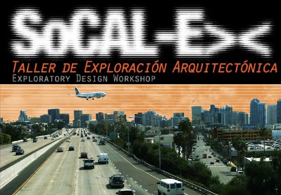
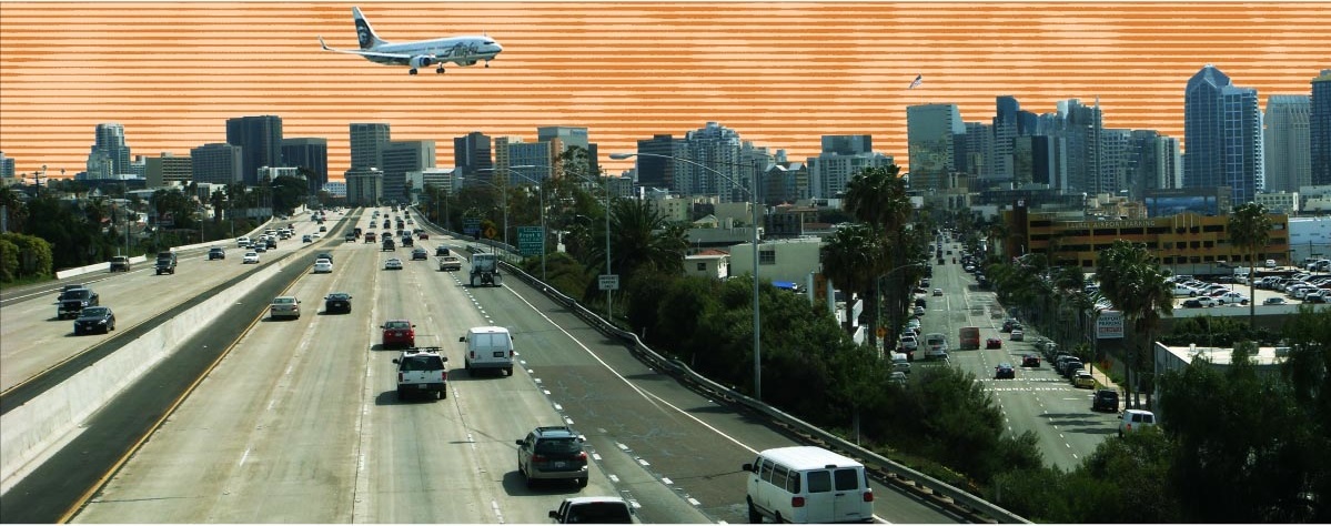
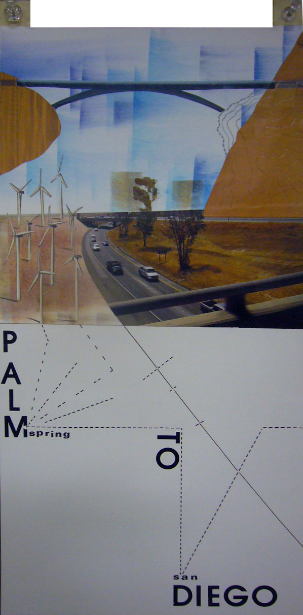
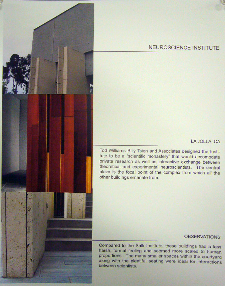
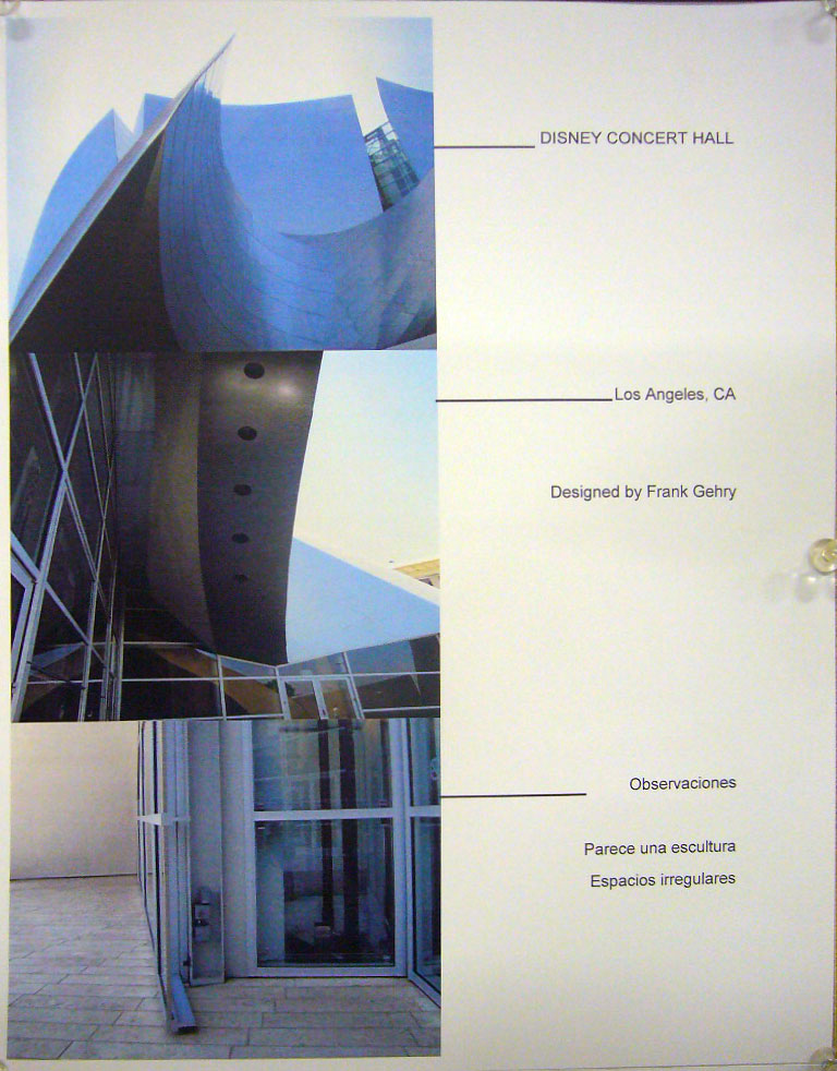
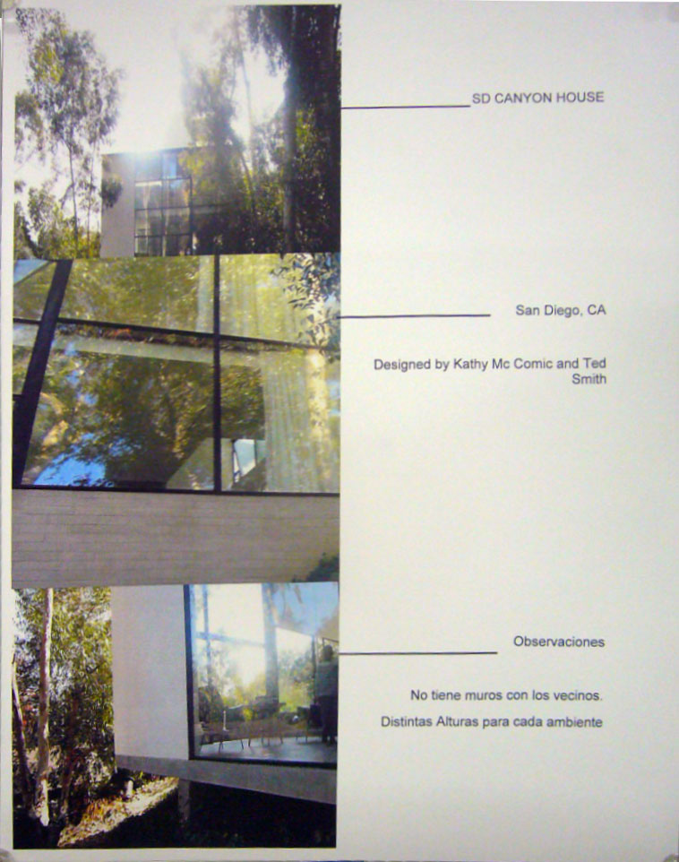
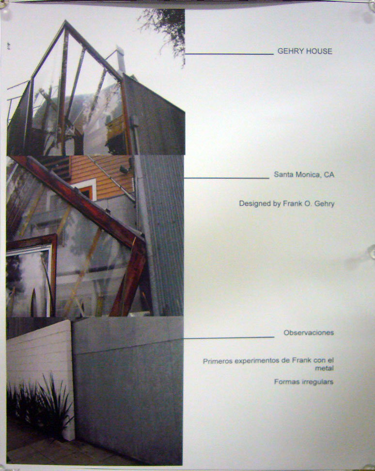
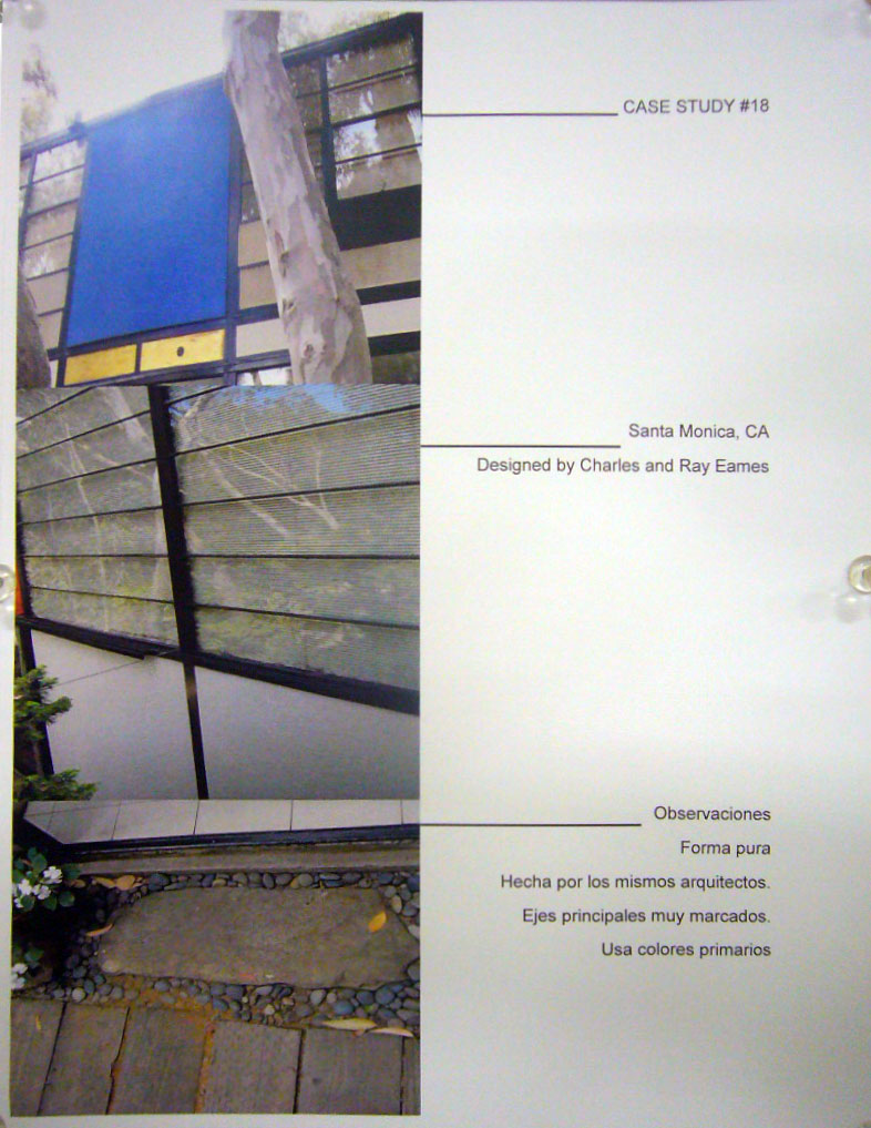
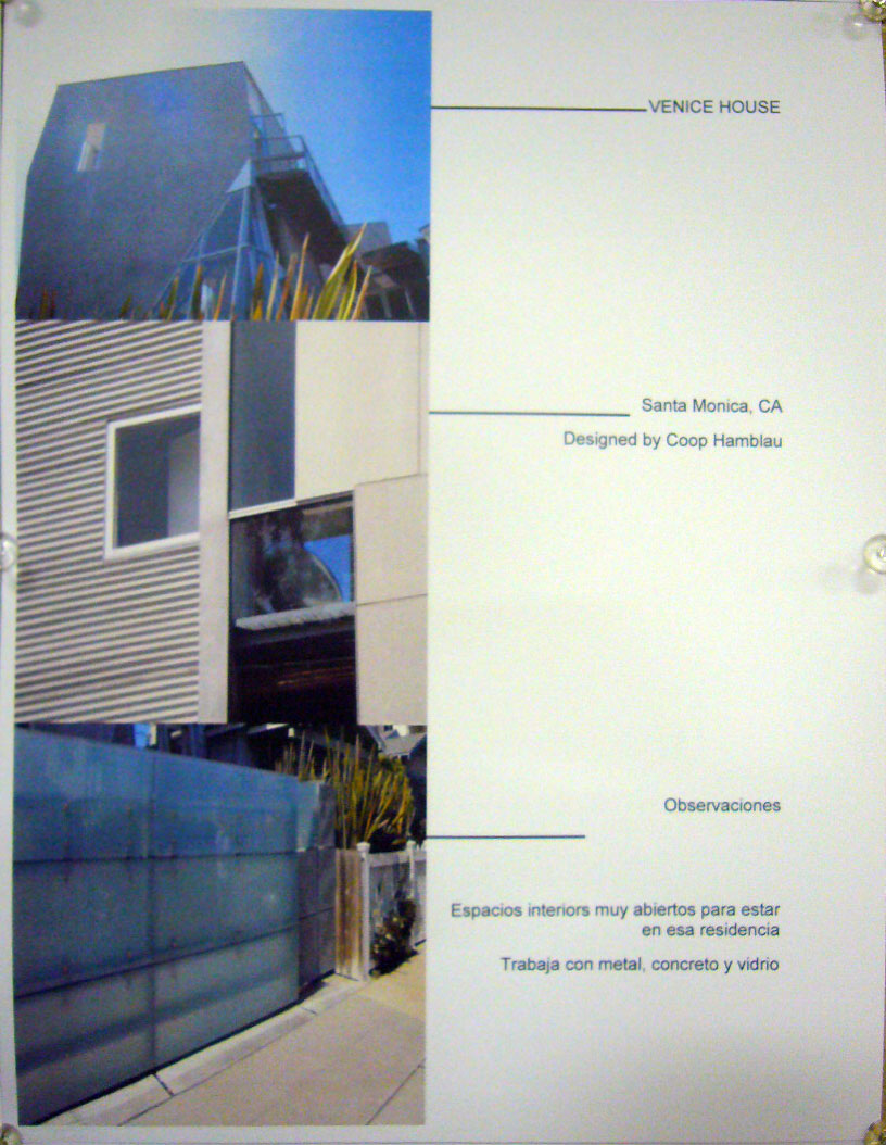
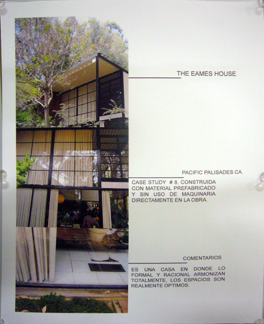
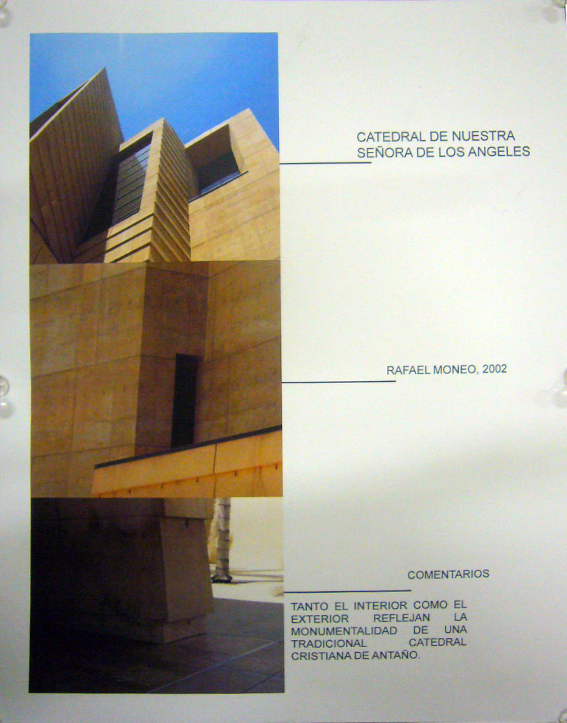
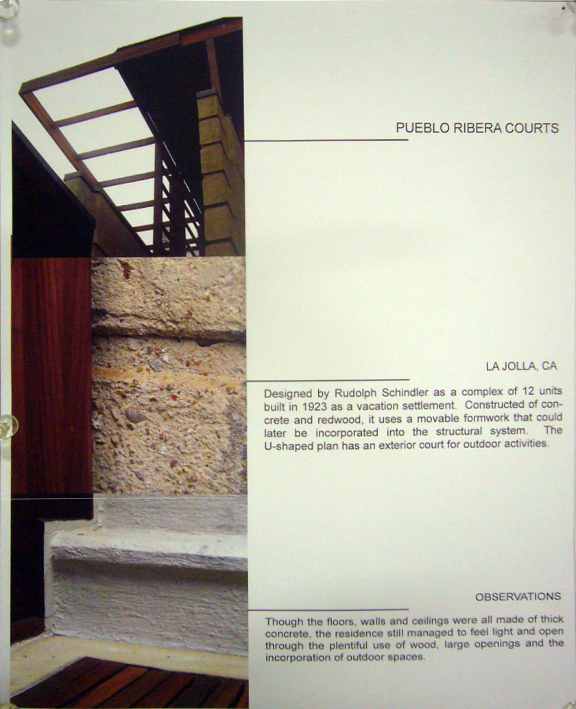
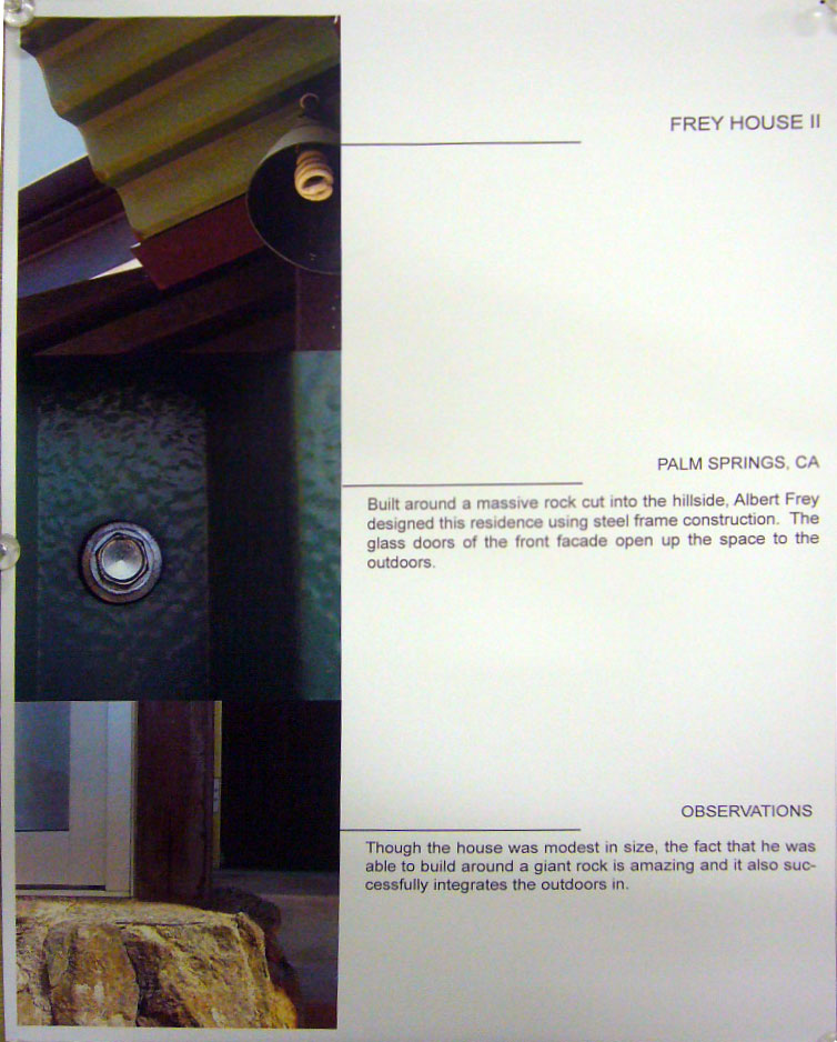
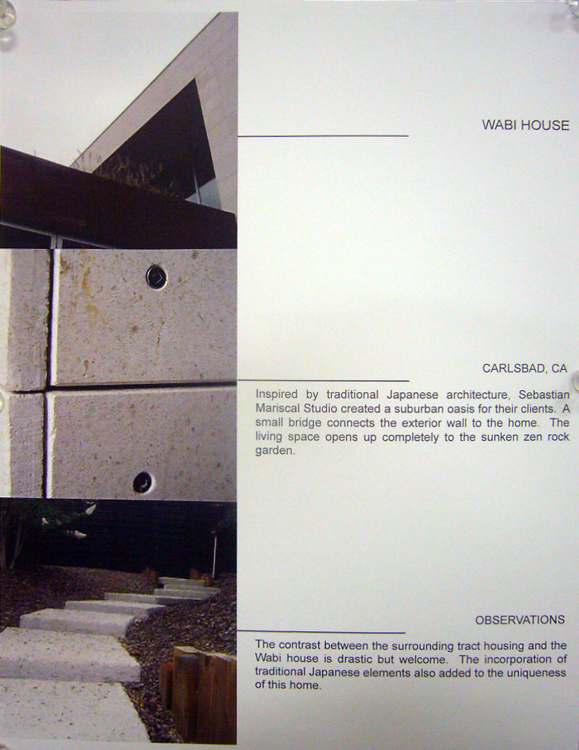
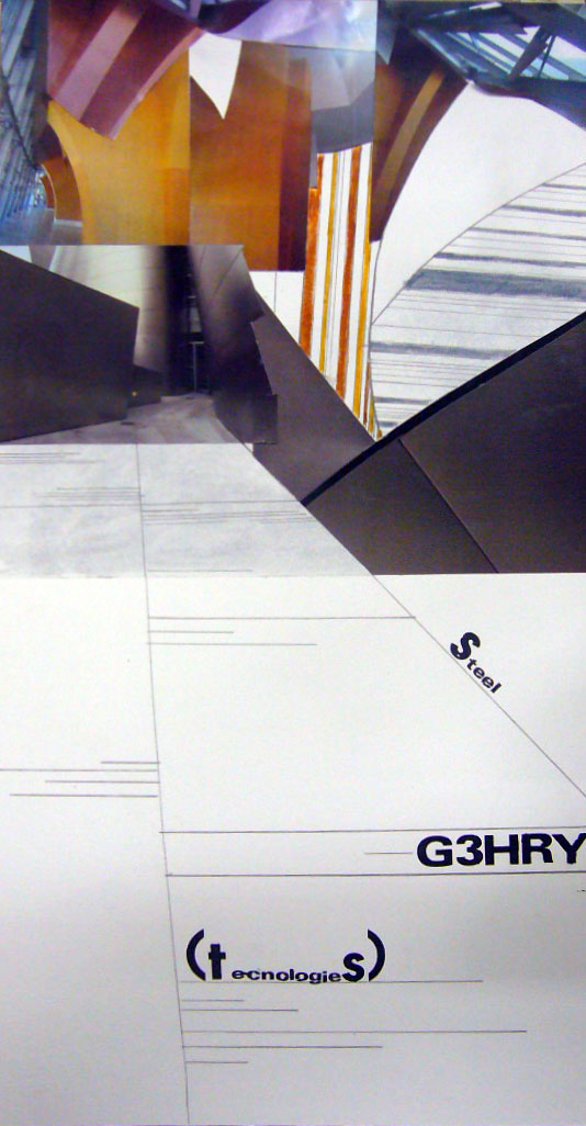
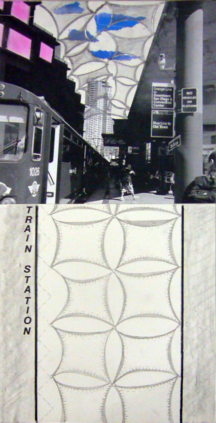
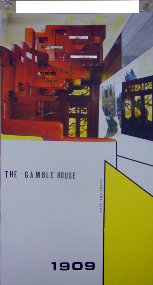
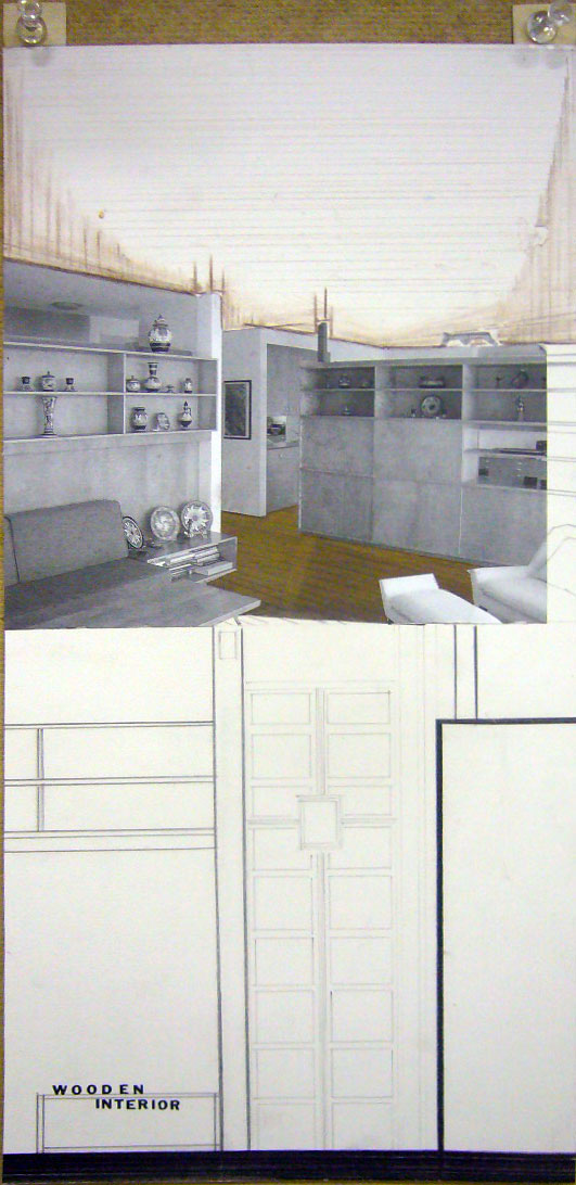
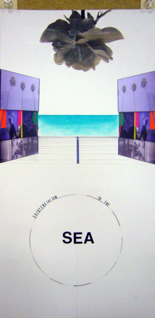
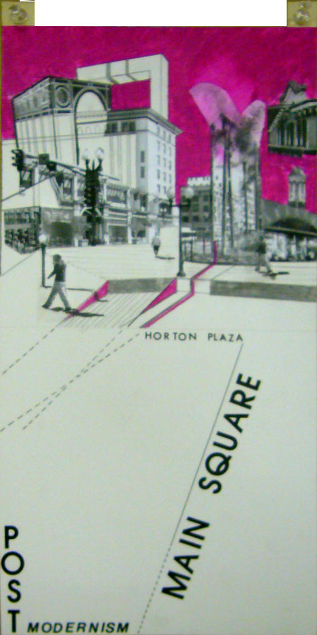
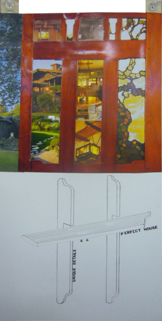
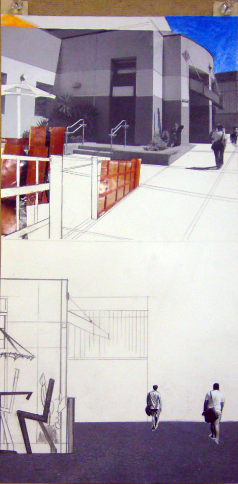
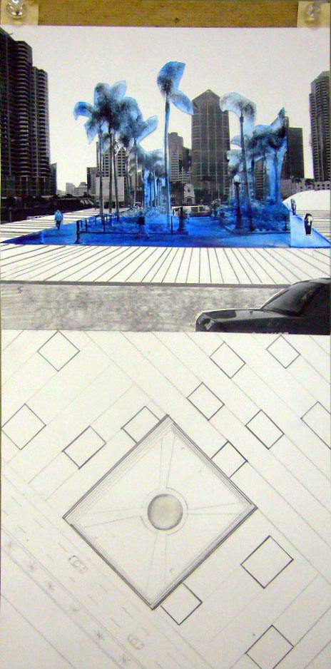
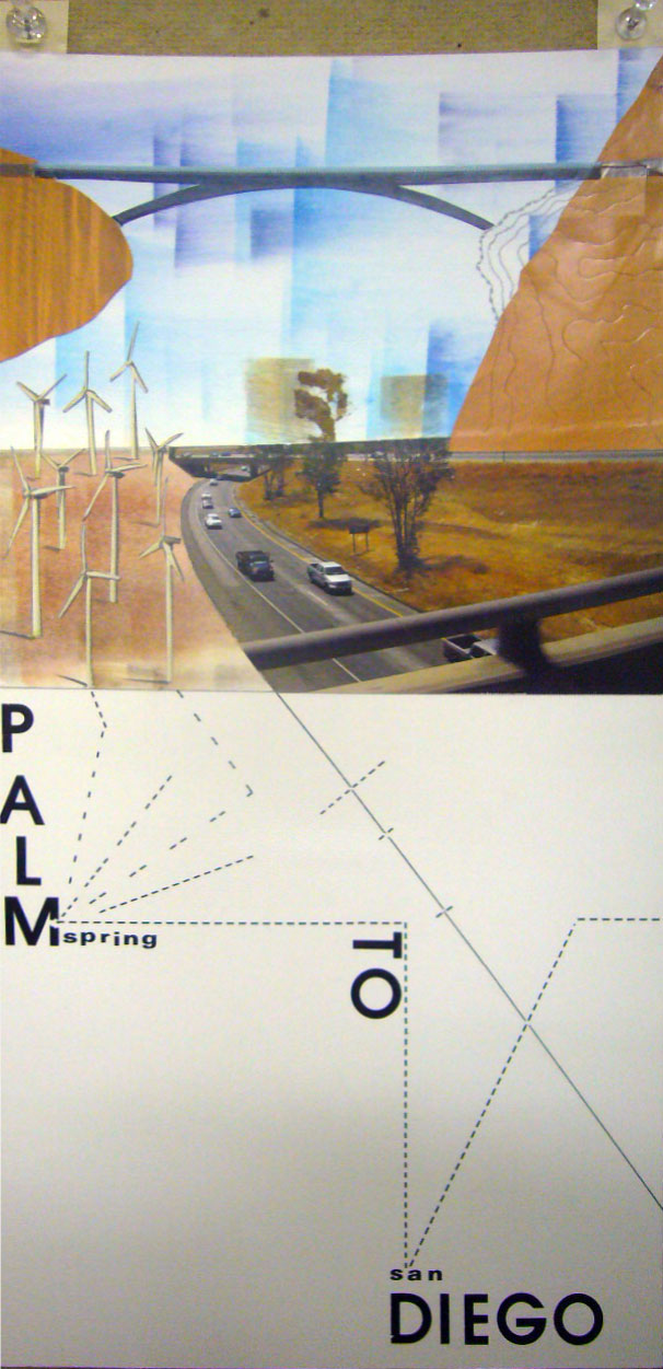
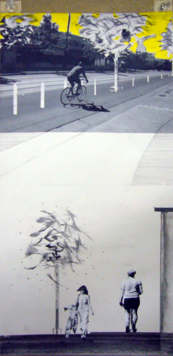
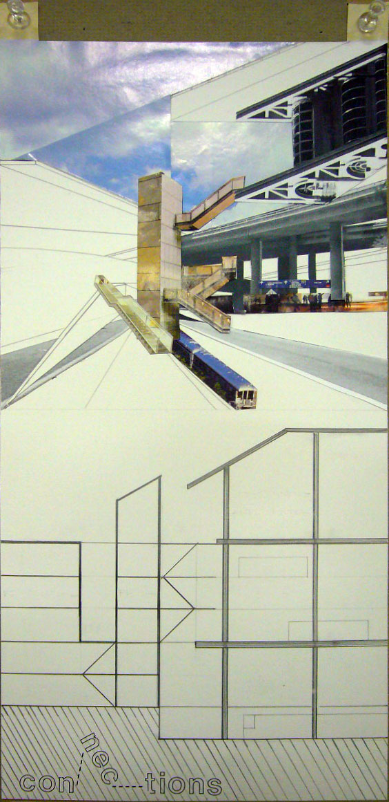
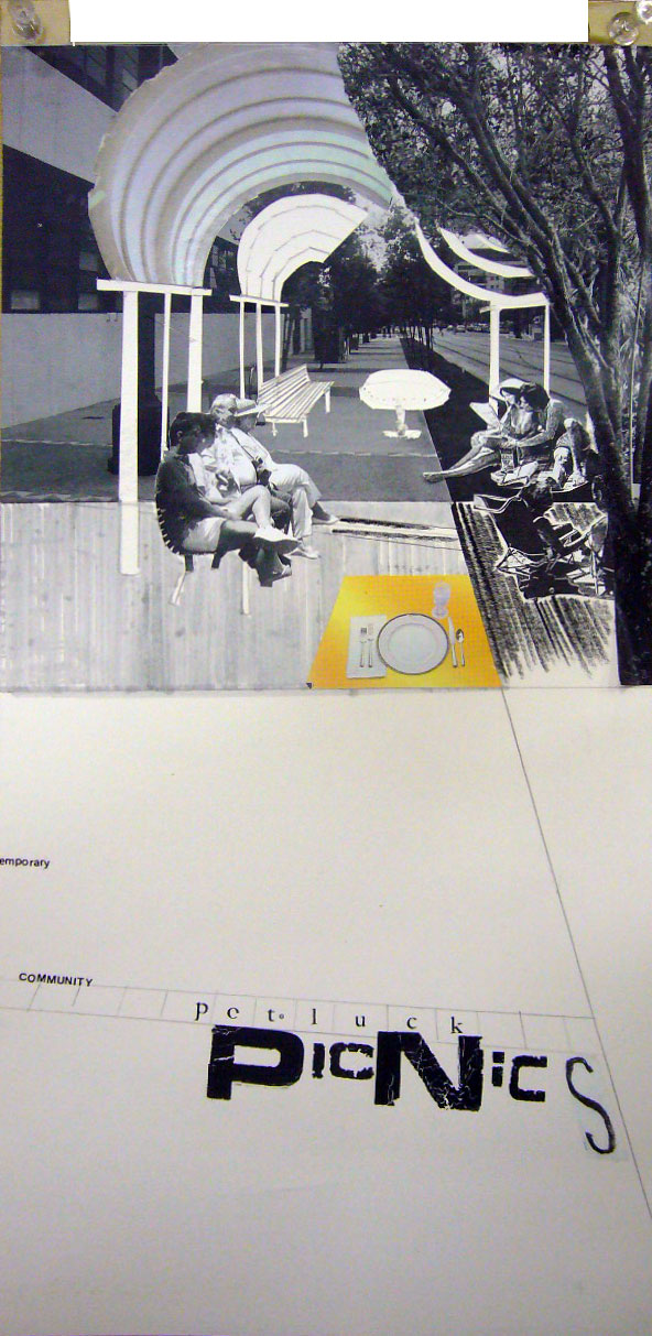
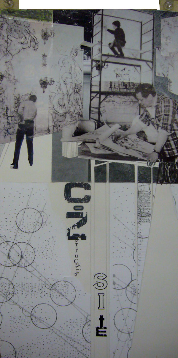
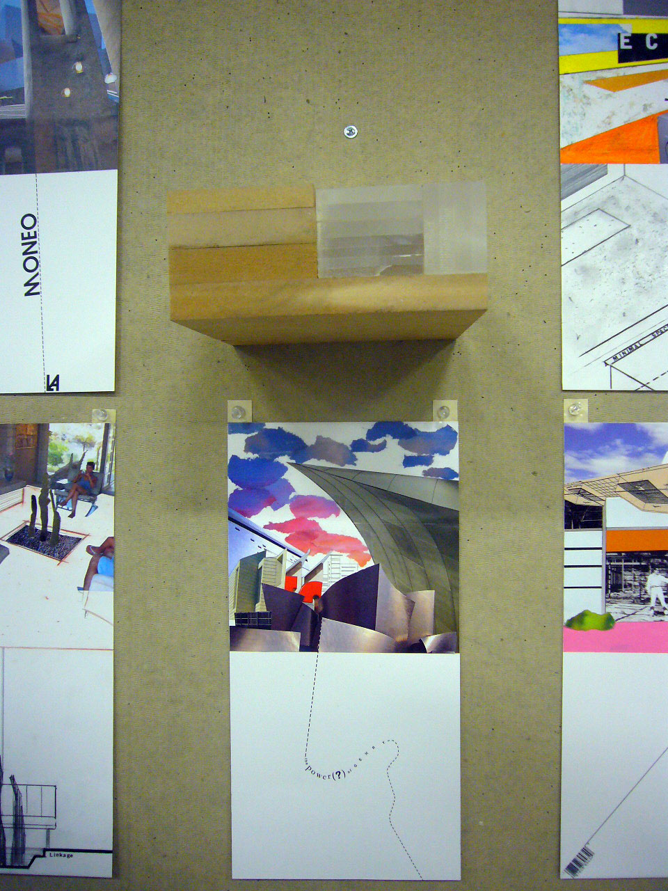
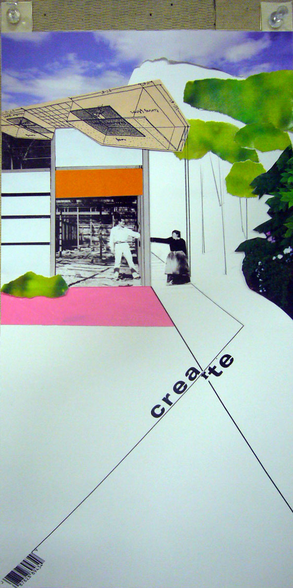
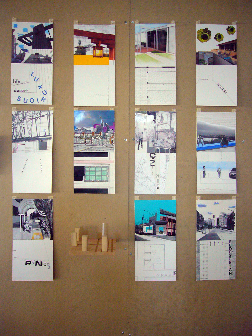
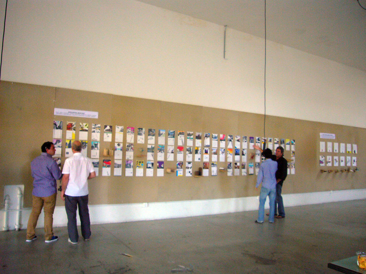
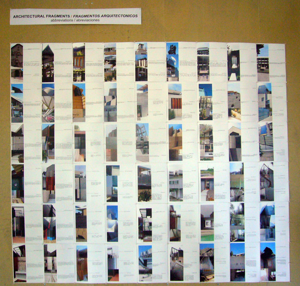


")


 nt)
nt)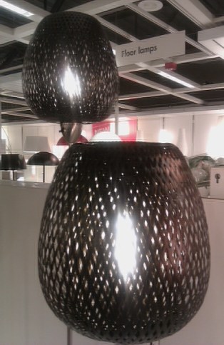
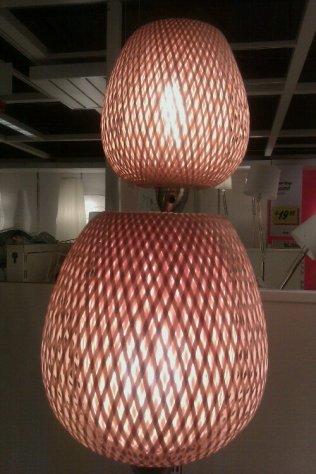
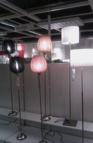
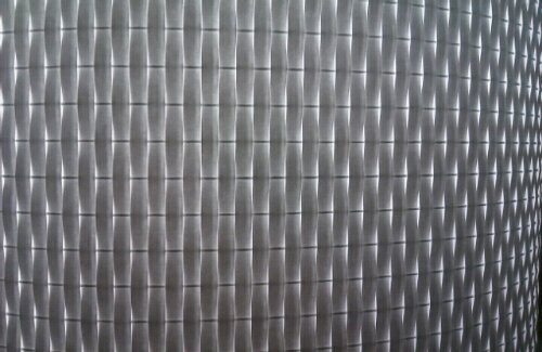
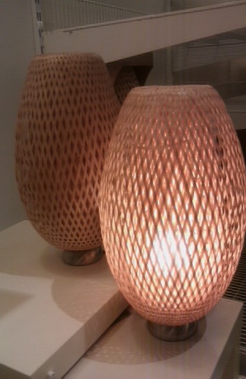
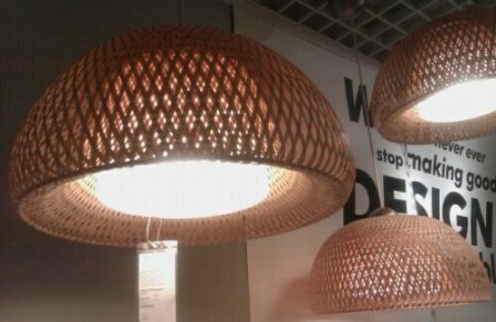
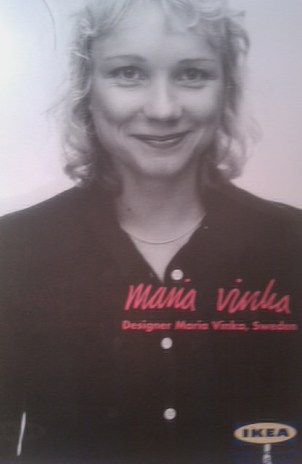


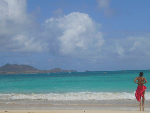


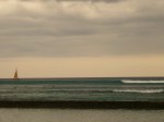
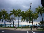

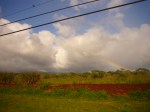
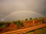
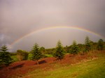
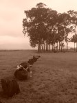
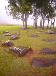
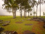
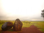

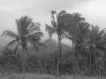


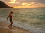
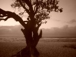

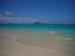
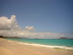
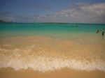
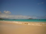
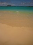
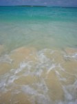
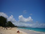
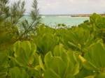
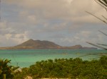
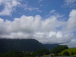
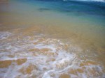
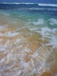
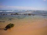
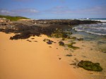
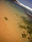
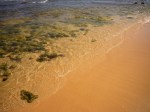
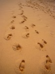
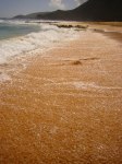
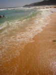
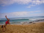
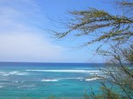
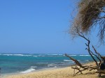
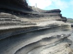
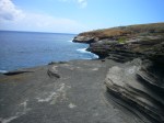
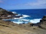
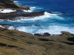
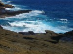
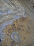
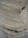
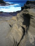
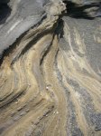
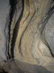
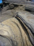
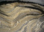
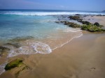
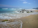
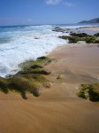
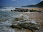
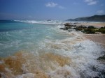
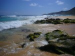
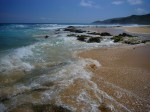
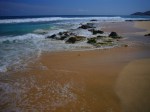
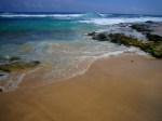
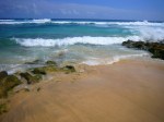
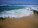
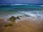
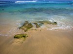
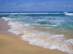
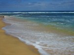
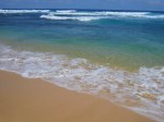
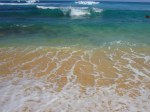
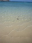
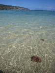
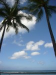


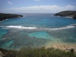

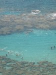

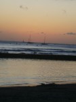


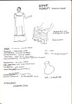


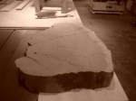
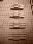
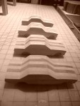
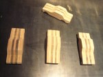
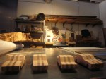
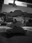
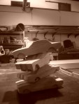
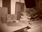
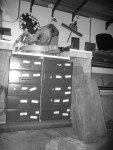
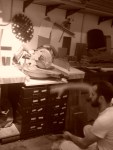
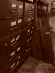
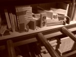
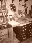

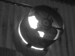
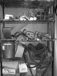
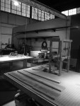
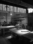
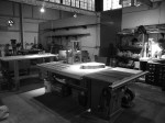
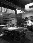
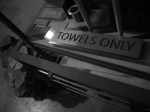
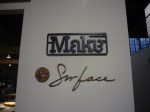
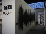

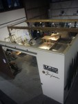
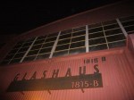
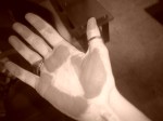


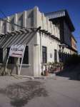
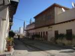
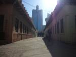
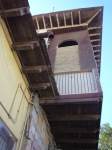
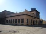
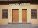
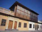
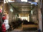
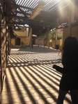
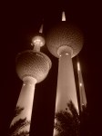
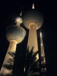

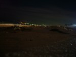
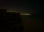
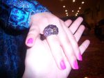


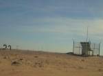
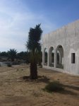
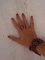
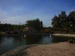
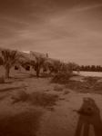
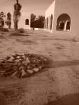
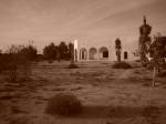
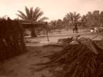
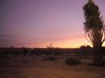


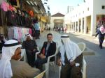
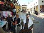
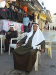
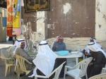
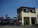
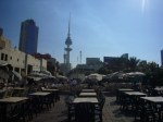
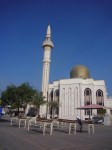
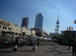
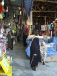
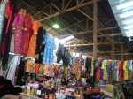
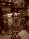
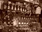
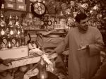
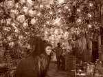
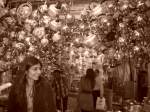
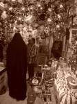
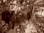
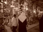
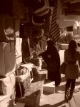
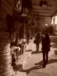

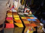
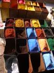
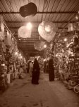
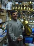
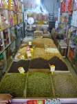
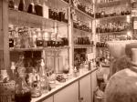
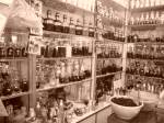
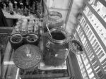
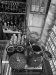
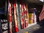


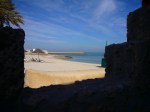
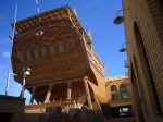
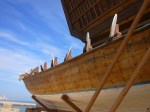
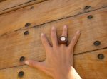
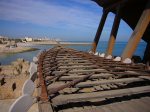
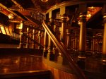
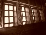

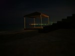

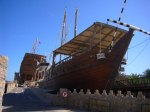
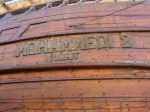
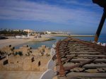


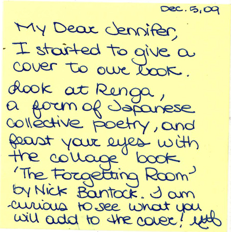


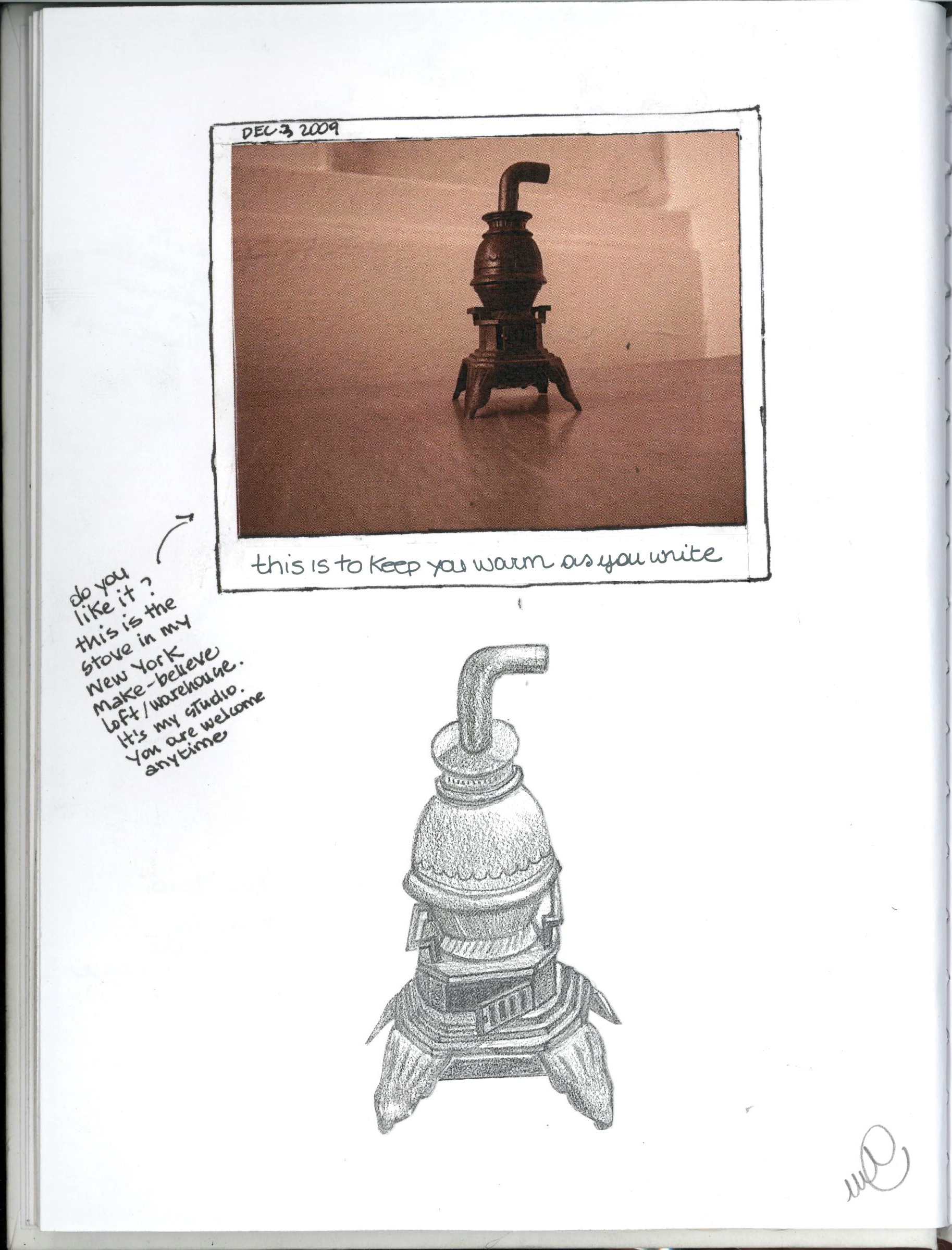


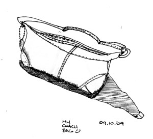


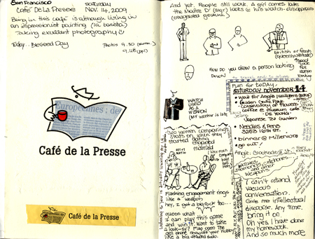


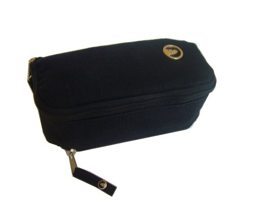
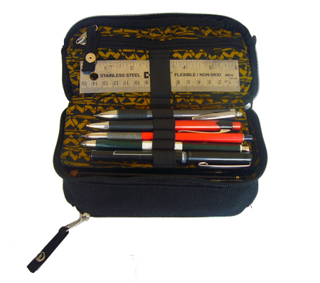

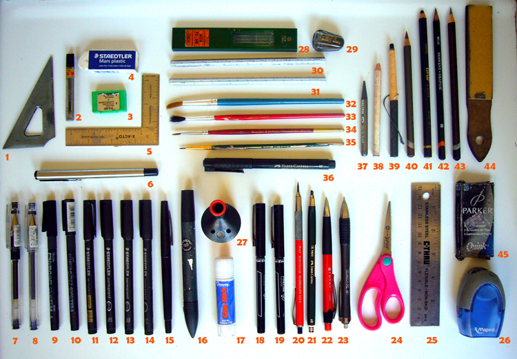


")
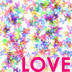


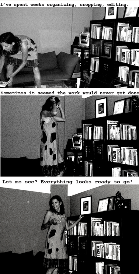
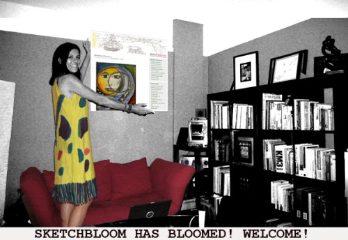


. Revisited 08.09")


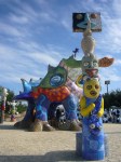
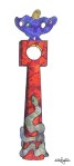
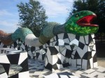
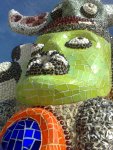
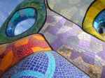
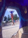
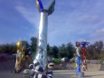
, Como, 2007")


")


 2009")


, Digital Background. 2009")


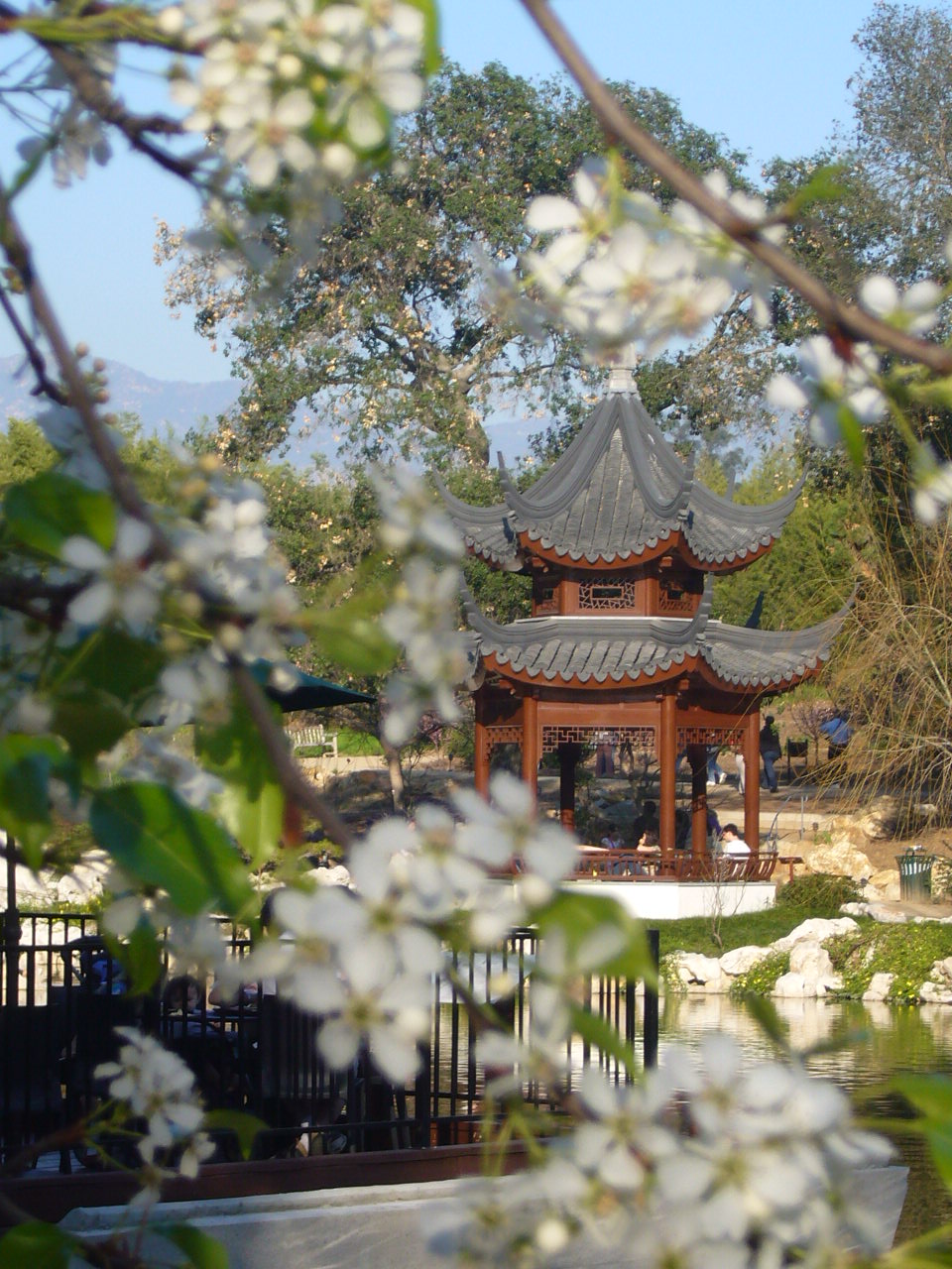
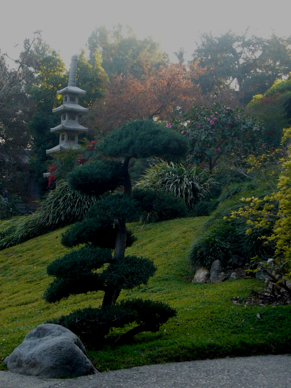
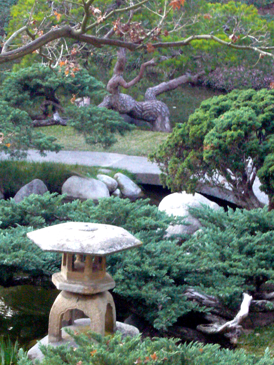
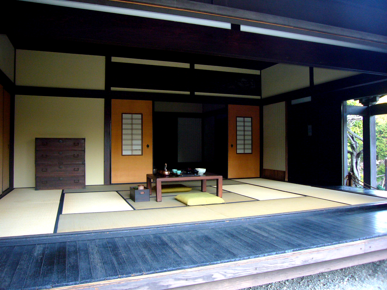
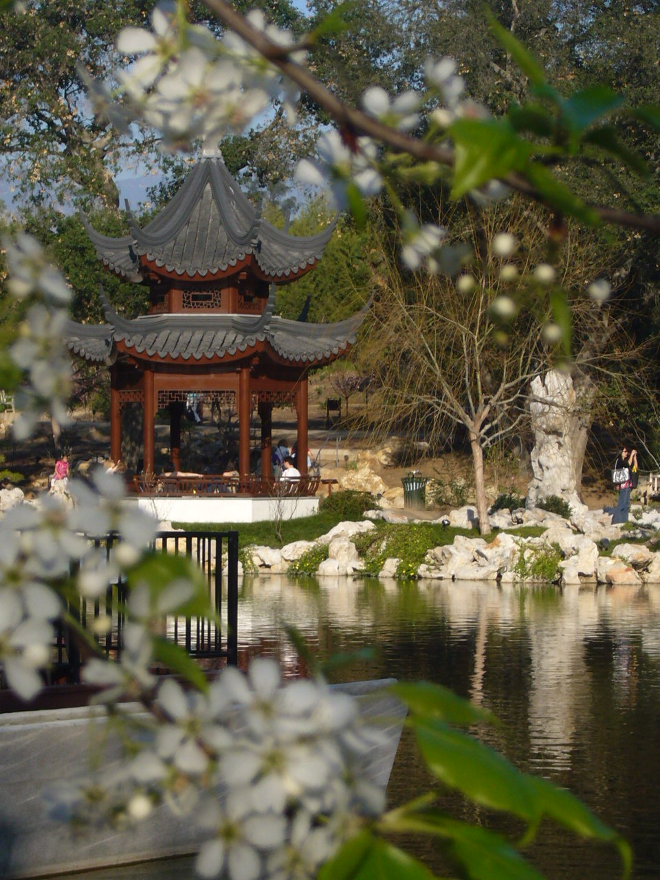
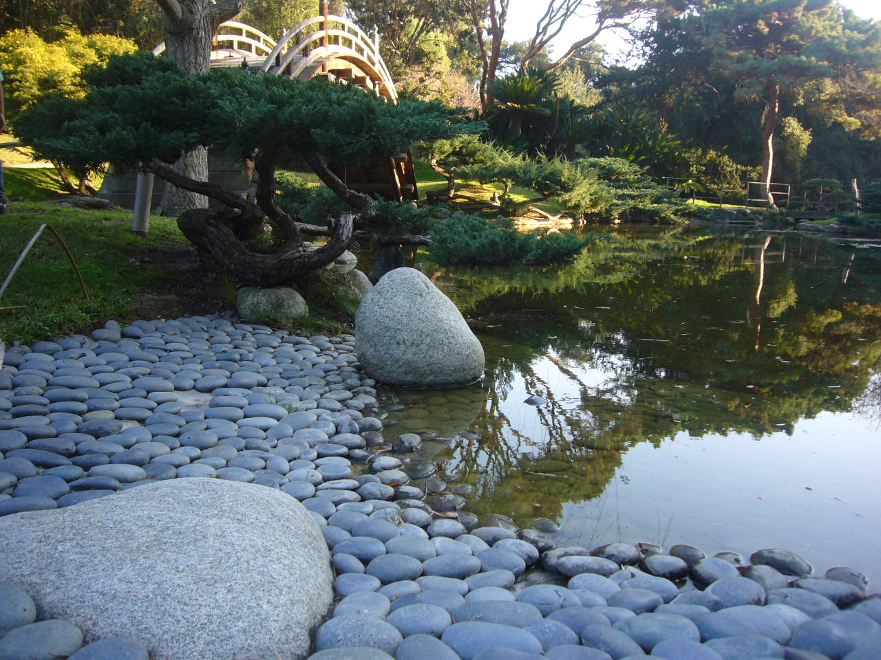
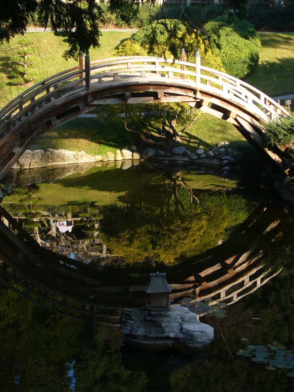
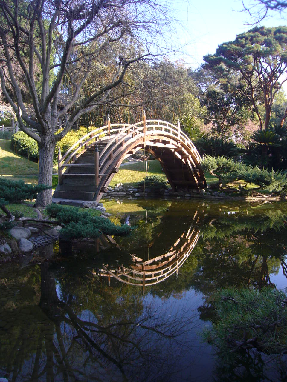
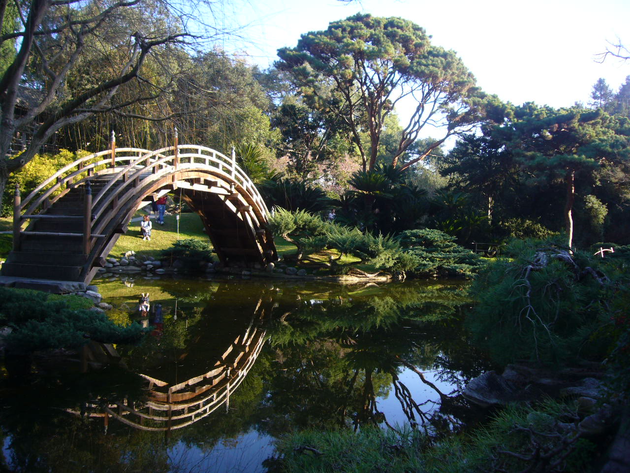
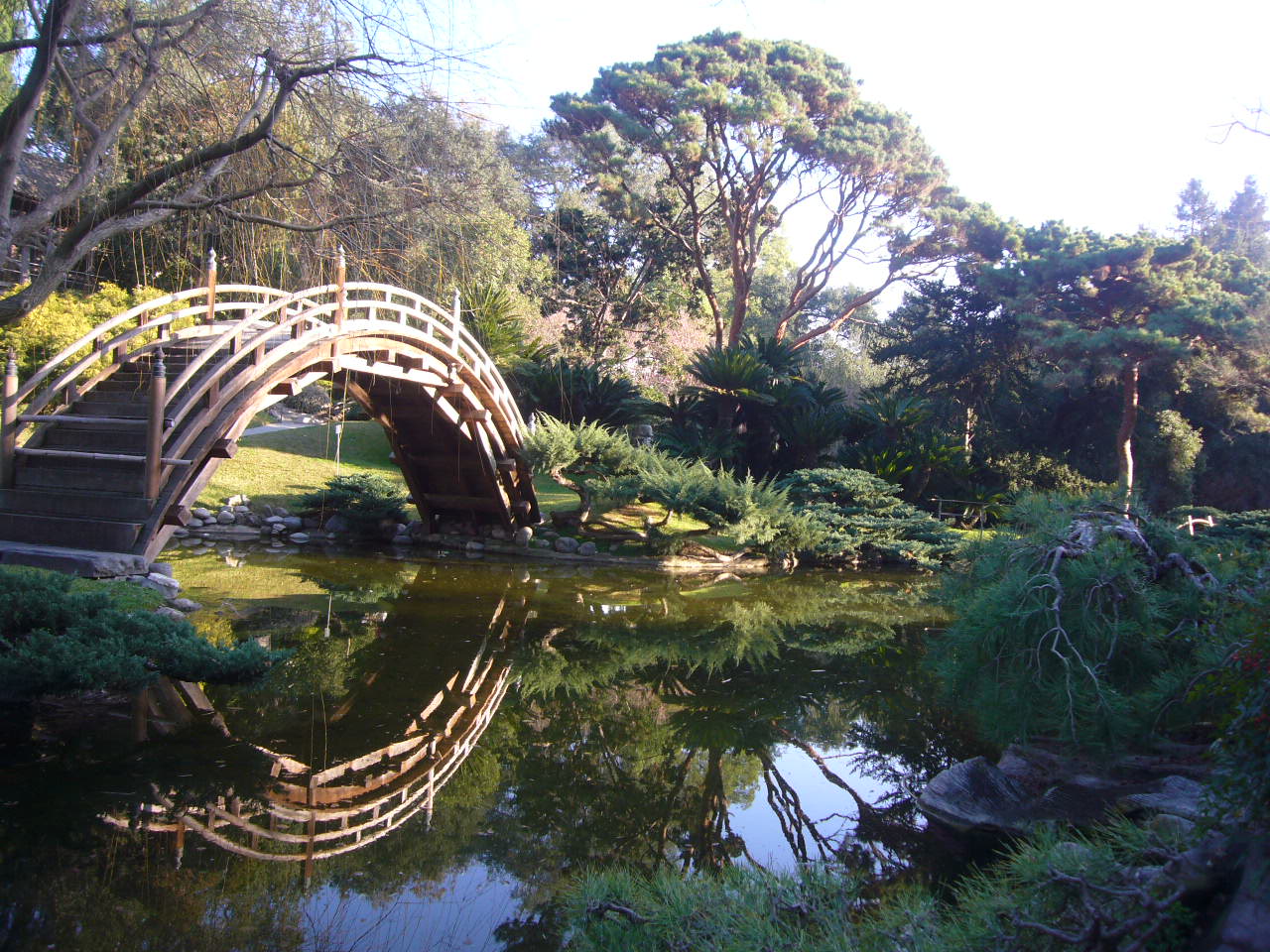

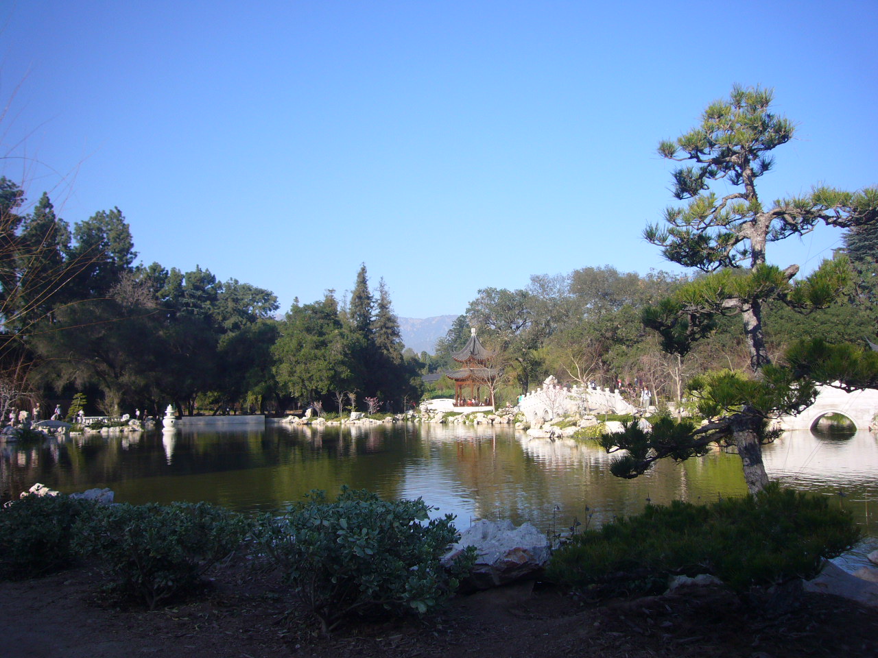
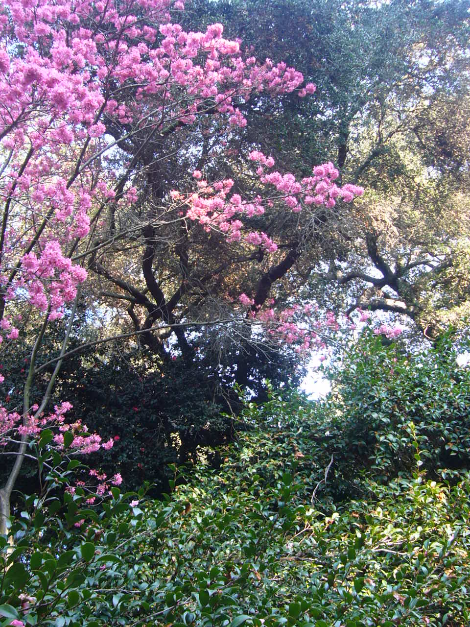

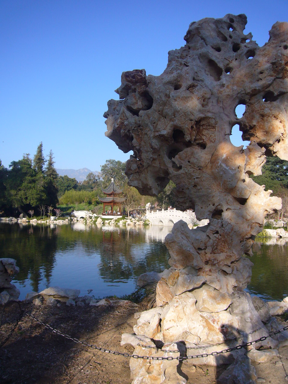
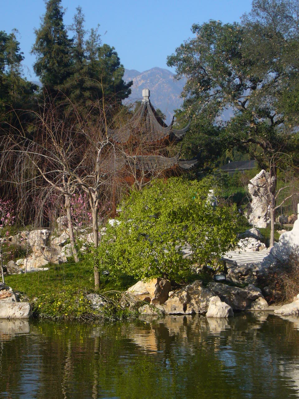


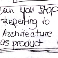
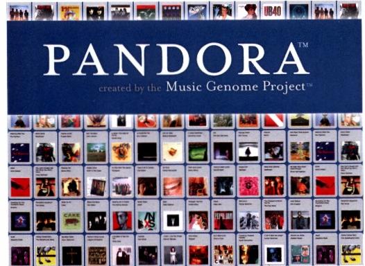


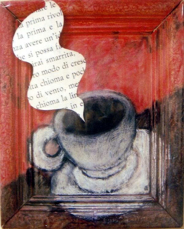


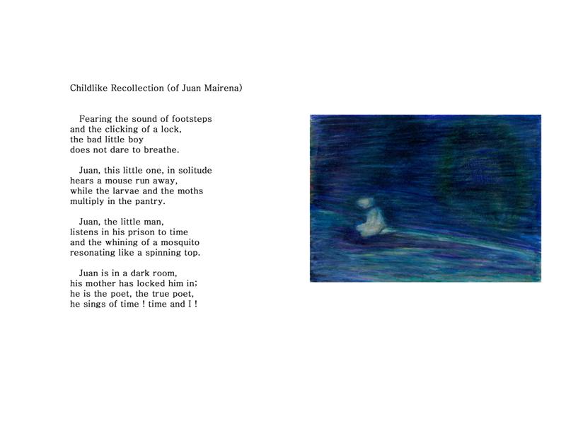
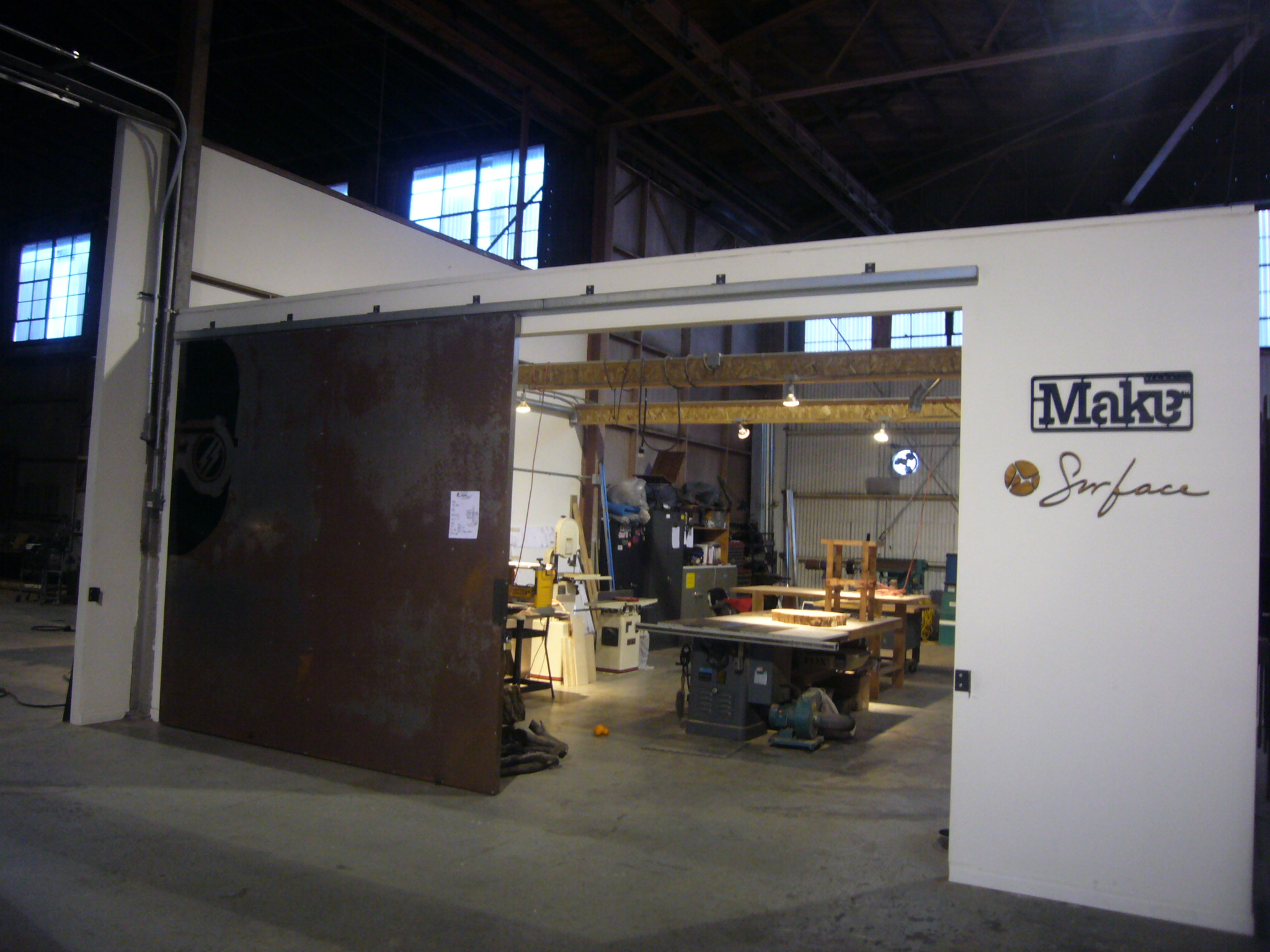