Feeds:
Posts
Comments

Archive for August, 2009

Terragni, Casa Del Fascio, Como, 1932

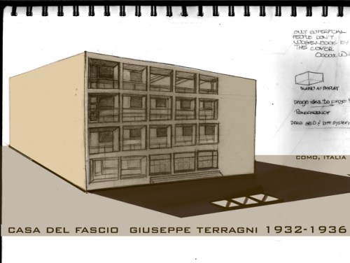
As part of the exploration in coloring with coffee, I wanted to experiment with overlaying digital sepia tones to previously drawn sketches.  The building above is Terragni’s Casa Del Fascio. Terragni is often overlooked as one of the pre-eminent modern architects in Italy, mainly because it has been hard to separate his architecture from the political regime of the time. Taken on its own, though, this building is single-handedly one of the most fascinating works of architecture in Italy –and the most illuminating example of Italian Rationalist architecture– due to its play of extruded volumes, transparencies and honest use of materials.

In 2003 none other than Peter Eisenman published an opus forty years in the making, Giuseppe Terragni: Transformations, Decompositions, Critiques, a thorough analysis of this and another work by Terragni, Villa Frigerio. Thanks go to Raul Diaz, AIA, for telling me about this book.  Surprisingly (or should I say, not surprisingly, the author being the controversial Eisenman), the book garnered very mixed reviews by readers on Amazon.  Nonetheless, the fact that Eisenman spent forty years focusing on the Casa Del Fascio speaks volumes (pardon the pun) on the work, mind and intellectual acuity of this Italian Rationalist.

I had the fortune to visit this building in the Spring of 2007, on the same day that I saw the Mausoleum of  Antonio Sant’Elia (Architect of the Italian Futurist group).  The sketch below is an example of what happens when graphite drawings are scanned: the original had much more contrast and much of it-along with the ‘life’ of the drawing- was lost in the digital translation.

I therefore bumped up the contrast in Photoshop and played with sepia tones and shadows. A great way to make a sketch presentation-ready. Another way to gain some layering would be to layer via-cut the body of the building, and subtract the volumes on the upper floors (the indoor-outdoor spaces).  By playing with the blending options of this new layer, new shadows could be cast, which would give a three-dimensionality to the sketch.
Casa Del Fascio, scan of original sketch (notice loss of contrast), Como, 2007
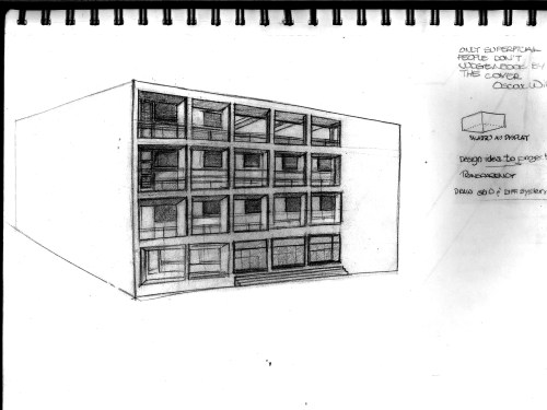
Casa Del Fascio, scan of original sketch (notice loss of contrast), Como, 2007

Casa Del Fascio, contrast corrected thru Photoshop, Como, 2007
Casa Del Fascio, contrast corrected thru Photoshop, Como, 2007

Casa Del Fascio, Sepia color with Photoshop, Como, 2007
Casa Del Fascio, Sepia color with Photoshop, Como, 2007
Read Full Post »

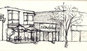
Original Sketch, Candelas Restaurant, Pilot Pen on Paper

Original Sketch, Candelas Restaurant, Pilot Pen on Paper

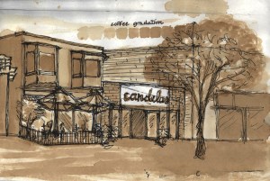
I have been experimenting with sepia tones done using espresso and with watercolors.

I am teaching a Rendering and Delineation class and the work done as demonstration for the students was great inspiration to continue sketching and using different ways to color the initial drawing. I suggested to my students a technique that I found of great help: instead of applying color directly to the original drawing, make multiple copies and experiment with different media. This is especially useful if the original drawing is done in graphite, or if one wants to keep the original version.

The experiment with Espresso was most revealing: by using regular American coffee I was only able to get couple of values/hues, but when I used an Italian Espresso-expertly made by Adam, our new coffee-cart owner here at the school (who was taught how by a professional Italian Barista :))- I was able to obtain a full scale of values, and even use the grounds for textures.

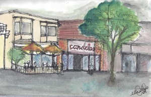
Watercolors are a fantastic rendering tools, for they can easily be augmented by pastels or pencils for more texture. I like to keep three or four fine watercolor brushes in different sizes in the sketching satchel I carry with me. I told my students to think of these different sizes as different lineweights for technical pens.

Candelas Restaurant- Rendering done using Espresso

Candelas Restaurant- Rendering done using Espresso

Candelas Restaurant- Watercolor

Candelas Restaurant- Watercolor

The sketches/drawings above were done during a tour of Downtown San Diego.  I found out that, even using plain copier paper the results obtained are fairly good, and, what was even more exciting, once I made color copies of my renderings, the results looked really polished and professional. Nevertheless, I am posting here the originals rendering to show the process. I actually like the rough quality of the results, but I cannot help but wonder what kind of fantastic effects one could obtain by manipulating these images in Photoshop and turning them into photocollages. I found out that the most successful photocollages are those done starting with solid, traditional work, whether in original, scanned or photocopied form.  Ah! The possibilities!

We also went to visit the brand new San Elijo Nature Center, and I will post the sketches from that site visit, where I experimented with a series of ‘watercolorable’ Graphitint pencils, which come in natural, landscape colors.

Next I want to further explore markers and pencils, and again use the Color Drawing book by Doyle as a guide. Rendering is a combination of Art and Architecture and I have to thank my former Professor Milt Yergens for supplying very inspiring watercolor renderings from his travels sketchbook. When using watercolor to give life to loose architectural sketches and drawings, the most important thing is not to be afraid of making mistakes and remebering to keep the brush ‘loose’.  After all, in these preliminary experiments with watercolor, the object is not sheer perfection, but playing with ‘splashes’ of color and learning about different effects and applications.

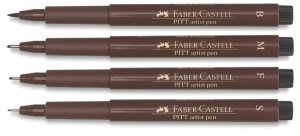
Faber Castell markers Faber Castell - Different lineweights

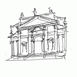
Other tools I really love is the Faber Castell artist pens: I have the sepia and landscape series. These markers come in Small, Medium, and Bold size.  The Bold size is shaped like a brush and is Great for quick, Venturi-like sketches, forcing one to get down the proportions quickly. I remember all those 10 seconds quick sketches in Drawing classes, and it is all about training the hand to get down on paper the greatest amount of information in the shortest time. Wonderful training for traveling artists, fans of the Moleskine.Speaking of Moleskines, I made great discoveries online about the beloved notebook, and will post my findings.

Robert Venturi. San Giorgio Maggiore

Robert Venturi. San Giorgio Maggiore

Read Full Post »

 
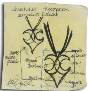
Concept for jewelry piece 'twomoons'
Concept for jewelry piece ‘twomoons’
I designed this piece in the summer of 2008.
Here is the concept on a Post-It (where else?).
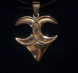
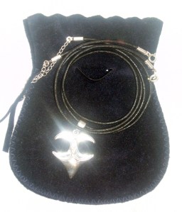
I then took it to a friend of mine in Calabria who has a jewelry shop and, from this design,her and the metalsmith first made a wax model then used  brushed silver to obtain the finished piece.
It was presented to me with typical Italian flair and attention to details.
I was ecstatic when I saw the result. The first thing that I designed in its entirety and that got ‘built’ 🙂
Twomoons Wax Proof-modeled after concept sketch

Twomoons Wax Proof- modeled after concept sketch

Final Twomoons Piece, Summer 2008

Final Twomoons Piece, Summer 2008

Here is how the jeweler presented me my 'project'. Italian taste!

Read Full Post »