Bouganvillae Vaporose | Fuori dal Borgo Acquerello su carta Arches 31cm x 41cm
Billowing Bouganvillae | Outside the Hill town Watercolor on Arches paper 12.2 x 16.14 inches Il Palazzo dei Sogni Acquarello su carta 100%cotone a grano medio. Carta Amatruda – La Carta di Amalfi 20.5 x 29.5 cm
The Dream Palace Watercolor on paper made of 100% cotton medium grain. Amatruda paper- Made in Amalfi 8 x 12.5 inchesLago di Montagna | Mountain Lake
Acquarello su carta 100%cotone a grano medio. Carta Amatruda – La Carta di Amalfi 20.5 x 29.5 cm
Watercolor on paper made of 100% cotton medium grain. Amatruda paper- Made in Amalfi 8 x 12.5 inchesVenti di Lavanda in Aix-en-Provence Carta per Acquerello Arches 18cm x 26cm
Lavender winds in Âix-en-Provence 7×10 inches Arches Watercolor Paper Equilibrio Instabile| Unstable Equilibrium
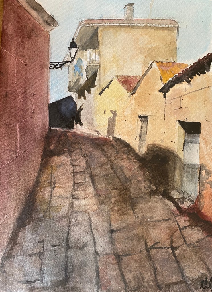
Acquarello su carta 100% cotone a grano grosso. 31cmx41cm
Watercolor on paper made of 100%cotton rough grain. 12.2 x 16.14 inches
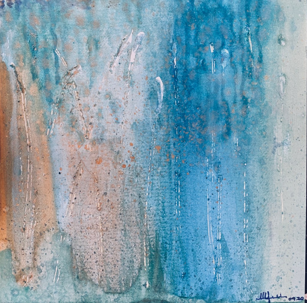
Colors of the Fall…Birches. Watercolor. September 19, 2020.
Happy Fall!
Is it “oh my God” or “Finally?”
How has your summer been?
Mine was a summer that wasn’t, between the lockdown on international flights and non-stop fulltime teaching plus fulltime academic duties. More work, adjustments, screentime and zoomed/voiced out feelings than i care to admit.
Still, there is gratitude for being able to work, pride in the results achieved with colleagues this summer, and beautiful moments of connections with my students, as we thankfully learn, adapt and evolve to communicate solely through these new media. It was a summer of intense learning, yet the curve was gentler than in the terrible Spring.
The closeness of the human voice substitutes the immediacy of vision – and this whole business of teaching and working remotely is getting a little less painful/ more bearable.
Have patience. All things are difficult before they become easy.
Saadi of Shiraz, Persian Poet, 1210
We are learning, fast, multiple new ways to transmit knowledge, of being there for someone, new ways to stay present, engaging and caring. We are growing and expanding- and this growth will stay with us even when “things return to normal”…whenever and whatever that is. I’m thankful for the enormous adaptability we possess as human beings.
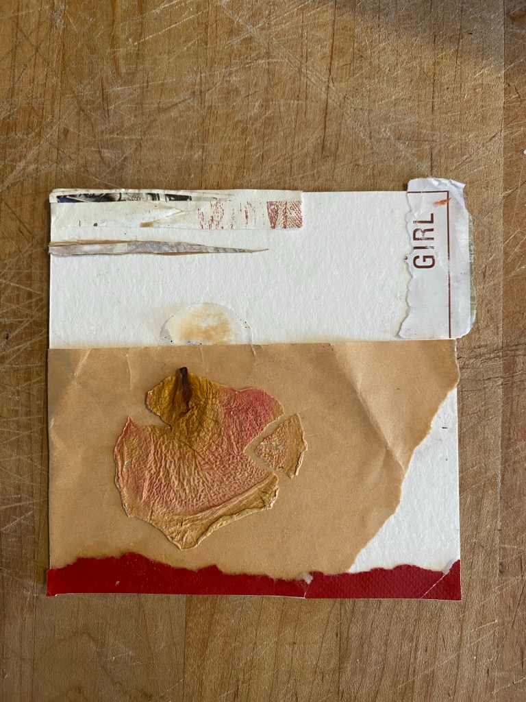
Voyages – Collage June 2020
With more Covid-related uncertainty, rightful continued political protests and unrest against police brutality and killings in the U.S, waves of closures and reopenings here in San Diego, the California/ West Coast fires, alarming news from Lebanon, immense trepidation for the upcoming U.S elections –and these are just the top things that come to mind – the summer of 2020 continued the general trend of this year’s suckiness (yes I just used that term) and moments of poignant glory.
(just added, since drafting this on the first day of Fall, the passing of the indomitable US Supreme Court Judge Ruth Bader Ginsburg, a tremendous loss and the terrifying prospect of trump nominating a third judge to the highest court of the land, with multigenerational repercussions)
—- b. r. e. a. t. h. e. —
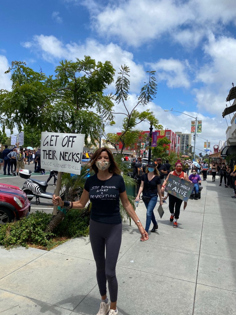
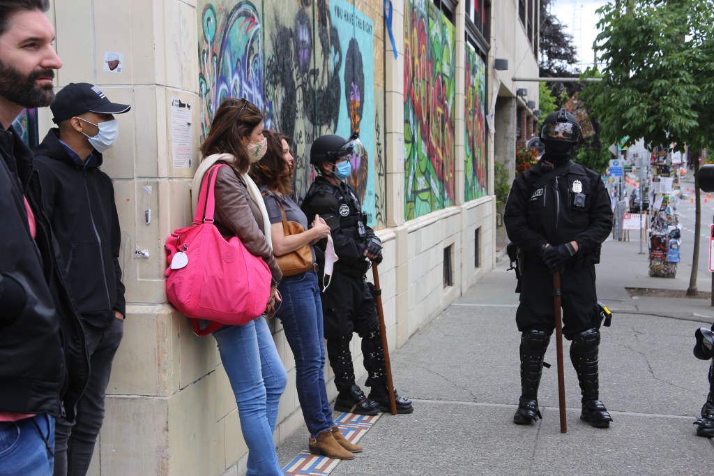
Protesting in the streets of San Diego after the killing of George Floyd at the hands of the state. Black Lives Matter ✊🏿 – and that’s just a start. June 2020
Personally, there was heartbreak and loss, hope, and gentle local travel in my beautiful state of California and the West Coast.
Endings and beginnings.
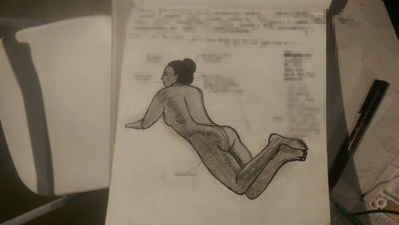
Graphite and Derwent Inktense pencils on paper. August 2020
As ever, the lovely friends and helpful spirits, old and new, God /Universe put in my path —along with a renewed spiritual practice— saved the day.
San Clemente Pier, California. August 2020.
I hope you were able to find moments of peace and beauty in the storms of your life, the nation.. the world. I hope you my readers found oases of joy in nature, friends, loved ones, cooking, yoga, joyful movement….art and spiritual practices. Time for yourself, to learn from solitude and silence. I hope, more than ever, you are taking better care of yourselves physically, mentally, spiritually and emotionally – for we are asked to function normally- and, some of us, to work even more, while there is a war going on.
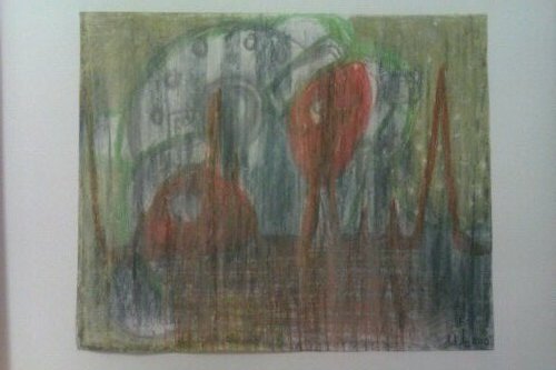
The Surface and the Deep. Watercolor. July 2020.
“When under, remember the surface. When on the surface, remember the deep”. When our days are turbulent and troubled, our challenge is to remember the wave is not the sea. Though it pounds us, the pounding will pass. Though it tosses us about, the tossing will pass, if we don’t fight it. Often our fear misleads us to stay in close to shore, when the safest place is in the deep, if we can get there. Any swimmer knows: stay too close to shore and you will be battered by the surf and undertow. We must swim out past the breakers if we are to know the hammock of the deep. Stay on the land or make it to the deep. It is the in-between that kills.”
Mark Nepo, The Book of Awakening.
I, ever the optimist, even started a running list of “silver linings” which resulted from this uncertain 2020.
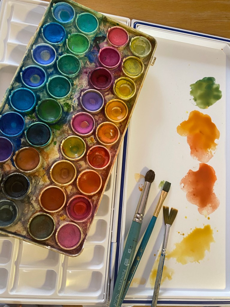
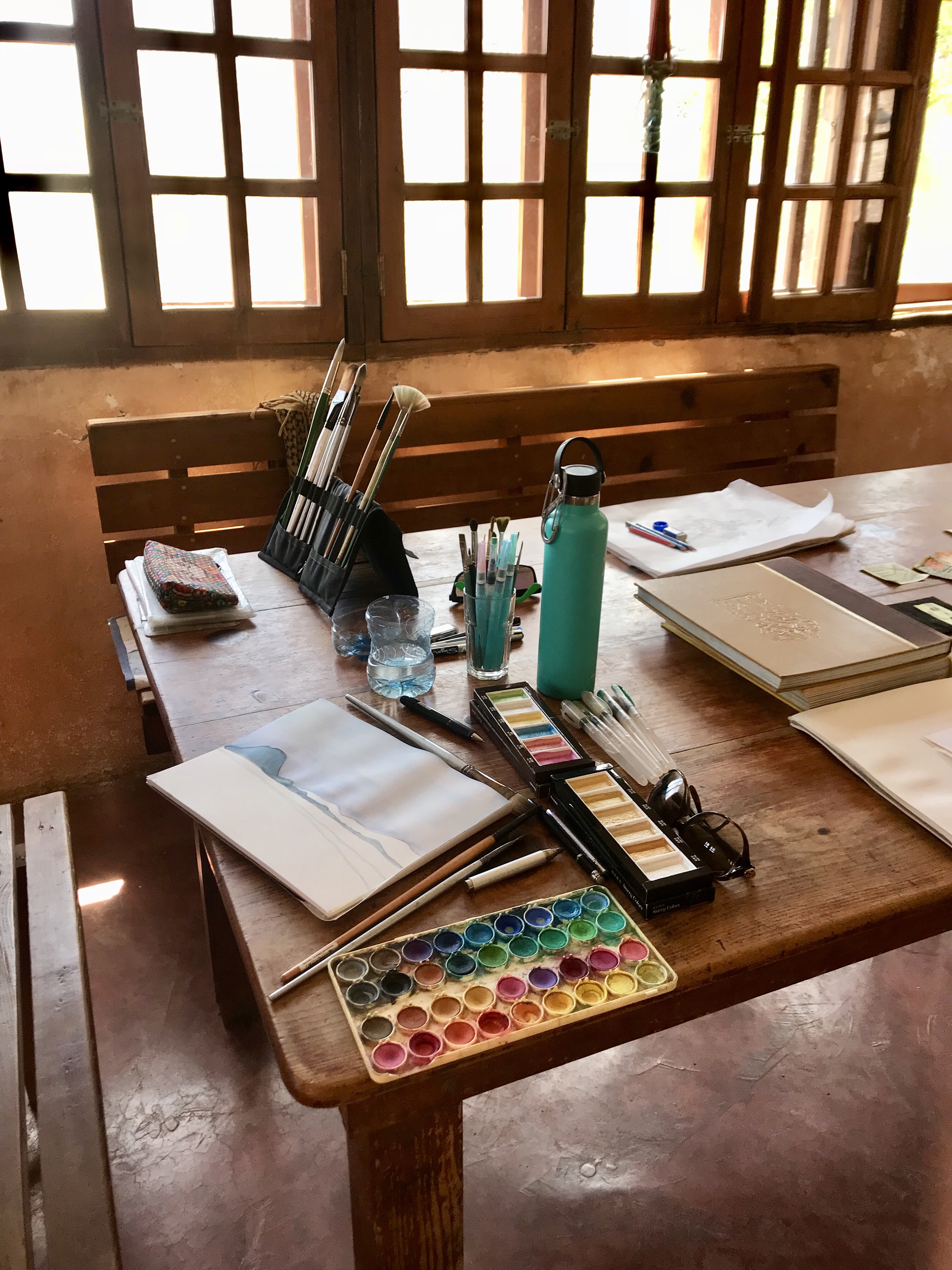
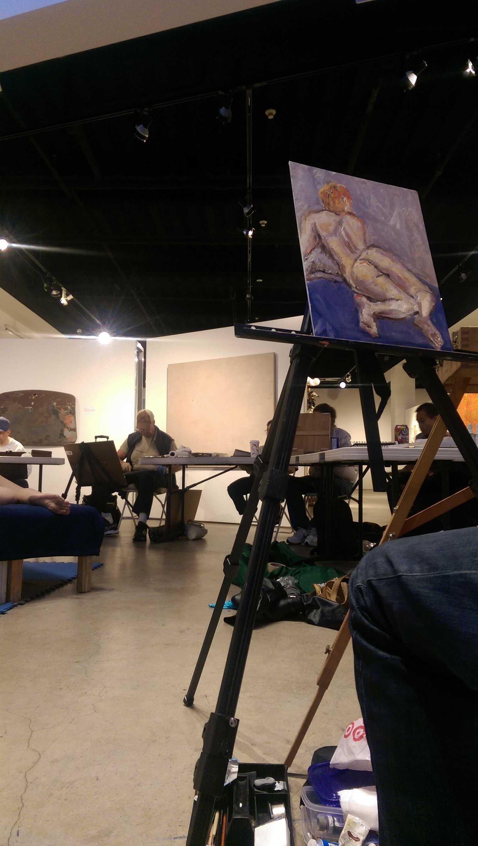
Art will save us. Setup for my watercolor classes. One of the good things to come out of this year is my return to art, in form of art classes, and now I can join anywhere in the world, since everything is online! My first watercolor with Escuela Alda con Limón in Madrid. My teacher was Ana Grasset. An attempt at a monochromatic studies when I still could not tell the difference in my Kuretake Japanese watercolor pans.Second watercolor with Escuela Alda con Limón in Madrid – Ana Grasset’s workshop.
Six months into the new reality, and with a full collection of artful masks to wear each day before I step outside —and to remind me of our strange time —these are things I know for sure:
Image from lolomercadito.com
I know right now the good is even better because we all stopped taking things for granted months ago.
Rumi
I know the Global Pause ( as a colleague called it) is a chance for all of us to reassess the “ busyness” a lot of us identified with — and perhaps were distracted by. I know this is a chance for all of us to go deeper, to interiorize, and find the center of calm and stillness inside of us. This is life changing.
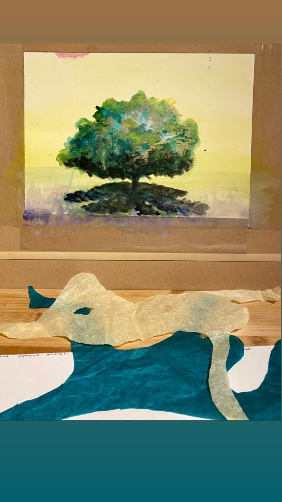
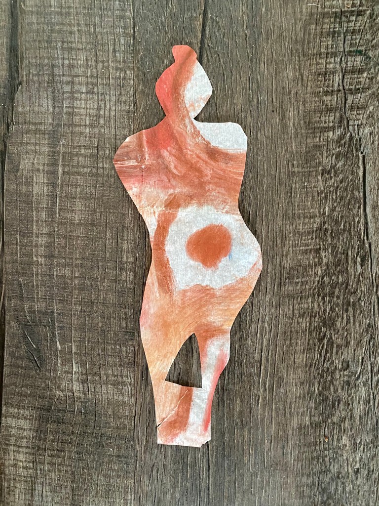
Watercolor of my favorite tree and remnants of my “Drawing with scissors: Matisse” workshop with the London Drawing Group. September 29, 2020. Watercolor class with Juan Saturio {take 1} from Escuela Alda con Limón in Madrid. I want to try this again as my street got too dark/muddy ( a danger with watercolors). I think even my imperfect children need to be shown.
I know that the work of lightworkers is needed more than ever, and these times ask each of us to lighten the load of our fellow human beings, in however capacity we can do this. Be a light and help to a neighbor, an elderly acquaintance, a friend you lost track of. We can take this time and insulate ourselves or we can greet our better selves at the end of this surreal journey.
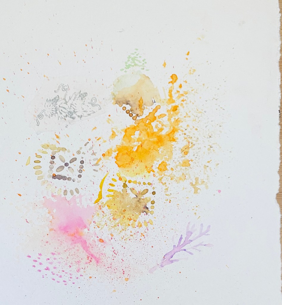
Watercolor experiments in light. September 29, 2020.
Finally, I know and can vouch for the healing power of movement and Nature. Move that body! Move that body everyday, walk or run among trees or by the ocean. Exercise in the fresh air to revive your mind and minimize the dreaded screen time. Open your windows wide ( if there are no fires around that is ..) Make sure you move everyday at least one hour to combat fatigue, depression and what in Italian we call abbrutimento ( degradation, brutalization) which comes from never leaving your home. Challenge yourself to go to different nature spots, to give your eyes something new to look at, and revive your spirit. Rumi also said the soul needs to travel as much as the feet. Daily loving movement, as the FlyLady calls it, is the foremost way we can help our body feel better- and when we feel better we can be better to those around us. Do anything you can not to go default.
The pier in San Clemente beach, which has been my refuge in this strange summer 2020. August 2020.
This summer I managed to steal moments of beauty and time for mini-art and writing retreats in long weekends spent in the beautiful “Spanish village by the Sea” San Clemente, California.
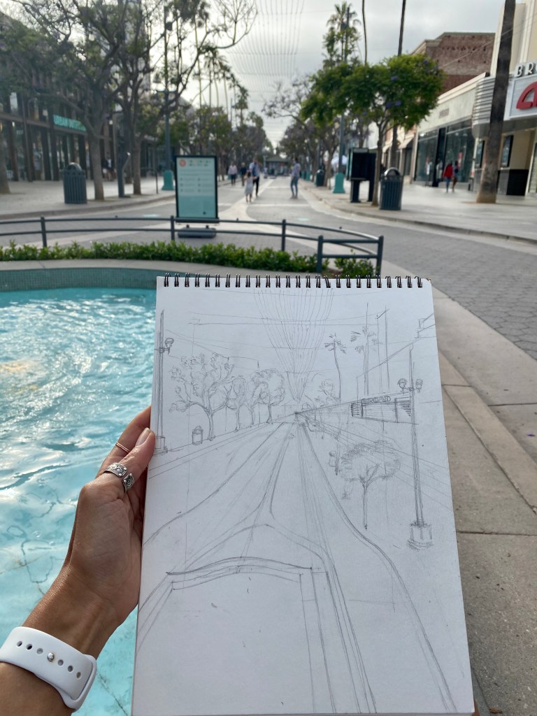
Drawing Third Street Promenade in Santa Monica, California. June 2020.
In June I ran away to Santa Monica.
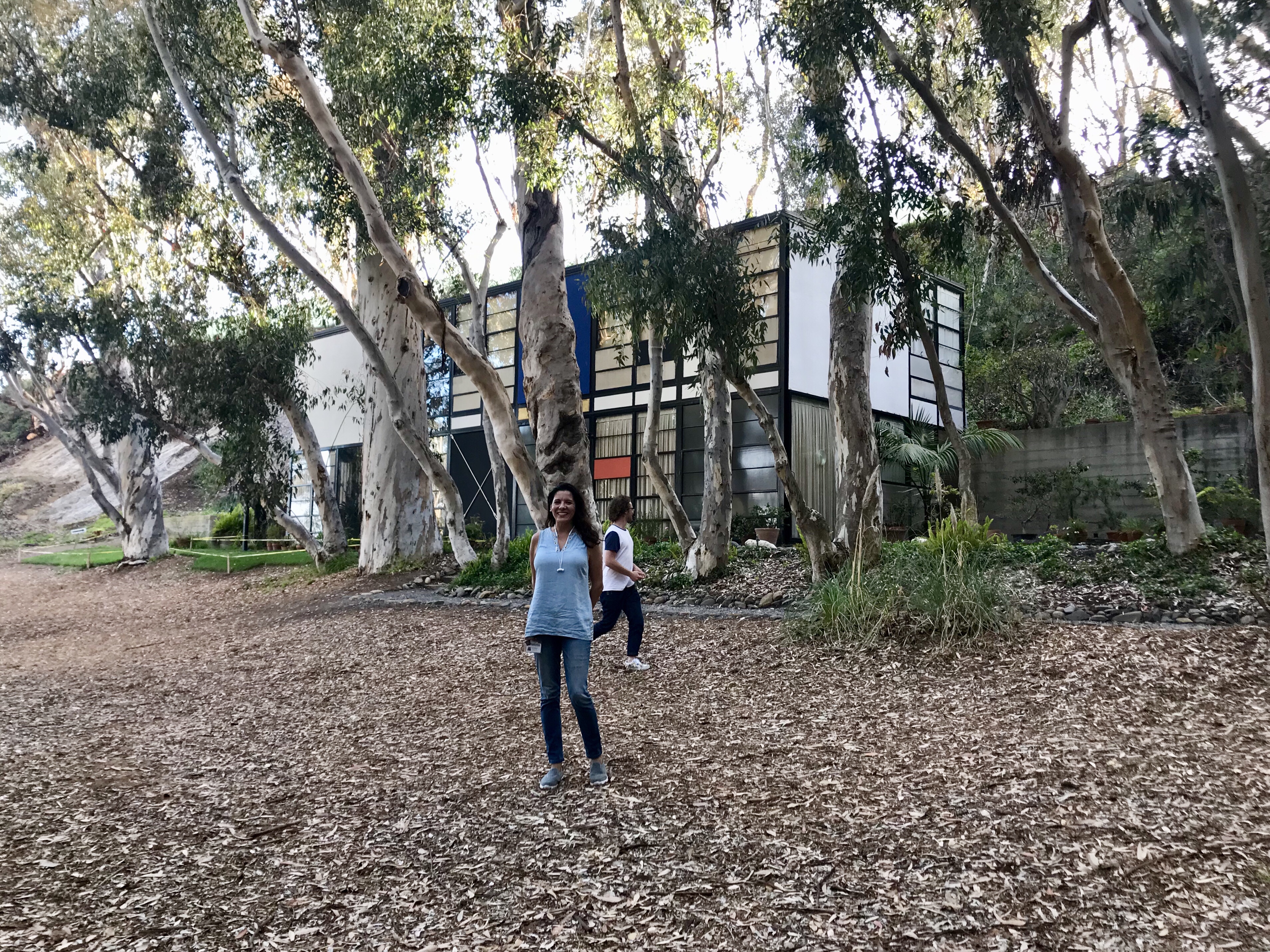
The Music Experience Project by Frank Gehry, Seattle. Graphite and watercolor. July 2020.
There was a brief visit, right before the 4th of July weekend, to a subdued Seattle. The architecture was galvanizing.. and it was so healing for me to give my eyes different views to see, after months of lockdown in San Diego. I visited the Autonomous Zone there and stood in front of menacing police in riot gears . Of course I will share my photo-dossiers of these escapes of mine. All in good time.
This summer I took A LOT of art classes online to stay sane and “force” myself to show up to my art practice. I am on a journey to develop an authentic contribution and I am exploring a lot of techniques and art workshops to find my voice amongst the languages of art. There is a lot of experimenting… right now I’m more sure of what is “ not me” than what is… but the experience is filled with light and play. There is discipline, too.
I hope you are able to follow me and my progress on Instagram, at least unti I develop the practice to post and write here before going for the insta-fix. Below samples of the art exercises I completed and the outcome from the Summer art classes I attended.
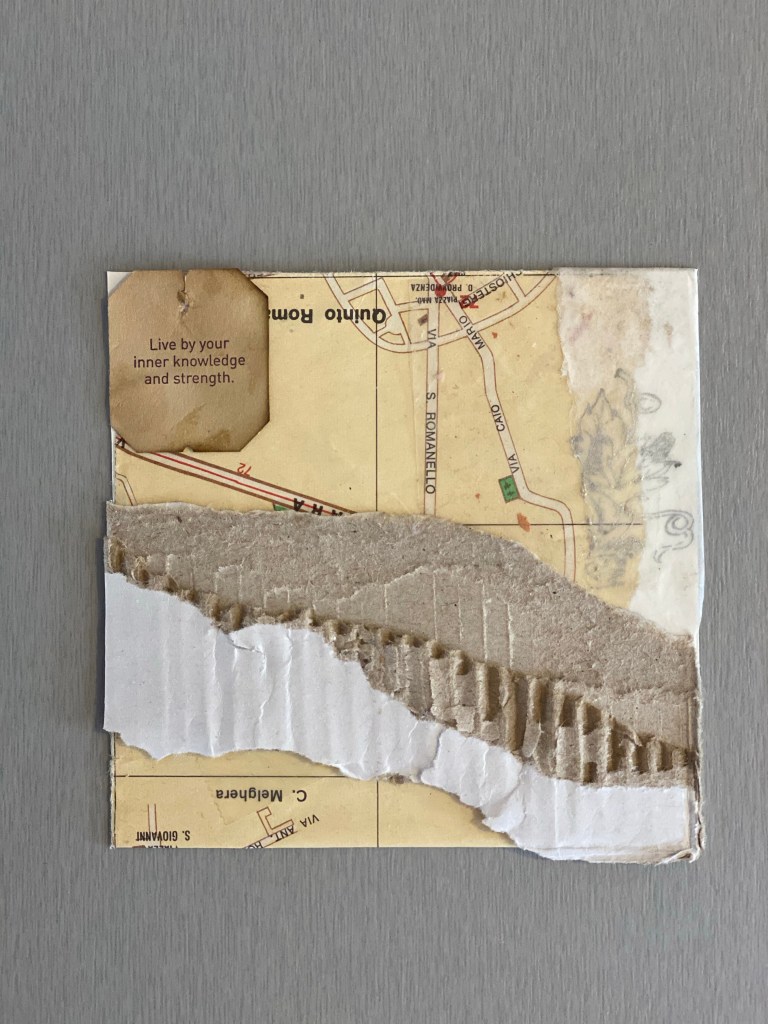
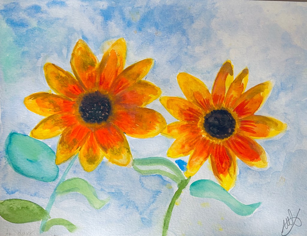
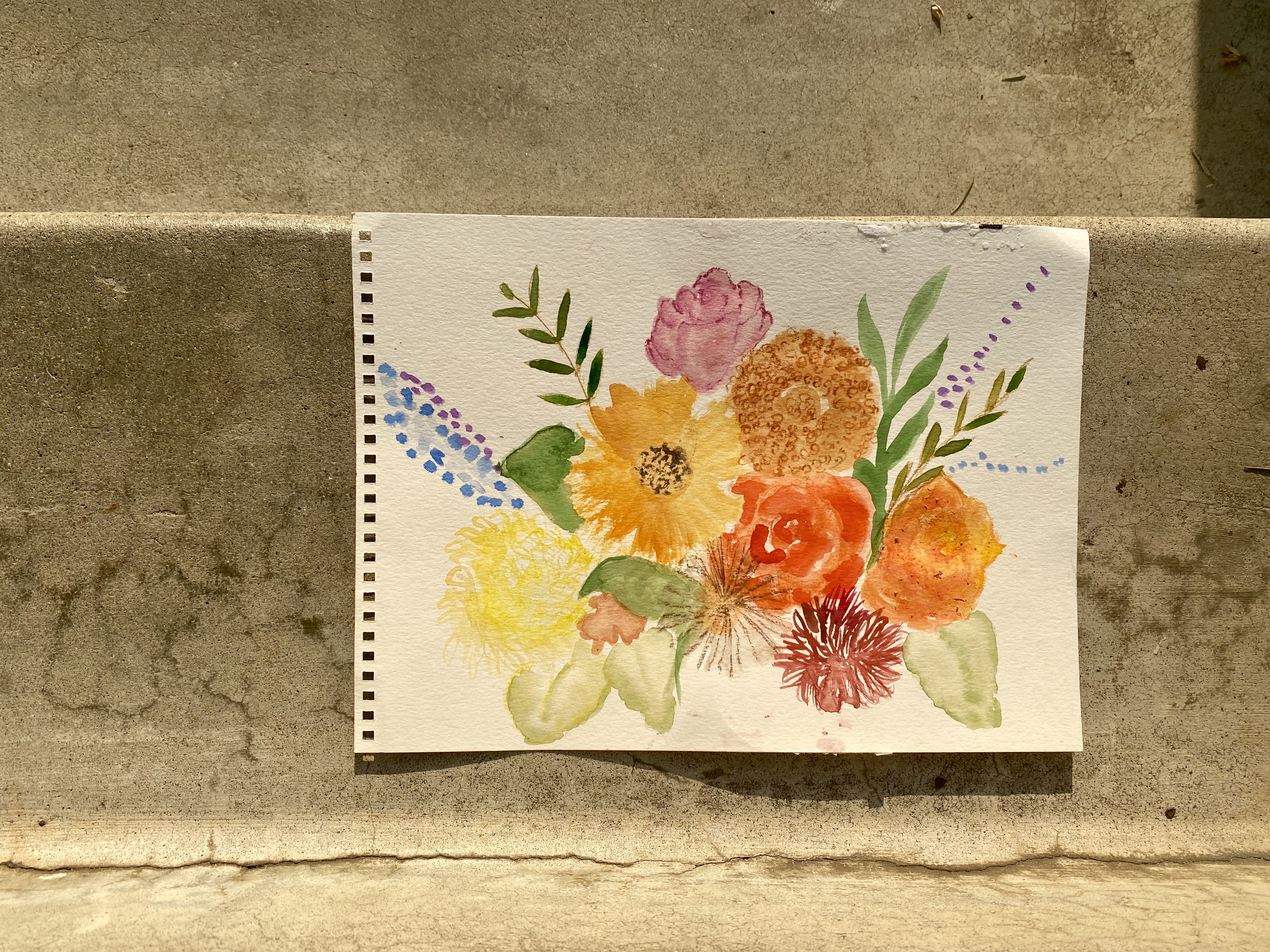
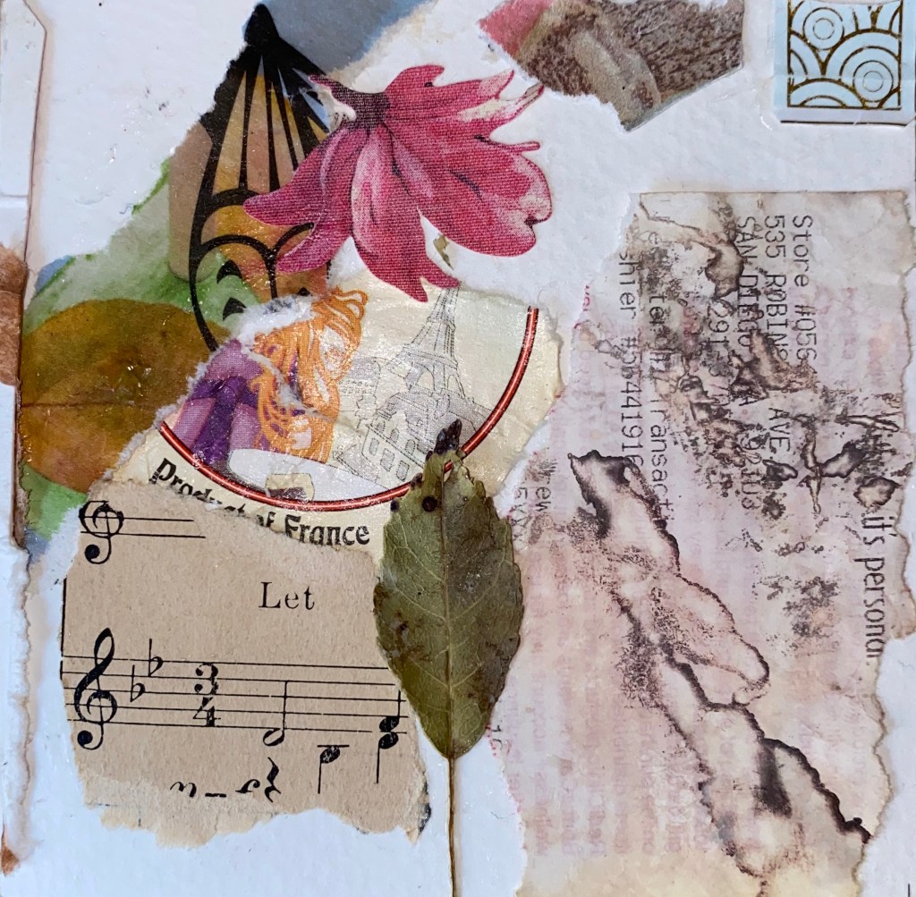
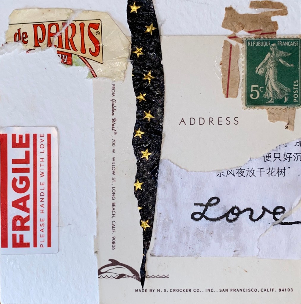
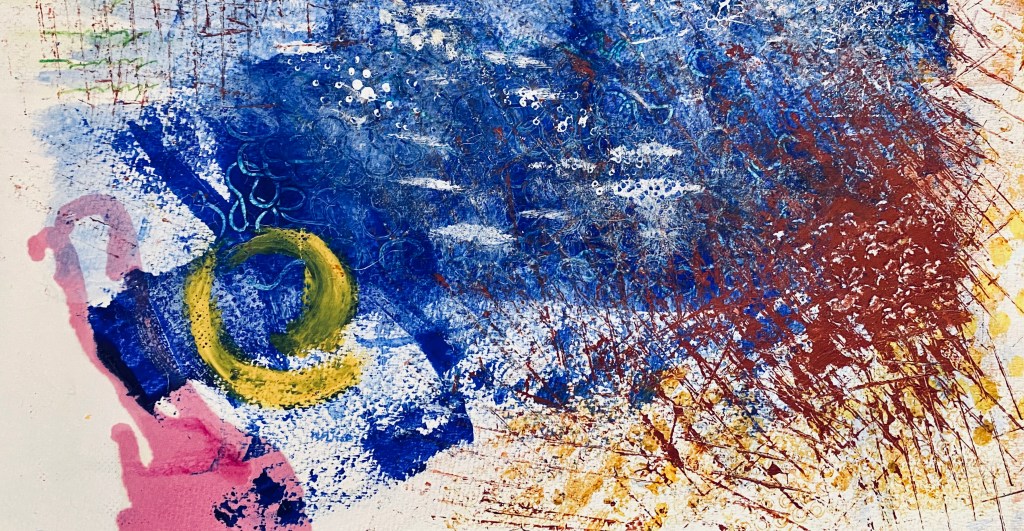
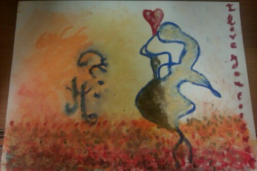
Delicate. Five minute collage, following the method of Crystal Marie Neubauer. Mixed Media. May 2020. The Road Home. Five minute collage. Mixed Media. May 2020. Ombre watercolor class with Jennifer Evans, of Periwinkle Studio. July 2020.Abstract watercolor class with Jennifer Evans of Periwinkle Studio. July 2020Gaillardia watercolor class with Jennifer Evans of Periwinkle Studio.Fall Bouquet watercolor workshop with Jennifer Evans of Periwinkle Studio.She Rests. Five minute collage. Mixed Media. August 2020.Letters to Love. Five minute collage. Mixed Media. August 2020.Love is Fragile. Five minute collage. Mixed Media. August 2020. Abstract watercolor class with Jennifer Evans of Periwinkle studio. September 2020
What else? I finally started a morning journaling practice centered on my art development, and came up with with my approach to life and art, in the form of the French word “doucement”- softly, sweetly. How to bring a quality of luminosity to everything I am, everything I do?
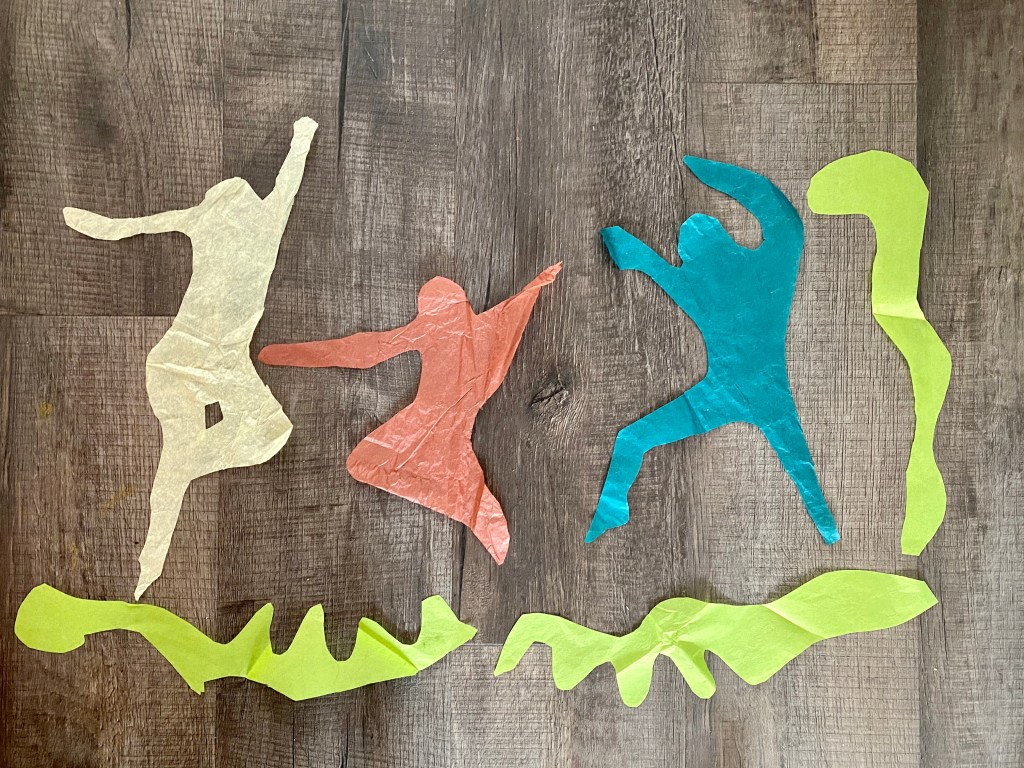
“Drawing with Scissors: Matisse” course with London Drawing Group. August 2020. This involved cutting figures and shapes freehand on sheets of tissue papers( no drawing beforehand).“Drawing with Scissors: Matisse” class with London Drawing Group. August 2020. “Drawing with Scissors: Matisse” class with London Drawing Group. August 2020.
I watched a film that still echoes, Bright Star, on the Romantic Poet John Keats, started rereading Art & Fear and am finally, systematically, going through my possessions and purging with Marie Kondo’s book.
I know I have said this for years but it took been grounded for a whole summer to finally tackle this.
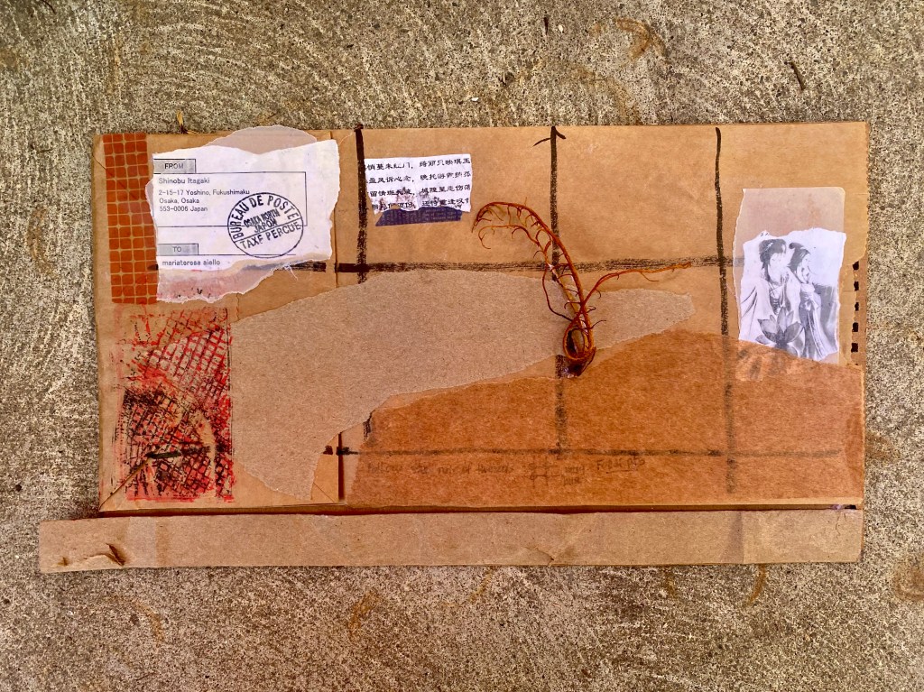
Postcards from Japan. A collage inspired by the Vintage Collage class by Jennifer Evans of Periwinkle Studio.
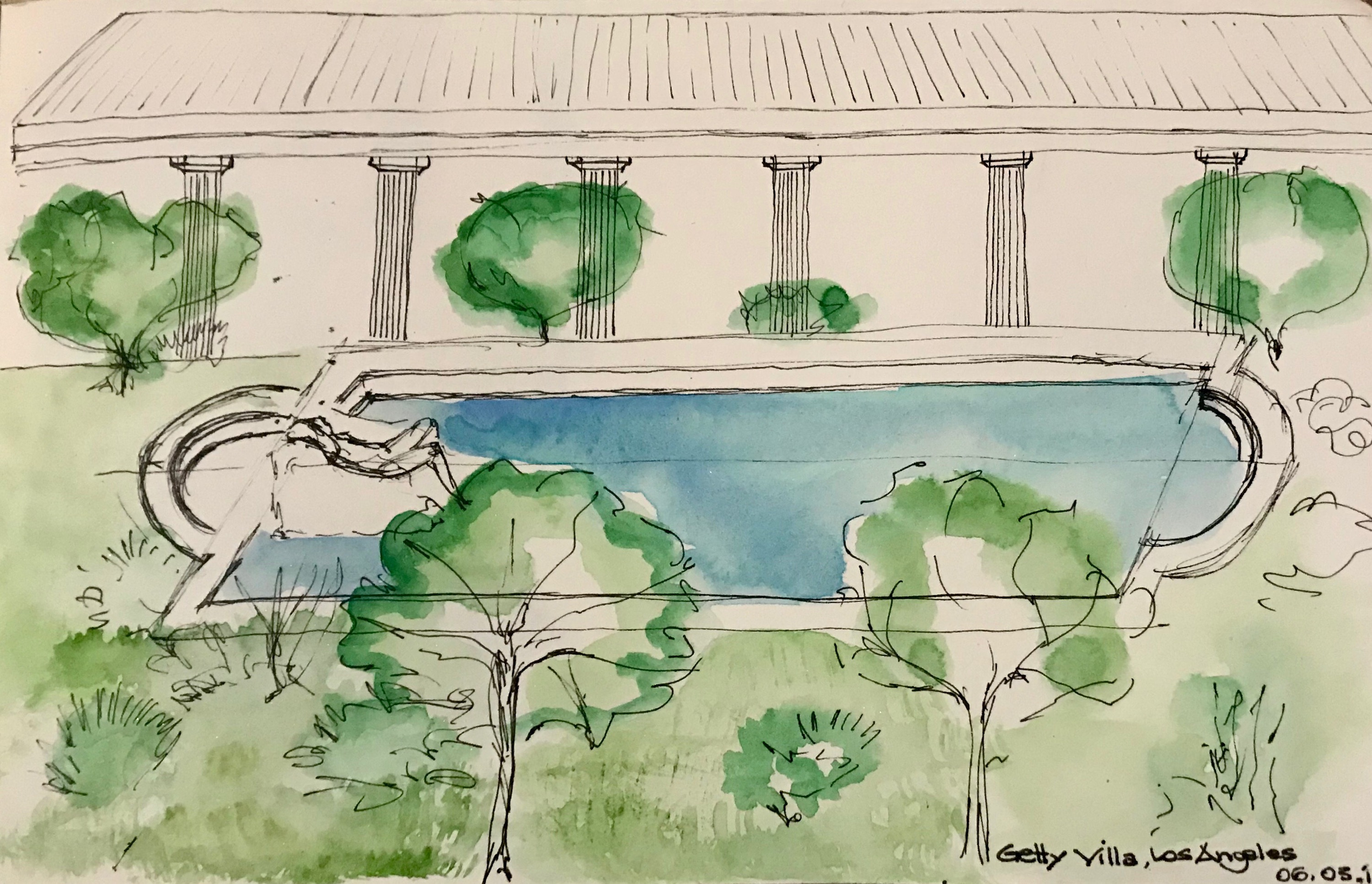
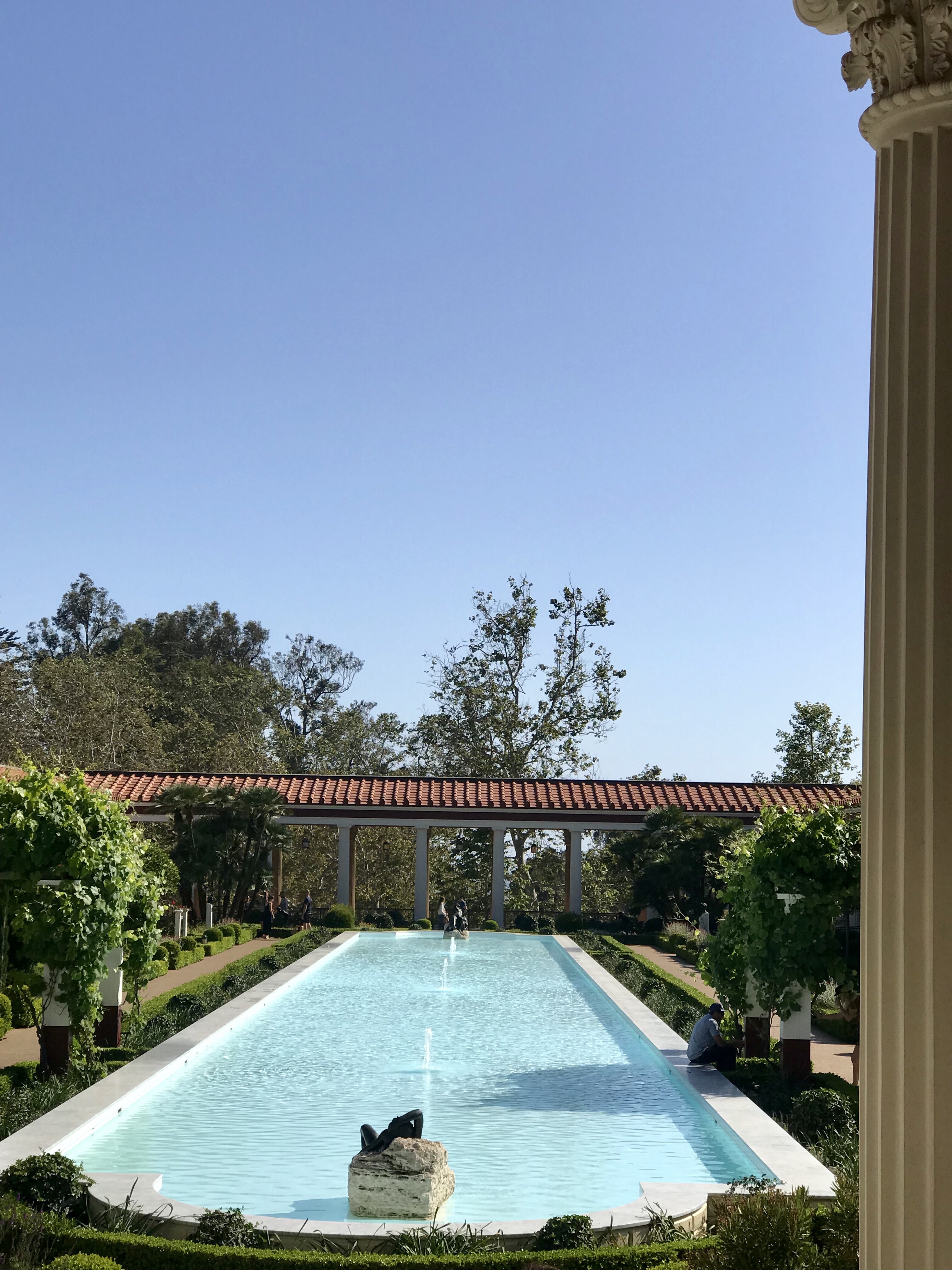
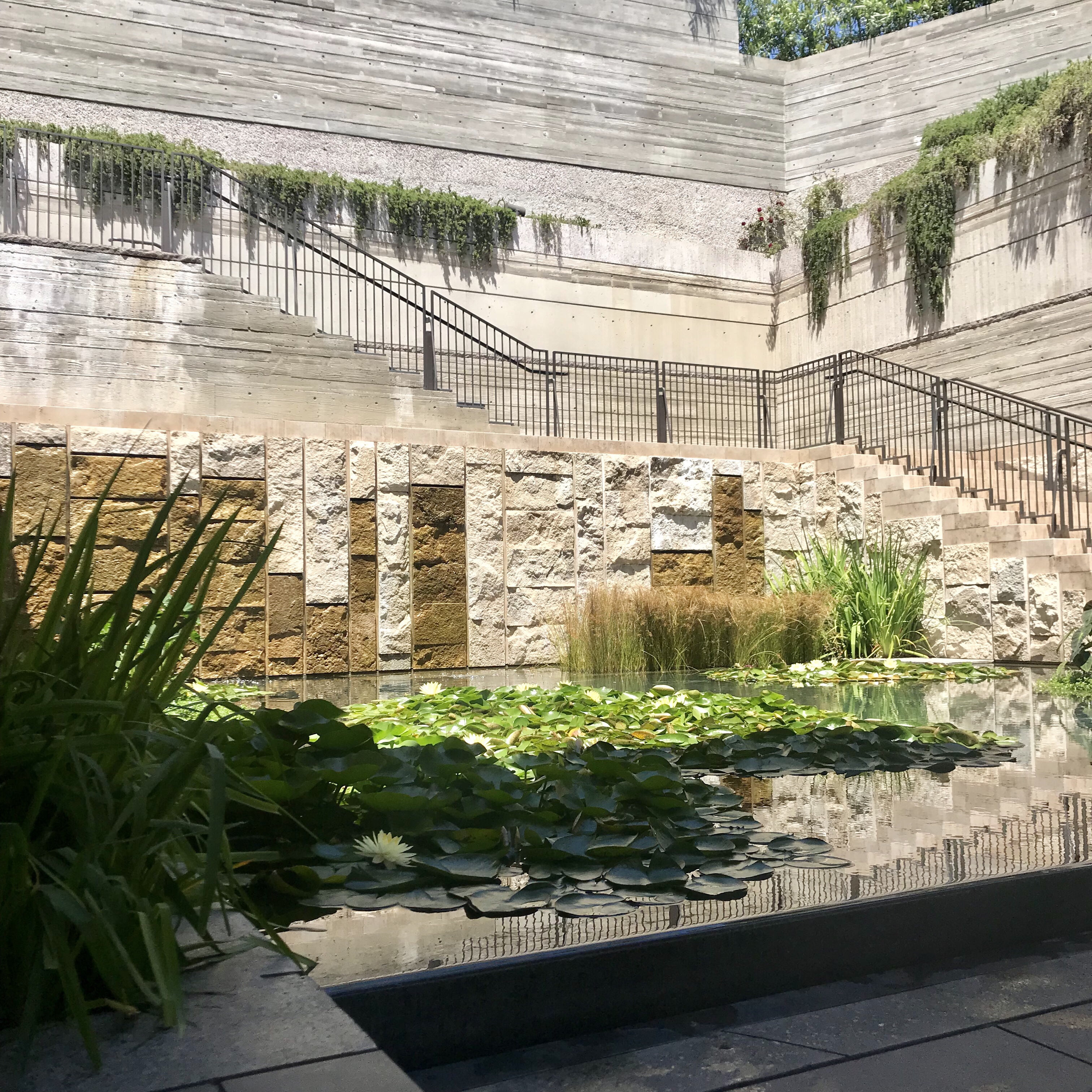
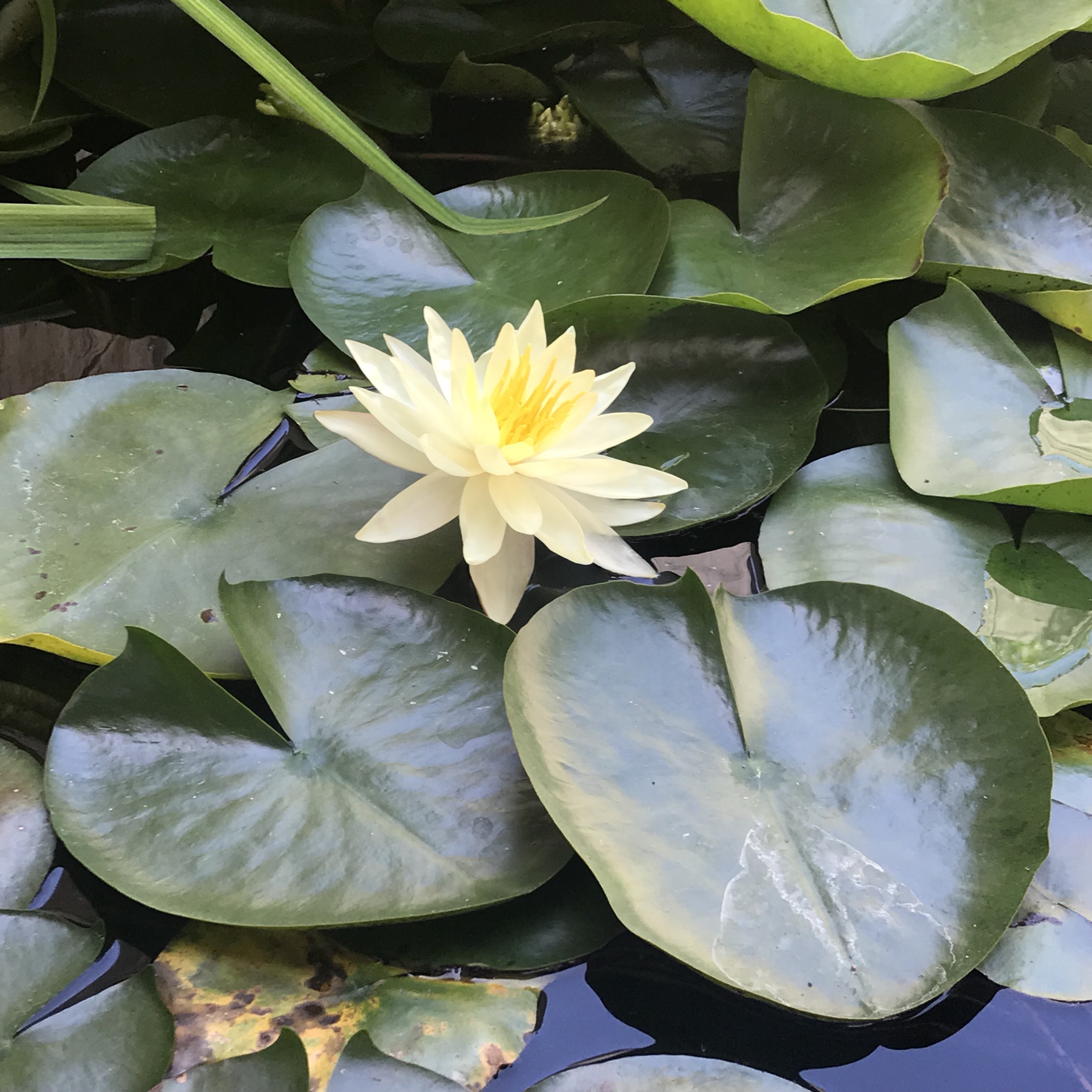
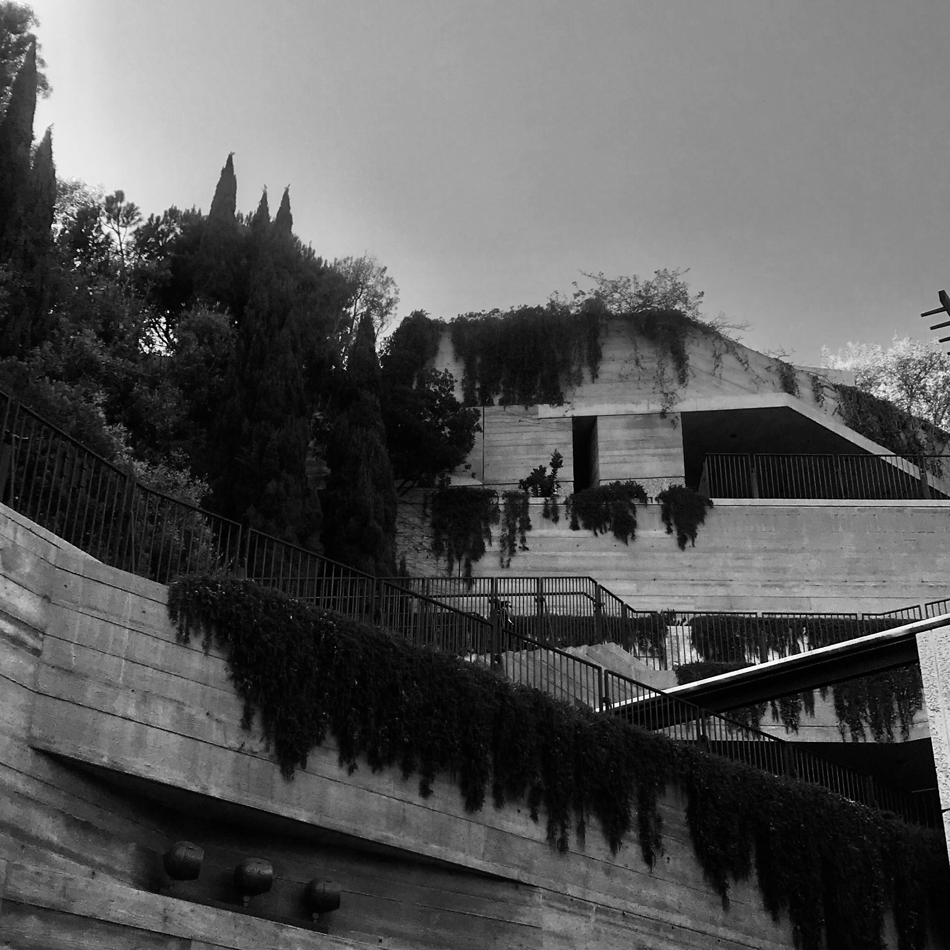
Here a quick watercolor from two weeks ago – a day trip with my Graduate students in the Architectural and Urban History Class.
We visited the Getty Villa- a replica of a Roman House in Santa Monica, California ( replica done with some poetic and unpoetic licenses…), contained in the Silvetti Machado contemporary expansion, a poem in stone that sets the Villa in an imagined archeological dig, with strata of travertine marble and concrete to pay homage to Roma.
Architecture is poetry in stone
The days since my last post have been filled with school activities, gratitude, beauty, poetry, reading, and finally.. some sun after the May Gray and June Gloom burned off. Oh, and I’m finally getting my place to where I want to be ( thankyou Marie Kondo).
Things are ( finally ) falling into place. It’s funny but I used to produce more art– and share more poetry — when my life was more chaotic, and centeredness has meant more introspection and less output. Now I’m much more deliberate and mindful of what/when to share…
I still have to steal these moments for art ( the demands of the modern living condition!) but I realize that there will always be more work to do, and let us all stop glorifying being busy.
Art helps us being in the Now- and that is all we have…I want to do less and be more. Thank you for reading, single reader.
Do you meditate? I have been for few months…and have added short gratitude prayers, reading and alignment to start the morning right. They say if you conquer the morning you conquer the day- and if you conquer the day you conquer your life.
Some days are better than others- and this weekend I will be going to my first spiritual retreat.
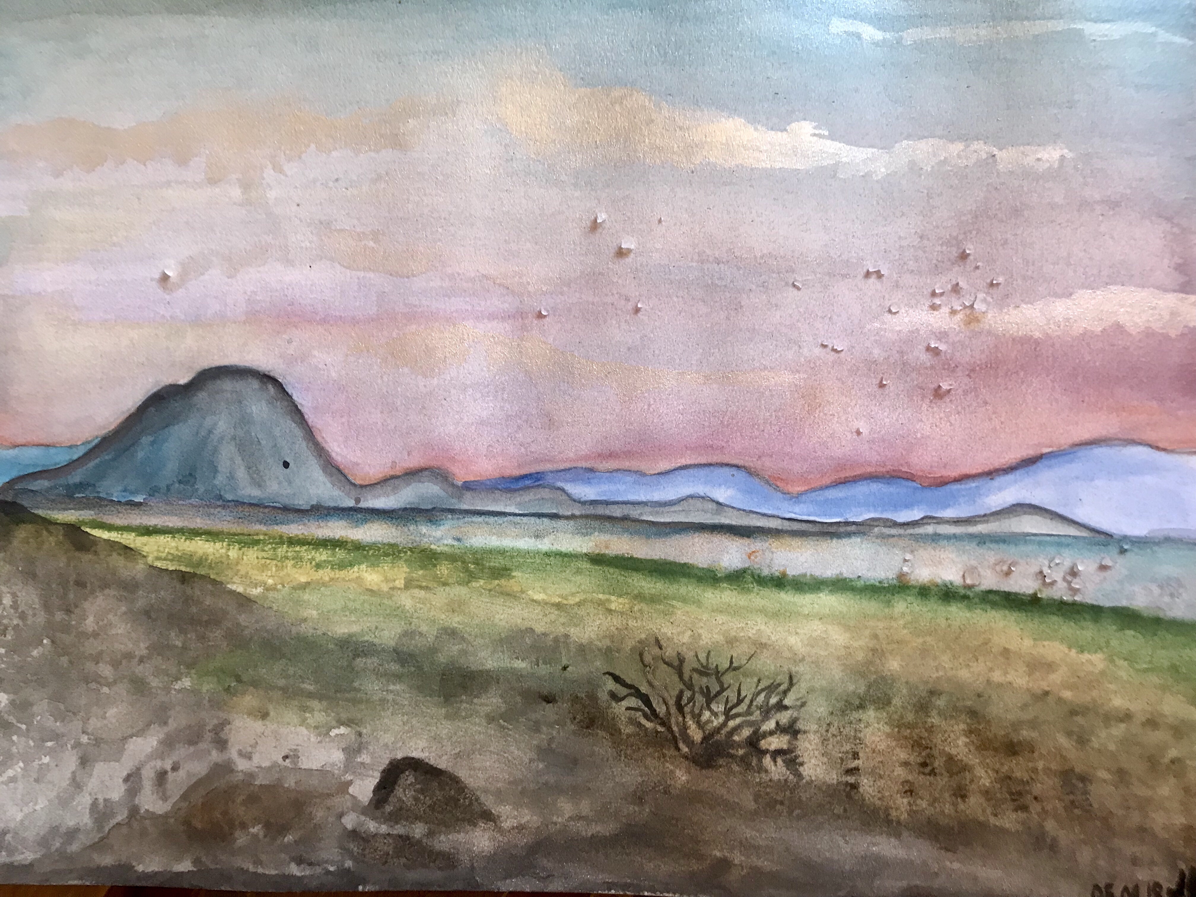
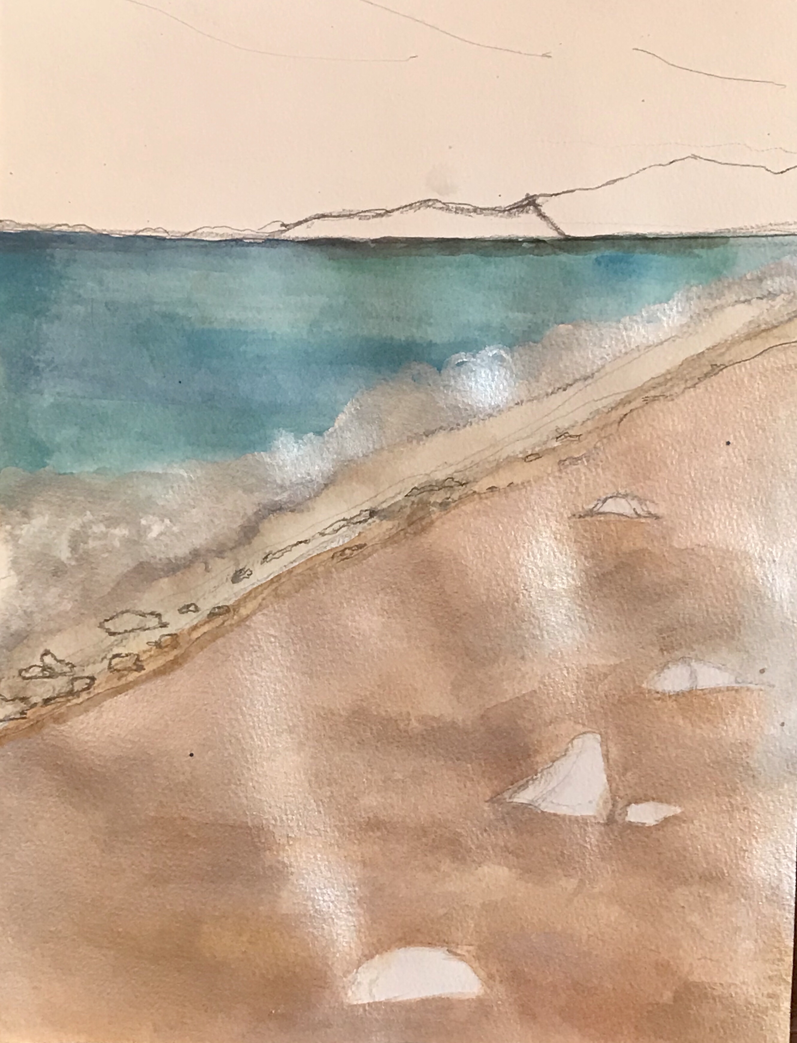
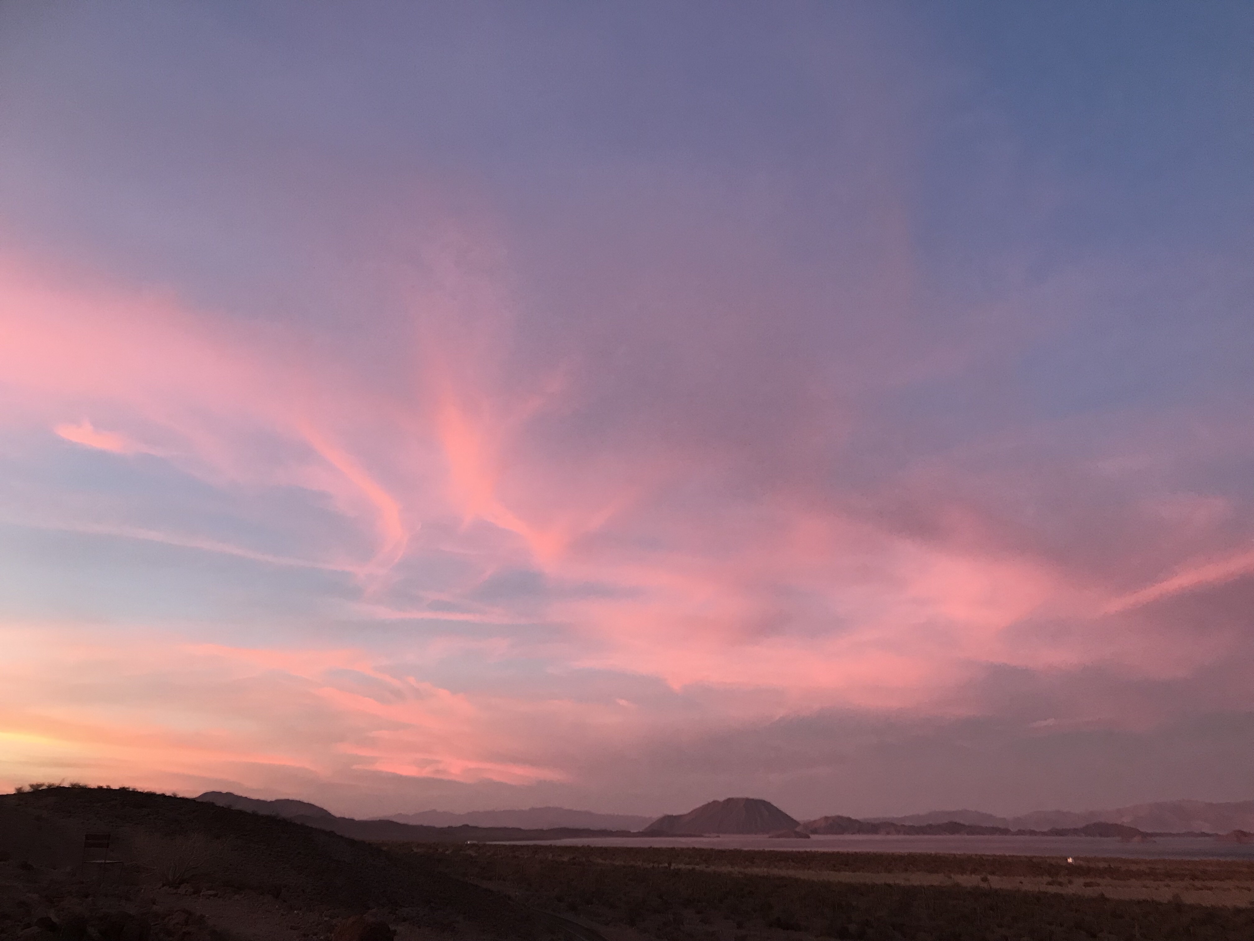
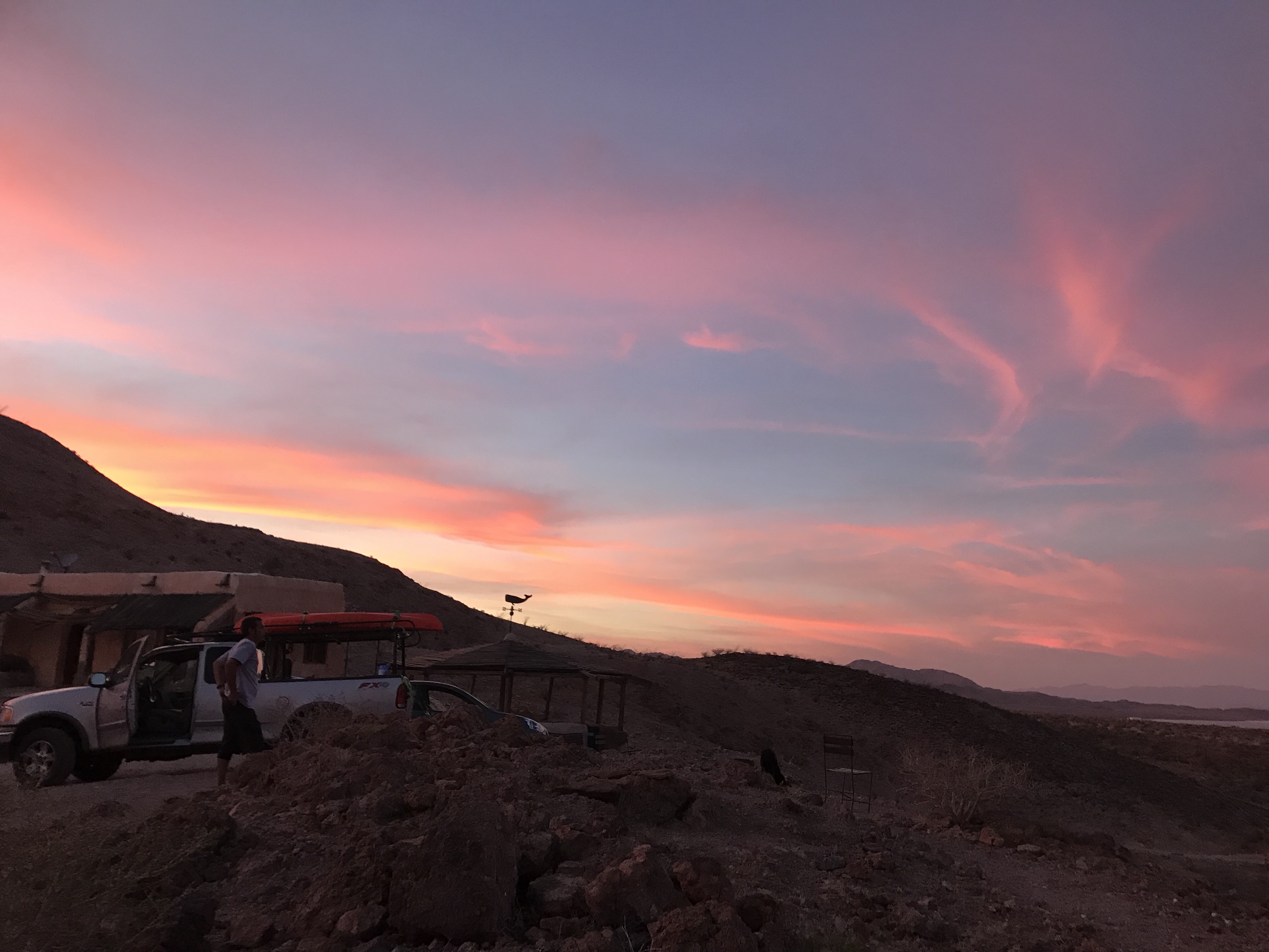
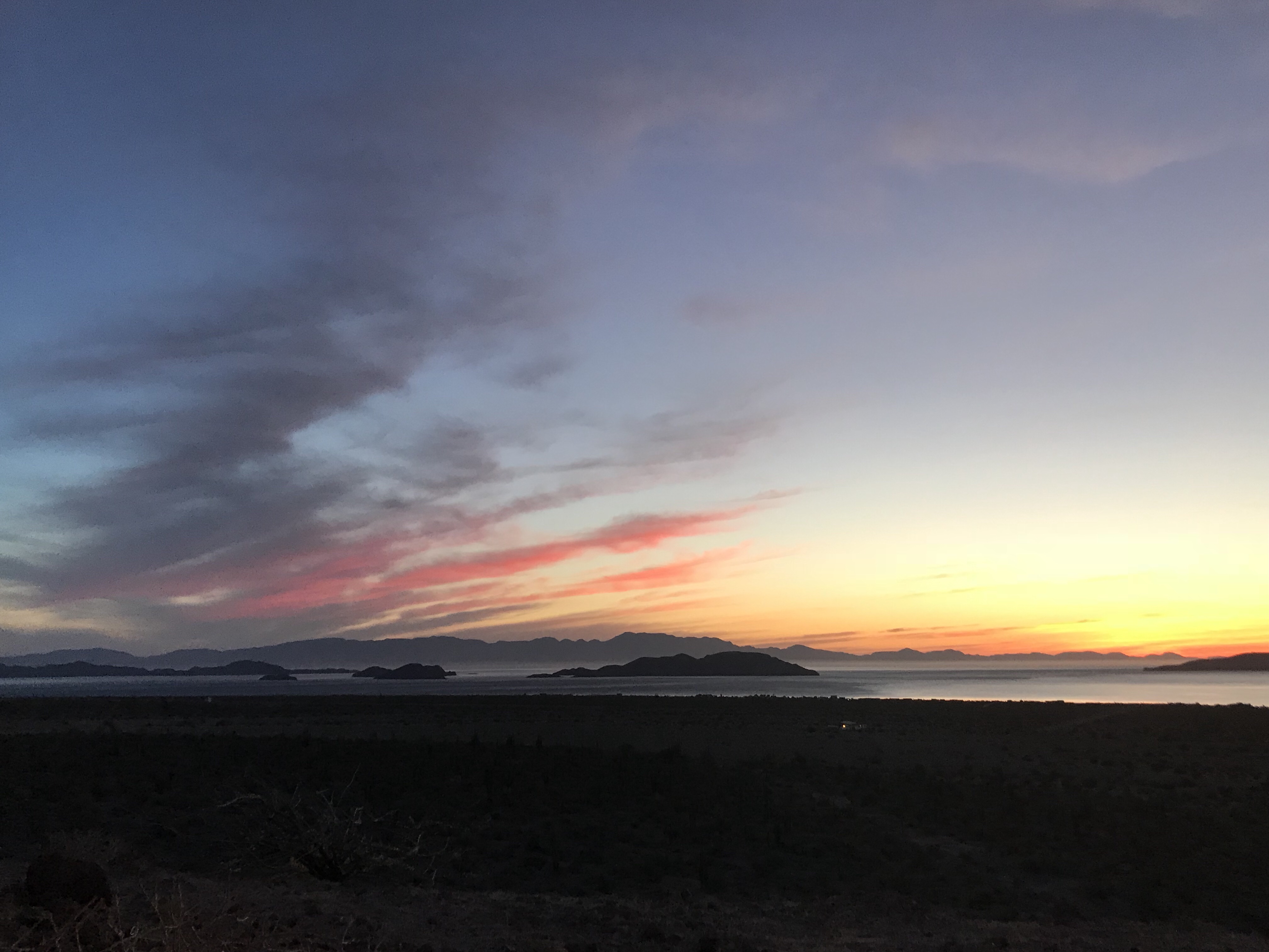
I just got back from another lovely stay at my personal retreat away from the world and telephone connection: Bahía De Los Ángeles in Baja California, Mexico.
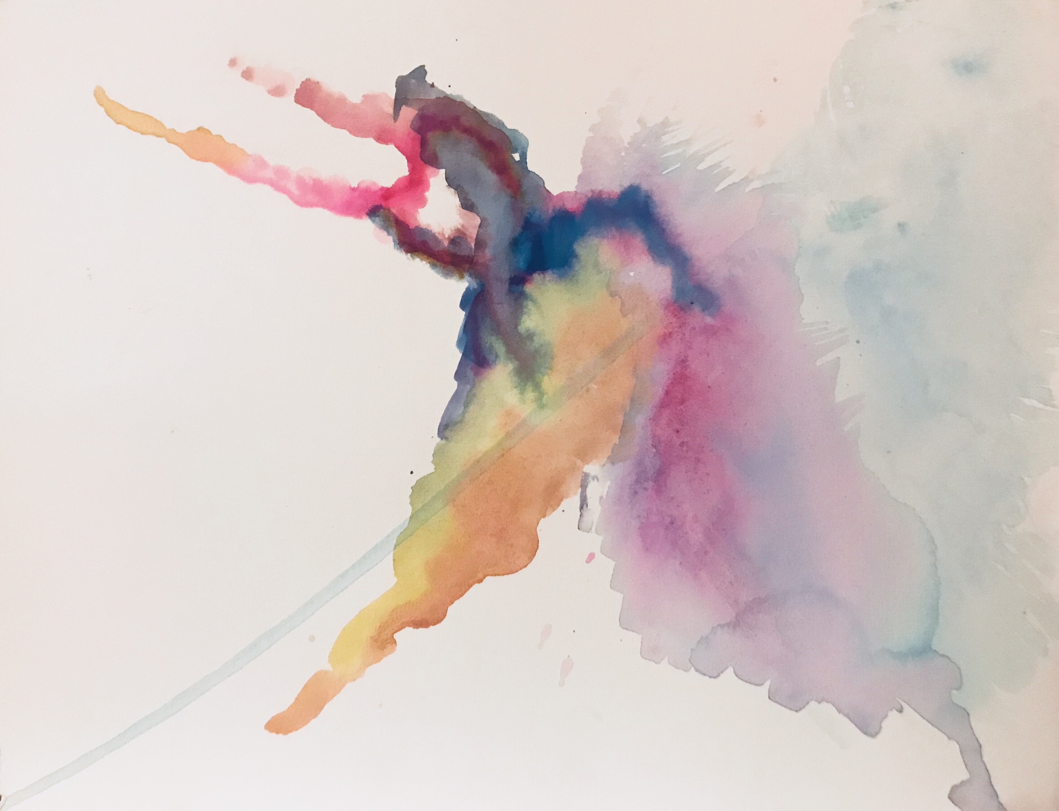
I brought *all* my watercolor stuff with me (acquired some pretty awesome new pearly Japanese watercolor pods) but, typically, not watercolor paper- so the first experiment on drawing paper turned out a bit flat.
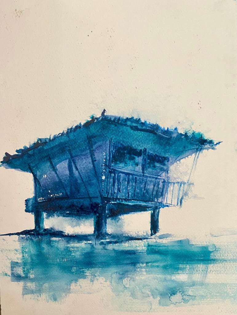
One of the guests i met at Mauro’s Posada, my Baja California home, had watercolor paper with him (!) so the water/sand beach scene shows a bit more promise. Still learning/ playing with watercolor techniques…
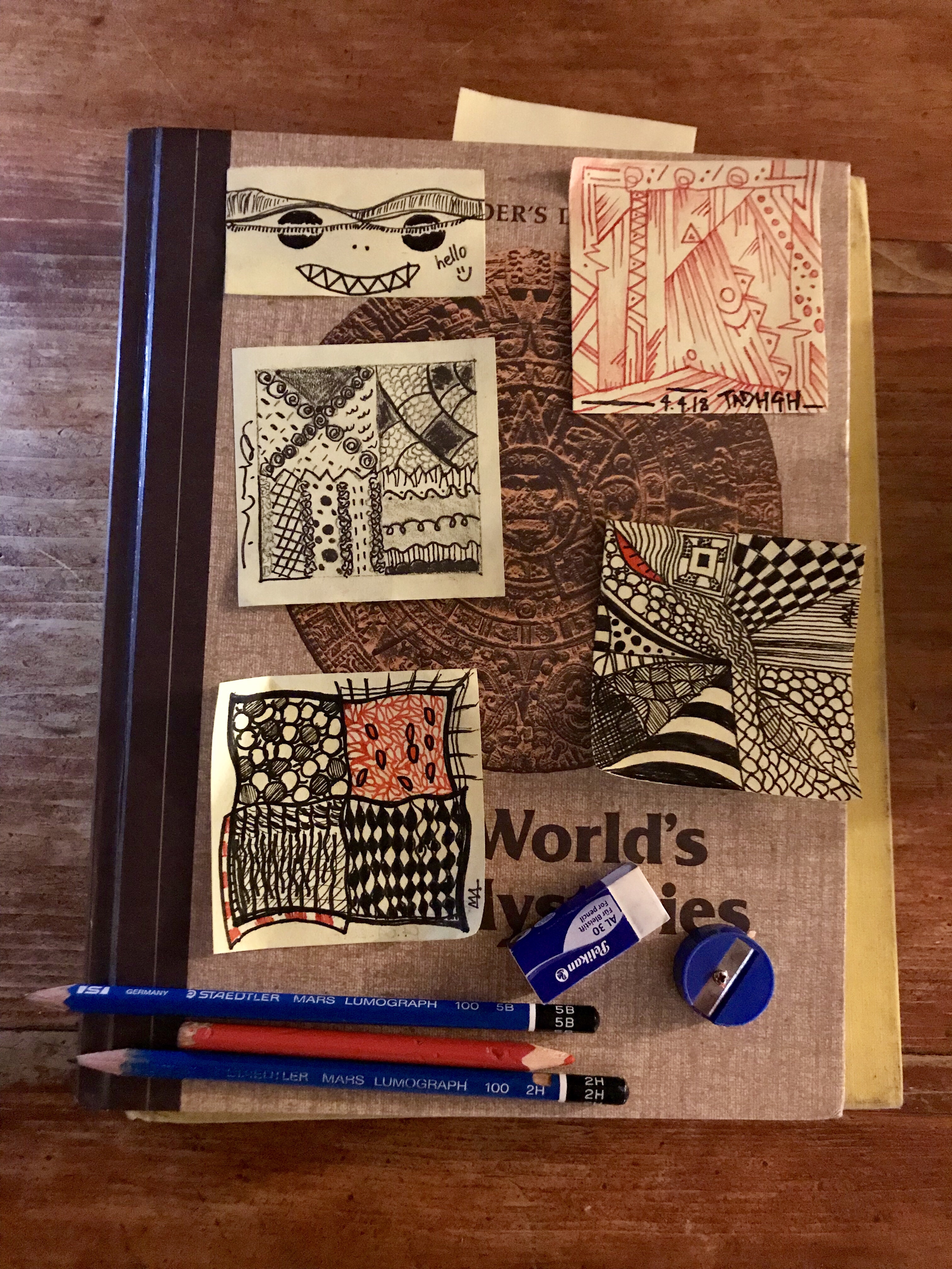
I also (re)discovered the zentangle technique and it has been fun to conduct a little tangle class with my friends –they call it “yoga for the mind” or meditation in action. I find it very freeing and love, as with collage, not knowing the outcome.
Below are some of the best sunrises and sunsets I have ever witnessed.
I put all my best photography from this trip on my Instagram page, @sketchbloom, so if you want to see more saunter over there.
The time in Baja California- and México- never fails to transcend into the magical, to bring unexpected gifts. The ones always awaiting are authenticity, peace and heart-naked beauty.
As for the others…who else/what else are you going to find and meet in a place named Bay of the Angels?
This place is an anachronism, the last Macondo…off-the-grid living, with no telephone towers, post office, atm’s or even too many people. It is a place for dreamers, wanderers and seekers. It is hard to get to – and always heals.
It is a place for reading, for the mind to be quiet. I took down some poetry lines, to be shared soon.
Some things are only meant to be burned on the altar of poetry, liquid like skin
Two planets colliding:
orbits not meant to ever meet again.
Some cities, like kisses that have no right to take and give so much, go to your head.
Where to start? Perhaps from the end
– going backward.
We danced on the H of the Hollywood sign
‘Tis the time of rose gold here
The color of California sunset
The spring of Lana Del Rey and Lorde
Laidback, the occasional listlessness
Head tilted backward on a convertible
We don’t know how lucky we are
His reckless back was softer than your silk robe. I’m not forty, I’m in my second twenties.
In an Uber, real tired, I realize the city I live in possesses the quality and repetition of a videogame,
“what should a town look like”- the approximation fails at convincing
I put the matchbook in your pocket so that one day you may find it in your hand and smile- go back to that night, that rooftop. that’s the scene from a movie.
If your man is gentle, and a good lover, you have two women to thank.
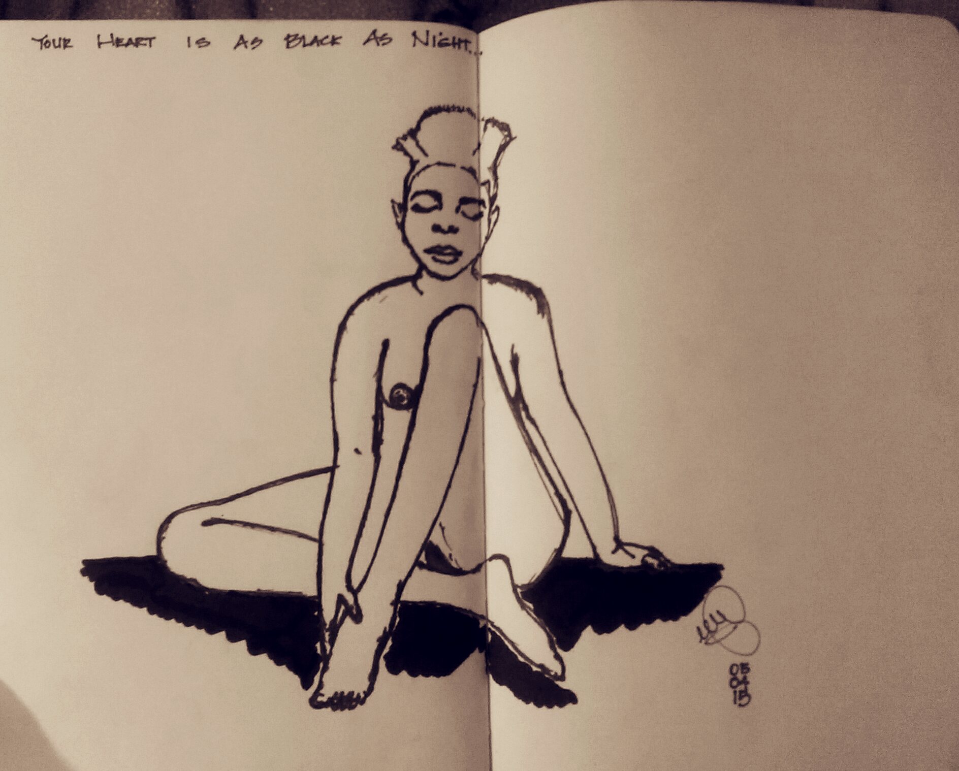
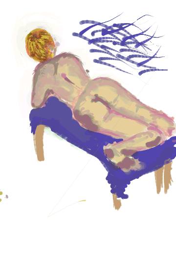
First experiment in Digital nude painting on my Android HTC ONE phone, using the Paint Commander App and the Sensu brush.
Two months to the day of my last post, I return.
Like a lover who walks into the door surreptitiously, I offer no explanations.
Just Kidding.
This quarter saw me teaching three courses with a total of 120 students, so, dear Single Reader, the reason for my hiatus is self-evident. It was a ten-week long journey into different periods of History of Architecture and Urban Design, Urban Issues and so. much. more.
Here are snapshots of my bimonthly art dates. I have quite a few drawings, but could not conjure up the time and mental space to scan and post them. Ideally, these will be scanned version soon..but here they are.
I embarked on an Arabic adventure as of Monday, and this will be a spectacular summer, I feel and know.
“If we had no winter, the spring would not be so pleasant: if we did not sometimes taste of adversity, prosperity would not be so welcome.”
Did you know I was a painter?
I know, hard to tell from this blog, where I have focused ,on the art-making side, on drawing and collages ( no art studio, less place for canvases). But I was a painter, an acrylic one, before I learned how to draw, architecture and other things, before sketching, collages, and before trying my hand with watercolor ( I still use watercolor as acrylic).
I was not a rigidly trained painter, as my teachers encouraged expression over technique. Painting is home.
Thank you mamma for letting me draw on the walls with permanent markers, for drawing our profiles in the moonlight, for the watermelon eaten with spoons on a beach still asleep, for all the walks, for the picnics in lawns amongst the highways, where you would bring my net, so I could catch butterflies.
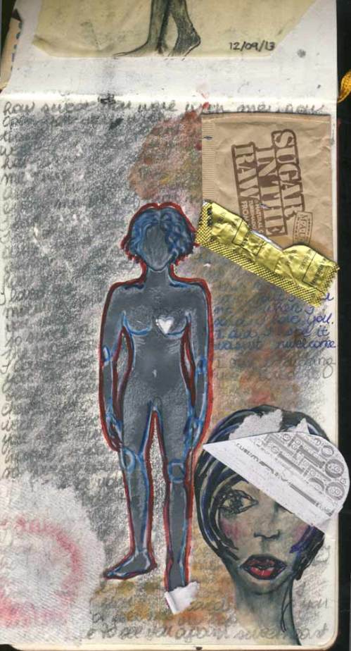
I found and lost myself inside of that night. Collage. Graphite, fountain ink, found objects. San Diego. December 9, 2013.
These collages are starting to need a change of byline for SketchBloom: Art Therapy. Oh well;)
Above, a work in progress (and, darling aren’t we all?)..not sure which way it will go.
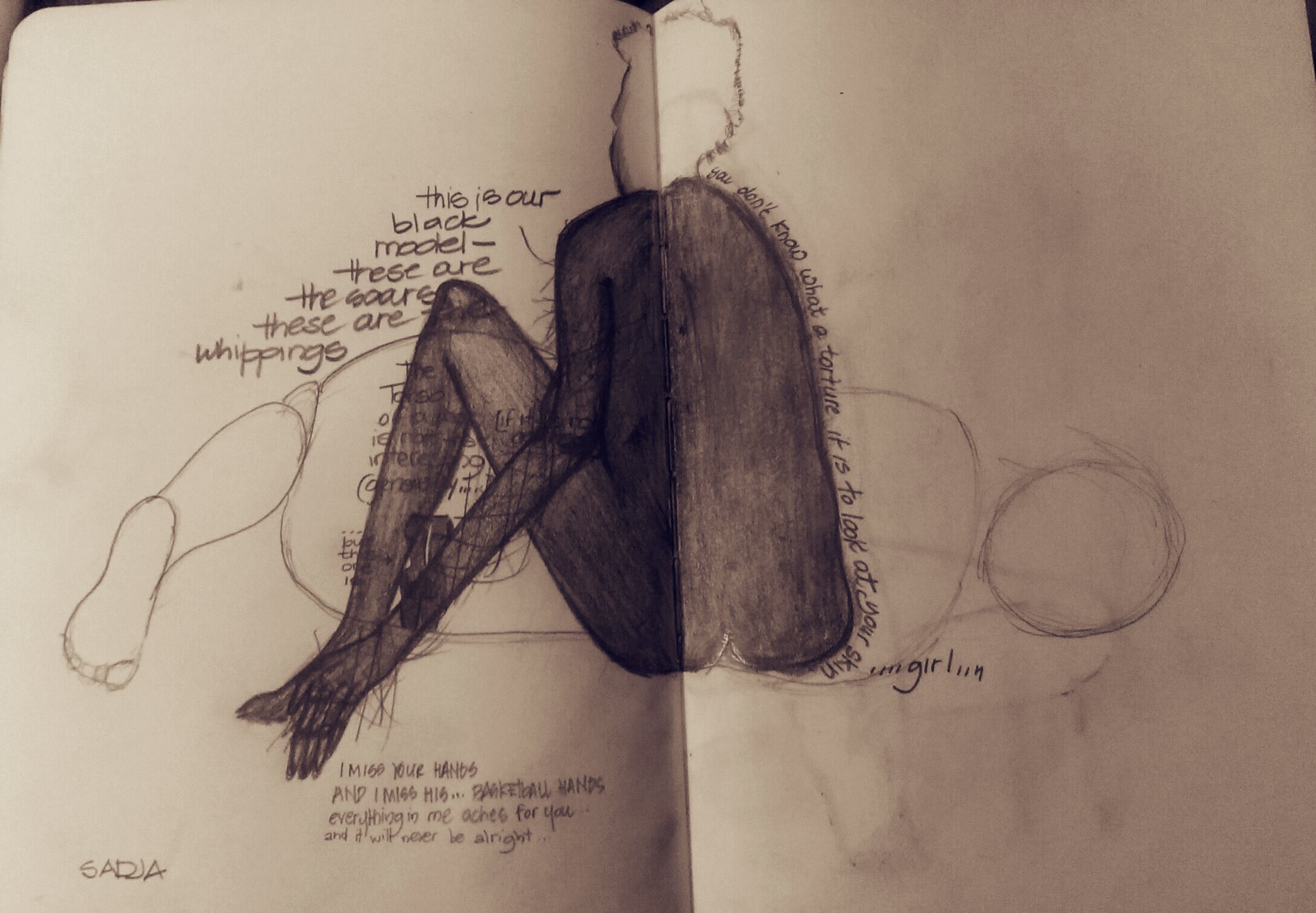
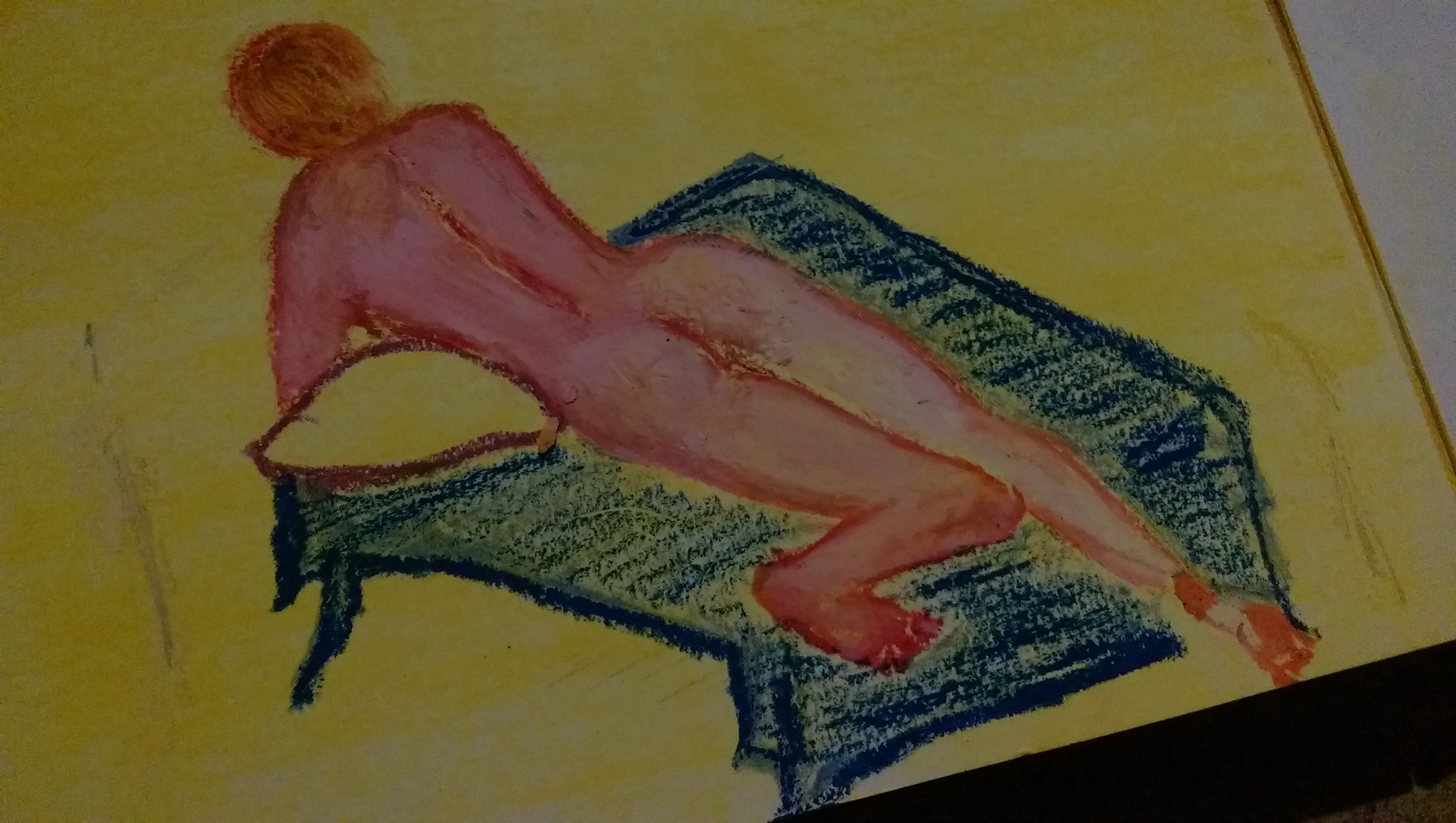
In the midst of nude painting to be done from memory (and I have started sketching, too bad the final product won’t be posted here), there’s been art and feelings on fire.
…
In the quest for ASCII hearts ( yes, lots of hearts are needed ) I found these lovely images.
This is a program called ASCIIART – which goes beyond recreating images in characters to delving into typography…and…this had me at hello.
I cannot wait to experiment with some black and white art.
…
Also, a return to poetry, literature and tender music. Maybe a new poem will blossom soon…the ingredients are there once again.
Some quotes from a book I am finally finishing (quotes that became a poem): The Beautiful Ruins by Jess Walter. Freedom and loneliness overlap, look in the mirror, my face, these words reversed.
Hearing his name caused him to turn back again
looking into her eyes was like standing by a door slightly ajar
how could you not push open the door
see what lay inside?
…
And that door seemed to open a little.
and the glimpse he had beyond the door tortured him
he wanted to say more, to say everything on his mind, but he couldn’t.
It wasn’t a question of language.
He doubted the words existed in any language.
…
He forced himself to look away from her then.
It was like prying a magnet off steel.
…
It was as though, outside of that room, there could be such a thing as ‘right’ and ‘wrong’.
La Baracca del Bucaniere - Fisherman's Shack - The Kitchen. Graphite and watercolor. Calabria, Italia. September 18, 2013.
Black and White Figs. Graphite and watercolor. Calabria, Italia. September 18, 2013.
The fastest drawings, right before leaving.
So many watercolor sheets to fill, and beautiful travel magazines to cut up for my collages.
I had to leave them behind and go…
Until another summer.
La Baracca del Bucaniere, Cucina. Graphite. Calabria, Italia, 2013
Few days ago I started this drawing, which I am hoping to finish in the morning. It’s time to pack and head back to my California.
I take with me many images, sounds, voices, messages…my metaphysical bag is always full after such extended trips to Italy, my home.
As a promise of things to come, I have been working the past few days on many posts that will feature the work of my father, my father the fisherman, painter, drawer, sculptor and designer.
My rugged, difficult, wonderful, talented father.
Then I have few posts on Calabria, my beloved and challenged Southern Italian region- sorting through three years of photos has been both grueling and rewarding.
Lastly, dispatches from my travels to Buffalo, New York City and Santa Fe.
The whole organizing effort has been quite the task.
This is the price for not posting enough this summer ;/
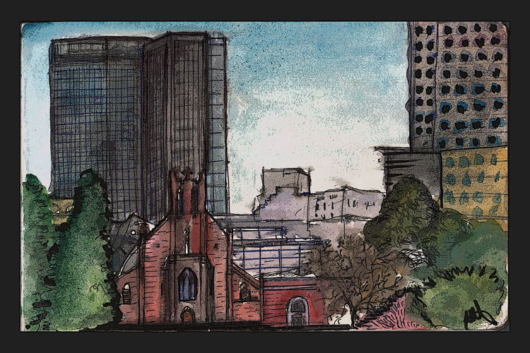
I always like to alternate drawings and artifacts to photography, so I offer today this humble work in progress which will become a watercolor.
Yesterday I was talking about sketchbloom to my friend Annamaria, who is a an apothecary with a lovely herbal store (erboristeria) in my little Southern Italian town.
Her store is called Radice Nuova or
New Root.
I was telling her that the days I do not share and make my art I feel I am neglecting a fundamental part of me…
‘as though you are not watering the plant’, she finished my sentence.
In fact, behind the stage, in darkness and silence, seeds are growing and blooming…thoughts and ideas are taking roots. Philosophy lessons, Japanese pillow books. Russian classics, Italian troubadours of the anarchic 60’s…this is the water I have been drinking this summer.
And time, alone and together, time for many coffees with my father, time for night yoga by the sea, full moon, with my mother, time to pick figs and grapes, time to work and to rest, time to spend with beautiful friends of youth and the soul, family time with my people, time to fish, time to swim and soak, meditate, in the sun, time to write, think and renew, time to listen to Italian music and reconnect to my roots, time to love hard, time to read.
Time to finally have time.
Always time that processes, metabolizes and purifies..time that brings strength and clarity.
Above all, I am thankful for the time this summer to be, think, live like an artist, to make and organize art, storing things for the winter of the soul.
Leaving California is exciting, especially when I get to use my passport, but returning, having filled my eyes, mind and spirit elsewhere, always means new beginnings.
I travel to remember (Southern California is light, has neither memory nor regret…nothing like the weight of the past felt in Italy), and return to forget
— and live in the Now.
Do not write love-poems. Avoid those forms which are too trite and commonplace: they are the hardest, for a great and mature power is needed to give of one’s own where good and often brilliant traditions throng upon one. Therefore betake yourself from the usual themes to those which your everyday life offers you. Paint your sadnesses and your desires, your passing thoughts and your belief in some kind of beauty
—paint all that with quiet and modest inward sincerity; and to express yourself use the things that surround you, the pictures of your dreams and the objects of your recollections. When your daily life seems barren, do not blame it; blame yourself rather and tell yourself that you are not poet enough to call forth its riches; for the creative worker knows no barrenness and no poor indifferent place. And even if you were in a prison, whose walls prevented all the bustle of the world from reaching your senses, even then would you not still have your childhood, that precious, kingly wealth, that treasure-house of memories? Turn your attention towards it. Try to recall the forgotten sensations of that distant past; your personality will strengthen itself, your loneliness will extend itself and become a dusky dwelling and the noise of others will pass by it far away. And when from this turning inwards, from this retreat into your own world verses come into being, then you will not think of asking anyone, whether they are good verses. Nor will you try to get journals interested in these works, for you will see in them your own loved and natural possession, a part and an expression of your life. A work of art is good, when it is born of necessity.
Crocheting Cathedrals. Il Duomo with parasitic architecture (stage for New Year's festivities). Ink and watercolor on hand.book paper. December 31, 2011.
Aperol and Spritz. Most of the older ladies in my neighborhood are incredibly fashionable, decked in the latest trend winter coat. Here's two enjoying a mildly alcoholic aperitivo at 11 AM. Ink on hand.book paper. December 31, 2011.
Santa Maria Presso San Satiro. The obligatory pilgrimage to the second Bramante's church. Last year I drew Santa Maria Delle Grazie, which is near to my place. I am always amazed by the playfulness and modernity of the oculi (round windows) on the Northern Romanesque facade. I found out that the space in front of the church is called 'Largo Jorge Luis Borges'. Can it get better than this?
Ink on hand.book paper. December 31, 2011.
Window of the Pio Albergo Trivulzio. In an act of Flanerie, I got lost trying to reach the Roseto, and found these whimsical, almost Gaudi-like windows on a palazzo I had not seen since my childhood, painted in the typical warm 'Milanese Yellow' (think saffron rice and add a patina of melancholy, smog and time). Ink on hand.book paper. January 1, 2012.
Ink drawing, Watercolor + Digital Manipulation. 16 November 2011.
I was recently reunited with luggage lost 45 days ago.
Three items were missing: a bottle of Cinema Eau De Parfum by Yves Saint Laurent, a beloved collaged orange umbrella bought in Barcelona and a pair of Sketchers shoes. Go figure.
Immediately i set out to substitute my lost umbrella. As said in one Law and Order episode (I paraphrase): “Hardheaded Calabrese: the people there are very stubborn… once something is taken away from them, they don’t rest until …they get it back.”
My mind went back to the orange umbrella I bought for my mom in Milano last Christmas (probably with her money;)), from one of my favorite stores: Muji.
In my quest, I ran into this glorious essay on a particular shade of orange.
I have a box of orange objects in my house that I have been meaning to combine into a series.
Tomorrow seems like a good day for it, and orange thoughts are perfect for winter-short days and too much yin.
If we lived during the time of the Dutch West Indies Company, I would tell you that the color that so captured me was the child of paprika and chocolate. The world no longer swoons over spice willing to risk a sail beyond the end of the known. And yes, sadly rape and pillage in its desperate greed. I had only to pass the window of the Muji store in Manhattan’s Chelsea to discover this color in an umbrella.
What is it that grabbed me? Is it a vibration for which the color is only a foil? Or is it something about the color itself lodged between memory and desire? This redder orange infused with luxurious chocolate yielded a strangely jazzier yet muter tone than orange. But if we are mapping out its terrain inevitably the orange relation comes up.
My “Muji Orange” is a distant relative of the neon orange of warning, as well as a “tangerine streamlined baby” of sixties psychedelic abandon. Its crazy older paternal cousin might be the Tang of astronauts or maybe the impossible orange of orange Crush soda, or possibly even Blake’s Tyger burning bright, but its doting grandmother, is definitely — yes, most definitely — a bittersweet French marmalade.
There is some mystery to orange. Orange is the only color in the seven-color spectrum besides violet that originates as a noun, naming a particular thing. It refers to the berry fruit of the orange tree, something very concrete and specific and not as abstract as the other colors. Was the experience of the orange fruit so strong that it came to stand for the orange experience?
The Old English Dictionary (OED) states that in Medieval Latin “the forms ‘arangia’, ‘arantia’ (Du Cange) whence ‘aurantia’ have “popular association with ‘aurum’ gold from the colour.” Perhaps, the OED postulates, there is an etymological relationship between the Old French “orenge” for “arauge” after “or” gold. The OED traces the “loss of the initial ‘n‘ in French, English and Italian” as “ascribed to its absorption into the indefinite article” resulting in “narange” absorbing “une” and “narancia” absorbing ”una.”
Also from the OED we understand that the “native country of orange appears to have been the northern frontier of India, where wild oranges are still found and the name may have originated there.” In Late Sankrit the word for orange is “naranga;” in Hindi it is “narangi” (OED, p. 2001)
Is “orange” related to the color of the fruit and/or to gold and the word “ore” (OED, p. 2001)? Are both these not only things, but also perhaps experiences of light? More questions arise as we consider other correspondences that I call “rhymes and ricochets.”
In Persian the world for pomegranate is “nar” (OED, p.2001) which echoes the nar of narange. Is this coincidence or relationship? The OED states it is not certain. Was the “nar” / pomegranate the fateful fruit of the tree in the Garden of Eden myth? It is possible because the pomegranate rather than the apple was the indigenous fruit. If the pomegranate was the tree of knowledge, what was the knowledge that this golden ball embodied? Might it have reflected a relationship of light to dark?
Is there anything other than coincidence to the resonance of the pomegranate which also figures in the myth of Persephone who spends half her days in a descent into Hades when the earth experiences the dark of winter and the other half above ground when the earth experiences the light of spring – alternations or gradients of light and dark?
In one narrative color is dependent upon history and culture. The OED by definition is a history of the English language, tracing the history and values of the western world with its migrations and roots to the East. Today we think oranges are synonymous with the warm climates of Florida and California. We often believe they are indigenous to North America. However, they were planted by conquistador sailors who needed to create supplies of vitamin C to take with them to guard against scurvy on their long sea journeys.
What is orange in cultures outside of the European? In other cultures closed off to our own for so long by the migration and exchange of trade, say the Japanese or Chinese, what is the etymology of the word orange? In Cantonese Chinese (but not in Mandarin), the word for orange is related by sound to the word for gold. At New Year’s the Mandarin orange embodies good wishes for prosperity. Are “gold” and “orange” a conflation of all these color experiences of light?
What about other earlier societies? I wonder whether orange might “rhyme” with “fire.” Fire had the life-giving power that made a large difference to a culture. If gold wasn’t the commodity of value, it might make sense for the word for this experience to be “fire.” Might gold be in part only an imitation of the light of fire?
These richoceting ruminations about gold and fire are vital, because it is precisely the light of gold or fire that starts to go missing in “my” Muji Orange. It is that chocolate brown in addition to the red of the orange that makes the color “step back” toward the shade. Muji Orange recedes from the saturation and almost clear brilliance of an ordinary orange that lags just behind the brilliance of yellow—whether the origin is the light of sun, gold or fire.
Muji is a Japanese company and that perhaps contributes and infuses a measure of its aesthetic into that of the west. The store’s name is related to “mujo” which evokes “transience” in Japanese. I once heard about Japanese “killed colors.” These colors had a little bit of death in them, fading from their original brilliance and glory. I couldn’t find reference to them again but only to the rikuyu colors made from graying. In Muji Orange the quality of orange steps away from the brilliance of the sunny orange into the shade, holding a note of something that is darker. It is not a sinister dark to be avoided but one to be savored like a fine chocolate.
Is my “Muji Orange” so beautiful to me because it captures the life of light and its brilliance — and the life of dark and its recession? To me “Muji Orange” is a kumquat color par excellence. First like the sweet rind of the kumquat there is a “taste” of brilliance and then immediately, almost simultaneously, just as the fruit yields a sour taste, my Muji orange bursts with another very different moody, darker earthy “taste.” Does Muji Orange with its paprika jazzy zest want to dance the tarantula? Is it death or lack of light that gives my Muji color its kick?
I have questioned whether it was the vibration of the color that pulled me into the Chelsea store — the umbrella an extraneous element. But I wonder if the precise color of orange might also be a “rhyme” with the function of “umbrella”? Are the form and the vibration related in the poetry of memory?
Recently I recalled an earlier encounter with umbrellas. When I studied in Madrid in my 20s, I would often take the subway to go downtown to the Turner bookshop. I’d climb the stairs of the appropriately named Sol subway stop that spilled out onto Jose Antonio, emerging more often than not into a scorching sun.
On my way to the bookshop I would pass outside the window of a store that made confectionaries of violets sold in white and purple miniature hatboxes. But my favorite was the neighboring shop entirely devoted to umbrellas with a placard handwritten in a swirly old-fashioned cursive script in the window that read “Manana llovera.” Both its whimsy and its sales-minded craft were not lost in the English translation — “tomorrow it will rain.”
Last December, many years after my sunny Spanish sojourn, when to me it is now irrefutable that night and day, death and life are folded into one another and that Persephone must braid both dark and light — the Muji Orange color caught my eye. Manana llovera. Tomorrow it will rain. Dear Reader, I bought the umbrella.
Bibliographic Note The Compact Edition of the Oxford English Dictionary, Volume I, AO, (Oxford University Press, United States, 1982).
All images are from a research project completed by my student, Mariam Thomas, on Architects as Artists and their rendering/design techniques.
The relationship between architecture and art, and the study of practitioners who are also artists (with the mindframe of artists), whose design process transcends design practices and pragmatism to include enlightment, discoveries and art- wonderings is of immense interest to me. Not only because I come from Italy , where the greatest architects of ‘our’ Rinascimento where first and foremost artists, but because I believe Architecture (with the capital A) is meant to embody Art and , in the best cases, become visual poetry (or frozen music). The relationship between the word and the built, i.e, literature and architecture, and architects/artists who are poets and writers…all these are dynamics that not only fascinate me, but give me hope and recharge me. I would love to one day explore these themes through one of more courses.
It’s fantastic to see the relationship between Steven Holl’s initial sketches and watercolors and his buildings, which preserve intact the spirit of their inception. I saw one of his works on the water in Amsterdam: it was similar to an e. e cummings poem, minimal and undeniable.
The line is so thin between his grayscale watercolors (an obsession of mine lately) and his white-grey walls. Holl’s book ‘Written on Water’ is one of my favorite books in our library, I steal it often.
Beautiful, Beautiful, Beautiful. I need to complete some collages soon, semi-architectural, archigram-style.
I have only been collecting ‘collage material’ for eight years. I hold on to fragments that could one day be part of a piece, it is time to justify these attachments.
I can hear the words in my future memoir:
At the end of the aughts, beginning of the twenties, there was no work. We were all doing collages….they were beautiful. We had time to think, sometimes not, but we still had books, and paper, and ink.
Kiasma Contemporary Art Museum(1992-1998). Steven Holl
Kiasma Contemporary Art Museum(1992-1998). Steven Holl.
Nanjing Museum of Art & Architecture (2002-2009). Steven Holl.
Nanjing Museum of Art & Architecture (2002-2009). Steven Holl.
Knut Hamsen Museum (1994-2009). Steven Holl.
Knut Hamsen Museum (1994-2009). Steven Holl.
Knut Hamsen Museum (1994-2009). Steven Holl.
Chapel of St. Ignatius (1994-1997). Steven Holl
Simmons Hall, Massachusetts Institute of Technology (1999-2002). Steven Holl.
Simmons Hall, Massachusetts Institute of Technology, CAD drawing. (1999-2002). Steven Holl.
Simmons Hall, Massachusetts Institute of Technology (1999-2002). Steven Holl.
10 AM Roy de Vries- Learn to paint with Windsor & Newton Oil Bar
Roy was our first mentor, We started the day experimenting with oil bars, a mix between big oil pastels and oil paint. They allow for playfulness and immediate gratification, while lending themselves to interesting blending and the joy of an oil painting without all the cleanup and threatened muddyness.
First experiment with oil bars. Can't wait to pair this up with a poem.
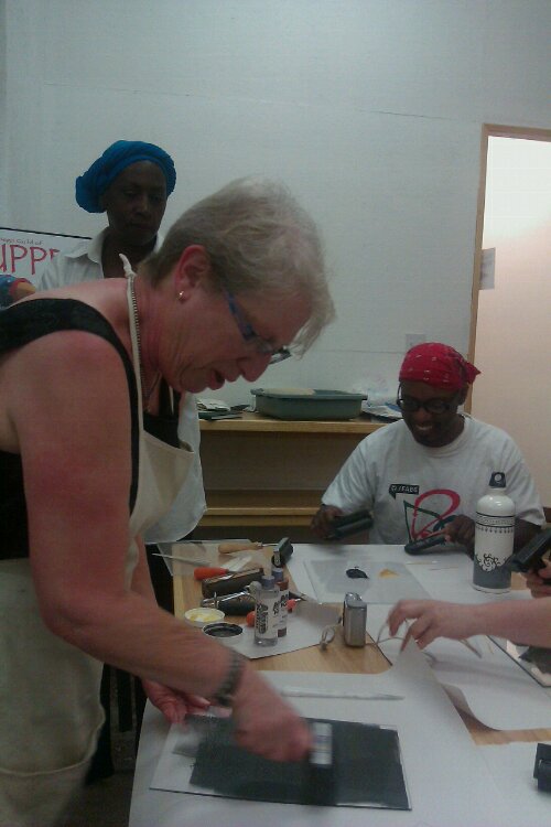
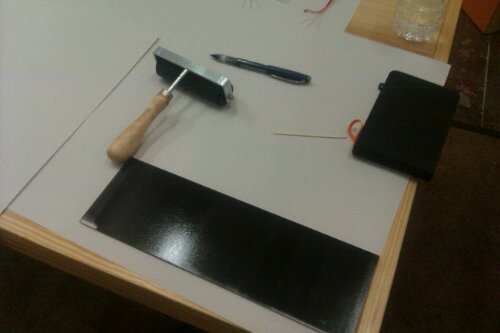
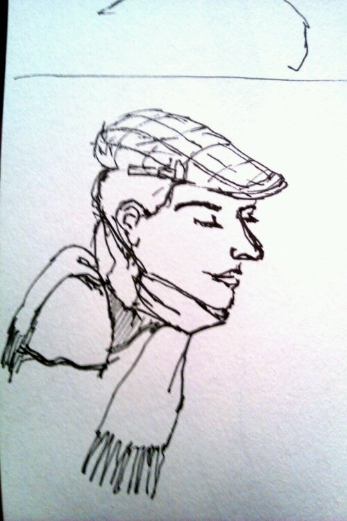
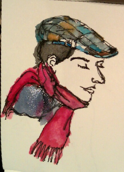
11 AM Valerie Henderson- Hands on Monoprint Workshop
'Stretching' the ink onto the plexiglass.
Removing the ink, working on negative space and texture with toothpicks and cutips.
The result: the spent plexiglass, the image and its ghost. I love prints and textures. Ready to be a designer for Ikea now;)
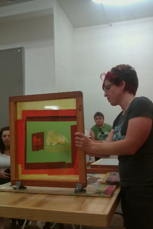
12 PM Lisa Starace- Screenprinting Demo
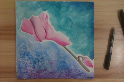
1 PM Marcy Gordon- Water Color.
Learning new watercolor techniques: wetting selecting areas of the drawing, alternating petals in this case, allows the water to have 'boundaries' and results in more controlled bleeding and blending.
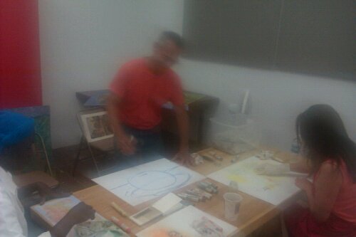
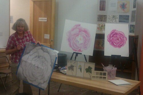
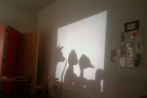
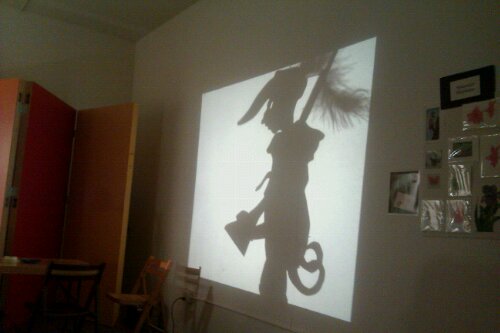
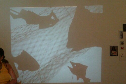
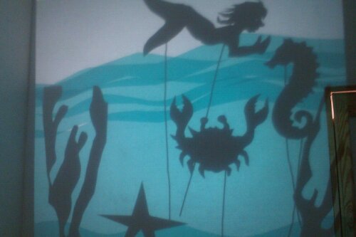
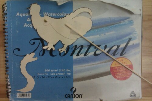
3 PM San Diego Guild of Puppetry- Overhead Shadow Puppetry: Tips and Techniques.
Shadow puppetry ...what a magical workshop. Here are my first movable 'puppets': a chicken and a worm/dragon. This was pure fun and I started thinking about shadow puppetry for architectural application (a city skyline to start a journey into form exploration).
The back of the puppets. Lots of work goes into making the moveable parts seamless and invisible.
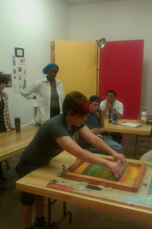
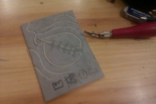
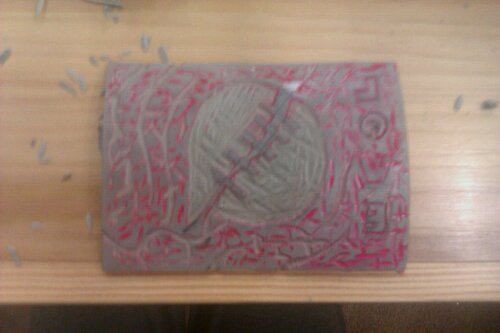
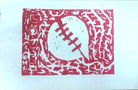
4 PM Chris Warren- Laptop Musicianship. 5 PM Jennifer Bennet- Collaborative Linoleum Print.
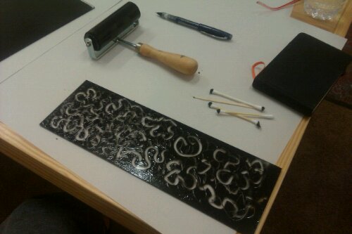
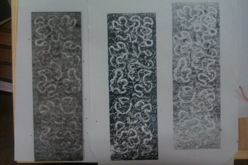
My first linoleum print since art school. Miss carving.
8 PM Colette Plush- A Visual Interpretation of a Sentence.
My starting sentence.
We followed a pretty elaborate process in choosing various hardware and found objects from various mounds, according to the number of words, adjective , verbs, the color of our sentence...
The end product.
I attended these workshops two Sundays ago at SD Space for Art. It was incredible, a whole day of art, a sort of ‘intervention’ that every creative should undergo at least once a year.
I apologize for the delay in posting this, and for going a bit M.I.A. Fall Semester has started at my school and while there is new energy and new purpose in the air — and I’m excited for the History of Architecture class– there just seemed to not be enough hours in the day lately.
(Follow the) Butterfly, Bone, Koa, String(s). Ink on trace paper. May 2010
Koa and Bone. Graphite and Watercolor. May 16, 2010
Some of you may remember my koa and bone set; here it is in ink and watercolor. The ink version is the one that surprised me the most: I noticed that by scanning the back of the drawing, the bracelet/string become more realistic, acquire thickness. The translucent properties of the trace paper and the shadows/distance/spaces created in the crevices lend this effect…something to keep in mind for the future.
I have been thinking and reading about Situationism: there was once a time in which we were all Situationists. I remember, as a teenager, roaming in the deserted streets of my neighborhood, on the ‘marina’ side of a small Calabria town. The whole neighborhood was a seasonal development and, in winter, my family (comprised of my mom, dad, and yours truly) was the only one living by the sea. Sometimes I would take off with my moped, the latest Stephen King tome and explore the abandoned villas, hide in construction sites, or walk over dried river beds– before exams, I would memorize historical dates while jumping from summer cabin to summer cabin, in the spring, when the grey beach and the deep sea were laying dormant, awaiting the summer sun, awaiting the brilliant cobalt colors and the golden heat…like they are probably doing now.
The Situationists would be proud of this roaming, untouched as it were by what they called ‘the consumer experience’.
Today I was an urban bedouin again, gathered in my scarves, on my pilgrimage (when you travel by bus it does feel like a pilgrimage, especially on Sundays) to the sea. Only grey waters reflecting grey skies today, but the sound was what I sought: this is my church and this is where I worship.
Since the last iteration I refined ground and sky, went over the watercolor with Prismacolor pencils to give the homes some texture, bumped up the contrast, pushed the darks a bit and, finally, worked on the vegetation and added the framing branches. You can see the first and second step here. C’est fini.
The topic of these first three Artuesdays has been watercolor, and I would like to share the work of some very talented folks who are inspiring me for future paintings, in subject matter or technique:
Sea Fruit. Watercolor, charcoal and white Prismacolor pencil. March 13, 2010
This is a mental recollection of an exquisite painting, smaller than 8 X 10, that I once saw in my friend Sophia’s place. It was an oil painting, varnished, and the raspberry on the beach looked so large, lustrous and luminous. You could tell the translucent quality of the skin. This is my humble attemp at recreating that piece in watercolor: oil paint allows for more luster, and maybe one day I will try that as well, even though most of my painting are done in acrylic .
What symbolism this piece recalls, and what do you see, I wonder…
I had a wonderful art session with my favorite artistes today, a lunch at my favorite French Bistro and a stroll through Little Italy’s Farmer’s Market, where we picked up fruit and vegetables (our models). A good, full day, not untouched by worries ( hard times to be had by all) rather, a respite…and realizing that, in the words of a fellow New York Times reader:
‘A good academic degree pays for itself in a flexible mind and an ability to adapt as well as the richness of inner resources to survive hard times without despair.’
Sitting in Cafe’ Italia, with my watercolors, and my ‘model’ perched on a napkin, envisioning faraway beaches and the quality of the water in Calabria– and feeling glances from patrons–I realize Art is a wonderful privilege, an ability to lose one’s self and a giving of kind, compassionate time to one’s self. Like every privilege, to me at least, art is also a responsibility. Of course the endless list of chores awaits, yet I felt what art offers is more than escapism or absorbing creativity produced by others , as in savoring a book or basking in a glorious movie ( I love both): with art we create our own narrative, as in writing a book vs. reading one. Does it make sense to be then a bit exhausted after a creative session? Perhaps it is all about resistance…learning to teach the wrist and mind to embody ‘effortlessness’.
Not to mention the refinement of the medium. This was the fourth serious attemp/experiment with watercolor I have done.
I will never forget, while following ‘The Artist’s Way’, one was to go for a week without reading. Reading has been in the past a way to procrastinate creating in the first person, a way to be vicariously creative . We must watch that.
Happy Tuesday. Throughout my four years of teaching Tuesday has always been my ‘work at home’ day, the one costant in the changing tides of quarters, classes and schedules. Today I thought I’d start a special Tuesday section, when I have more time to start new projects. So here is the first artuesday: this is the view I wake up everyday to, small happy townhomes in earth colors. I always wanted to do a watercolor of these homes on the edge of urbanity and nature (they sit on a canyon in uptown San Diego). Yup, I live near a canyon, yet in the city, more on this later. So here is my progress, I started with some guiding lines and this is as far as I got today. The watercolor will be a simple wash.
[click to enlarge. Unfortunately, soft graphite drawings are infamous for not scanning well]
Starting the drawing with tree shadows, to warm up the hand. From stationary point on the ground, the proportions are lightly drawn.
Vertical guiding lines.
Vertical and horizontal guidinglines of doors and windows-
Drawing and leaning on car, then sitting on the curb or grass in front of each house in my neighborhood was fun, and different cause I *never* hang out near my house. I even met a neighbor who was an artist! Doing art outdoors can tell you so much about where you live, and I am so glad no paranoid people called neighborhood watch on me (:P)
I used a Derwent Sketching for roughing in the proportions, the (only) tree and the tree shadows. You can see my new Faber Castell mechanical pencil, bought in Kuwait. What a dream drawing tool, see how ergonomic it is? (ok I will stop showing off now).
Derwent Sketching 2B, Faber Castell Grip Matic 0.5, Staedler eraser, Kneading eraser (to tone down lines).
A thing of beauty. The eraser part twists to reveal the eraser stick.
Sometimes I see my students sketching from photos, and it breaks my heart: there is nothing like the training of the hand to succeed as a designer and architect. I like to tell them to use the verb ‘draw’ as in ‘drawing information’.
Don’t get me wrong, I am not a dinosaur. I love Sketchup, as a 3D modeler use 3D Max, have done my fair share of CAD and Revit and Photoshop is my religion, but, as this article says, if you don’t know how to draw and sketch, and quickly convey your ideas through hand-eye coordination, your role as an architect will be very limited. Thank you to Andrew Duncan for sending me this.
Should rulers be outlawed when sketching? I believe in training your hand to be a plumb weight, creating straight yet ‘human’ lines.
Françoise Gilot. Self-Portrait. Copy, ink on paper. January, 2010. Françoise was Picasso's long-time mistress, an accomplished artist in her own right. I saw this piece at the San Diego Museum of Art.
The original drawing. I couldn't find it anywhere online, so hope it helps someone. No photos allowed on this one *cough*
Somebody bought me blue roses....Watercolor and Graphite. January, 2010.
Photograph edited in Photoshop. February, 2010.
Coffee Carrier (delle). Graphite on paper. Kuwait. January, 2010.
Miniature Pomegranate. Watercolor on chocolate wrap. Kuwait. January, 2010.
What I’ve been buying: My only shopping in Kuwait consisted of pens, pens, pens. I received a bounty of gifts, so that anything I could have wanted to buy, was given to me. And for this I will be forever grateful. But my contribution to the Kuwaiti economy can be seen below:
Pens such as these can be found in regular, small office/school supplies stores in Kuwait. In Italy they would be called 'Cartolerie'.
So I gave myself a belated Christmas present by buying a much-needed 1.5 TeraBytes External Memory (It’s a thing of Beauty), and shopped at NaraCamicie, an Italian brand known for the best shirt design in the world. I was so delighted to find it in San Francisco. I visited their Firenze store three years ago, and have been pining for Nara since then. Apparently there are only two U.S stores and when I saw the San Francisco one, I promised myself a visit for a special occasion.
What I have been watching: Art:21, a series of PBS (Public Television) documentaries on contemporary American artists, mostly alternative, independent ones.
What I have been pondering (on Photography):
Joe Nicholson, the First Year coordinator at my school, a veteran academic, who brings a Yale-borne rigour to our class and an incredible dose of warmth, fun and passion for art and architecture (and who I consider my mentor) shared with us this anecdote:
As part of the exploration in coloring with coffee, I wanted to experiment with overlaying digital sepia tones to previously drawn sketches. The building above is Terragni’s Casa Del Fascio. Terragni is often overlooked as one of the pre-eminent modern architects in Italy, mainly because it has been hard to separate his architecture from the political regime of the time. Taken on its own, though, this building is single-handedly one of the most fascinating works of architecture in Italy –and the most illuminating example of Italian Rationalist architecture– due to its play of extruded volumes, transparencies and honest use of materials.
In 2003 none other than Peter Eisenman published an opus forty years in the making, Giuseppe Terragni: Transformations, Decompositions, Critiques, a thorough analysis of this and another work by Terragni, Villa Frigerio. Thanks go to Raul Diaz, AIA, for telling me about this book. Surprisingly (or should I say, not surprisingly, the author being the controversial Eisenman), the book garnered very mixed reviews by readers on Amazon. Nonetheless, the fact that Eisenman spent forty years focusing on the Casa Del Fascio speaks volumes (pardon the pun) on the work, mind and intellectual acuity of this Italian Rationalist.
I had the fortune to visit this building in the Spring of 2007, on the same day that I saw the Mausoleum of Antonio Sant’Elia (Architect of the Italian Futurist group). The sketch below is an example of what happens when graphite drawings are scanned: the original had much more contrast and much of it-along with the ‘life’ of the drawing- was lost in the digital translation.
I therefore bumped up the contrast in Photoshop and played with sepia tones and shadows. A great way to make a sketch presentation-ready. Another way to gain some layering would be to layer via-cut the body of the building, and subtract the volumes on the upper floors (the indoor-outdoor spaces). By playing with the blending options of this new layer, new shadows could be cast, which would give a three-dimensionality to the sketch.
Casa Del Fascio, scan of original sketch (notice loss of contrast), Como, 2007
Casa Del Fascio, contrast corrected thru Photoshop, Como, 2007
Casa Del Fascio, Sepia color with Photoshop, Como, 2007
Favorite drawings, paintings, collages and handwork on SketchBloom
Ink on Paper. December 2010.
Queen Califia’s Garden, Totem/Sculpture. Ink, color pencils and markers. 2009
Ink and watercolor on paper and tracing paper. A bit of digital manipulation. Feb. 09,2011.
Mare Mosso Act II. Graphite drawing by Gianni Aiello. Collage. March 18,2011
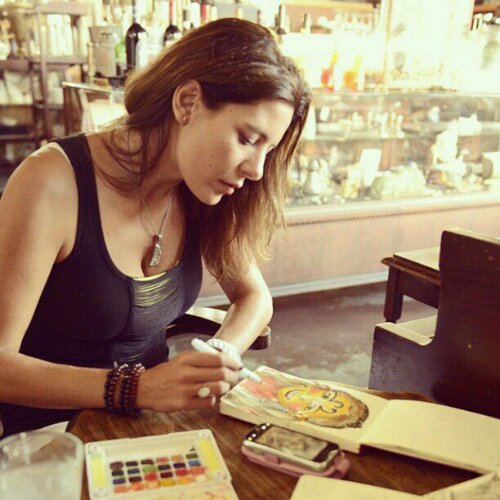
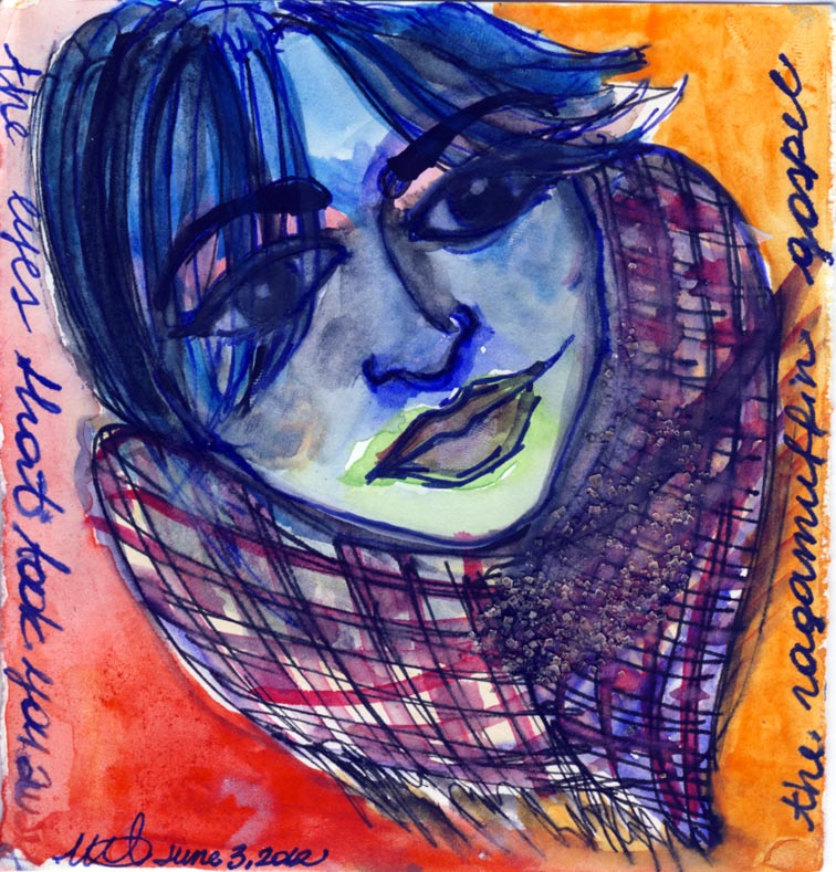
Watercolor on paper. June 3, 2010
Ink on hand.book paper. Paris, 2011.
Casa Del Fascio, contrast corrected thru Photoshop, Como, 2007
Earth and Water. Beads and yarn. June 24, 2011
our very own coffee cart @ NewSchool: Cafe’ A la Carte
Ink on Paper. December 2010.
The Fortress of Lost Time. Graphite on paper and magazine cutouts. December 27, 2010. Miti and Gianni Aiello.
Pilot Pen on Paper. November 2009
Barcelona Chairs by Mies Van De Rohe, 1929 @ the CED Library in Berkeley
Twomoons Wax Proof-modeled after concept sketch
Ink on Paper. Calabria, Italia. September 29, 2011.
Platonic Solid Exercise. Graphite on Paper. 2007
Pilot pen on paper. January 2011
Collage, Pilot Pen on Paper
The Sun, the Moon, and on there being no abstracts in life. Pencil, ink, watercolor on 4″X5″ canvas.2009
Watercolor and Graphite. November 12, 2009
Concept for jewelry piece ‘twomoons’
Felt tip on paper. March 22, 2011.
Baggalini Red.
The funambulist. Ink drawing + digital collage. August 2011.
Ink on Paper. September 2009
Persimmon- very quick pastel rendering. November 12, 2009.
Pencil and Watercolor on canvas
Ink on tracing paper. Kuwait, January 2010. The scene at the bottom is what I saw-or decided to see- at The Avenues, the most popular malla in Kuwait City. There is nothing like seeing photography and drawings from a trip abroad to make you realize all reality is subjective, and we choose to see what we want to. We just don’t realize it in our own backyard.
Mare Mosso Act III. Graphite and pen drawing by Gianni Aiello. Collag and pastel. March 19, 2011.
Earth Henna, Eucalyptus Oil. May 2, 2010.
July 27, San Diego Museum Of Art. The Age of Enlightenment – Gabrielle Emilie Le Tonnelier de Breuteuil, Marquise du Chatelet by Yinka Shonibare- Ink on hand.book paper
Waiting for Godot | Static Head. Digital Collage. May 5th, 2010
Final Twomoons Piece, Summer 2008
Miniature Pomegranate. Watercolor on chocolate wrap. Kuwait. January 2010
Coffee Carrier (delle). Graphite on paper. Kuwait. January 2010
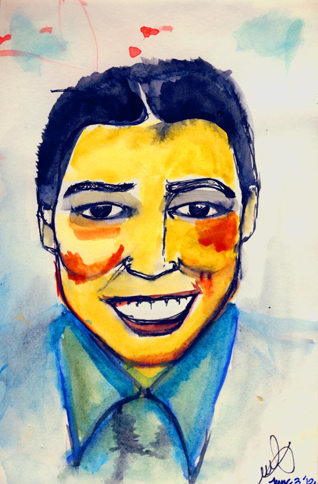
Dr. Gregory House. Watercolor on Paper. June 3, 2010
Graphite on paper and magazine cutouts. December 27, 2010. Miti and Gianni Aiello.


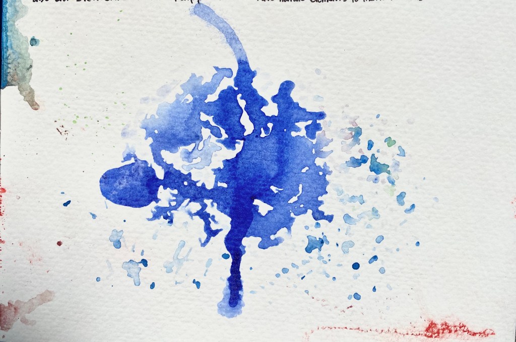 The Surface and the Deep. Watercolor. July 2020.
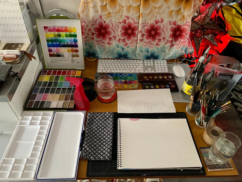


, Como, 2007")


