Feeds:
Posts
Comments

Archive for the ‘Paper Goods’ Category

Paintings by Suanne Summers

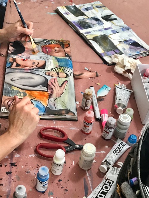
On Sunday I was lucky enough to spend the afternoon at my friend Jana Freeman’s Way Art Yonder Studio for one of her monthly open studio days. I met Jana at my school, first we were friendly colleagues then mischievous friends, and now she is living the Dream running her own art studio and hosting incredible workshops with Mixed Media artists the world over…

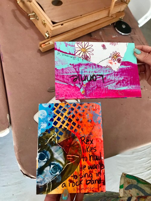
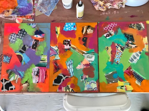
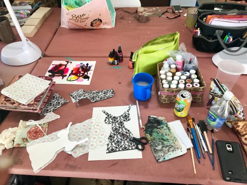
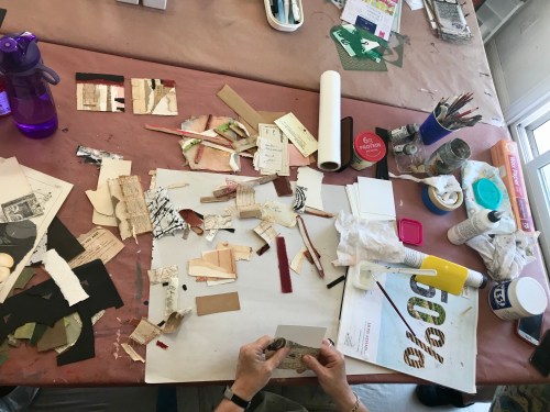
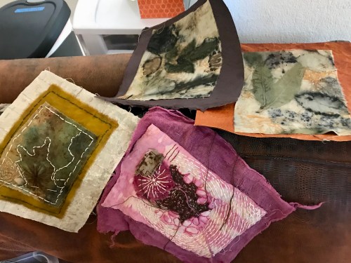
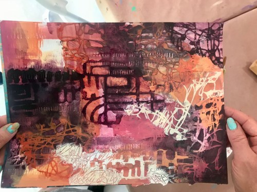
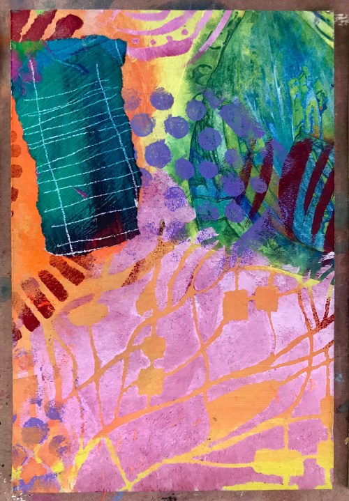
Here is a sample of the work I was “curiousing” on on Sunday ( yes, I am making up this word). Most of the vibrant work I photographed is by Suanne Summers, then there is the dreamy stitch/ fabric art of Shelley Watkins and the layered collages of Krista Jarrard. Jana, the studio owner, can be seen completing one of her exquisite pieces. This is my Art tribe, comprising of Carla Bange who could not make it this time.

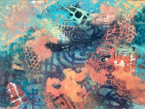
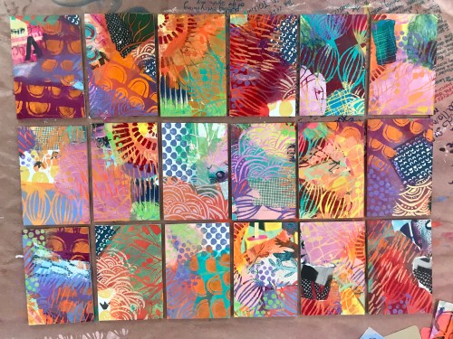
Paintings by Suanne Summers

Collage in progress by Krista Jarrard

Jana in the process of assembling one of her captivating mixed media works on small square canvases, painted black.

This cool collage is by a sweet lady from Minnesota (!) . I will find out her name 🤔[[[[[[

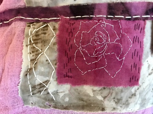
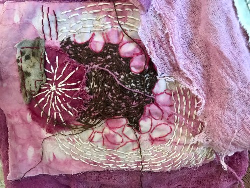
Fabric/stitch art by Shelley Watkins. She dyes her own fabric 😮

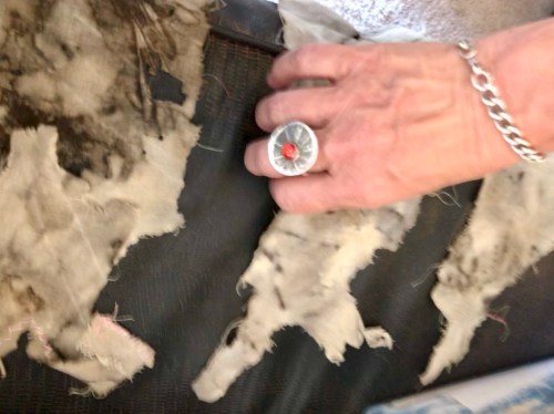
Above, Jana and her regal ring touching one of Shelley’s distressed samples of fabric. She uses a process involving peroxide to “ eat through” the fabric. We named this “ Dickensian Orphanage, or the street urchins.”

Here is more of Suanne’s work:

What can I say, these ladies have been at this a long time and I need to up my game and get back to my collages instead of collecting drawerfuls of materials (but if I say so my self I have lots of exciting materia prima from my travels).

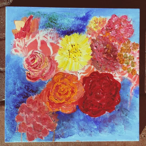
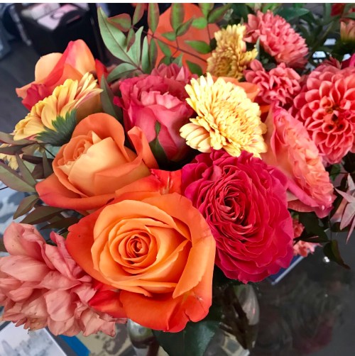
But first I want to finish my “flower portrait”- here is the work-in-progress ( which will include poetry and mixed media). The

The original was GORGEOUS, made for me by a very special person who ” painted” my portrait with handpicked flowers. {swoon}

Work in progress, acrylic on canvas.

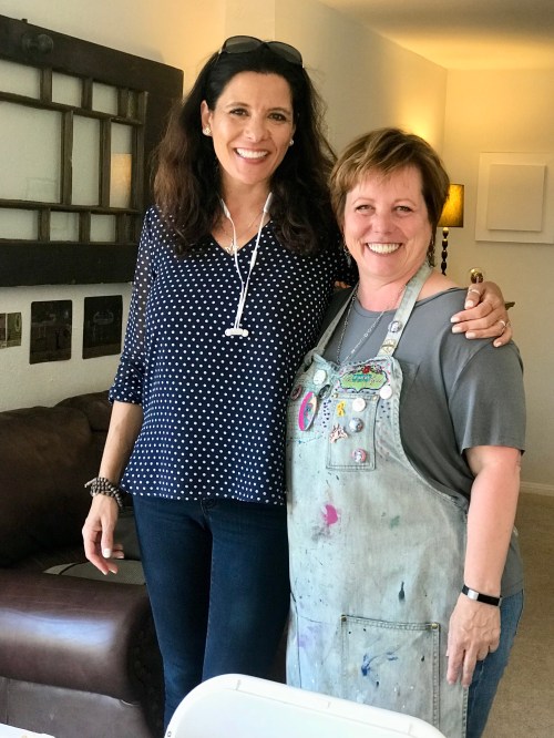
Jana and I at Way Art Yonder, my happy place!

Thank you Jana!

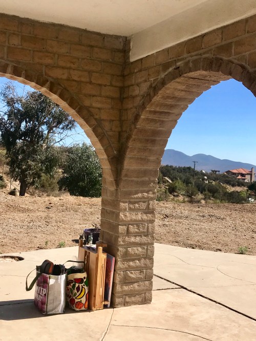
I will soon be back under the portico with my bags 😉

This is one place where I don’t feel bad lugging all my stuff with me- as all the other tribe members do the same. I think I found my people.

Read Full Post »

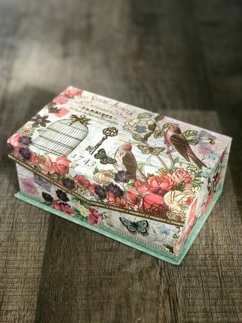
Carillon. December 16, 2017. San Diego, California.

Carillon. December 16, 2017. San Diego, California.


They had put together a delightful album with the postcards that Pietro Crespi received from Italy. They were pictures of lovers in lonely parks, with vignettes of hearts pierced with arrows and golden ribbons held by doves. “I’ve been to this park in Florence,” Pietro Crespi would say, going through the cards. “A person can put out his hand and the birds will come to feed.” Sometimes, over a watercolor of Venice, nostalgia would transform the smell of mud and putrefying shellfish of the canals into the warm aroma of flowers. Amaranta would sigh, laugh, and dream of a second homeland of handsome men and beautiful women who spoke a childlike language with ancient cities of whose past grandeur only the cats among the rubble remained. After crossing the ocean in search of it, after having confused passion with the vehement stroking of Rebeca, Pietro Crespi had found love. Happiness was accompanied by prosperity. His warehouse at that time occupied almost a whole block and it was a hothouse of fantasy, with reproductions of the bell tower of Florence that told time with a concert of carillons, and music boxes from Sorrento and compacts from China that sang five-note melodies when they were opened, and all the musical instruments imaginable and all the mechanical toys that could be conceived. Bruno Crespi, his younger brother, was in charge of the store because Pietro Crespi barely had enough time to take care of the music school. Thanks to him the Street of the Turks, with its dazzling display of knickknacks, became a melodic oasis where one could forget Arcadio’s arbitrary acts and the distant nightmare of the war.”

“Habían hecho un precioso álbum con las tarjetas postales que Pietro Crespi recibía de Italia. Eran imágenes de enamorados en parques solitarios, con viñetas de corazones flechados y cintas doradas sostenidas por palomas. «Yo conozco este parque en Florencia», decía Pietro Crespi repasando las postales. «Uno extiende la mano y los pájaros bajan a comer.» A veces, ante una acuarela de Venecia, la nostalgia transformaba en tibios aromas de flores el olor de fango y mariscos podridos de los canales. Amaranta suspiraba, reía, soñaba con una segunda patria de hombres y mujeres hermosos que hablaban una lengua de niños, con ciudades antiguas de cuya pasada grandeza sólo quedaban los gatos entre los escombros. Después de atravesar el océano en su búsqueda, después de haberlo confundido con la pasión en los manoseos vehementes de Rebeca, Pietro Crespi había encontrado el amor. La dicha trajo consigo la prosperidad. Su almacén ocupaba entonces casi una cuadra, y era un invernadero de fantasía, con reproducciones del campanario de Florencia que daban la hora con un concierto de carillones, y cajas musicales de Sorrento, y polveras de China que cantaban al destaparlas tonadas de cinco notas, y todos los instrumentos músicos que se podían imaginar y todos los artificios de cuerda que se podían concebir. Bruno Crespi, su hermano menor, estaba al frente del almacén, porque él no se daba abasto para atender la escuela de música. Gracias a él, la Calle de los Turcos, con su deslumbrante exposición de chucherías, se transformó en un remanso melódico para olvidar las arbitrariedades de Arcadio y la pesadilla remota de la guerra.”

“Avevano fatto un grazioso album con le cartoline postali che Pietro Crespi riceveva dall’Italia. Erano immagini di innamorati in parchi solitari, con illustrazioni di cuori trafitti e nastri d’oro sorretti da colombe. “Io ho visto questo parco a Firenze,” diceva Pietro Crespi sfogliando le cartoline. “Stendi la mano e gli uccelli scendono a mangiare.” Certe volte, davanti a un acquarello di Venezia, la nostalgia trasformava in tiepidi aromi di fiori l’odore di fango e peoci marci dei canali. Amaranta sospirava, rideva, sognava una seconda patria di uomini e donne belli che parlavano una lingua da bambini, con città antiche della cui passata grandezza restavano soltanto i gatti tra i ruderi. Dopo aver varcato l’oceano alla sua ricerca, dopo averlo confuso con la passione nei brancicamenti pieni di veemenza di Rebeca, Pietro Crespi avevo trovato l’amore. La ventura portò con se la prosperità. Il suo magazzino occupava allora quasi un isolato, ed era un semenzaio di fantasia; con riproduzioni del campanile di Firenze che davano l’ora con un concerto di carillon, e scatole musicali di Sorrento, e portacipria di Cina che se aperte cantavano temi di cinque note, e tutti gli strumenti musicali che si potevano immaginare e tutti gli artifici a molla che si potevano concepire. Bruno Crespi, il suo fratello minore, dirigeva il magazzino, perché lui non aveva tempo che per badare alla scuola di musica. Grazie a lui, la Strada dei Turchi, con la sua abbagliante esibizione di cianfrusaglie, si trasformò in una gora melodica per dimenticare gli arbitri di Arcadio e l’incubo remoto della guerra.”

Read Full Post »

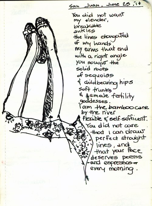
Ink on Moleskine paper. Schneider Hybrid 0.5.  San Juan, Puerto Rico. June 2014.

Ink on Moleskine paper. Schneider Hybrid 0.5.
San Juan, Puerto Rico. June 2014.

Read Full Post »

The sacrificial lamb- an old leather jacket already repaired twice.

The sacrificial lamb- an old leather jacket already repaired twice.

image

With my pattern and leather in the Materials Lab, to trace images in Illustrator and experiment with the laser cutting process. “The object feels good if the process feels good.”

image

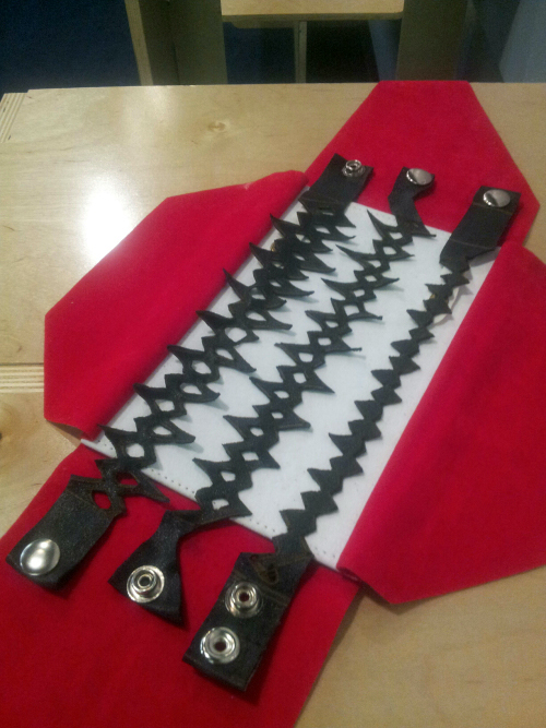
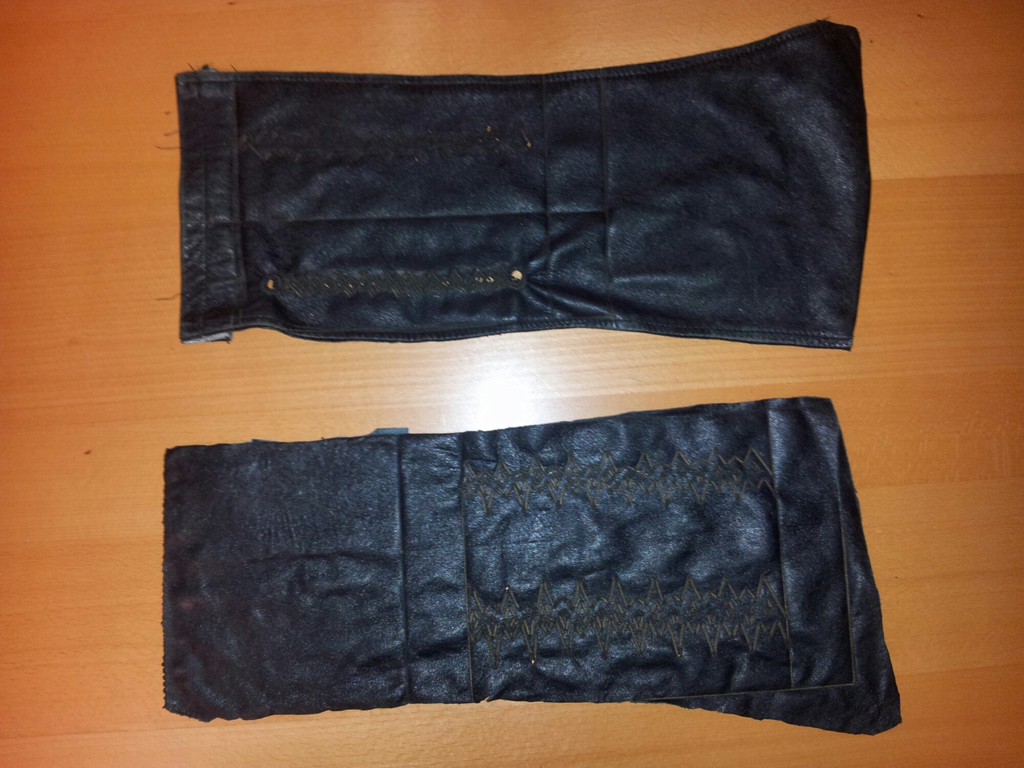
The laser etched leather swatches. Fire drawings…scars…tattoos and cattle branding.

image

Preparing for night surgical cutting, tailoring and riveting. And documenting. The whole project came about in three days (Friday to Sunday), but was months in the making (and in the thinking, and in the promising).


wpid-20140427_083037_2

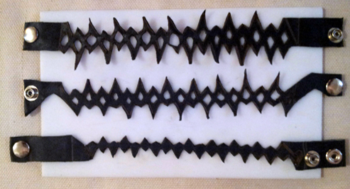
The prototypes are done!

image

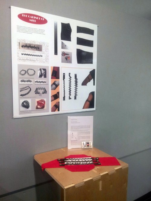
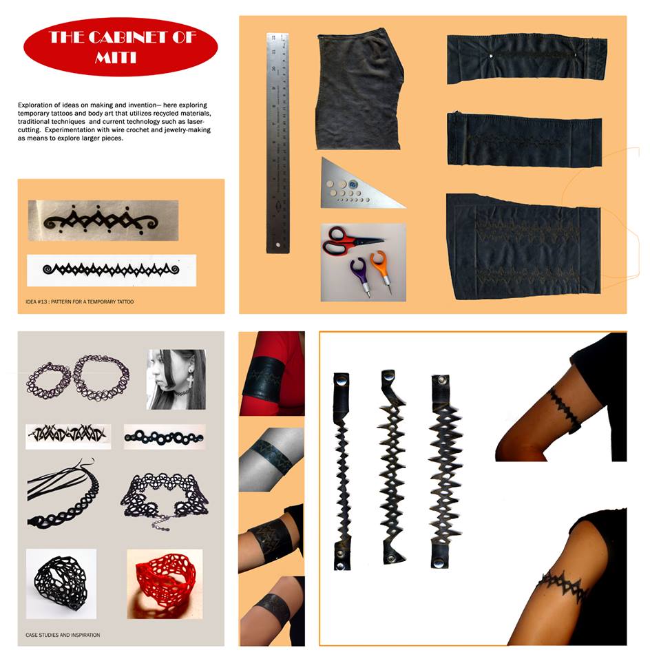
Laying out this graphic board illustrating the process took longer than I would like to admit. In the end, it was a process of elimination…which is the secret to design, really.


wpid-20140428_213830

Exhibit time. Board layout #2 with Illustrator patterns :).

wpid-20140428_213835


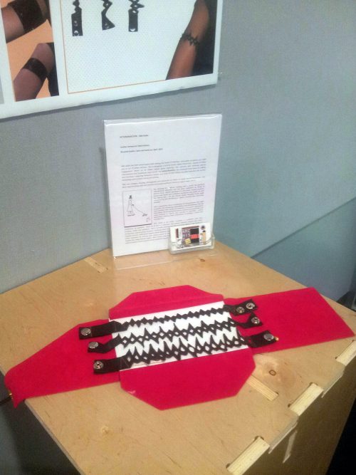
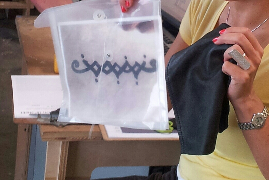
Project fini. Ready-to-wear, custom-made temporary leather tattoos....by yours truly.

Project fini. Ready-to-wear, custom-made temporary leather tattoos….by yours truly.


Idea #13: Temporary Leather Tattoos

Experiments with recycled leather, tattoo patterns and the laser cutter in our Materials Lab for the Action/Reaction Faculty show, where students react to faculty work.

I chose to explore these tribal tattoo patterns I drew long ago and finally turn them into ‘temporary’ leather tattoos – since an actual tribal armband tattoo is out of the question (#italianmother).

In the process, I learned how to make leather-on-leather tattoos, used the laser cutter for the first time, hand-cut till my hands were sore, learned how to put rivets, and was taught about vector lines and patterns in lllustrator by my wonderful, patient students.
Thanks to student feedback/critique (which was extremely positive about the artifacts :)) the board could use one more ‘pass’ as far as fonts and background, but I wanted to post this now, as the show is coming to a close.

While researching case studies, I was astonished by the amount of cool accessories, arm bands and earrings made with recycled bike tires and inner tubes.

Etsy, here I come.


Here are some photos from the Action|Reaction opening, by Donn Angel Perez, the curator of the show (and author of the beautiful paintings shown), along with student Chuck Wilson

For the opening- in keeping with the recycled/sustainable theme, and to save time 😉 – I projected my board.


This slideshow requires JavaScript.


…….

littlescreenshot <<<and this, this little guy on my desktop just makes me happy.

Read Full Post »

1web


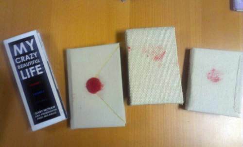
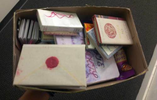
Above, my Christmas presents from my students.
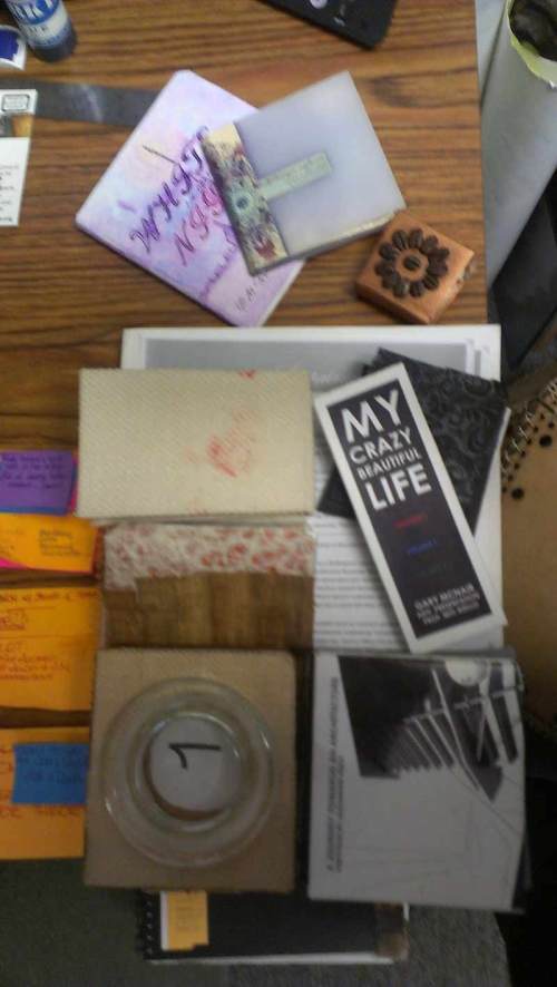
The ‘one hundred small books’ were a project for the Advanced Presentation course I taught.

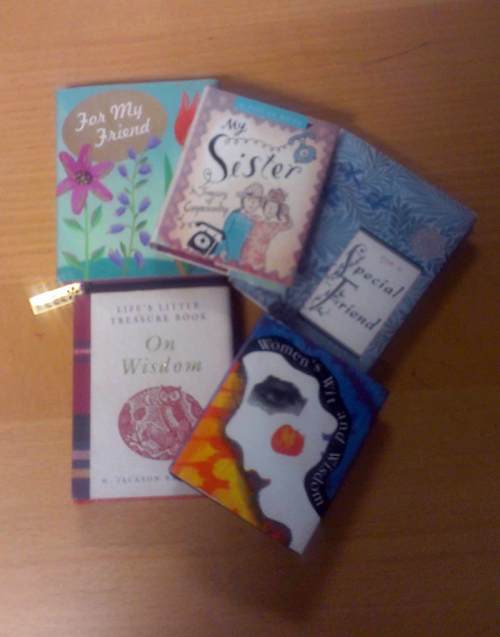
To start the conversation on small scale binding, I brought some of my mini books to show.
How did I end up with these? 😛


IMAG4351(1)web


My students could choose their own narrative and learned how to bind books using different techniques and materials.
We covered layout through a discussion on portfolio graphics and blog and website design –and used some color palette tools–
so for the final project I wanted to do something different and strange, inspired by an artist in the 70’s who created one hundred little books.

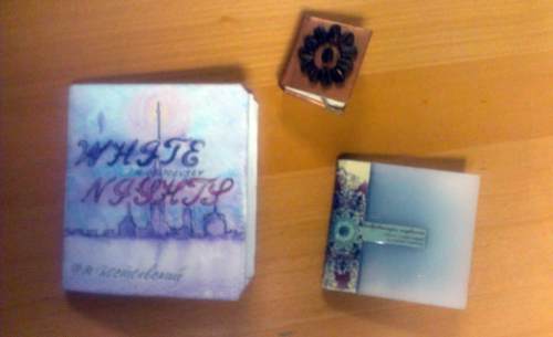
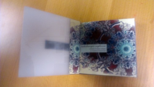
Some of them are portfolios, some poetry, photography…a couple are on love and music 🙂


IMAG4354web

IMAG4357web

IMAG4353web


There is even Dostoevsky’s novella ‘White Night’ and a book entirely on coffee and quotes, both done by Anastasia, a fellow artist (someone knows me!).

You can follow her beautiful work here.

I will post more pages from the little books once school resumes. I also (shocking, I know) have a little book on coffee quotes at home, bought in Italy few Christmases ago. I’ve been meaning to write a post about it, and now I will share it with you – and Anastasia 🙂

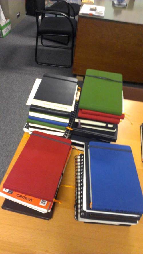
Also there were lots and lots of sketchbooks from my History of Architecture students (!).

IMAG4362web

I. love. them.


Before I go (get coffee), some coffee quotes from my little coffee book:

If asked: ‘How do you take your coffee’?
I reply : ‘Very Seriously’

Unknown


Coffee is a language in itself

Jackie Chan


Wake up!

Drink coffee…

Then think.

Unknown


Coffee is the favorite drink

of the civilized world.

Thomas Jefferson


Black as night,

Sweet as sin.

Neil Gaiman ‘Anansi Boys’


Deja Brew:

The feeling you’ve had

this coffee before.

Unknown Coffee


It is inhumane, in my opinion, to force people who have a genuine medical need for coffee to

wait in line behind people who apparently view it as some kind of recreational activity.

Dave Barry


Black as the Devil,

Hot as Hell,

Pure as an Angel,

Sweet as Love.

Charles Maurice De Talleyrand


IMAG4363web

My Bounty. Merry Christmas.

Read Full Post »

Drawing by Jackie McDowell.

I am posting the first of a series of samples of student work from the exhibit  History of Architecture: Analysis and Synthesis Through Visual Notes. Moving chronologically, today we start with the Beginnings of Architecture.  This body work was completed for the Graduate History of Architecture sequence, comprising of three courses, which i taught during the 2011-2012 school year.

I will also post some photos from the Exhibit.

These visual notes are by Jackie McDowell.

Drawing by Jackie McDowell.

Drawing by Jackie McDowell.

And here is the  paper abstract summarizing the project objectives and research purpose.  The full paper will be presented and published next Spring. 

History of Architecture: Analysis and Synthesis Through Visual Notes

Miti Aiello, Full-Time Faculty

NewSchool of Architecture and Design, San Diego, California

The need to update and make relevant the study of History of Architecture in an evolving profession and academic environment has never been more urgent: our discipline demands not only an expanded scope (mandatory inclusion of global or ‘non-western’ traditions and architecture of the vernacular), but new methods of delivery and course projects that are interdisciplinary, that bridge the divide between studio courses and history and that educate the young practitioner in reading history utilizing the same
methods learned in design practice.

Spiro Kostof, the legendary UC Berkeley architectural historian, advocated giving students “something tangible to carry away to the drafting table”.

It is possible to adopt an educational methodology that questions monumental architecture of the past and the traditional, vernacular “architecture without architects” in the same way as students approach a design problem in studio. Hans Morgenthaler’s “Chronology versus System: Unleashing the Creative Potential of Architectural History” – which served as this paper’s catalyst- denounced the inadequacy of relying on the chronological organization of history and suggested designing the History course as a series of design problems or buildings/events, illustrated through architectural drawings (the language of our profession) and not photos. History of Architecture instructors are encouraged to “occupy themselves simultaneously with the study of the past, with critique, and with invention”.

The argument for learning history through drawing, in this case in the form of student-generated visual notes based on textbook reading is related to the ‘invention’ mentioned above and supported by Morgenthaler: “This approach derives from the understanding that a drawing is capable of communicating information about buildings impossible through other means. In addition, as a subjective record, drawings could become part of the history of ideas, as opposed to photographs, which are only evidence. Moreover, drawings express the “belief in architectural precedent and typology which gave relevance to history.” Rachael McCann in her “Exploding the History Survey” also introduced ‘graphic summary pages’ as active inquiry in her course at Mississippi State University, breaking down her large lecture course in smaller sections which would investigate a question brought forth by a particular building, through visual analysis. It is clear that History of Architecture lecturers are seeking novel, more critical models to articulate the course, and better narrate “a story of architecture”.

Read Full Post »

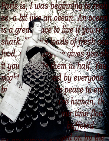
The Screen Woman. Digital Collage. Text from "A Year in the Merde" by Stephen Clarke.


Photo from Inspired Goodness.

 
Founded in 2008, Inspired Goodness is a custom invitation and paper goods studio
located in Brooklyn, NY.
 
—————————————————————————-
 
Notable books:


Read Full Post »

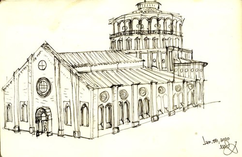
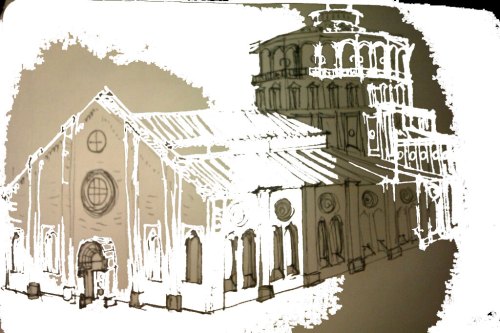
Santa Maria Delle Grazie with Bramante's apse. Milano. Pilot pen on paper. January 2011

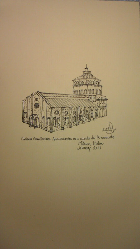
 In the monastery adjacent this church, just a few minutes’ stroll from my house, one can find Leonardo Da Vinci’s ‘Last Supper’. The apse (widely attributed to Donato Bramante, and dated around 1490) is significant as it signals a crucial transition from the Late Gothic style of the nave to a splendid Northern Italian Renaissance in the apse, the choir and cupola.

.25 technical pen on cardstock. January 2011.

Photoshop manipulation of pen drawing. January 2011.

MITI’S RECIPE FOR SKETCHING:

Day One: Look. (First Encounter)

Day Two: See. (Visual Analysis;walkaround…resist the urge to take photos. Training your eyes will not only lead to better sketches, better lessons learned from the Architecture itself, it will lead to–if you are so inclined–even better photography in the end. Notice, examine and mentally record -on the exterior- connections, details, rhythms, proportions, materials; on the interior: spaces, rituals, light, sequences, apertures, passages…)

Day Three: Sketch. (even quickly…by now you learned the lessons, you acquainted yourself with the building. You begin to understand.) Use the verb ‘to draw’ as in drawing water from a well, draw information (this last advice comes from Travelling the World with an Architect’s Eye)

Tips for cold-weather sketching: stop when your legs fall asleep. Wear half (I call them ‘homeless-style’) gloves to keep the hands free. Listen to warm music on your ipod. Bring a thermos or mug with hot, organic, unsweetened english breakfast tea.

And…

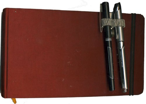
for impromptu urban sketching, carry your pens with the very handy penholder by Muji (did I mention before that I love Muji?)

Sketchbook by hand book, penholder clip by muji.

Read Full Post »

So you already know I heart Japanese Stationery stores.

Here are more lovely pens and things from Jetpens.

Some of these, like rubber stamps – or writing letters sealed with rubber stamps- don’t exactly fit my life right now, but isn’t it fun to imagine such settings?

Thanks go to my (enabling)  friend Andy who shared Jetpens with me.

Click on the images for more details.

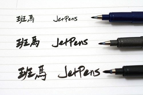
Brush Pens

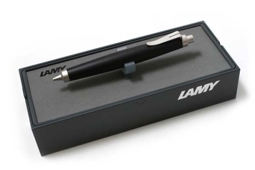
Lamy Mechanical Pencil

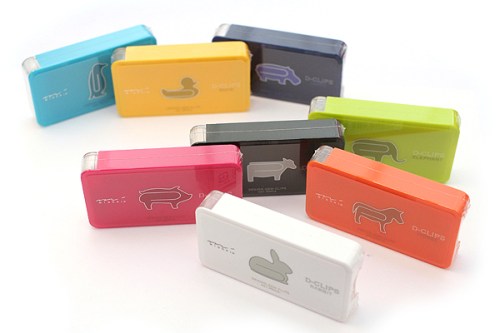
Midori Animal Shape D-Clips

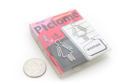
Woman-shaped clips by Sun-Star

Rubber Stamp by Kodomo no Kao Ouchi Mininature House : A Chair and Ciao!

The beautiful packages of Kodomo no Kao Ouchi Miniature House Rubber Stamps.

Round index tabs by Metaphis

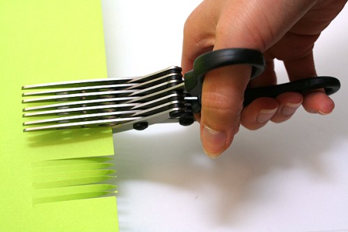
Sun-Star 7-Blade Shredder Scissors

Acid-free, refillable adhesive tape from Tombow- for the gluing perfectionist (wow).

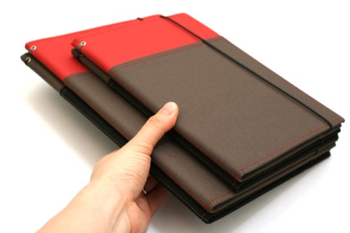
Kokuyo Systemic Special Cover Refillable Notebook

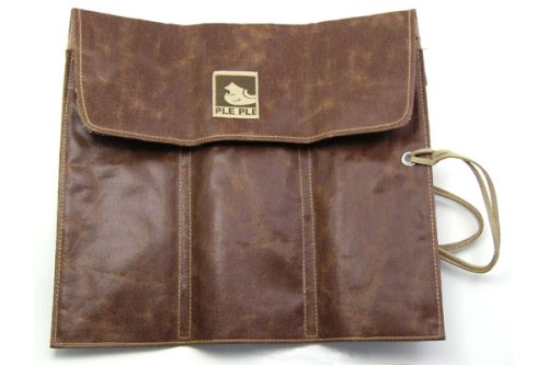
PlePle Choco Wrap Pencil Case

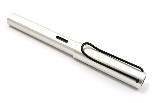
Lamy fountain pen, extra fine nib, aluminum body.

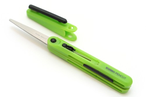
My favorite: Pen-Style Scissors.


Here are some photos of 
Jet Pens aficionados.


Share

Read Full Post »

Something eye-opening occurred at my school yesterday.

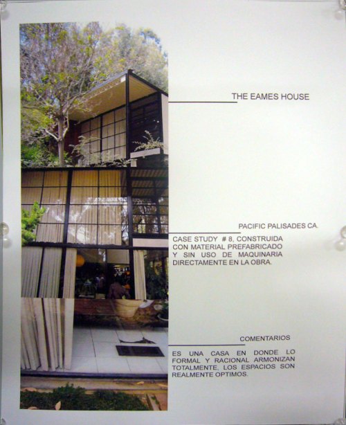
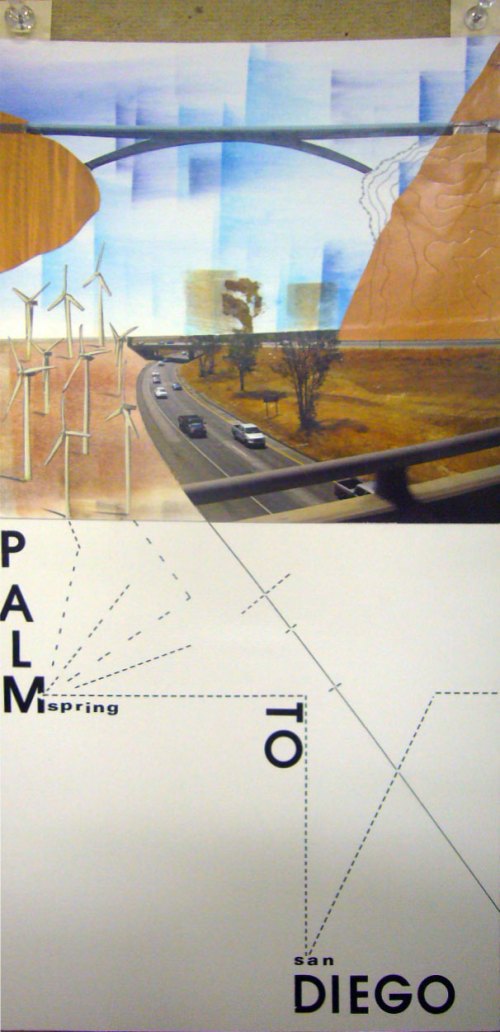
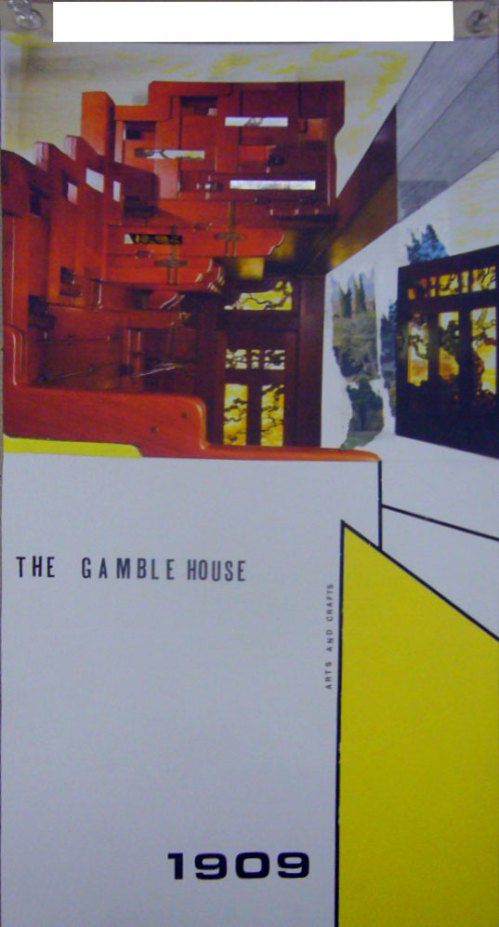
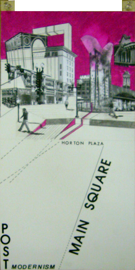
I attended the exhibit for SoCal -Ex : Exploratory Design Workshop, completed by Professor Hector Perez and his students.

Here are the specific of the Workshop:

6 Explorers

Andrea Benavides/Alfredo Melly/Henry Palomino/Charles Santamaria/Nancy Tariga

25 Days

July 12-August 5

10 Field Trips

San Diego/La Jolla/Del Mar/San Juan Capistrano/Los Angeles/Santa Monica/Culver City/Venice/Pasadena/Palm Springs

9 Progressive Practices

Daly Genik Architects/Eric Owen Moss/Estudio Teddy Cruz/Gehry Technologies/Luce Et Studio/Michael Maltzan Architecture/Morphosis/Sebastian Mariscal Studio/Smith and Others

15 Extraordinary Residences

Charles and Ray Eames/Craig Ellwood/Christine & Russell Forester/Albert Frey/Frank Gehry/Greene and Greene/Coop Himmelblau/Alberto Kalach/Ed Killingsworth/Sebastian Mariscal/Kathy McCormick & Ted Smith/Richard NeutraRudolph Schindler/Don Wexler

I spoke with Professor Perez and he told me that the analysis of the case study residences and projects were concentrated on the ‘crown’, ‘body’ and ‘feet’ of the aedifices.

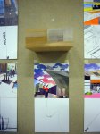
Through collages, reminiscent of Superstudio and Archigram, the field trips become a venue for envisioning alternative architectural and urban scenarios (Design Workshops). I hope you’ll enjoy these images just as much as I did; each collage read like a miniature work of art, and the juxtaposition of architectural drawings and bold hand-drawn colors created fantastic, detailed, abstract constructs.  What a wonderful way to illustrate architectural drawings, and bring to life photographs.  The collages, done by hand, using cutouts, colored pencils and paint had a physical presence, a texture that a purely digital (photoshopped) images invariably lack.

I am inspired to create some more collages of my own and…can’t wait for the book 😉

This slideshow requires JavaScript.

Click on an image to enlarge.

Share

Read Full Post »

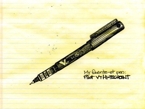
Pilot Pen V5 (aka Pilot Precise Extra Fine) on office pad. August 3, 2010.

Drawn with Pilot Pen V5 (aka Pilot Precise Extra Fine) on office pad. August 3, 2010.


The Man with Many Pens

by Jonathan Wells


With one he wrote a number so beautiful

it lasted forever in the legends of numbers. With another


he described the martyrs’ feet as they marched

past the weeping stones and cypresses, watched


by their fathers. He used one as a silver wand to lift

a trout from its spawning bed to more fruitful waters


and set it back down, its mouth facing upstream.

He wrote Time has no other river but this one in us,


no other use but this turn in us from mountain lakes

of late desires to confusions passed through


with every gate open. Let’s not say he didn’t take us

with him in the long current of his letters, his calligraphy


and craft, moving from port to port, his hand stopping

near his heart, the hand that smudged and graced the page,


asking, asking, his fingers a beggar’s lucent black,

for the word that gave each of us away.


More poetry from the New Yorker


I confess: I am weak for love pens and other writing instruments.

I have had a fascination with pens (and office supplies) since I was 4, when I would help organize my mother’s supply center at work.  I was very scrupolous 🙂  In college, buying pens at the Varsity Store on Campus, or better yet, at Mathison’s,  was therapy.  Above you see my sine qua non pen.

And, one more thing  for today: my blogsister Ghadah at PrettyGreenBullet gets an A.

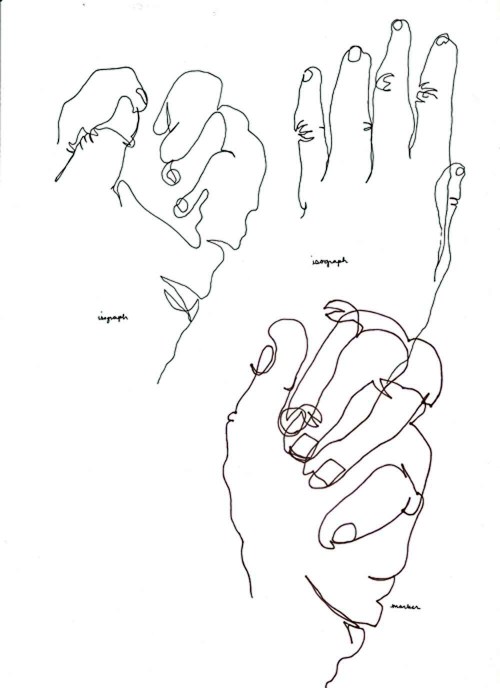
Ghadah Alkandari. Isograph and Marker. Hand Exercise from 'Drawing on the Right Side of the Brain' (Aug.2,2010)

Share

Read Full Post »


Reading Gemini. Half-Price Bookstore, Berkeley, California. Photography, June 28, 2010.

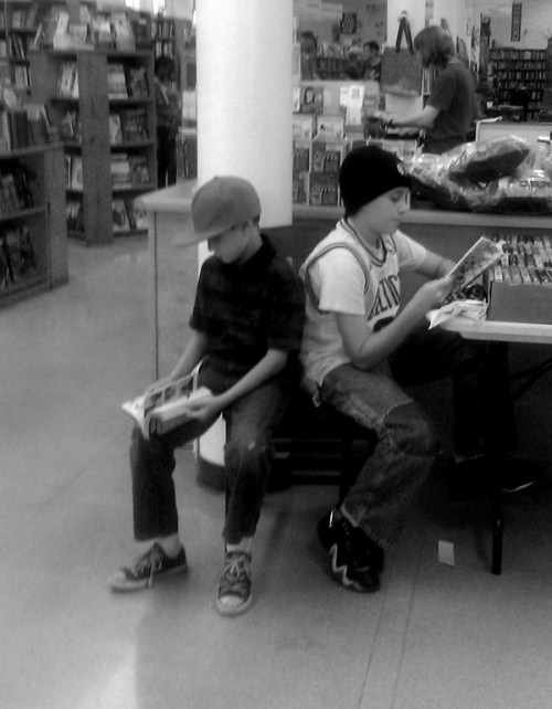
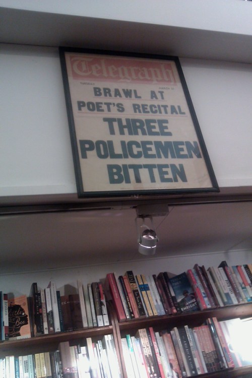
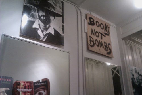
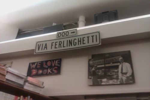
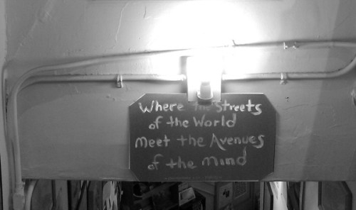
 All the following images have been taken at City Lights Booktore in North Beach (Little Italy) , San Francisco, on June 29, 2010. I dedicate this post to my dear English and Literature Professor at NDSU, Steve Ward. Long live The Beats.

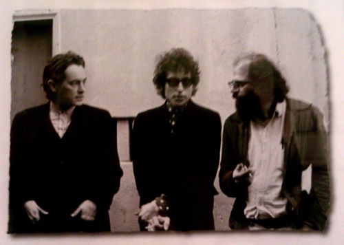
McClure, Bob Dylan and Allen Ginsburg at the last Beats gathering, 1965.Outside City Lights Bookstore, North Beach, San Francisco.

Read Full Post »

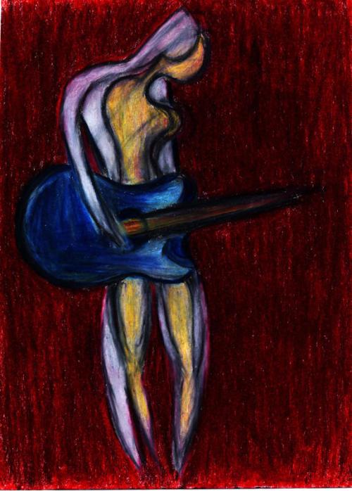
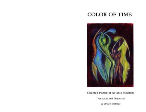
Playing the Muse by Bruce Matthes

Perhaps if we all had, every day, time for art and for poetry, just a daily dose, perhaps our lives would feel a little less hurried, a little less hectic, and time would slow down for that cup of tea in front of a vintage art book. Perhaps we could squeeze more out of our day by letting the mind lull a bit, recharge, empty itself so that we could squeeze more info, memories, ideas. How do we download the weight of each day, how do we discharge- our mind like a sieve- retaining only lessons that could benefit us, letting go of the inconsequential? Perhaps with few moments under the sun, or with nature, few breaths and a prayer.

Today I was listening to NPR and I heard a man say that it is the job of  human beings to learn to let go of large quantities, and hold on to the precious little.

Antonio Machado’s poetry, according to Antelitteram, evolved to acquire with time the personal aspects of reevaluation of time, nature and feelings, until it reachead a poetry influenced by a profound interest in philosophy.

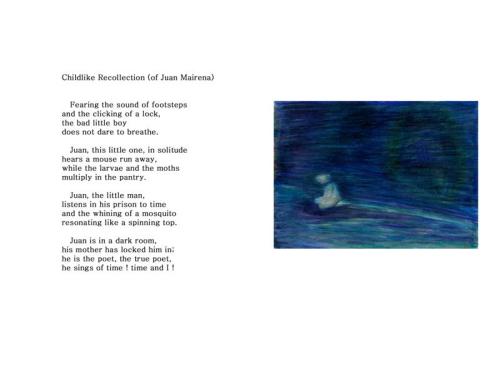
Bruce Matthes, a fellow artist and humanist , told me over coffee (what else?)  about his illustrations of Antonio Machado’s poetry.  I was immediately piqued, having completed a similar project- which I hope to share here soon. Bruce was kind enough to let me showcase his beautiful, lyrical work.

Click on each image to enlarge and read the poetry.

This slideshow requires JavaScript.

Read Full Post »

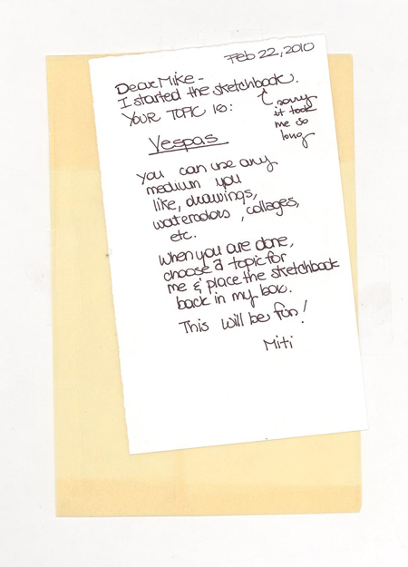
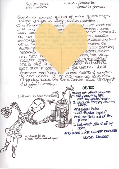
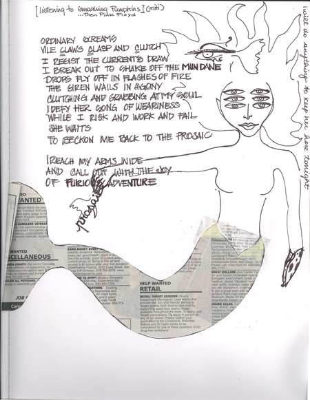
I started a new sketchbook exchange with Mike Riggin, a Teaching Assistant at my school.

My initial contribution: illustrating two of my friend Sarah‘s poems, and an origami heart– due to my recent infatuation with Between the Folds).


Also I must, must, must tell you about an art show that could have possibly changed my outlook on life, art, etc.

Tara Donovan, Untitled (Styrofoam Cups), 2008, Styrofoam cups, hot glue, dimensions variable. Artwork © Tara Donovan, Courtesy of the Artist and PaceWildenstein. Photo by Dennis Cowley.

One of the most mesmerizing collection of works  I have ever seen, Tara Donovan’s opus has left San Diego this past weekend, but I for one will find her wherever she will show next.  And don’t buy the book, or even look at my link, which is here for reference only.  No reproduction could ever even attempt to duplicate the sense of wonder experienced in front of one of her works. This is phenomenological art at its best, an art that cannot be reproduced, but must be experienced and uncovered tactically, body-in-the-room, primordially.

You can find a podcast that will guide you through her works here on Itunes. And, while you are there, you can check out Artists on Art.

The shock of understanding will rock you. You will see why Tara was awarded the 2008 MacArthur ‘genius’ award.

No virtuality , no screens.  How refreshing. Hers is one of the faces of Art, and I will refer to her, over and over, when I am asked :”What is Art”?

Art transcends the medium to achieve the sublime.


Read Full Post »

For many artists/designers endeavoring to build an online a presence, a blog is an incredible way to show up to their work and share new projects. Still, designing a high-quality blog and content is not enough. You have to get the word out ( is a blog still a blog if nobody reads it?)

So how can you make it inviting for people to visit your digital studio?

I believe a non-cluttered, restful design is key, for starters. My design zen inspiration is An Open [Sketch] book. Joining blog/aggregating communities such as networked blogs, technorati and notcot.org can bring like-minded people to your online home.  Also, blogging websites are full of advices on how to ‘get read’ (see ‘On Blogging’ on my blogroll).

In December, I designed my new business cards so I could share my online work and vision with artists and professionals I met  (do you like them? – ordered with Vista = very happy)

I also found a way to have a  digital V-Card as a gmail signature so that people could visit my art and architecture websites when I sent them an email- we will talk about this next.

But I believe the best way to reach out to people is to be an answer to their problem, i.e tutorials ( like I’m doing now…this is so meta). In other words, if you couldn’t find something online and had to build it yourself , save the struggle to other people and you will gain aficionados. In my case, I wanted to have a customized ‘Buy Me Coffee/Micro-Donation’ button for my WordPress blog, linked to Paypal, just in case someone wanted to take me out for coffee cause they loved my blog and art  so much:) A sort of digital tip jar.

What I found online did not fit my blog or design needs, and there were problems linking my button my free Paypal account. So i did a bit of code magic. I hope it helps you.

And if it does and you want to tip me…well… that would be just swell!

How to make a customized ‘Buy me Coffee’ Paypal micro-donation button


Premise:  You have a free PayPal (not-merchant) account, and a free WordPress.com blog.

Goal: You want to be able to place an attractive button where folks who enjoy your posts can drop couple of bucks to sustain your caffeine
addition (or other, who am I to judge?).

Problem:

A. You have tried to generate the button code from your Paypal account but, once it is placed in your blog, it does not link to your
Paypal donation page. You tried messing with the code, and it still doesn’t work.

B. You need help with placing your own image on the Paypal button, or with creating the button on WordPress.

Solution:

Well, I struggled so you don’t have to.

1.If you are here, I am assuming you have a blog.  If you don’t have one, go to wordpress.com and sign up for one. It is beyond the scope of this tutorial to enumerate the qualities of WordPress, but people who have shopped around invariably choose to host their [free] blog here. You will be well-cared for. For the WordPress.org [paid domain] folks, there is a Paypal plugin, so no need to go further.

2. After accessing your blog, sign up or sign on to your Paypal account. Look at the tabs on top of the page: under ‘Products and Services’, click ‘Website Payment Standards’

You will land on  ‘Website Payments Standards Overview’ >Payment Button tab.

Go to  ‘Accept donations anywhere on the web’ and click on ‘Create one now’

Fill out the fields (skip Step 2 and 3 unless you want to upgrade your PayPal account).     You can customize your button now, but you probably want to substitute the ‘donate’ image with something more appealing at a later time. I did not customize for this tutorial, and did not fill the ‘Company’ or ‘Donation ID’ fields.

When you are done, click ‘Create Button’ at the bottom of the page.

This will generate the button’s code. Remove ‘Code Protection’, on the top right of the box (very important) and click ‘Select Code’.

Copy (ctrl+c) the code. On your desktop, right-click anywhere, select ‘New’ and create a new text (.txt) document, or you can use your usual html editor as well. Paste (ctrl+v) the code.

You will get something like this (where the red X’s are your id numbers):

3. Normally you would now go to your WordPress blog dashboard, choose Widgets, drag a ‘Text- Arbitrary text or HTML” widget  to your sidebar  and and paste the above code to obtain a button. This time though, this would result in an empty field, and we need a workaround.

You will use the ‘Image-Display an image in your side bar’ Widget

Drag it in the sidebar and open it:

A. Widget Title: You can name your button ‘Donate’ or ‘Feed the Starving Artist’ etc.

B. In the ‘Image URL’  place the URL address of any  image that is hosted on image hosting websites such as Flickr, Photobucket etc.

(I always recommend hosting your own images). You can usually find this code under a ‘Share’ button by the hosted image in these sites.

The address will look something like this (where ‘yourhostingsite’ and ‘youraccountname’ are a substitute for your actual code):

http://i231.yourhostingsite.com/albums/ee231/youraccountname/7338fccb7887.jpg

C. In the ‘Link URL’ (where you want visitors to land when you click your button) you will paste this code, derived from the PayPal code above (with a sprinkle of magic).

https://www.paypal.com/cgi-bin/webscr?cmd=_donations&business=XXXXXXXXXXXXX

(the X’s are your ID code from the Paypal button code in Step 2)

Now we have the ‘ingredients’ for our customized button: an image hosted online, its address, and a link to your PayPal donation page.
I like to have the button centered, so I adjusted the size and justification of the widget until I was satisfied.

Be creative, you can design your button to include text and credit cards symbols, in a software such as Photoshop.

Hope you will enjoy your very own PayPal/Donations button and that this worked out for you!


Share

Read Full Post »

Happy San Valentino!

Here are some card designs I have been playing with, let me know if you would like a hi-res version, and  which one I should put in my future etsy print shop.

Finally, I have been listening to my Buddha Bar CD’s today, and in Buddha Bar II there is a Rumi poem recited by Deepak Chopra and Demi Moore, set to beautiful, haunting music. If you are interested in the CD, here you go. Here is the text, and may all your days, like this one, be filled with love.

A lover knows only humility,
He has no choice.
He steals into your alley at night,
He has no choice.
He longs to kiss every lock of your hair,
Don’t fret,
He has no choice.
In his frenzied love for you,
He longs to break the chains of his imprisonment,
He has no choice.

A lover asked his beloved,
“Do you love yourself more than you love me?”
And the loved replied:
“I have died to myself and I live for you,
I’ve disappeared from myself and my attributes,
I am present only for you.
I have forgotten all my learnings,
But from knowing you I have become a scholar.
I have lost all my strength,
But from your power I am able.
I love myself,
I love you.
I love you,
I love myself.”

I am your lover,
Come to my side,
I will open the gate to your love.
Come settle with me,
Let us be neighbors in the stars.
You have been hiding so long,
Endlessly drifting in the sea of my love.
Even so, you have always been connected to me.
Concealed, revealed, in the norm, in the un-manifest.
I am life itself.
You have been a prisoner of a little pond,
I am the ocean and it’s turbulent flood.
Come merge with me.
Leave this world behind us.
Be with me,
I will open the gate to your love.

I desire you more than food or drink.
My body, my senses, my mind,
Hunger for your taste.
I can sense your presense in my heart.
Although you belong to all the world,
I wait in silent passion,
For one guesture, one glance.

Rumi


Rumi’s words are often mysterious, yet often refer to his personal search and passionate, intimate connection with the Divine Presence within.

(via enlightenedbeings.com )


From: Love: The Joy that Wounds. Love poems by Rumi

PREFACE BY
Jean Claude Carriere

CALLIGRAPHY BY
Lassaâd Metoui

Everything – strength, joy and knowledge – comes to us through love.
Love burns and devours, love destroys life and it gives life.
Love is both secretive and revelatory.
This is how it was for Jelalaldin Rumi, the thirteenth-century Persian
poet, grand master of the Sufi tradition and founder of the brotherhood
of Whirling Dervishes.
Born in what is now Afghanistan, then settling in Konya, in Turkey,
shielded from the invading Mongol hordes, he was a venerated teacher,
an unrivalled scholar. People from everywhere came to listen to him.
Then one day he met a wandering dervish, a man who was very
sensitive to the cold, and older than Rumi was. He spoke in riddles,
was insolent and irritable, and his name was Shams al-Din of Tabriz.
Love blossomed between the two men. They stayed together, locked
away, for forty days and forty nights.
When they went their separate ways, Rumi was no longer the
academic whom everyone had known. He danced, laughed, made up
poems. He had been illuminated, as though from within.
In a lightning flash he had become a poet.
And for the rest of his days, he forgot his professorial chair and his
teaching, and, instead, sang of this metamorphosis to the whole world,
with unforgettable elan.
In all he wrote some 50,000 lines of poetry, much of it collected
together in The Book of Shams al-Din of Tabriz and in the Masnari, two
jewels in the world’s history of poetry.
Love is a grace, Rumi tells us over and over. It is a fire, it is
intoxication, an unceasing turning, a breath from heaven. It is a way
for all lost people and a cure for every fever.
And love is limitless, for it excludes nothing and no one. Here, lovers
are not alone in the world.
Quite the opposite. To love someone is to love the whole world.
Jean-Claude Carrière

The following poems were written by Jelaluddin Rumi in the 13th Century A.D.  His words are often mysterious, yet often refer to his personal search and passionate, intimate connection with the Divine Presence within.

The following poems were written by Jelaluddin Rumi in the 13th Century A.D.  His words are often mysterious, yet often refer to his personal search and passionate, intimate connection with the Divine Presence within.

Share

Read Full Post »

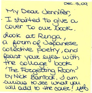
Do you remember this, my sketchbook exchange with Jennifer of Habit of Design?

I actually completed my ‘project’ last week, but wanted to wait till Jennifer received my sketchbook by mail so not to spoil the surprise!

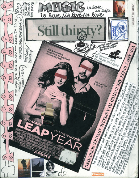
The cover, before and after….. (yes I was not authorized to operate on the sketchbook cover…I did it anyway):

A blank sketchbook cover...an invitation to mischief!

Front Cover- inspired by various things among whom (is this how you say it?) Death in Venice

Back cover

And who knows what it might turn thanks to this. (More on Renga)

I know, I am so demanding.

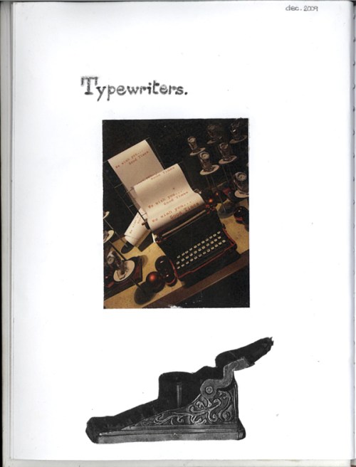
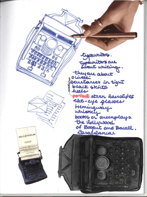
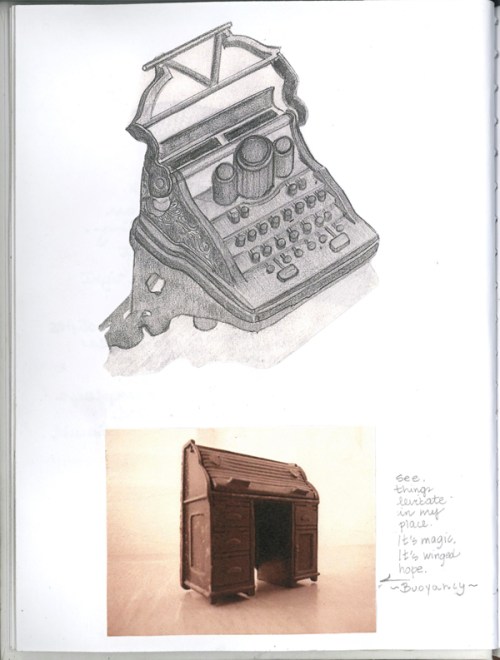
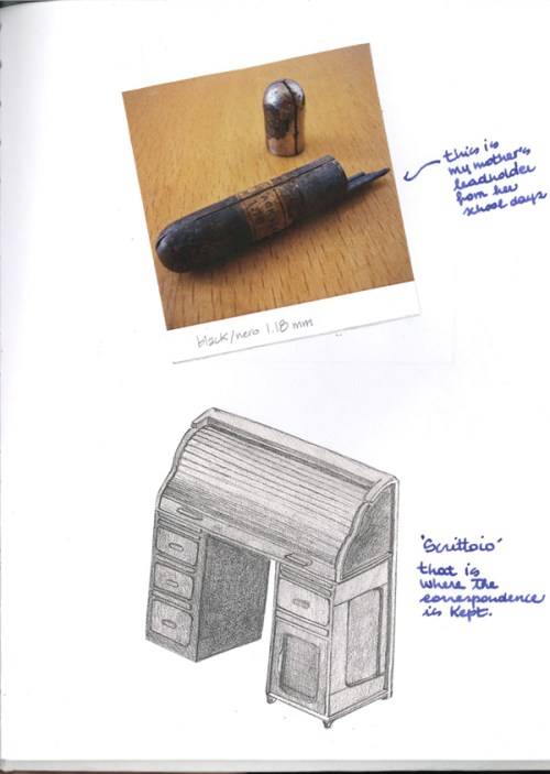
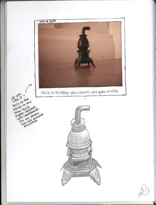
SO my assigment was Typewriters… Yes, these are all my drawings and photos! What do you think?

Typewriters - Page 1

Typewriters - Page 2...and that's why my fountain pen matters.

Typewriters - Page 3

Typewriters - Page 4

Typewriters - Page 5

This was a wonderful experience- to be soon repeated.

Thank you Jennifer for the Brilliant idea!

I have to thank Professor Booker…Back in my Undergraduate days @ NDSU, he introduced us to Renga Arts and the stunning, surreal, Moorish-inspired “Forgetting Room’ by Nick Bantock.

About Renga and Renga art…[and here it’s to future Renga poetry and art collaborations]

Renga Platform Contemporary forms of Renga in the UK
Renga Arts Functional Art.
Renga @ Wordshop.com (love the name! and yes, it does take two to renga)


Share

Read Full Post »


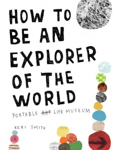
This book awoke all senses in me. 

Keri smith possesses a truly remarkable voice; she embodies that Fellini quote:


Put yourself into life and never lose your openness,      your childish enthusiasm throughout the journey that is life, and things will come your way.

Federico Fellini

Take a peak of the book here and check out Wish Jar, the blog of Keri Smith.

Share

Read Full Post »

Ink on Paper (original). November 2009


Influenced by my new find, Applied Arts – Canada’s Visual Communication Magazine I wanted to try my hand at product placing, color iterations and offsetting, a great Photoshop tool that I am sure all of you in Graphic and Interior Design know and love, but that is seldom used in Architecture applications (we specialize in skies, people and -yawn- cars).

The issue I perused was all about the winners of Canadian print, media and radio ads. This territory is completely new to me, but was fun to explore, in a sort of ‘provocative foreign art gallery’ kind of way. The creativity and innovation out there is astounding.  Some of these advert are pure genius. Go Canada!

So here are some things that definitely piqued my interest:

1. Insane Spots (for you yankees, ads) for Milk:
These are short (sometimes micro), irreverent and bizarre videos on the virtues of milk, each shot with a different animation technique and visual style. You can find them here and here.
Personally, i prefer soy milk, but wanted to share the artistic innovation.

2. Provocative campaigns
     I looove these ads:

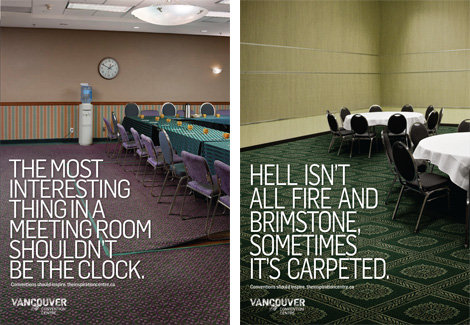
Campaign for the new Vancouver Convention Center. Images via http://www.underconsideration.com, and created by ddbcanada.com

I loathe thee, carpet! 

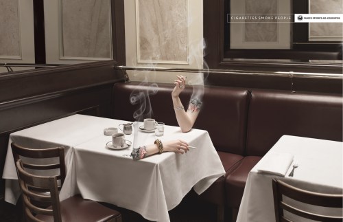
Cigarettes always win, in fact, "cigarettes smoke people". Campaign for the Canadian Cancer Patients Aid Association, created by bleublancrouge.ca

Cigarettes Smoke People II


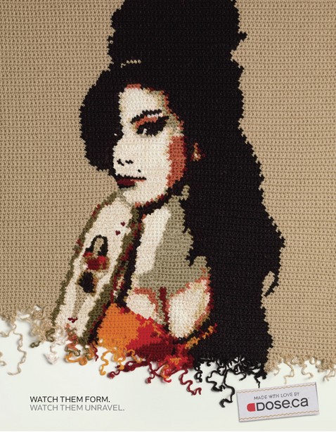
Amy Winehouse en crochet. Dose. ca campaign by rethinkcommunication, image via their website

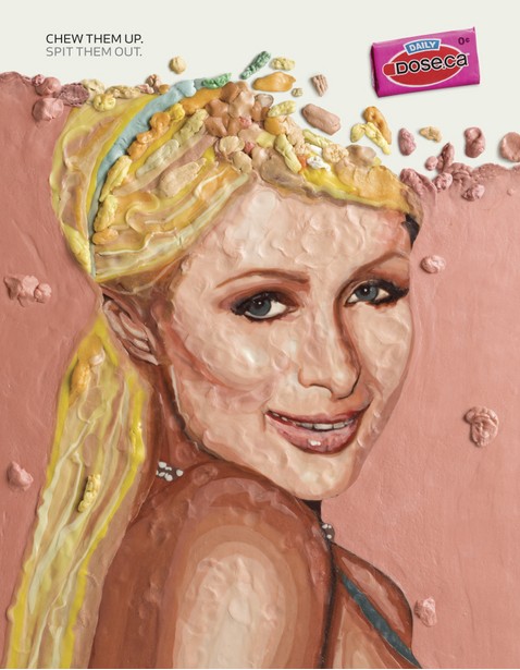
Paris Hilton made of chewing gum. Dose. ca campaign by rethinkcommunication, image via their website

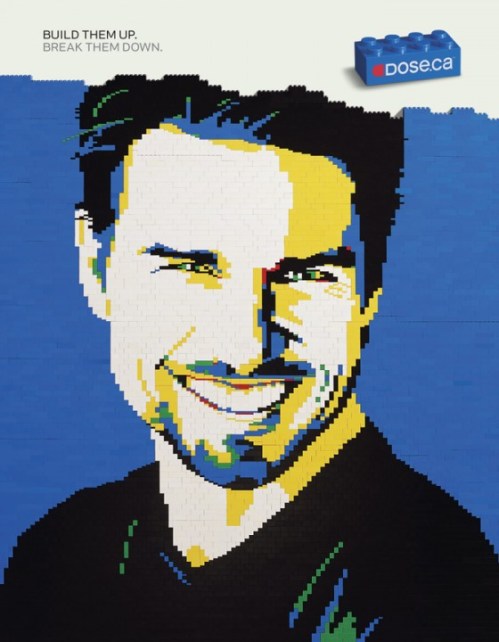
Lego Tom. Dose. ca campaign by rethinkcommunication, image via stillad.com

For a great commentary on this campaign, read here

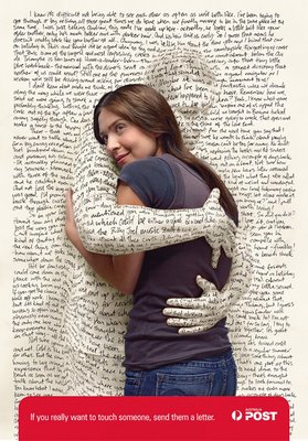
And lastly, this ad which I stumbled upon- a very dear message to me –as a lover of letters, books and all things paper.

Campaign By the Australian Post, by Saatchi Melbourne. Image via pixelpastahome.blogspot.com

It says “If you really want to touch someone, send them a letter.”

I am actually sending a letter to my mamma sunday, with some of my art, since she never saw my blog – and probably never will. She doesn’t have a computer and loathes the internet.  She does however, prefer texts to phone calls.  Please, Santa Web, come to my mother’s house!

Read Full Post »
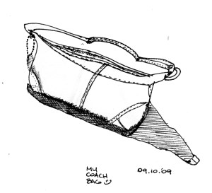
artistpouch_small

HAVE YOU SEEN ME?

I‘m back.

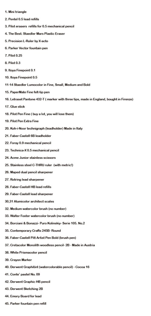
I have been asked to write a post on my sketching tools, and it took a while to organize my ‘shooting session’.
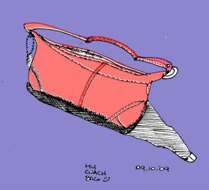
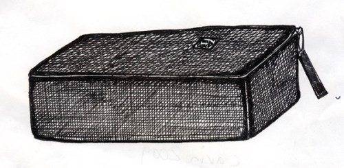
Also, less than ten days ago, the unthinkable happened: my artist pouch went missing.  This was followed by a period of ‘mourning’ and this drawing to put on a sign (yes, I am crazy like this- especially about my art instruments).

Thanks be to God I found my art pouch, but only after compiling a detailed list of its contents and extensive research to replace everything (yes, I know, very OCD of me). I also found out I am carrying quite a treasure.

So here is my post on my art pouch and its contents, and a celebration for things found! Yay!

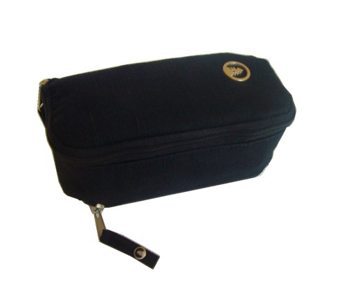
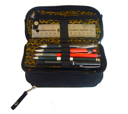
The inner zipper is great to keep eraser, mini-scales, lead refills and small objects safe from graphite. The writing instruments here are the ones used most often.

pouch_side_small

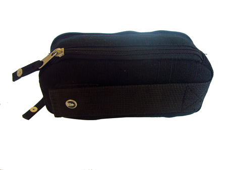
The side zipper is great to keep extra Pilot pens and my Parker fountain pen. The case has a velcro strap plus snap button for safety, it can be worn on a belt, attached to a bike etc. On the far side a beautiful detail: a small red bead, reminiscent of Andean artifacts.

I found this perfect pouch/pencilcase at Whole Foods (of all places). It is made by Livity Outernational. You can find it in their store (it is the Rip-Tide, Hemp Organic Cotton Canvas Pencil Case).

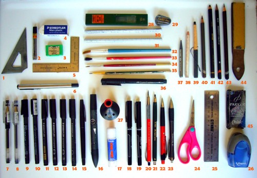
So here all my instruments, ink, graphite, brushes for spontaneous coffee watercolors and scissors/glue for impromptu collages. And yes, they all fit in the pouch pictured above.

sketcheressential_small

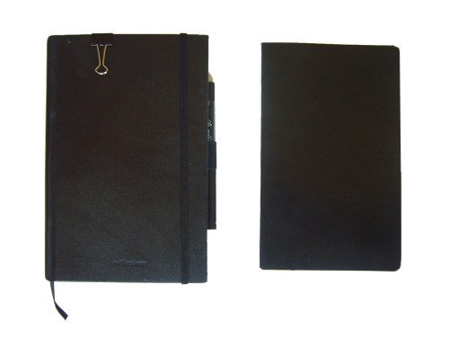
As for  sketchbook(s), here is what I carry with me everywhere I go (one tucked inside the other):

sketchbooks

Reflexions Medium Sketchbook and Moleskine Notebook (made by modo&modo in Italy)

I try to use the notebook for lists and to-do’s, and keep the sketchbook for sketches (all that you have seen lately here in the blog) writings and quotes. It has not quite worked that way, and I am almost done with the sketchbook. We’ll see with the next one.

As it usually happens, while composing this post, i stumbled upon fascinating websites for fellow lovers of writing instruments and cases.

Here they are:
Leadholder– if you love drafting pencils, you have to see this.

Parker Pens

Eco-friendly hipster laptop bags

Well enjoy, hope this inspired you to go out and do Art ! Oh, more on this and on my favorite book soon!

Share

Read Full Post »
So , I have been busy doing some art here

This the bounty I received by mail this week!

1.  A wonderful watercolor postcard from my blog/artsister Ghadah, especially made for me!

Mara by Ghadah Alkandari

Mara by Ghadah Alkandari

2.  A new sketchbook (and drawing project) from Jennifer at  habitofdesign.blogspot.com.

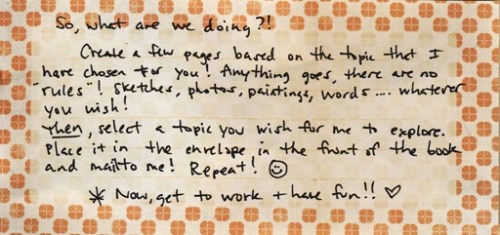
Jennifer has started a wonderful project called ‘ A Study In…’ This is a sketchbook exchange where two artist pick a topic for each other -to fill few pages of the sketchbook, and send the work back and forth.  Jennifer started with ‘Trees” and below you see what she chose for me (so excited!)

Jennifer's Package for Yours Truly.

A new SKetchbook. Tabula Rasa!

A new Sketchbook. Tabula Rasa!

The Instructions.

The Instructions.

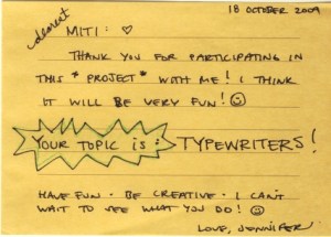
Jennifer chose this topic for me : Typewriters. Guess I am going to research that next...and I DO love them!

Jennifer chose this topic for me : Typewriters. Guess I am going to research that next...and I DO love them!

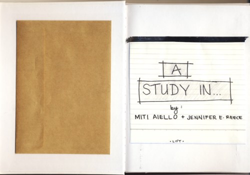
The beginning of "A Study In..' Project Designed by Jennifer Reece

The beginning of "A Study In..' Project Designed by Jennifer Reece


Share

Read Full Post »

Card Design 1 of 7- Fall 2009

Card Design 1 of 7- Fall 2009

I am always happy if my internet connection goes down for a bit. It is the time I can then dedicate myself to catching up with my offline (old school) reading. Books, magazines, San Diego weeklies…. things I find in the most disparate places.

I am an unapologetically omnivorous reader and that, combined with a respect for the written word I have inherited from my mother, results in knowing a bit about everything and being at constant risk of  being overwhelmed by paper at all times.

Well, the past few days i have had intermittent connection, and that combined with a very ambitious redesign of my little place and general reorganizing and putting away of things, plus the getting ready for the new school year  means that today I am definitely  stealing time and burning the candle at both ends– and putting up two posts that have been simmering for a week.

Being plugged into art and writing means that sometimes art just must BE, that is, I have been immersing myself in design inspiration (see the augmented blogrolls and site freshening up/networking!!) and seeing the amazing amount of creative output these talented souls put out almost daily inspired me so much to claim the time to post new discoveries, and sketch, and share.

In my dreams I would have time to be like a professional blogger and post everyday or at least every other day, but the reality is that writing needs time, and if I want to be more prolific, I ought to start alternating written pieces with art, and do I have lot ready to share (in my famous digital trunk).  Geez, I don’t want to sound like Julie from Julie and Julia, I am not cooking elaborate french recipes and waking up at five in the morning to post the daily progress . Clearing actual and digital clutter, ‘feng-shui’ing’  life to make ways to creative endeavours is invisible labor, but of immense consequence.

It seems like the work never gets done, and that one could always do more, or  re-do things using a finer comb, or to greater degree of perfection.  See, here is where my mom comes in with her ‘il meglio e’ cattivo del bene’ or ‘better is enemy of good enough’. I tend to perfectionism, and sometimes at results in over-ambitiousness. Hence, the effectiveness blogroll for inspiration!

I am aiming to making this website, my digital live-work loft, more inviting, more connected, like Making it Lovely , and that meant coding and learning a bunch of new stuff- like subscribing to networkedblogs- thanks for ALL the views :)! All of that was worth it (i have been a busy little bee since the last post) because the fans and subscribers and have been growing and I can only hope a year from now to be where my Design Inspiration gurus are.

Thank you for all the support!

Personal success has nothing to do with ordering others, but is a matter of ordering oneself. Nobility has nothing to do with power and rank, but is a matter of self-realization. Attain self-realization and the whole world is found in the self.
Happiness has nothing to do with outward wealth and status, but is a matter of inner harmony.”

Wentzu, Verse 4


Share

Read Full Post »
Paper Goods

I have returned from San Francisco with lots of paper goods (my favorite addiction), and found a gem of a store there:

Ever since I was little, writing instruments and surfaces proved irresistible to me.  My mother, a lawyer, was in charge of an office and, of course, its office supply closet was my favorite playground.  I looove folders and ‘things to put/organize things in’.  Consequently, The Container Store is a place best for me to avoid.

In comes Mai-Do .  I spotted this quaint store  from the other side of the Westfield gallery (by Union Square) and even though I had no idea what it was, I could smell trouble.

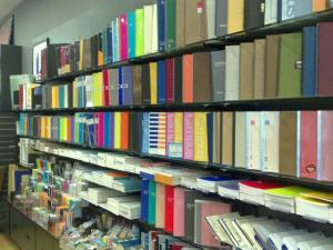
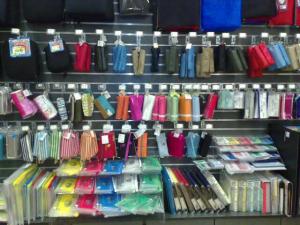
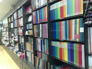
Here are some photos of the incredible selections of folders at Mai-Do (every color imaginable).

011020092670110200926801102009270

And did I mention the pens? Did I mention the …ehm…notebooks?

Everything in this store appears to be carefully handpicked and designed to be lethal to the incorregible paper addict (quoi? moi?).

I am beginning to think Stephen King’s ‘Precious Things’ was modeled after Mai-Do.

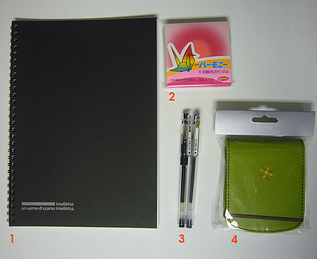
To wit below the spoils:

MaiDo_numbers_small

1. Thin Notebook by Apica. Made in Japan (of course!)

2. Origami Paper

3. Hi.Tec.C Pens 0.25 (a size next to impossible to find) and 0.3 by Pilot

4. Post-It holder by Sacchi

What a delicious place. A true feast for the eyes (and hands- of course I had to touch and open everything).

This store  reminded me of one of my favorit-est places in the world, Muji, and to never, ever–for any reason– go to Japan or Singapore:  death by paper surely awaits me there.  At the end of my visit I got a small Mai-Do card with four stamps, and, after it’s filled, it’s good for a discount at the store.  Something tells me I will be back.


I couldn't find my card, so the wonderful people at Maido sent me another.

I couldn't find my card, so the wonderful people at Maido sent me another.


maidocard2_small_web

Even the stamp are design well thought-out.


maido_small

Read Full Post »
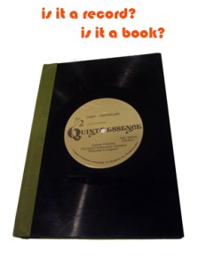
I found my next sketchbook. And it literally sings.

lpbook_small copy_text

Michael Roger Press sketchbook. Cover made from recycled LP record

How cool is that? What a great idea for recycling.
It makes me feel so green 🙂

The sketchbook is by Michael Roger Press, Made in California. I found it at Urban Outfitters in Berkeley. The great thing about these sketchbooks- and the winning part of the concept- is that each one is unique. I love the title of my LP-book : Quintessence.

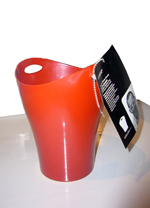
A mission to locate the inexplicably hard-to-find [in Berkeley] Pilot pens took me to the UC Berkeley ‘Cal’ Bookstore. I was amazed by the amount of very design-y, very chic offerings there. Obviously, some discerning buyers at work, for the college student who will not be wont for nothing. I thought of my days at North Dakota State, and our Varsity store. Well, we might have had the NDSU-emblazoned apparel and mugs but, no, we sure didn’t have the Garbini

Garbini_small

Brought to you from the formidable Karim Rashid, the one and the same who brought design to the masses at ‘Tarjet’. I love my Garbini, but more than that I love saying ‘Garbini by Karim Rashid’.

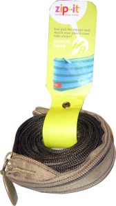
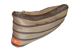
And last but not least, the one gratuitous purchase (but oh-so-cool) : the pencilcase made of zippers.
zipper_small

zippercasesmall

My mom has been sewing all her life , why didn’t she think of that? So here you see my new, nth pencil case ( I collect them so when I am really old my whole life will be organized in pencilcases with different labels). Here you see the zippercase in its original position and then ‘deployed’.

Until next time. The shopping window has closed for now lest this become a treacherous path (how many of us bloggers buy so we can post? study ‘the show and tell factor’ in consumer culture….). I can see the danger lurking. More art soon!

Read Full Post »