Feeds:
Posts
Comments

Archive for the ‘Design’ Category

img_1436

The French poet Paul Valéry said that all things are generated from an interruption. I learned this from my favorite Italian thinker, Alessandro Baricco, here in en español, whose lectures – to be found only in Italian – I listen to to learn about literature, writing, and life.

There were many interruptions this year, and not just personal. I can think of the devastating Hurricane Irma in my beloved, beautiful Puerto Rico, or the September 19 earthquake in my favorite city this side of the Atlantic, Ciudad De México – which occurred on the 32nd Anniversary of an earthquake that killed more that 10.000 people.

My personal earthquake and hurricane happened on August 21 of this year, when my dad passed away. I can now finally begin to write this sentence, and about it, without being swallowed up in the chasm that this loss left in my life. I know his spirit went back to his sea, where he returned, and I feel he is near, both inside my heart and dancing around in freedom and light. I like to think I can take him with me wherever I go now, and share my life in a more immediate way. I like to think his energy was transformed into waves of the sea. The sea can hug you, yet you can’t hug the sea, his immensity. I like to think he is in a butterfly, sometimes in a song. A friend of mine wrote “I heard your dad went back to the Universe”. I like that.

My dad loved the Old Man and The Sea, drawing boats and fish, Jonathan Seagull, reading, Venice, watching documentaries on nature, fishing, and working on his boat. He loved his friends and he loved me. He is the reason art is in my life. He is the reason I read One Hundred Years of Solitude in middle school (I used to raid the books of his youth unbeknownst to both my parents). It became my favorite book, it still is, and magical realism, anarchy and arcane literary worlds shaped who I am.

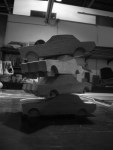
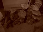
I thought about coming back to SketchBloom with a post on Van Gogh, and the film Loving Vincent, which I saw this month. The movie reminded me of my dad, of his love of painting, his simple bedroom , and his fisherman shack on the beach, La Baracca Del Bucaniere, which he lovely composed for the last ten years of his life here on the Earth school.

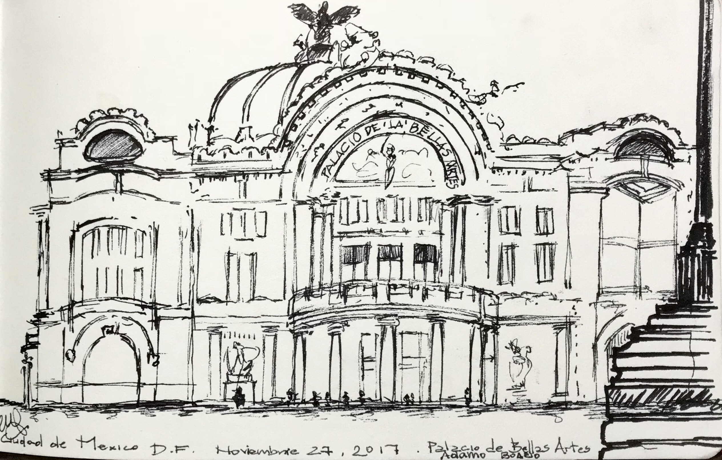
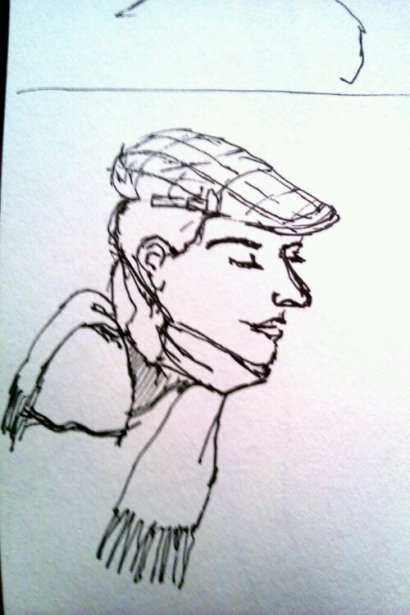
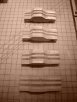
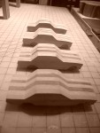
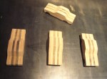
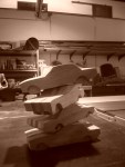
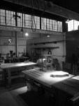
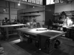
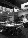
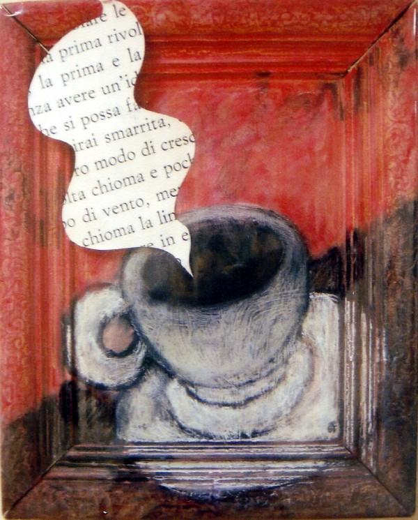
That post is in the pipeline, and I took new photos of his sculpture when I was last in Calabria –  but I wanted to return with a sketch, a return to art.

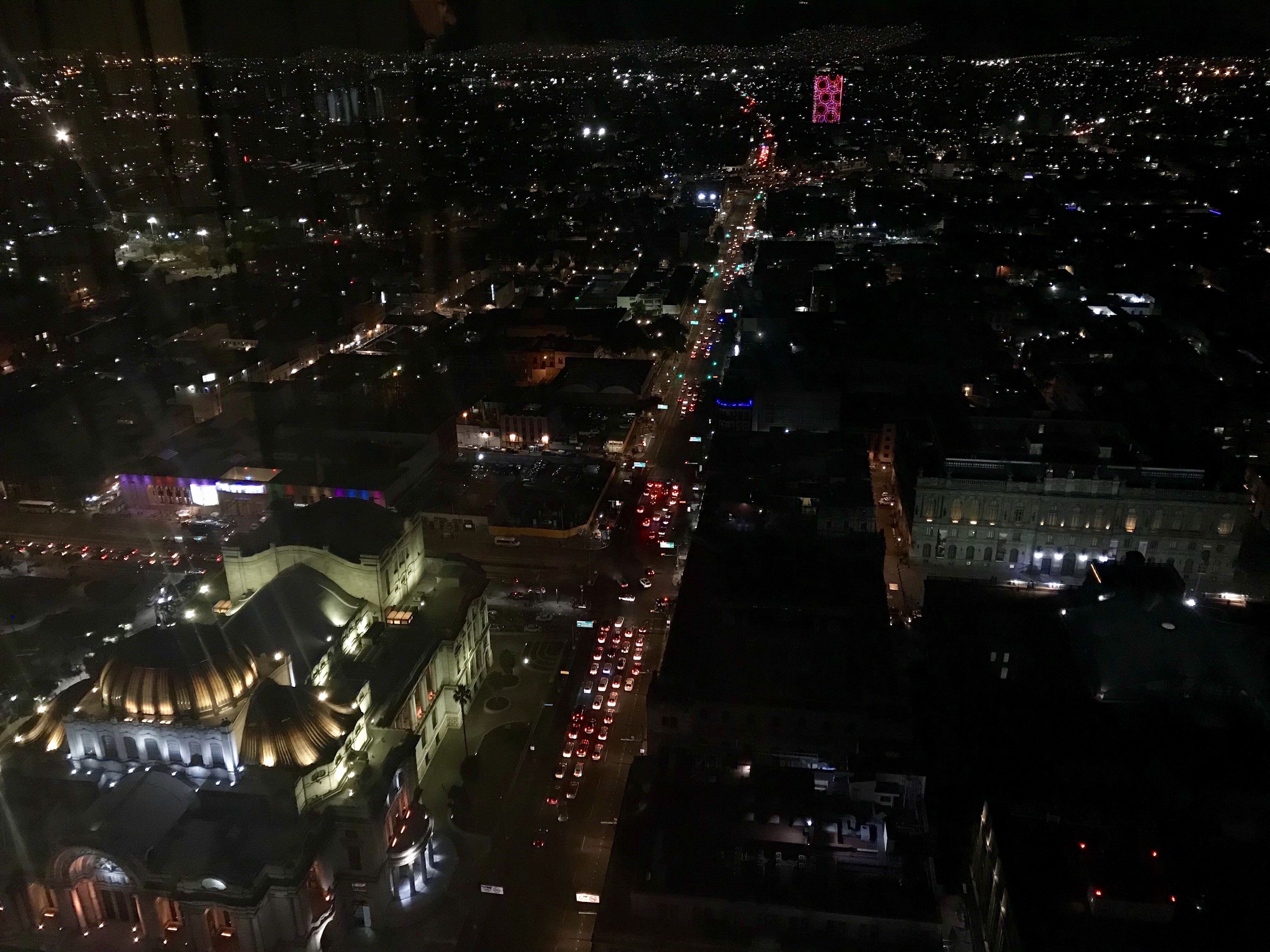
I just got back from Mexico (that is how the locals call it, Mexico…no need to use “Ciudad de”) yesterday, where I finally got over my protracted artist’s block.

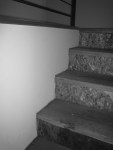
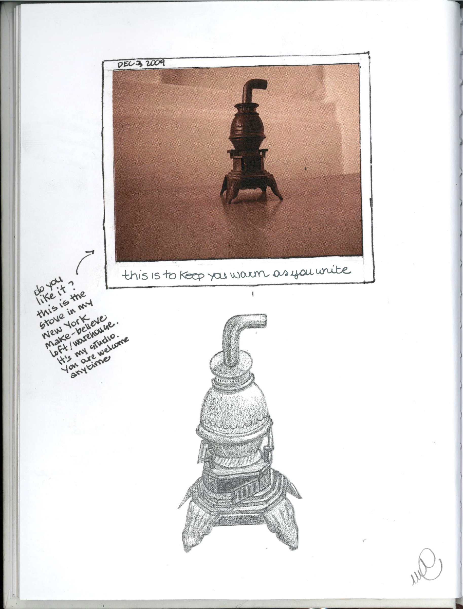
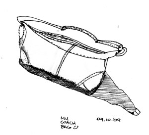
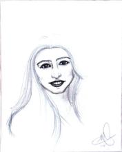
Here, a simple sketch (above) and some photos/vignettes/stories I bring back from my trip.

Walking in Coyoacán – Frida’s neighborhood:

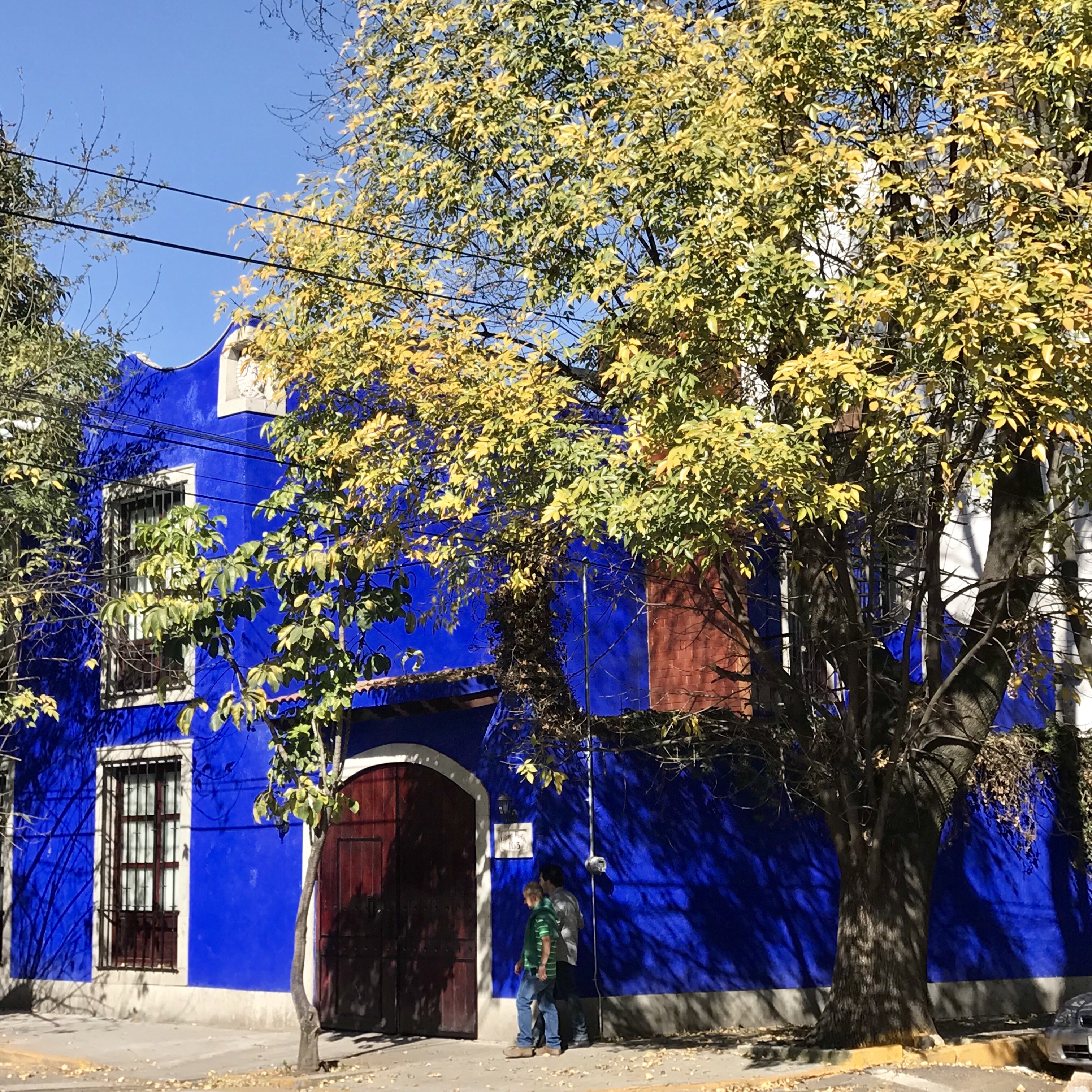
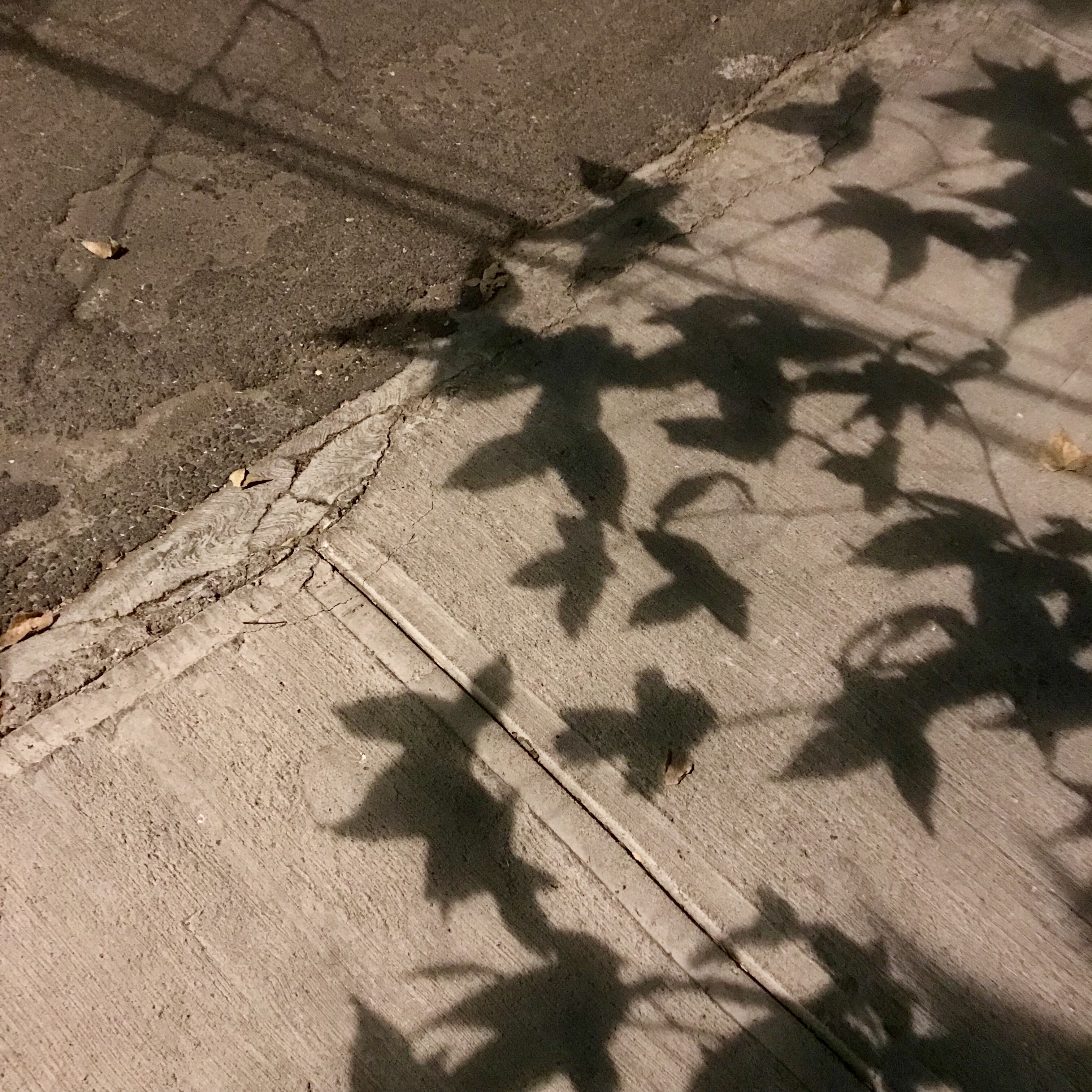
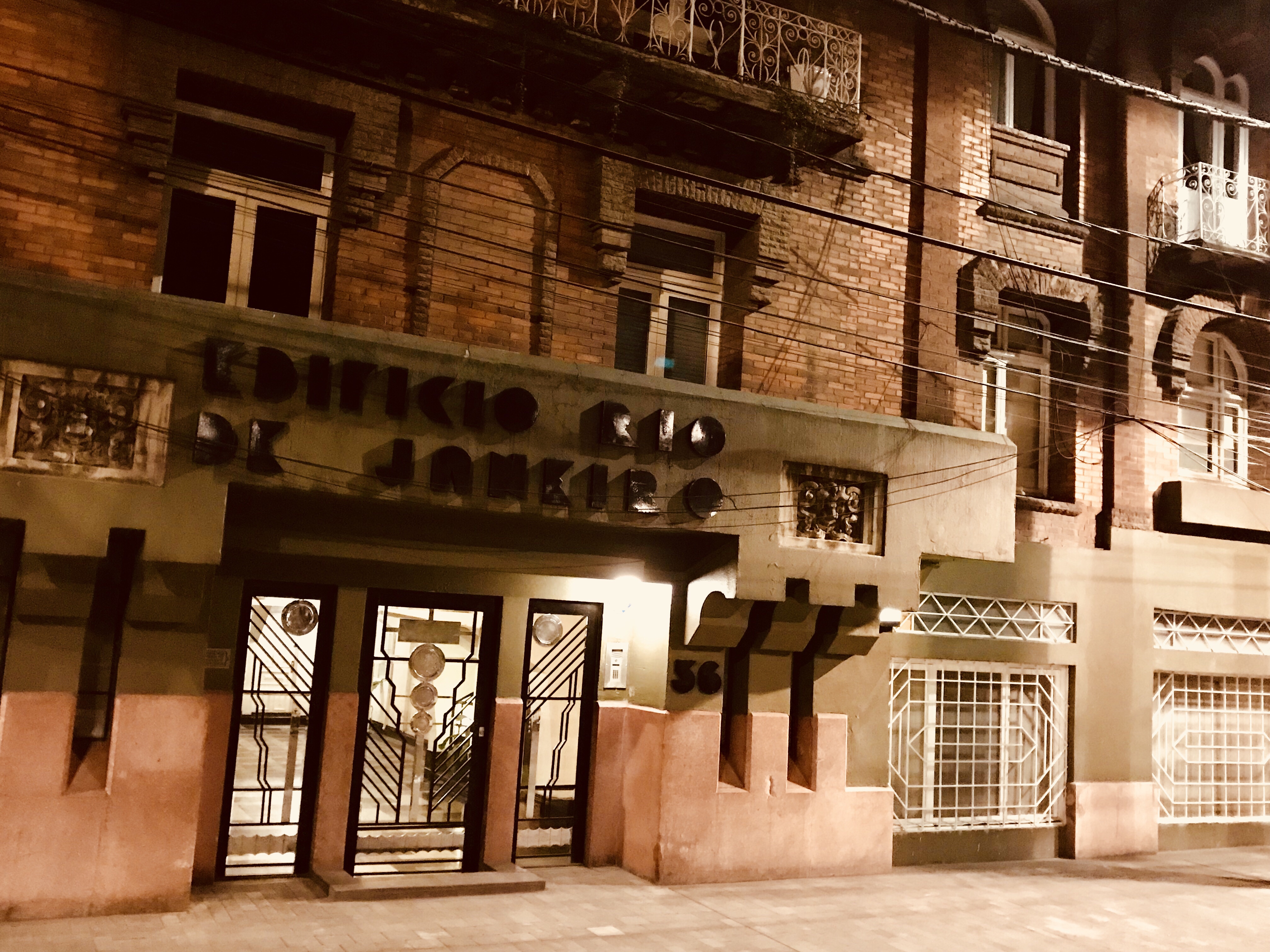
Scenes from Roma, one of the neighborhoods of DF:

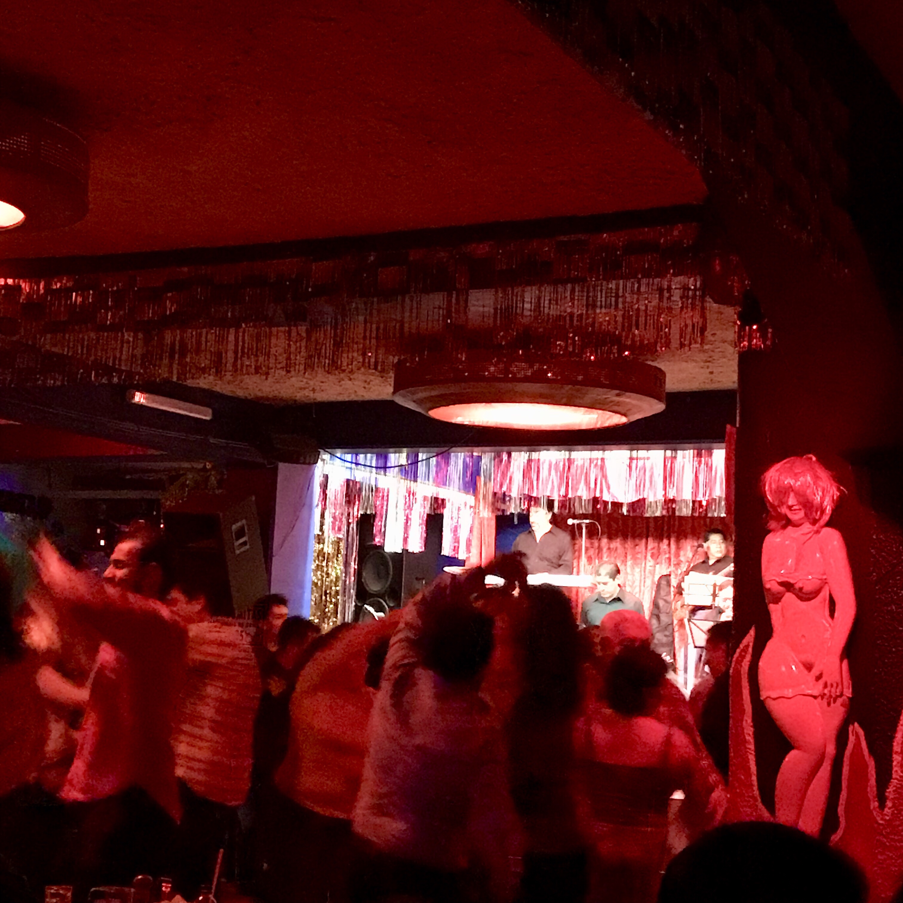
This is Barba Azul, a cabaret from another era, where salsa is danced from midnight till dawn, where there is an altar upstairs (I have seen them in parking lots, too) and where the exit is a tiny rectangle carved into a decorated garage door- something out Pinocchio’s Paese dei Balocchi (toyland)…or a circus in a Fellini movie. One of the many surreal vignettes of this metropolis.

Unfortunately I could not take a better photo of it (with the usher emerging!) but it is on my list for next time. I also learned about the ficheras , the ladies of the establishment who sell a dance for a token (and more, at their discretion).

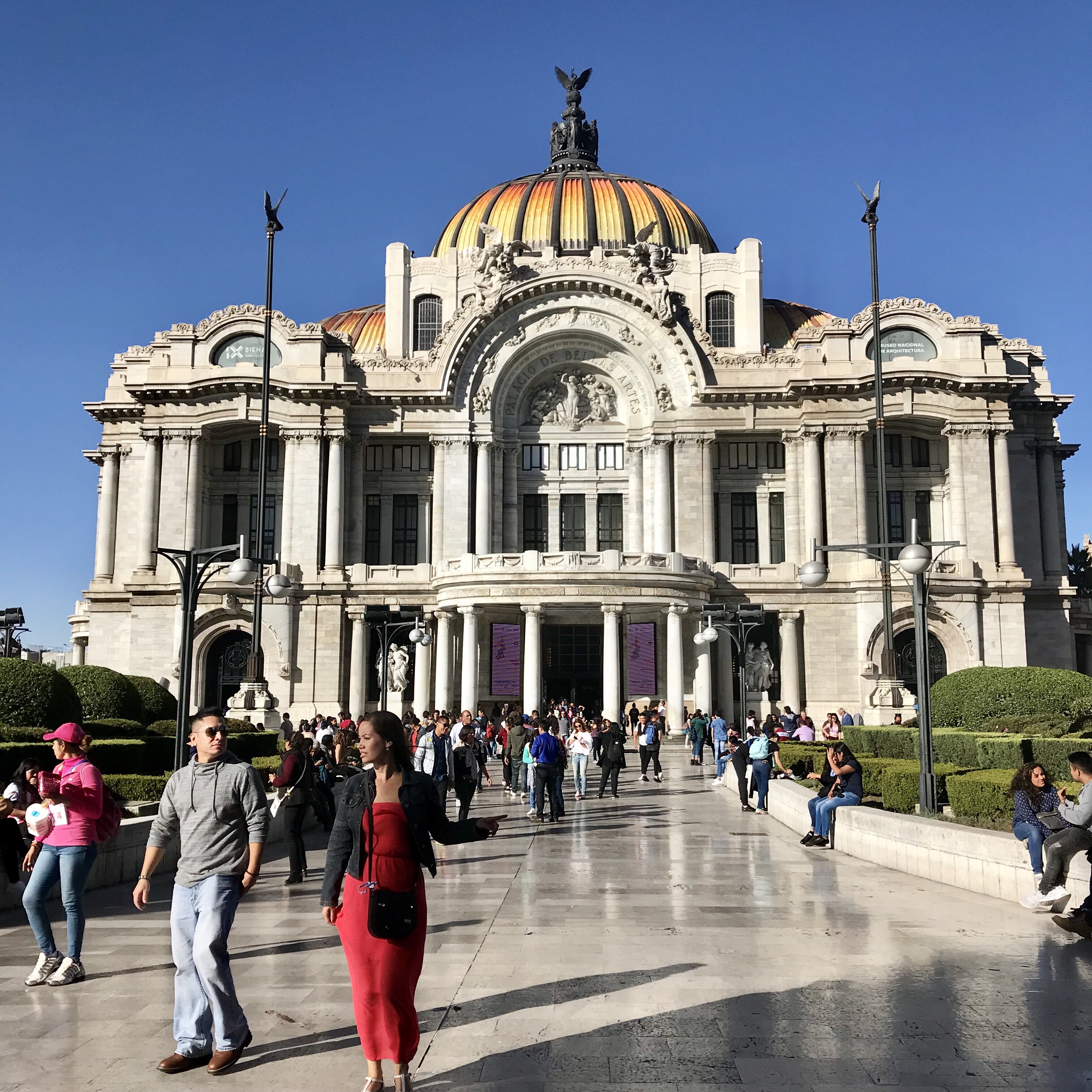
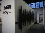
The obligatory photo of the Palacio De Bellas Artes, November 2017 version:

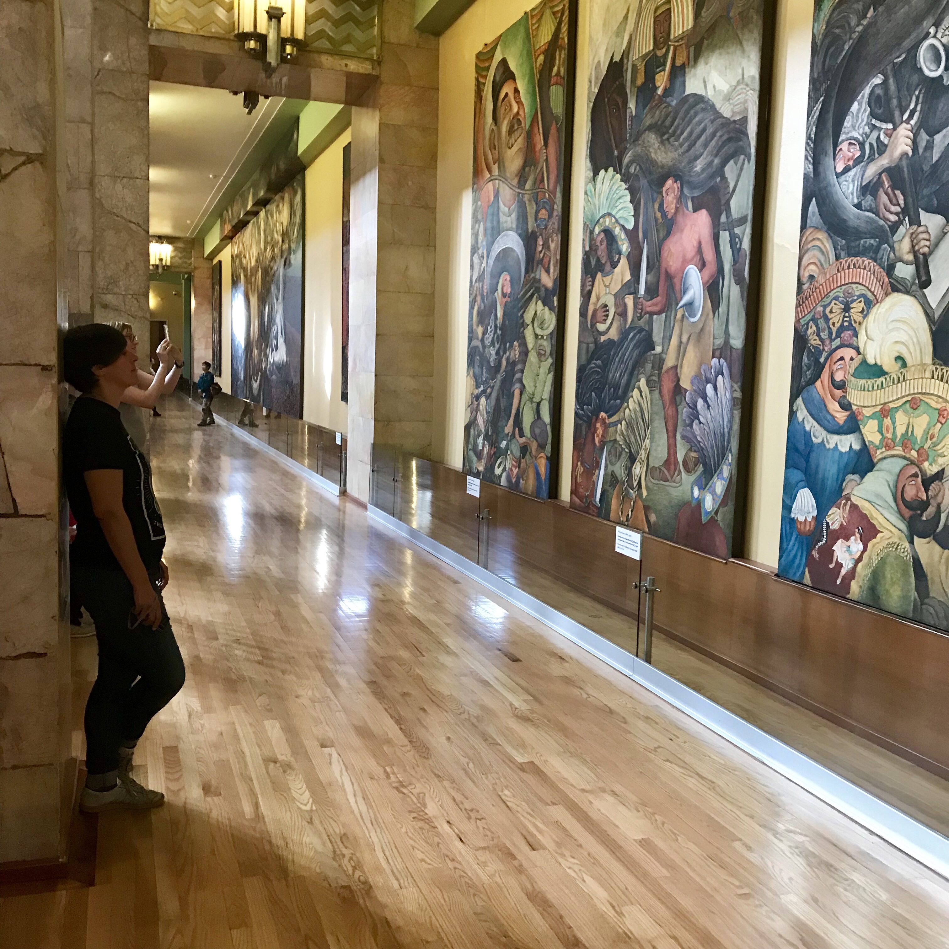
Where I had the chance to see Diego Rivera’s murals…

…and learn about the Rojo Mexicano (the red pigment from cochinilla bugs found inside the cactus fruits in Oaxaca, which was utilized in paintings around the world from the XV Century to the XIX) and see Van Gogh’s Bedroom At Arles with my own eyes (!!!).

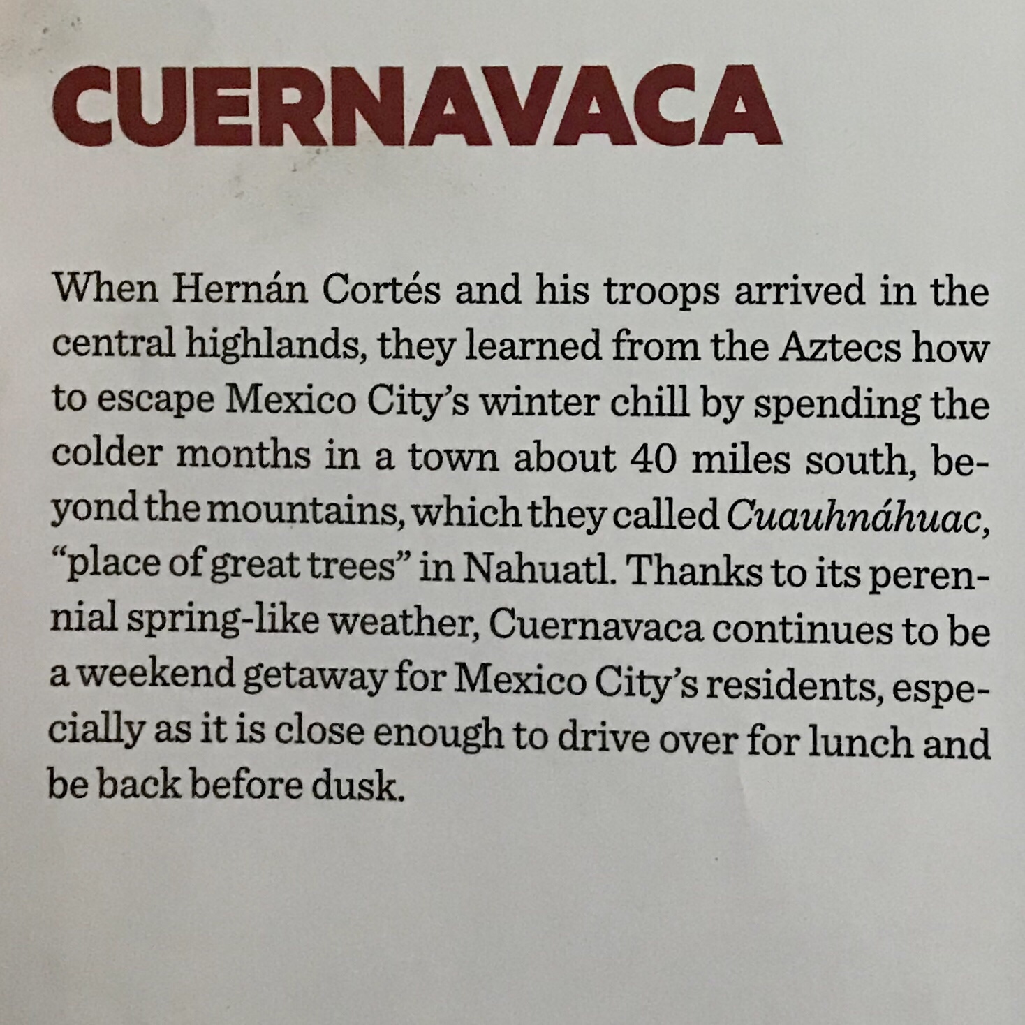
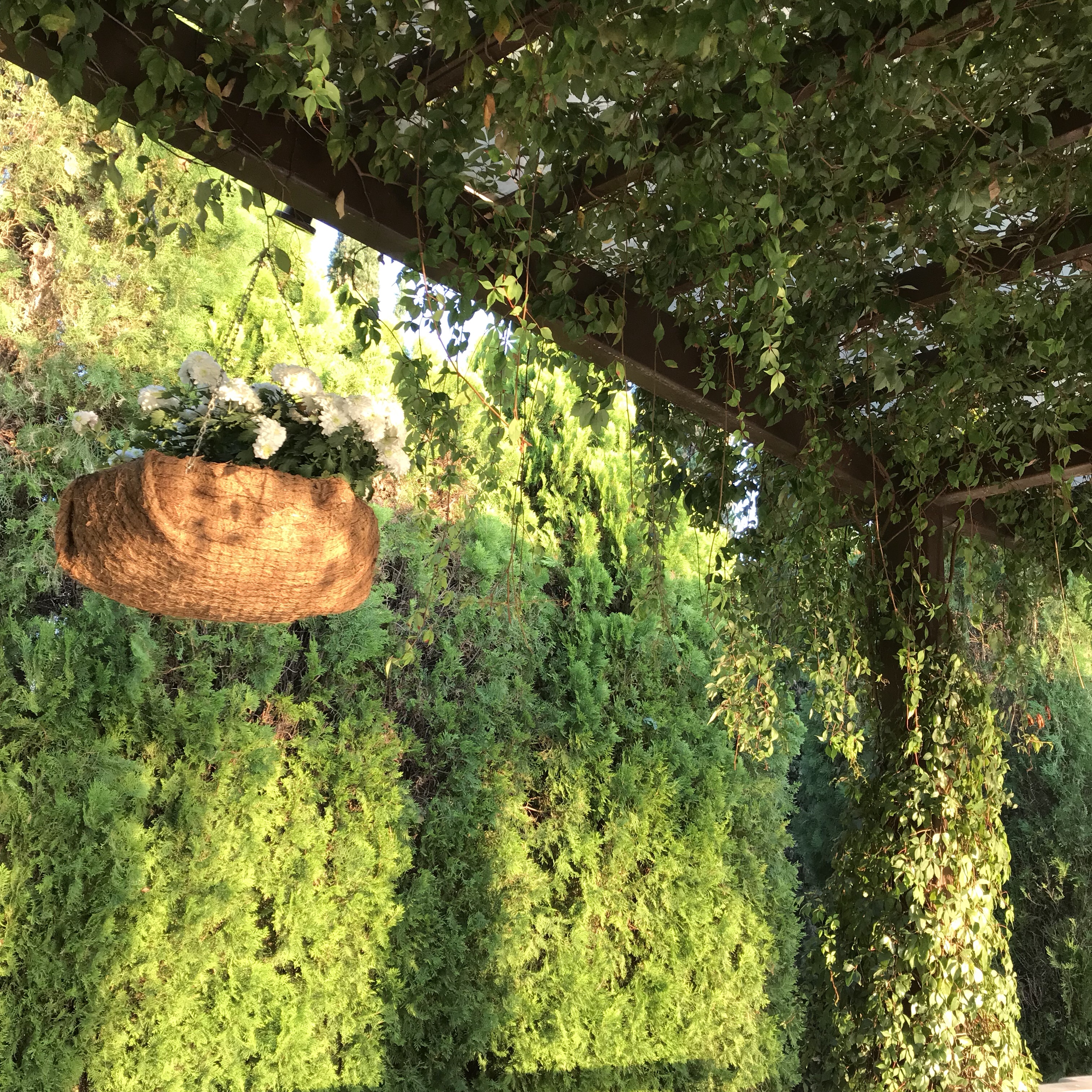
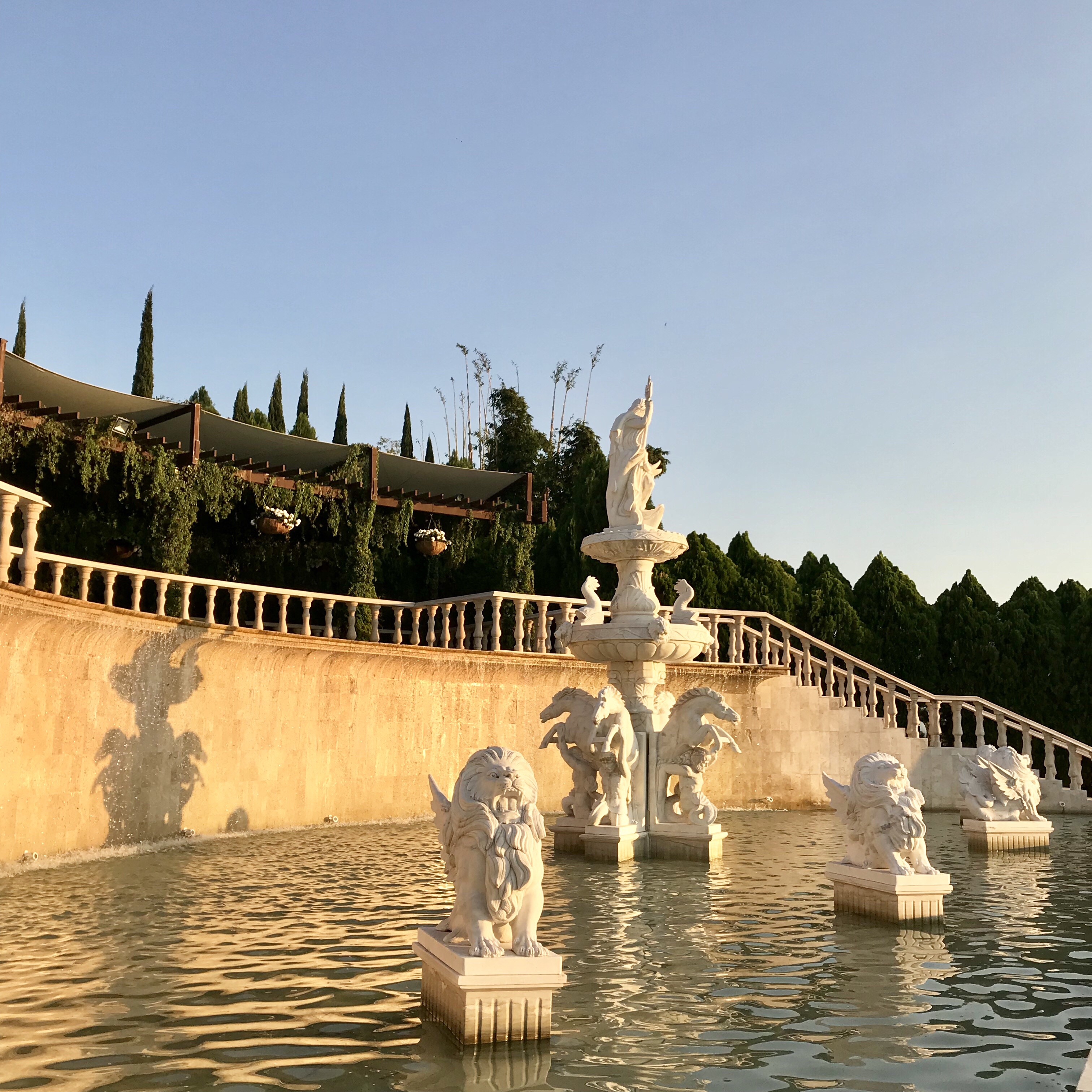
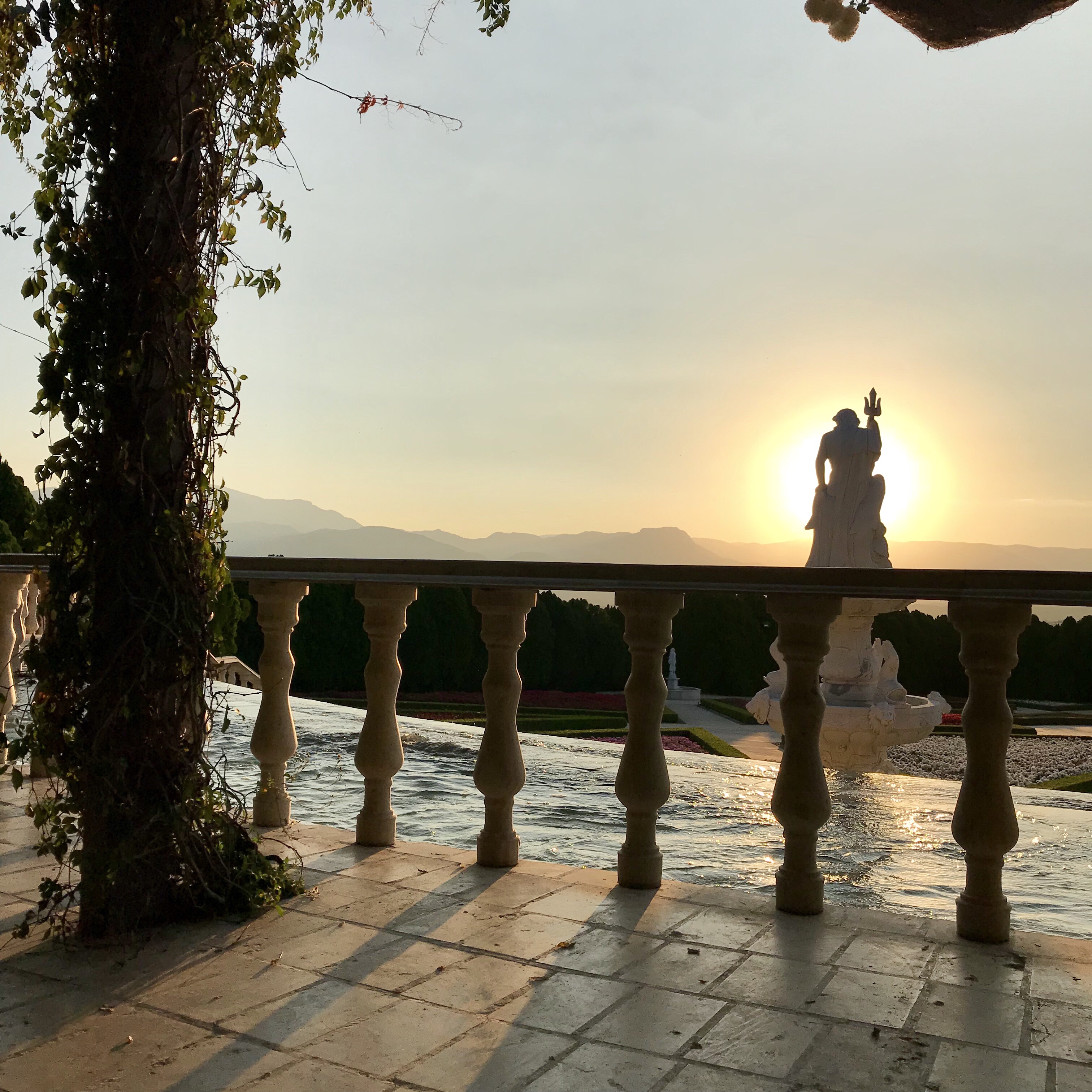
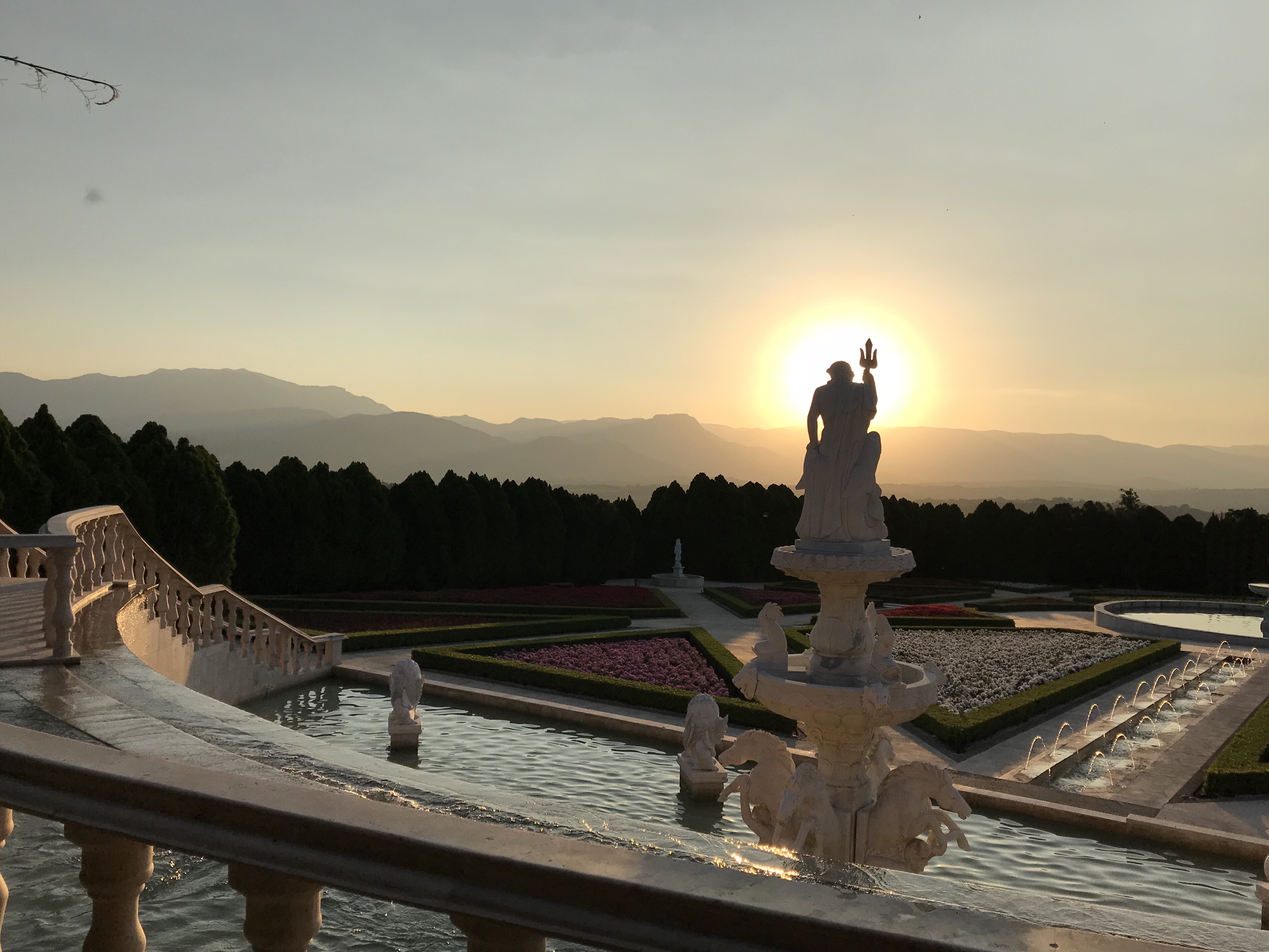
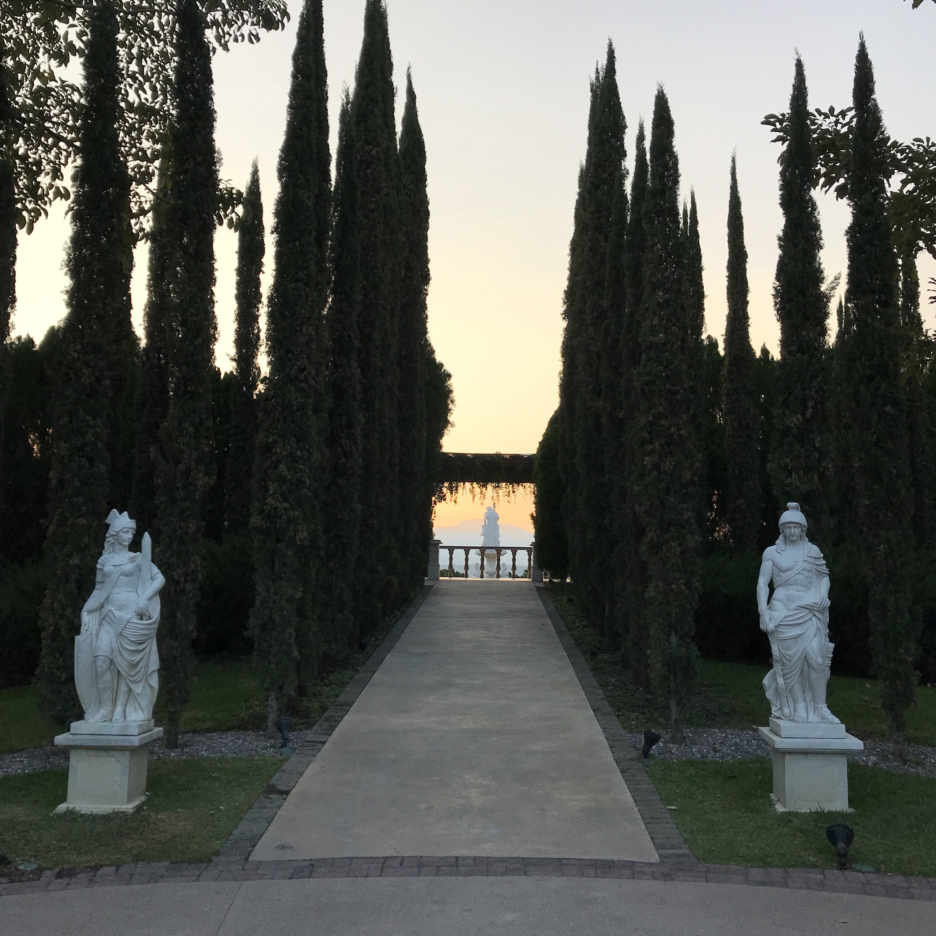
I also visited Cuernavaca, La Ciudad de la Eterna Primavera (The City of the Eternal Spring), where i completed my yearly self-evaluation for #work in a garden within Jardines de Mexico, surrounded by butterflies. Talk about INSPIRING.

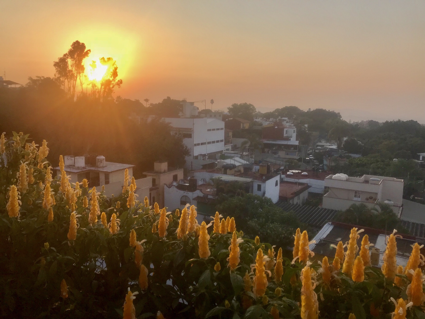
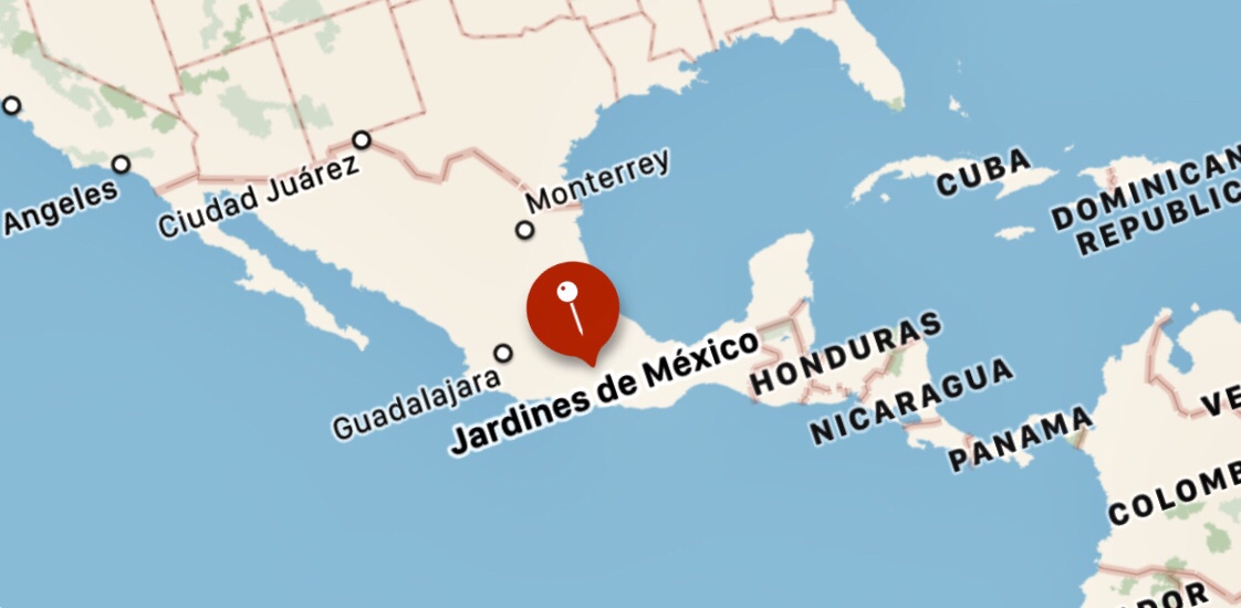
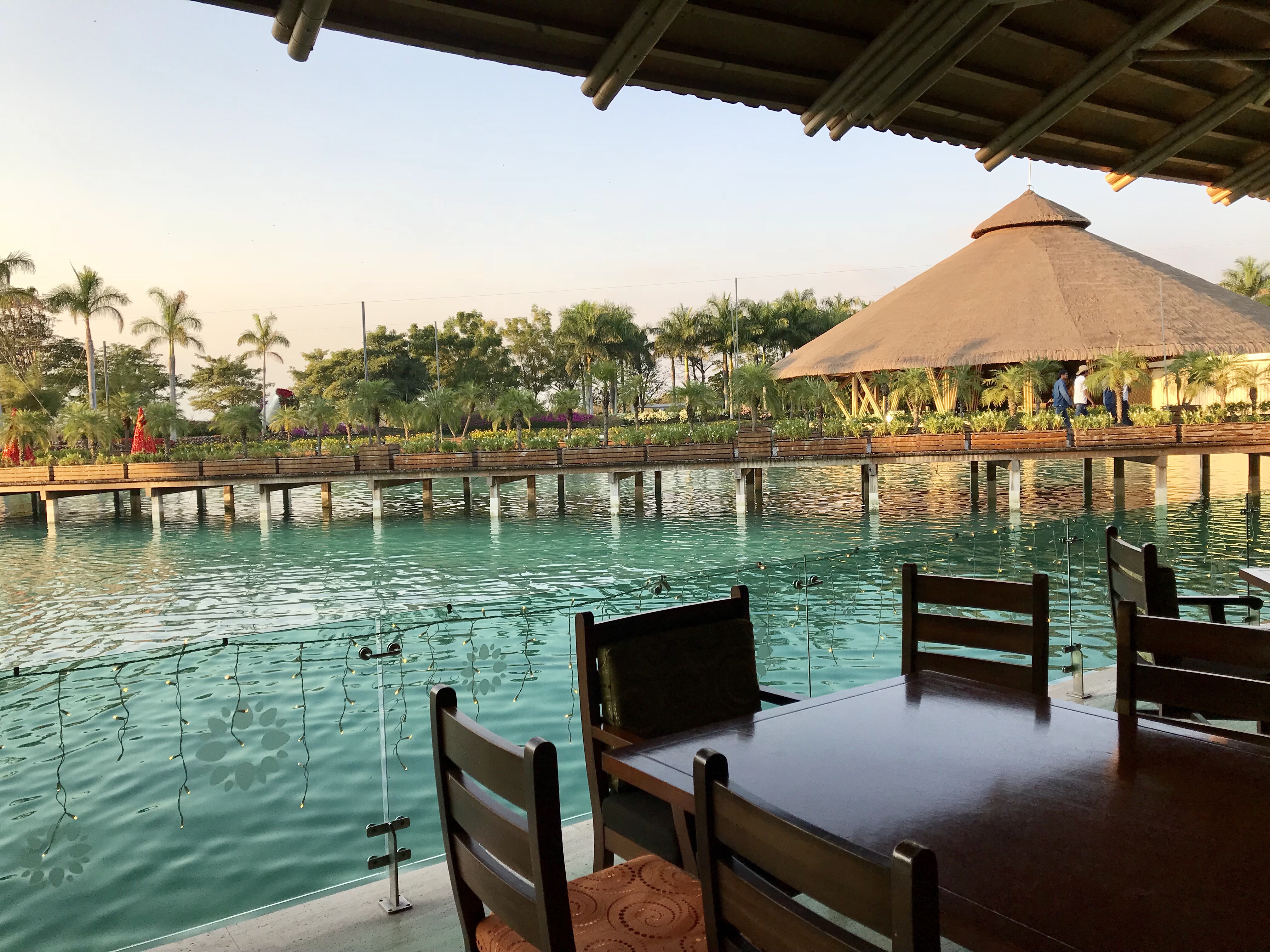
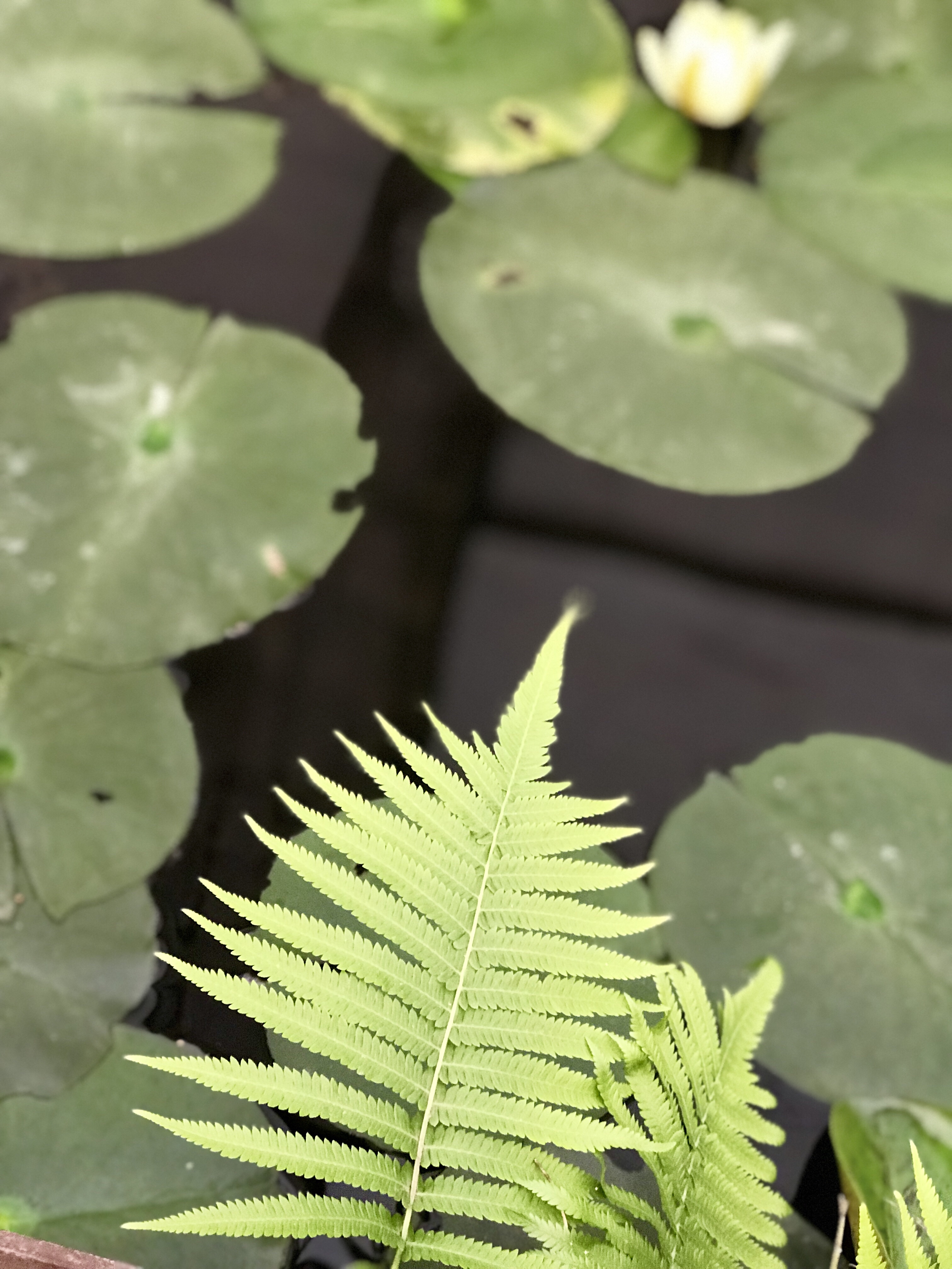
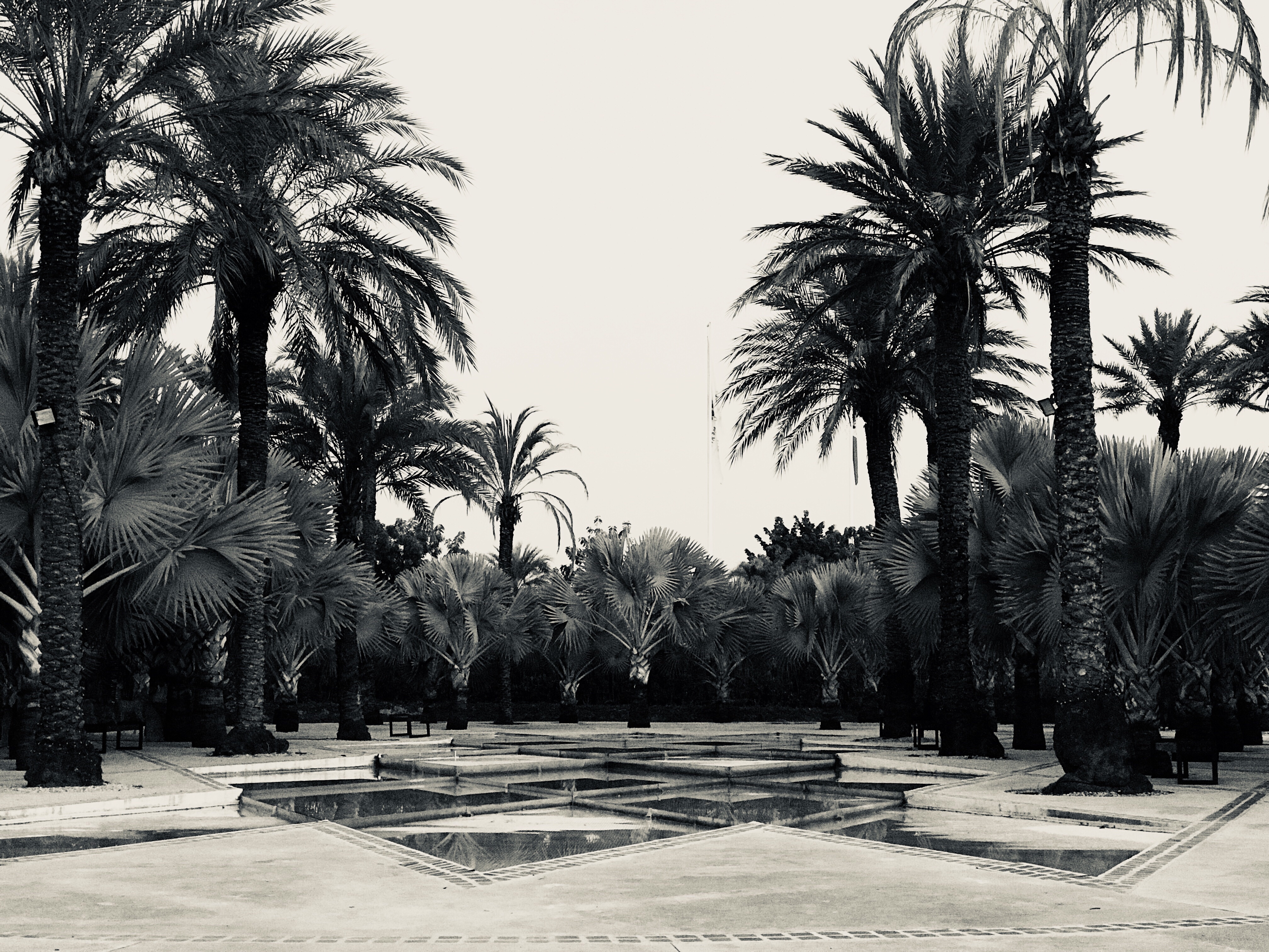
Italian Garden at Jardines De Mexico (my favorite, obv)

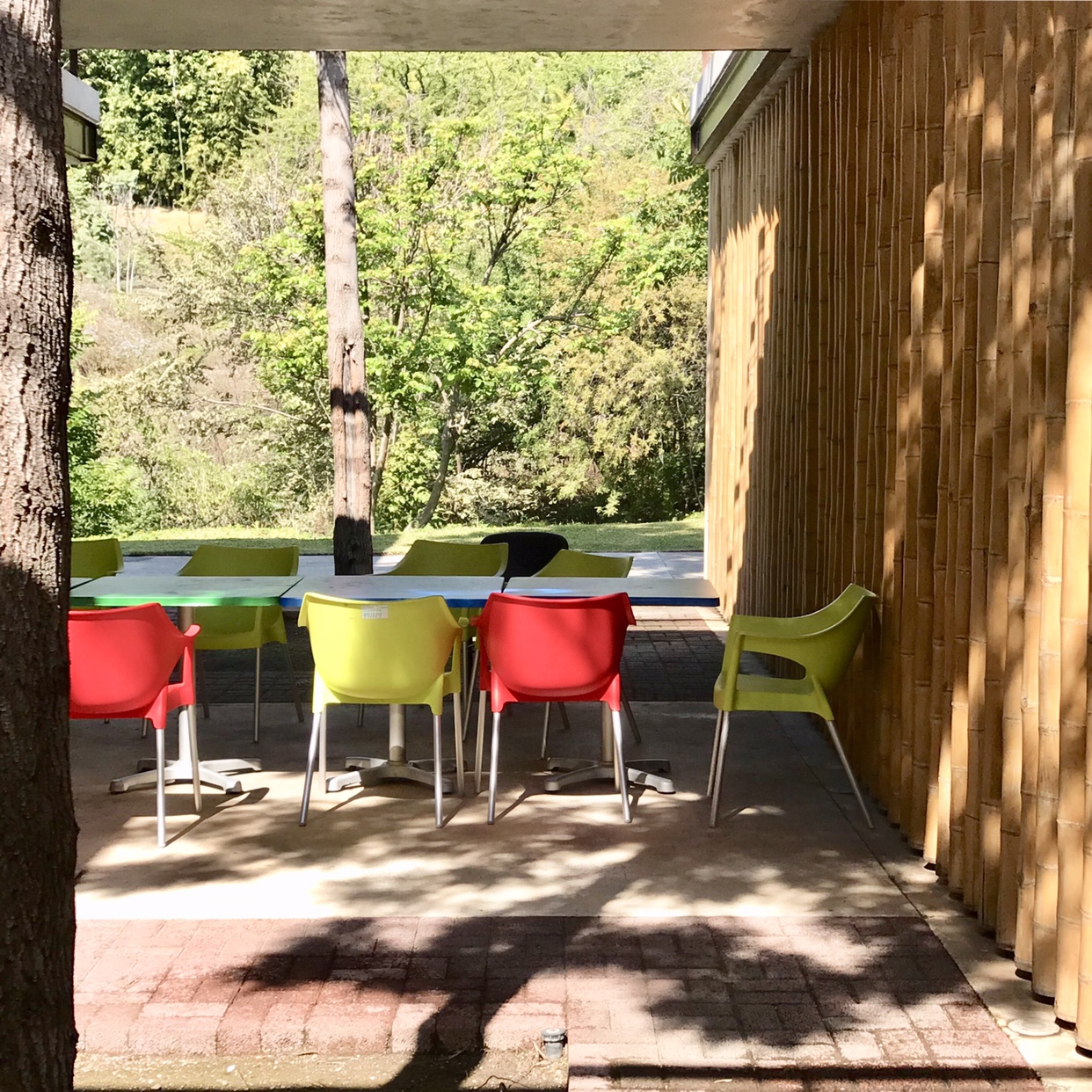
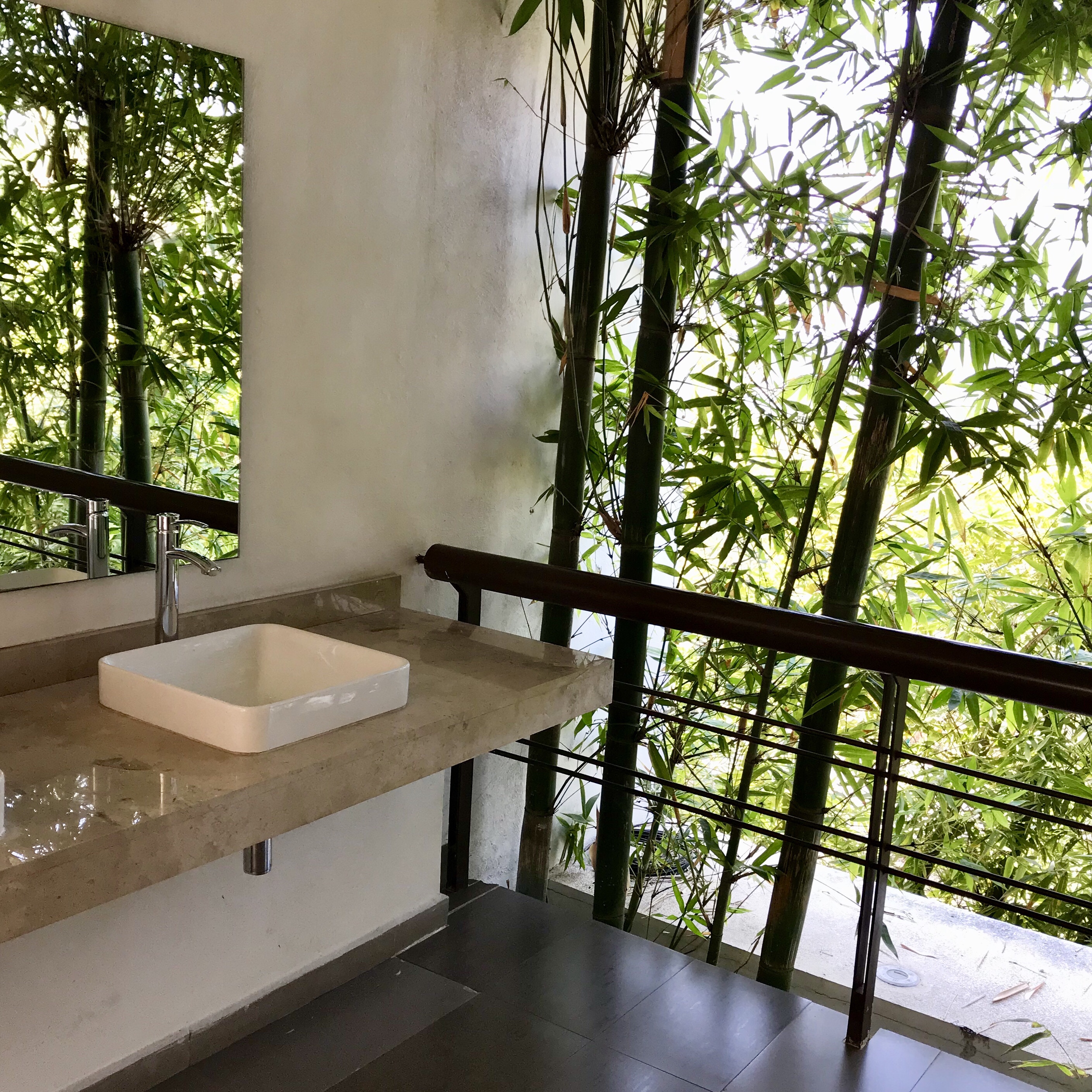
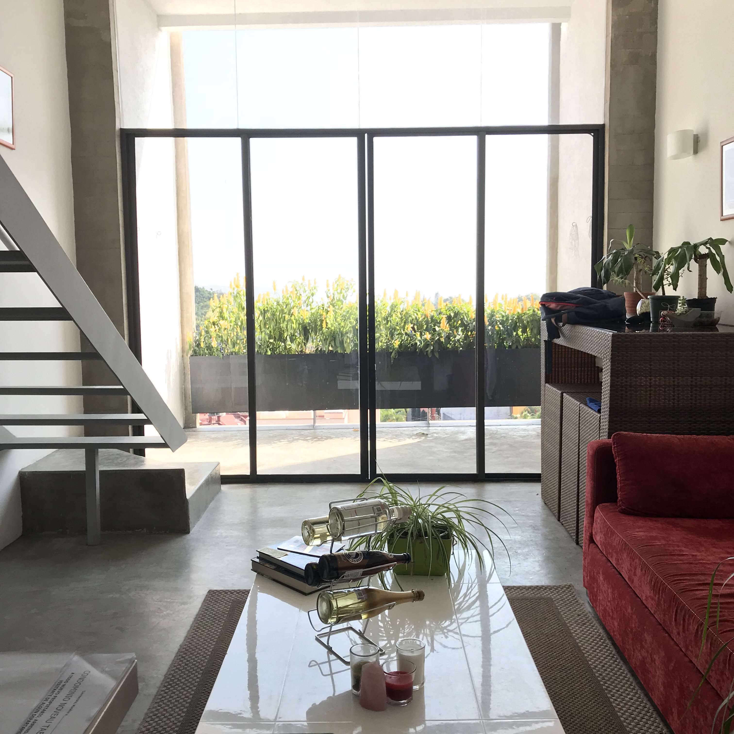
In Cuernavaca, I stayed in a copy of Unité d’Habitacion (but if you follow me on Instagram you already know this).

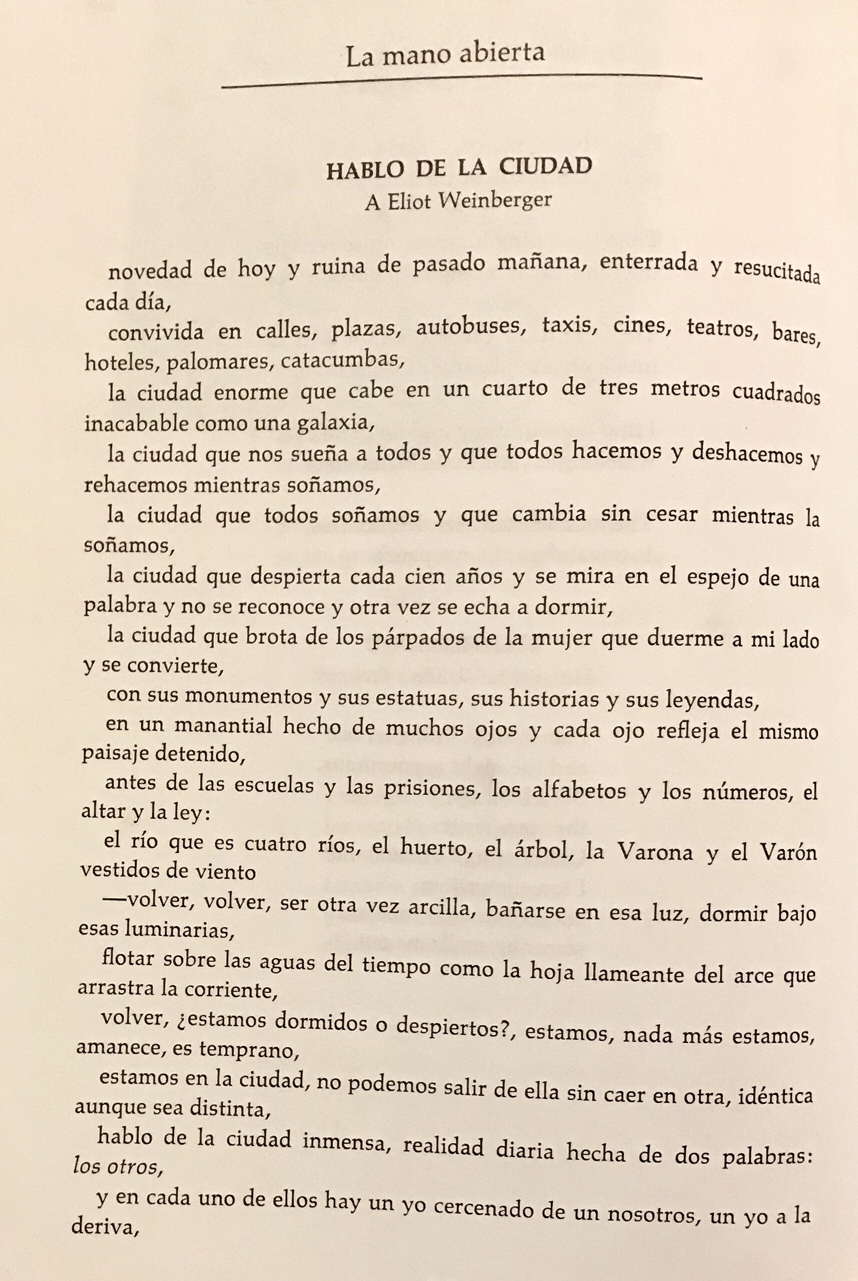
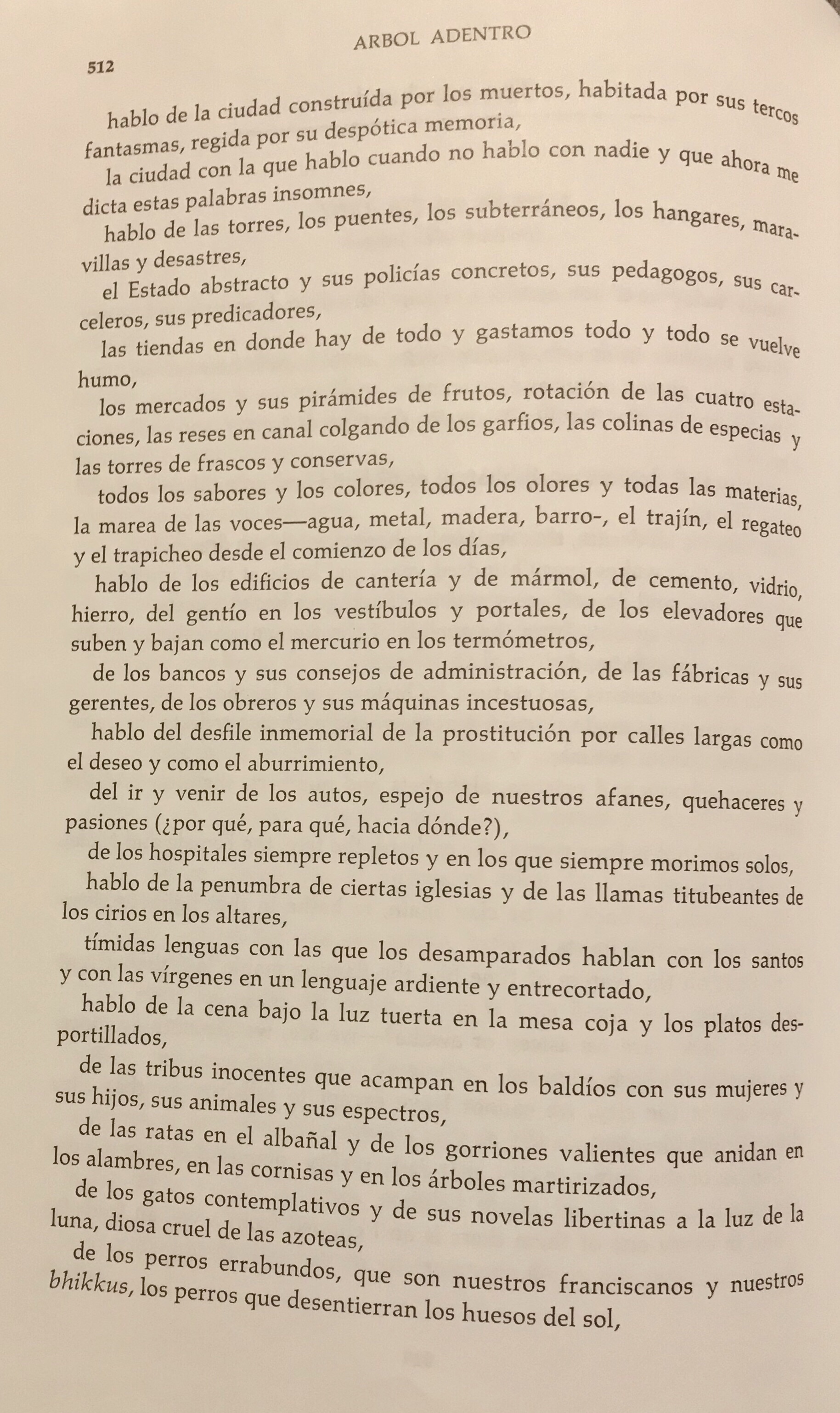
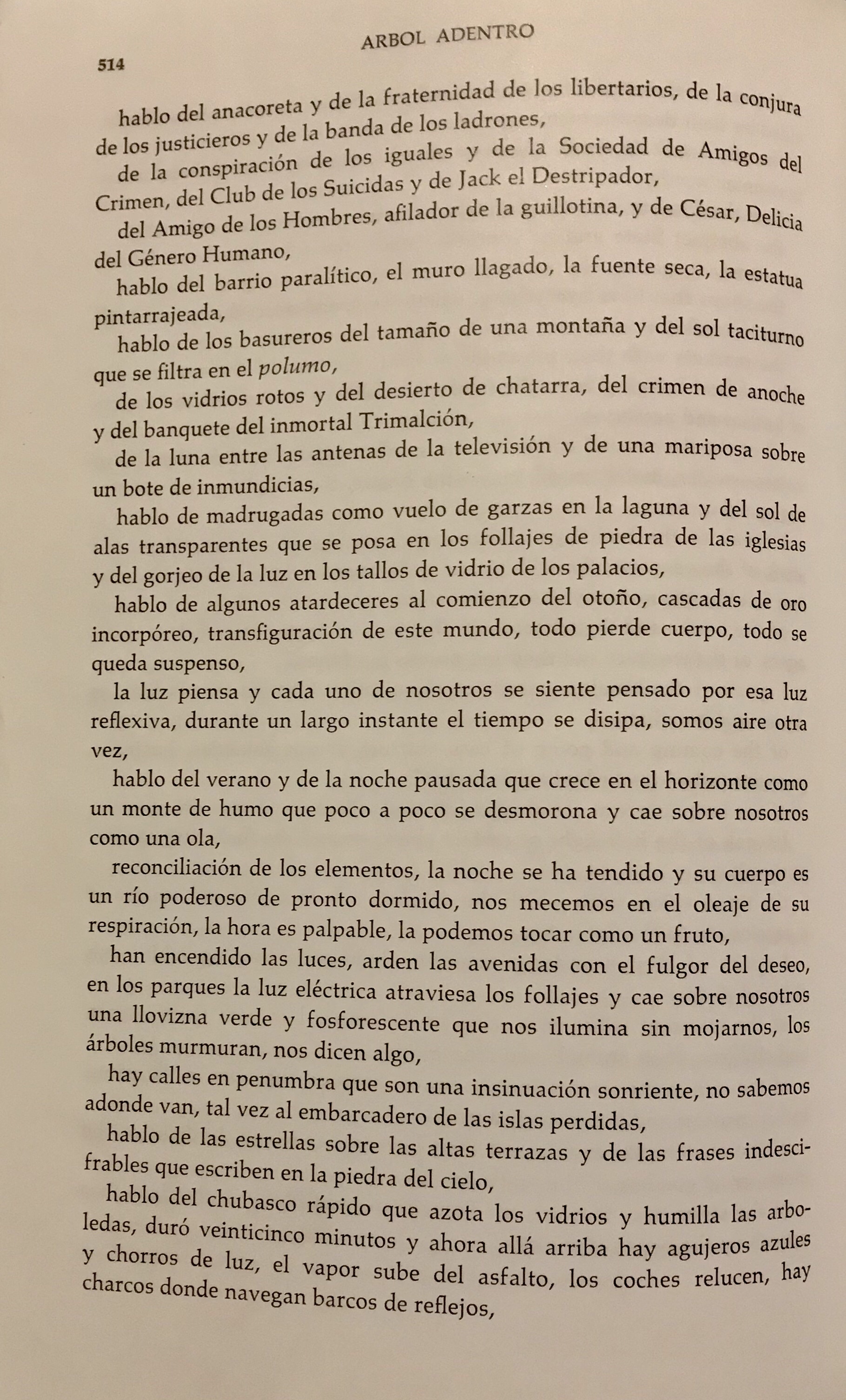
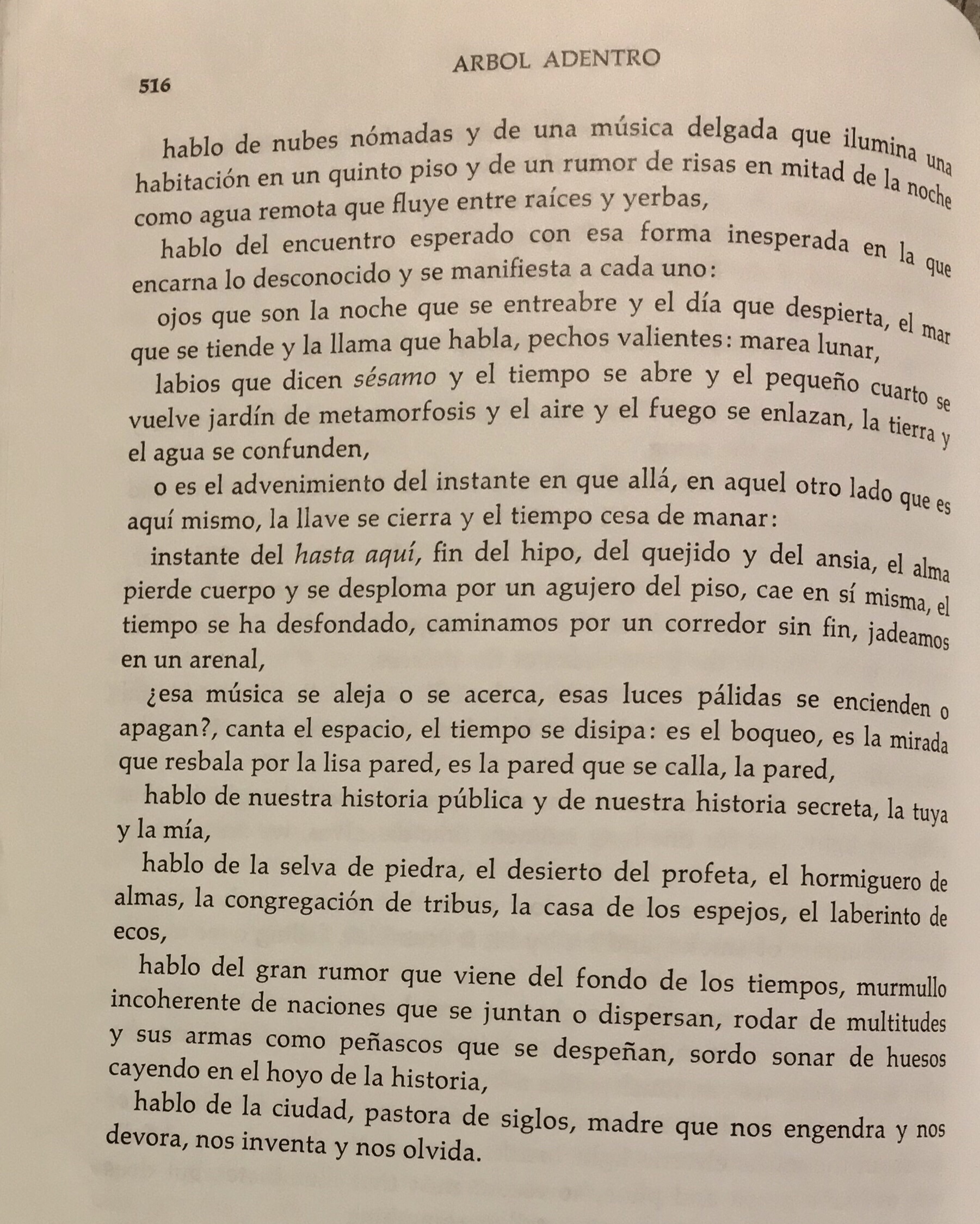
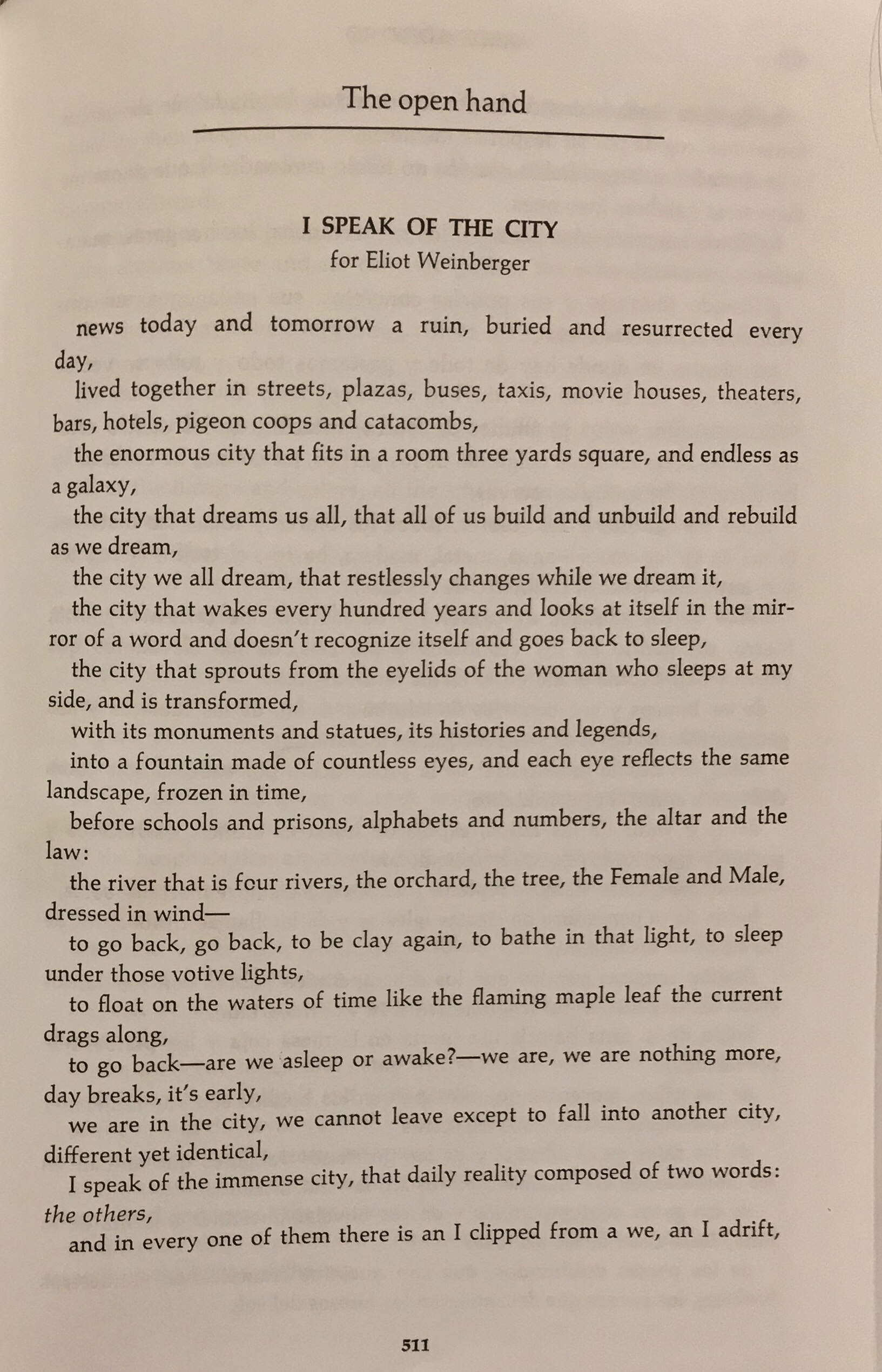
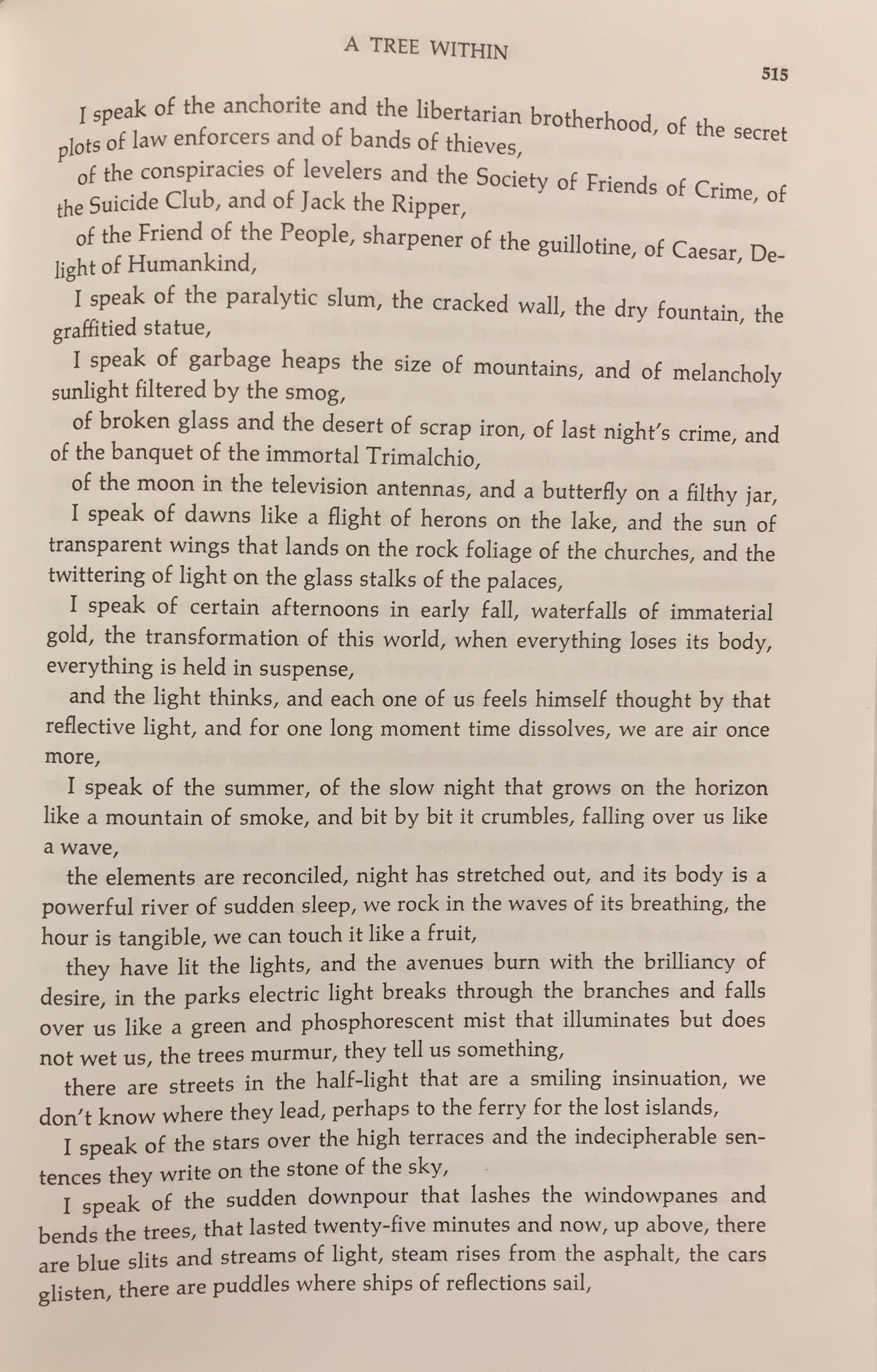
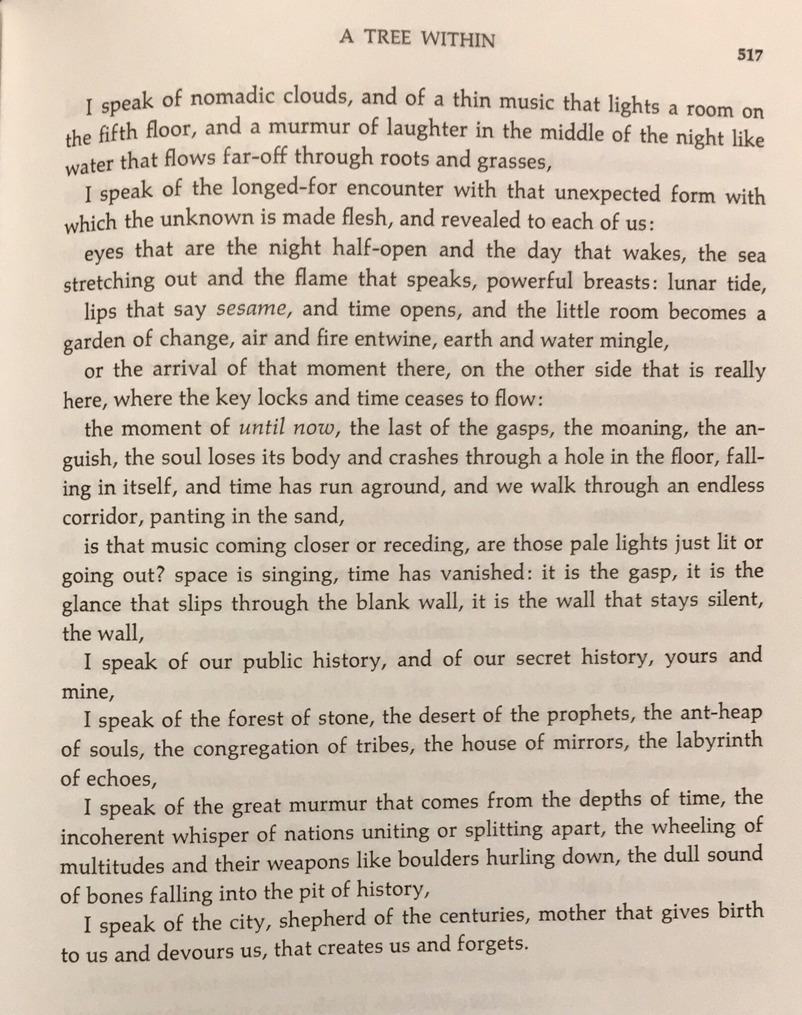
I want to close with a poem by Octavio Paz — who is considered the greatest Mexican poet and thinker — and, of course, was a native of Mexico City.

This is his poem Hablo de la Ciudad | I Speak of the City. Below the text in the original Spanish and the translation in English.

This poem perfectly encapsulates what Mexico City is. I have more posts on La Ciudad to craft, from my previous visits, and more poetry- but this shall suffice for tonight.

Here is to more gentle earthquakes and hurricanes in 2018, inner ones to bring soul renewals, and to a kinder year.

For the Aztecs, this was the bellybutton of the Moon.

Nos vemos pronto, Tenochtitlán.

Read Full Post »

image

Hello Stranger!

In case you are wondering what happened to me and why I’ve gone M.I.A during the month of February and most of March, the board above is one of the reasons. As it happened in 2010,
our school underwent an enormous accreditation visit, which meant preparing for months collecting, documenting and providing evidences.

One of the best things to come out of the work leading to the Accreditation was that Faculty was once more asked to prepare a record of what we have been doing – outside of teaching- the past five years.
It is a monumental task to audit, select and curate five years of life, work, art – yet I welcome the chance to take stock of where I have been, for it points to where I want to go. This process of self-evaluation is a privilege not afforded to many professions, and I was thankful for the challenge.
We were also asked to write a brief narrative. I worked on this more hours than I care to admit and I am happy to now share this with you: words, drawings and travel photography — some of which hasn’t been seen here yet! Hope you enjoy it.


“The French writer Daniel Pennac describes the notion of  the passeur, of the ‘transmitter’, as intimately connected to the ownership of culture.  He considers pedagogy as a branch of dramaturgy: a great teacher is a playwright, a vector of knowledge who instills curiosity, personifies her subject, and communicates passion. As an academic, designer, artist, and poet , storytelling is central to my work.

When I was six years old, fascinated by a book of folktales of Northern Europe, I decided I wanted to be a collector of legends. Though my path took me to Architecture and Fine Arts, teaching History of Architecture brought me to travel to Latin America, the American Southwest and the Caribbeans  where I began to record the history of place through the stories of its native people, These ‘stories of architecture’ become the framework of my courses. Through drawing, urban sketching, collages, photography, and writing, my preoccupation has been with collecting, documenting, processing and communicating narratives – while letting the spontaneous unfold.”


Miti Aiello, San Diego, March 2016

Writer Update:

My abstract on my research on Storage Cities has been accepted by one of the two main Architecture academic bodies here in the U.S for presentation at their International Conference! They are sending me to Santiago, Chile in June, and will publish my academic paper. Too excited for words. If you want to get a sneak peek and read my abstract check out my academia.edu page.

This is likely a hello/byefornow.
I wanted to update my blog now that classes have ended for the quarter, and before once again leaving for Mexico, this time in Baja California Sur for a week of volunteering. Faculty and students of my school are going to help build a healing center using natural architecture in a location that is three hours away by car from the closest road. It will be very remote, challenging and, I am sure, transforming. I will document everything.

Few weeks ago I wrote that, sometimes, we don’t have time to do art because we are too busy living a life that is art itself.
That is a true blessing, amidst the inherent challenges.

Although I have not posted here, I have not stopped taking photographs, seeing, collecting, thinking. My hope of hopes is to get caught up with my posts this summer…Promises we have heard before…

“You don’t need motivation.
What you need is discipline, young lady!”

Joe

Read Full Post »

image

image

image

No se trata de velocidad
Si no de resistencia
Para lograr lo que se quiere.

To achieve what we want
It’s not about speed,
But resistance.

I wish you a Glorious 2016.

Read Full Post »

The sacrificial lamb- an old leather jacket already repaired twice.

The sacrificial lamb- an old leather jacket already repaired twice.

image

With my pattern and leather in the Materials Lab, to trace images in Illustrator and experiment with the laser cutting process. “The object feels good if the process feels good.”

image

The laser etched leather swatches. Fire drawings…scars…tattoos and cattle branding.

image

Preparing for night surgical cutting, tailoring and riveting. And documenting. The whole project came about in three days (Friday to Sunday), but was months in the making (and in the thinking, and in the promising).


wpid-20140427_083037_2

The prototypes are done!

image

Laying out this graphic board illustrating the process took longer than I would like to admit. In the end, it was a process of elimination…which is the secret to design, really.


wpid-20140428_213830

Exhibit time. Board layout #2 with Illustrator patterns :).

wpid-20140428_213835


Project fini. Ready-to-wear, custom-made temporary leather tattoos....by yours truly.

Project fini. Ready-to-wear, custom-made temporary leather tattoos….by yours truly.


Idea #13: Temporary Leather Tattoos

Experiments with recycled leather, tattoo patterns and the laser cutter in our Materials Lab for the Action/Reaction Faculty show, where students react to faculty work.

I chose to explore these tribal tattoo patterns I drew long ago and finally turn them into ‘temporary’ leather tattoos – since an actual tribal armband tattoo is out of the question (#italianmother).

In the process, I learned how to make leather-on-leather tattoos, used the laser cutter for the first time, hand-cut till my hands were sore, learned how to put rivets, and was taught about vector lines and patterns in lllustrator by my wonderful, patient students.
Thanks to student feedback/critique (which was extremely positive about the artifacts :)) the board could use one more ‘pass’ as far as fonts and background, but I wanted to post this now, as the show is coming to a close.

While researching case studies, I was astonished by the amount of cool accessories, arm bands and earrings made with recycled bike tires and inner tubes.

Etsy, here I come.


Here are some photos from the Action|Reaction opening, by Donn Angel Perez, the curator of the show (and author of the beautiful paintings shown), along with student Chuck Wilson

For the opening- in keeping with the recycled/sustainable theme, and to save time 😉 – I projected my board.


This slideshow requires JavaScript.


…….

littlescreenshot <<<and this, this little guy on my desktop just makes me happy.

Read Full Post »

image

image

image

image

image


Thom, one of my past students, showed me his project during our school’s Finals’ Exhibit –where the best projects from each year were showcased.
He had found a silhouette that happened to look like me and placed it in his final rendering. 🙂

Read Full Post »

image

image

image

image

image


Don Draper: As much as I would like to join all the ads making fun of the ubiquitous San Francisco hippie, let’s try to trade on the word ‘love’ as something substantial.

– I don’t think that it’s possible in this context.

Don Draper:
So why are we contributing to the trivialization of the word? It doesn’t belong in the kitchen.
” I love this.”
” I love my oven.”
” You know what I’d love ?
I’d love a hamburger.”
We are wearing it out.
Let’s leave it where we want it.
We want that electric jolt to the body.
We want Eros. It’s like a drug.
It’s not domestic.

What’s the difference between a husband knocking on a door and a sailor getting off a ship?

About 10,000 volts.

Read Full Post »

1web


Above, my Christmas presents from my students.
The ‘one hundred small books’ were a project for the Advanced Presentation course I taught.

To start the conversation on small scale binding, I brought some of my mini books to show.
How did I end up with these? 😛


IMAG4351(1)web


My students could choose their own narrative and learned how to bind books using different techniques and materials.
We covered layout through a discussion on portfolio graphics and blog and website design –and used some color palette tools–
so for the final project I wanted to do something different and strange, inspired by an artist in the 70’s who created one hundred little books.

Some of them are portfolios, some poetry, photography…a couple are on love and music 🙂


IMAG4354web

IMAG4357web

IMAG4353web


There is even Dostoevsky’s novella ‘White Night’ and a book entirely on coffee and quotes, both done by Anastasia, a fellow artist (someone knows me!).

You can follow her beautiful work here.

I will post more pages from the little books once school resumes. I also (shocking, I know) have a little book on coffee quotes at home, bought in Italy few Christmases ago. I’ve been meaning to write a post about it, and now I will share it with you – and Anastasia 🙂

Also there were lots and lots of sketchbooks from my History of Architecture students (!).

IMAG4362web

I. love. them.


Before I go (get coffee), some coffee quotes from my little coffee book:

If asked: ‘How do you take your coffee’?
I reply : ‘Very Seriously’

Unknown


Coffee is a language in itself

Jackie Chan


Wake up!

Drink coffee…

Then think.

Unknown


Coffee is the favorite drink

of the civilized world.

Thomas Jefferson


Black as night,

Sweet as sin.

Neil Gaiman ‘Anansi Boys’


Deja Brew:

The feeling you’ve had

this coffee before.

Unknown Coffee


It is inhumane, in my opinion, to force people who have a genuine medical need for coffee to

wait in line behind people who apparently view it as some kind of recreational activity.

Dave Barry


Black as the Devil,

Hot as Hell,

Pure as an Angel,

Sweet as Love.

Charles Maurice De Talleyrand


IMAG4363web

My Bounty. Merry Christmas.

Read Full Post »

image

The Parker. Palm Springs. December 19, 2013.

image

image

image

image

image

P1040219web

image

The Ace hotel in Palm Springs. December 19, 2013.


We came to Palm Springs
in search of the sun and found desert modern design,

image

Desert Springs. The Canal @The Marriott.

perforated walls and floors that become water.
image

Read Full Post »

bukhoor_logo_contrast

bukhoor_logo3_final

Builtculture logo. Digital Manipulation. October 2013.

Happy November!

If you have been wondering what I have been up to, I have been here.
Builtculture is a project I have started last year with a graduate student, Samar Sepehri. It is finally taking off.
(If you are so inclined, and feel like Liking our page, please do so!).
I designed our logo, starting from an image of bukhoor, and overlaying over an image of San Diego.
The creative juice have been applied to community outreach, still I was happy to be making something art-like.

Related to this, I have been working on bringing speakers and workshops in the field of community and activist design, such as this:


postermilenko_web

Also related to this, I went over the border, to Tjiuana to work on an international project, make connections and do a bit of wine tasting and cultural sightseeing.

I also went to Deer Park Monastery for a Day of Mindfulness.

Photos coming soon.

Read Full Post »

image

image

image

image

image

image

image

image

You have to keep breaking your heart
until it opens.
Rumi

Without the use of a camera Portland-based artist Jim Kazanjian sifts through a library of some 25,000 images from which he carefully selects the perfect elements to digitally assemble mysterious buildings born from the mind of an architect gone mad. While the architectural and organic pieces seem wildly random and out of place, Kazanjian brings just enough cohesion to each structure to suggest a fictional purpose or story that begs to be told.
Reblogged from here.

Read Full Post »

How to pin a heart to a sleeve. Ink on Paper. 2002

How to pin a heart to a sleeve. Ink on Paper. 2002

Reblogged from : The Subject Tonight is Love.

image

Sketch for armband tattoo. December 2012.

tattooweb

Pattern for armband tattoo. December 2012

Read Full Post »

Click to see my architectural shoots over at ArchistDesign | Studio. All projects by Architectural Concepts in San Diego, CA.


Apparently this is my year. The year of the Water Dragon.
I am happy to say, I am finally completing my architecture website.

This other digital studio has been on the back burner for about a year , but it looks like 2012 is the antithesis of  procrastination.

A year that quickens…like a strong sun that vanquishes the fog.

I have added some photography work for my friend and mentor Margit Whitlock at Architectural Concepts. Photographing these well-executed design projects was a joy.

Still few portfolio items to add to the site (and three new projects on the boards!)
Will keep posting updates as they happen, and hope to finish in few weeks.


Read Full Post »

image

San Diego, November 25, 2011. Third Avenue Pedestrian Bridge.

image

San Diego, November 25, 2011. Third Avenue bridge and context (canyon).

Bridge, De-constructed.

” In recent years , the modern understanding of social responsibility as functional program has been superseded by a concern for context. But contextualism has been used as an excuse for mediocrity, for a dumb servility within the familiar. Since deconstructivist architecture seeks the unfamiliar within the familiar, it displaces the context rather than acquiesce to it. What makes it disturbing is the way deconstructivist architecture finds the unfamiliar already hidden within the familiar context. By its intervention, elements of the context become defamiliarized. In one project, towers are turned over on their sides, while in others, bridges are tilted up to become towers.”

Mark Wigley

Read Full Post »

Wire Crochet tubular bracelet. This can be made in pure silver wire. November 20, 2011.
Wire Crochet tubular bracelet.  November 20, 2011.
Wire Crochet ring. This is a cocktail ring that can have a rounded or flattened look. November 20, 2011.

Wire Crochet ring. This is a cocktail ring that can have a rounded or flattened look. November 20, 2011.

Wire Crochet and Ring. November 20, 2011.

I have been busy conjuring up objects from wire.
As architects, jewelry is the smallest realized design we can create. Next of course there are the futuristic 3D printers, but I like the analog character of crochet, using my hands, painting with metal and ending up with wearable art. I have been crocheting since the age of eleven (thank you, Salesian Sisters!) but this is the first time i produced jewelry. I remember at 14 using pliers, crazy glue and metal wire to create very small butterfly earrings. My parents must not have been impressed, because i was not immediately pulled out of my Linguistic Lycaeum and redirected to the Fine Arts and Jewelry institute.
The bracelet, a simple tubular structure, and the ring (my design),  can be made using pure silver , copper, gold or various wire colors. I used No. 2 Crochet Hook and 34 gauge wire.
Cannot wait to experiment further, the Amazon fairy shall visit again soon (she brought me really good books on wire and hook jewelry this time).
Merry Christmas to me and here is to more jewelry and sculpture with a hook!


Wire crochet ring- Rounded position. November 20, 2011.

Wire Crochet Flattened look. November 20, 2011

Wire Crochet Ring - Flattened look. November 20, 2011

Wire Crochet Bracelet and Ring. November 20, 2011.

Read Full Post »

Ink drawing, Watercolor. 16 November 2011.

Ink drawing, Watercolor + Digital Manipulation. 16 November 2011.

I was recently reunited with luggage lost 45 days ago.

Three items were missing: a bottle of Cinema Eau De Parfum by Yves Saint Laurent, a beloved collaged orange umbrella bought in Barcelona and a pair of Sketchers shoes. Go figure.

Immediately i set out to substitute my lost umbrella. As said in one Law and Order episode (I paraphrase): “Hardheaded Calabrese: the people there are very stubborn… once something is taken away from them, they don’t rest until …they get it back.”

My mind went back to the orange umbrella I bought for my mom in Milano last Christmas (probably with her money;)), from one of my favorite stores: Muji.

In my quest, I ran into this glorious essay on a particular shade of orange.

I have a box of orange objects in my house that I have been meaning to combine into a series.

Tomorrow seems like a good day for it, and orange thoughts are perfect for winter-short days and too much yin.

Before you read, keep this in mind:

Fire in Arabic is ‘Nar’.

………….

My Orange

by Michele Foyer


If we lived during the time of the Dutch West Indies Company, I would tell you that the color that so captured me was the child of paprika and chocolate. The world no longer swoons over spice willing to risk a sail beyond the end of the known. And yes, sadly rape and pillage in its desperate greed. I had only to pass the window of the Muji store in Manhattan’s Chelsea to discover this color in an umbrella.


What is it that grabbed me? Is it a vibration for which the color is only a foil? Or is it something about the color itself lodged between memory and desire? This redder orange infused with luxurious chocolate yielded a strangely jazzier yet muter tone than orange. But if we are mapping out its terrain inevitably the orange relation comes up.


My “Muji Orange” is a distant relative of the neon orange of warning, as well as a “tangerine streamlined baby” of sixties psychedelic abandon. Its crazy older paternal cousin might be the Tang of astronauts or maybe the impossible orange of orange Crush soda, or possibly even Blake’s Tyger burning bright, but its doting grandmother, is definitely — yes, most definitely — a bittersweet French marmalade.


There is some mystery to orange. Orange is the only color in the seven-color spectrum besides violet that originates as a noun, naming a particular thing. It refers to the berry fruit of the orange tree, something very concrete and specific and not as abstract as the other colors. Was the experience of the orange fruit so strong that it came to stand for the orange experience?


The Old English Dictionary (OED) states that in Medieval Latin “the forms ‘arangia’, ‘arantia’ (Du Cange) whence ‘aurantia’ have “popular association with ‘aurum’ gold from the colour.” Perhaps, the OED postulates, there is an etymological relationship between the Old French “orenge” for “arauge” after “or” gold. The OED traces the “loss of the initial ‘n‘ in French, English and Italian” as “ascribed to its absorption into the indefinite article” resulting in “narange” absorbing “une” and “narancia” absorbing ”una.”


Also from the OED we understand that the “native country of orange appears to have been the northern frontier of India, where wild oranges are still found and the name may have originated there.” In Late Sankrit the word for orange is “naranga;” in Hindi it is “narangi” (OED, p. 2001)


Is “orange” related to the color of the fruit and/or to gold and the word “ore” (OED, p. 2001)? Are both these not only things, but also perhaps experiences of light? More questions arise as we consider other correspondences that I call “rhymes and ricochets.”


In Persian the world for pomegranate is “nar” (OED, p.2001) which echoes the nar of narange. Is this coincidence or relationship? The OED states it is not certain. Was the “nar” / pomegranate the fateful fruit of the tree in the Garden of Eden myth? It is possible because the pomegranate rather than the apple was the indigenous fruit. If the pomegranate was the tree of knowledge, what was the knowledge that this golden ball embodied? Might it have reflected a relationship of light to dark?


Is there anything other than coincidence to the resonance of the pomegranate which also figures in the myth of Persephone who spends half her days in a descent into Hades when the earth experiences the dark of winter and the other half above ground when the earth experiences the light of spring – alternations or gradients of light and dark?


In one narrative color is dependent upon history and culture. The OED by definition is a history of the English language, tracing the history and values of the western world with its migrations and roots to the East. Today we think oranges are synonymous with the warm climates of Florida and California. We often believe they are indigenous to North America. However, they were planted by conquistador sailors who needed to create supplies of vitamin C to take with them to guard against scurvy on their long sea journeys.


What is orange in cultures outside of the European? In other cultures closed off to our own for so long by the migration and exchange of trade, say the Japanese or Chinese, what is the etymology of the word orange? In Cantonese Chinese (but not in Mandarin), the word for orange is related by sound to the word for gold. At New Year’s the Mandarin orange embodies good wishes for prosperity. Are “gold” and “orange” a conflation of all these color experiences of light?


What about other earlier societies? I wonder whether orange might “rhyme” with “fire.” Fire had the life-giving power that made a large difference to a culture. If gold wasn’t the commodity of value, it might make sense for the word for this experience to be “fire.” Might gold be in part only an imitation of the light of fire?


These richoceting ruminations about gold and fire are vital, because it is precisely the light of gold or fire that starts to go missing in “my” Muji Orange. It is that chocolate brown in addition to the red of the orange that makes the color “step back” toward the shade. Muji Orange recedes from the saturation and almost clear brilliance of an ordinary orange that lags just behind the brilliance of yellow—whether the origin is the light of sun, gold or fire.


Muji is a Japanese company and that perhaps contributes and infuses a measure of its aesthetic into that of the west. The store’s name is related to “mujo” which evokes “transience” in Japanese. I once heard about Japanese “killed colors.” These colors had a little bit of death in them, fading from their original brilliance and glory. I couldn’t find reference to them again but only to the rikuyu colors made from graying. In Muji Orange the quality of orange steps away from the brilliance of the sunny orange into the shade, holding a note of something that is darker. It is not a sinister dark to be avoided but one to be savored like a fine chocolate.


Is my “Muji Orange” so beautiful to me because it captures the life of light and its brilliance — and the life of dark and its recession? To me “Muji Orange” is a kumquat color par excellence. First like the sweet rind of the kumquat there is a “taste” of brilliance and then immediately, almost simultaneously, just as the fruit yields a sour taste, my Muji orange bursts with another very different moody, darker earthy “taste.” Does Muji Orange with its paprika jazzy zest want to dance the tarantula? Is it death or lack of light that gives my Muji color its kick?
I have questioned whether it was the vibration of the color that pulled me into the Chelsea store — the umbrella an extraneous element. But I wonder if the precise color of orange might also be a “rhyme” with the function of “umbrella”? Are the form and the vibration related in the poetry of memory?


Recently I recalled an earlier encounter with umbrellas. When I studied in Madrid in my 20s, I would often take the subway to go downtown to the Turner bookshop. I’d climb the stairs of the appropriately named Sol subway stop that spilled out onto Jose Antonio, emerging more often than not into a scorching sun.


On my way to the bookshop I would pass outside the window of a store that made confectionaries of violets sold in white and purple miniature hatboxes. But my favorite was the neighboring shop entirely devoted to umbrellas with a placard handwritten in a swirly old-fashioned cursive script in the window that read “Manana llovera.” Both its whimsy and its sales-minded craft were not lost in the English translation — “tomorrow it will rain.”


Last December, many years after my sunny Spanish sojourn, when to me it is now irrefutable that night and day, death and life are folded into one another and that Persephone must braid both dark and light — the Muji Orange color caught my eye. Manana llovera. Tomorrow it will rain. Dear Reader, I bought the umbrella.


Bibliographic Note The Compact Edition of the Oxford English Dictionary, Volume I, AO, (Oxford University Press, United States, 1982).

Copyright Michele Foyer. Web: http://michelefoyer.com/news.html

Read Full Post »

Fill in the blanks. Ink on Miquelrius paper. October 2011.

This drawing was inspired by this one , by my blogsister Ghadah Alkandari.

Read Full Post »

Three Talismans|Nodes necklace by Archist Design Studio © . I used Industrial Chic spacers.

A talisman (from Arabic طلسم Tilasm, ultimately from Greek telesma or from the Greek word “telein” which means “to initiate into the mysteries”) is an amulet or other object considered to possess supernatural or magical powers. (thankyou wiki.)

Each spacer/bolt has the word intre·pidi·ty embedded on it.

Susan Lenart Kazmer, of Industrial chic ,gives us this definition of a talisman:

tal·is·man \ˈtælɪzmən\: objects worn to bring specific qualities into your life, such as strength, happiness and protection.

She considers herself a “contemporary builder of talismans utilizing objects of her own culture”. As soon as I saw her rugged and evocative spacers I was immediately inspired to create an industrial/architectural piece.


A pretty package containing rugged things.

Read Full Post »

For my birthday, my blogsister Ghadah dedicated a page to me

Read Full Post »

In Tea Veritas. New York City. June 2011.

Well, this is no good! August is almost here and once again balmy summer days flew by with traveling, urban escapades and some R&R…while the postings have been mighty sparse.

I have been a curious tourist in my own city and state, and, in between summer courses,  the roamings included a visit to Joshua Tree National Park, Much Ado Abouth Nothing, a tour of the Getty Villa in Malibu, an evening dreaming of Cuba and its Architecture and finally, a retro movie under the stars. There have also been some further experiments with jewelry design. And many caffe’ shakerato’s. And many of foreign movies.  And declutterings, of tangibles and intangibles. I have been busy.

I am back from my adventures for good now, just in time to be blindsided and crushed by Amy Winehouse’s death (more on this later).
I have some shots to share from my travels, the challenge now is not to turn this into a photography blog (after all it is called *sketch* bloom) so i will be back tomorrow with more sketches and plan to alternate photos with drawings and collages for the next few posts.

It’s good to be back, renewed and energized.  I hope this month was good to you too.

Read Full Post »

C'est fini! Here is the Fabric City on a backpack. The writing was done with 3D Fabric paint. June 25, 2011.

Back of The City. Fabric and thread. June 2011.

The reverse side of “The City” reminds me of a Situationist psychogeographic map. I toyed with the idea of letting go of all the work on the map and apply this abstract work on the backback. This would have been the gutsy thing to do but, in the end , i couldn’t let go of the work.

Guy Debord, c. 1955. Psychogeographic guide of Paris.


Read Full Post »

The Fabric City is finally finished! Yay! Back to collages and sketches now.

From this…

…to a process of cutting and puzzle-making…

to this:

The Invisible City|La Gitane. Fabric and colored yarn, sewn by hand. June 24, 2011.

Tomorrow the ‘city’  will be cut and applied to a presently plain backpack and signed.

I also want to share this impromptu jewelry design, my second, kindly modeled!

Earth and Water. Ceramic beads and yarn. June 24, 2011

Finally, work inspired by New York in form of a guest post:

Winter Kisses. Ink and Watercolor on translucent Yupo watercolor paper. By Amina Alkandari. June 2011

Read Full Post »

La Gattamorta. Digital Manipulation. May 19, 2011.


As I Walked Out One Evening  
by W. H. Auden
 
As I walked out one evening,
   Walking down Bristol Street,
The crowds upon the pavement
   Were fields of harvest wheat.

And down by the brimming river
   I heard a lover sing
Under an arch of the railway:
   'Love has no ending.

'I'll love you, dear, I'll love you
   Till China and Africa meet,
And the river jumps over the mountain
   And the salmon sing in the street,

'I'll love you till the ocean
   Is folded and hung up to dry
And the seven stars go squawking
   Like geese about the sky.

'The years shall run like rabbits,
   For in my arms I hold
The Flower of the Ages,
   And the first love of the world.'

But all the clocks in the city
   Began to whirr and chime:
'O let not Time deceive you,
   You cannot conquer Time.

'In the burrows of the Nightmare
   Where Justice naked is,
Time watches from the shadow
   And coughs when you would kiss.

'In headaches and in worry
   Vaguely life leaks away,
And Time will have his fancy
   To-morrow or to-day.

'Into many a green valley
   Drifts the appalling snow;
Time breaks the threaded dances
   And the diver's brilliant bow.

'O plunge your hands in water,
   Plunge them in up to the wrist;
Stare, stare in the basin
   And wonder what you've missed.

'The glacier knocks in the cupboard,
   The desert sighs in the bed,
And the crack in the tea-cup opens
   A lane to the land of the dead.

'Where the beggars raffle the banknotes
   And the Giant is enchanting to Jack,
And the Lily-white Boy is a Roarer,
   And Jill goes down on her back.

'O look, look in the mirror,
   O look in your distress:
Life remains a blessing
   Although you cannot bless.

'O stand, stand at the window
   As the tears scald and start;
You shall love your crooked neighbour
   With your crooked heart.'

It was late, late in the evening,
   The lovers they were gone;
The clocks had ceased their chiming,
   And the deep river ran on.


Read Full Post »

Digital Collage. May 16, 2011.


Ink drawing and digital manipulation. May 2011.

 
The Pretty Parking Lot
 
I have dreamt of perfect poems
faded like dewdrops upon awakening
 
About mice and buildings
built by men
 
Cities are sentences that haunt me
 
Book thieves, foreign movies…
the line is thin between memories and reverie
 
The fog has lifted
the rain felt soft (like a blessing)
yet I am in a pretty parking lot.
 
You left your eyes as you passed me by.
 
May 2011
 
…………………………………………………………………..
 

                     Where can I run? 
                    You fill the world. 
                   The only place to run is within you.

                        From Agata e la Tempesta| Agata and the Storm


……………………………………………………………………..
 

They miss the whisper that runs
any day in your mind,
“Who are you really, wanderer?”—
and the answer you have to give
no matter how dark and cold
the world around you is:
“Maybe I’m a king.”

               William Stafford


Read Full Post »


Marrakesh. From ‘Domestic Architecture of the Arab Region’.


From 'Domestic Architecture of the Arab Region"

Digital manipulation. Commissioned artwork.

Read Full Post »

Bjarke Ingels came to speak to our school Friday night.

The venue was the Museum of Natural History in scenic Balboa Park.

I am still blown away by the lecture and, more importantly, the message.

It was truly (r)evolutionary.  The fact that BIG’s insanely brilliant concepts not only get built but a) give back to the community in terms of urban interaction b) are socially and ecologically responsible and c) are giving him fame and making him a household name is galvanizing.

Expanding the collective idea of what is possible through architecture: this is the optimism we need after years of gloom, in face of all the naysayers and ‘pie-in-the-sky’ disablers.  Something is blooming in the state of Denmark.

What an event. My friend Alan Rosenblum told me it would be as if  ‘Lady Gaga came to San Diego’.

And. It. Was.  The students loved it. Three days later, and we are all still giddy.

I could not agree more.  Thank you Mr. Ingels.
You intensified the dialogue between students and educators, and showed us how the ‘crazy’ ideas that are developed in studio and propose new typologies for the city are not only possible but timely and welcome. This creates a better learning environment, where pragmatism actually means being part of the solution, not propagating the problem.

I had the same dilemma when working in traditional, corporate offices and found refuge in academia. BIG showed us that there is a third way, the ‘Bigamy’ way. You can have it all. You can be good and successful. You can be extremely famous
and not be arrogant. He spoke of pragmatic idealism, and hedonistic sustainability. He demonstrated how to create building that are fun to experience as inhabitants and city neighbors and yet are sustainable. He showed us the intellectual approach and use of hybridization of traditional typologies to achieve new functions and forms. To wit: the Garbage to Energy plant in the middle of Copenhagen, which will be the city’s tallest structure and will house a ski slope (!) and blow smoke rings each time one ton of CO2 is burned. These are usually ‘crazy’ projects that we see coming from the upper studio division, when we ask the students to ‘dream big’ (pun intended) and question the drab, anti-interactive reality of center cities such as San Diego. The students, deep inside, try to dream but are conditioned to think that projects such as the one we saw in the lecture could never be built due to various factors such as financial interests or politics of control, or even lack of relevance of our role as architects.

We have been liberated from all of this because we can now point to BIG’s projects. Here it was demonstrated that the only limits we have as architects and human beings are those self-imposed, or those we feel ‘reality’ has burdened us with. I know that as faculty we felt validated by BIG’s successes ( does it make sense?). The music and videos, the whole presentation and BIG’s  infectious enthusiasm, warmth and positive energy were, in the words of a student ‘AWESOME’. Another student told me he learned a lot about diagrams from the lecture.
The lecture also was a model for engaging presentations. I have been toying with the idea, but now I am committed to use music and pop references in my History of Architecture classes; I ran the idea with few students and they were all for it. 🙂 I will quote Ingels when he says that we need to ‘cease to consider the building as objects but focus on what they do for the city’ : this informs and generates a new approach to ‘sacred architectural monsters’ and teaching history of architecture (or as I like to think, architectural stories).

A big thank you to Allen Ghaida, the AIAS and all my colleagues at the NewSchool Arts Foundation for making this dream of an event a reality.

I sketched feverishly- and took down all the provocative quotes. Here are my hybrid/computer-augmented notes.

I will add all of the proper building names and location as soon as possible.

click to enlarge

…..and this was my present 🙂

Read Full Post »

The Creative License by Danny Gregory. Click for his blog and links!

Everywhere I turn these days i see the word Creativity..could this be a sign …cause I have not been posting that much???

This post is more like…four…but so be it.

The back of the book. Do you dare to be creative?

A dear student let me borrow this fantastic book: The Creative License: Giving yourself permission to be the artist you truly are. What a wonderful title. So this post, like the book is dedicated….

From Danny Gregory's book The Creative License.

This book is full of helpful suggestions, assignments and encouragements for artists, wannabe-artists and artists-to-be.
There are helpful tools, techniques and a great section on negative space. The style reminds me of Michael Nobbs and his ‘Start to Draw Your Life’ [find link to download his e-book here]
I love this quote:

I believe in the energy of art, and through the use of that energy, the artist’s ability to transform his or her life and, by example, the lives of others.

Audrey Flack

Inspired by the ‘sketch your life’ vibe,I finally got around drawing something that has been giving me JOY lately:

Ink and watercolor on paper and tracing paper. A bit of digital manipulation. Feb. 09,2011.

Yes! These magnific Illy concoctions have come to a freezer near you…I love these babies.
I also picked up the Oprah magazine…i do enjoy this publication…as a reader said ‘it brings a little magic into my life’. I devour news and ‘serious’ books ( I love novels, but have started a stack of non-fiction and architecture-related books in the past four years …and I am determined to finish it by the end of the year)…so sometimes Oprah reminds me to feed my spirit. Go ahead and judge:P
This month’s issue caught my eye, for the focus was creativity.
This is the un-quiz I am taking…designed by filmmaker Miranda July and Artist Harrell Fletcher, creators of the website Learning to Love You More. Click for creative assignments!
The results will be uploaded at oprah.com.
If you are so lucky to have an Ipad, you can check out Oprah’s own sketchbook app, SketchBook O.
Here are:
7 WAYS TO SPARK YOUR CREATIVITY:
(from designer Anna Rabinowicz)
1. Read Not a Box by Antoinette Portis
2. Go Outside
3. Start a collection
4. Touch Stuff
5. Travel Solo
6. Go Analog
7. Grab every opportunity
(read about this on this month’s issue of O, the Oprah Magazine)
One of the things I am always reminded of when I read Oprah is to give gratitude. It has been difficult lately, between my hypercritical mind, a full-out technological meltdown and a string of missed yoga classes. Nonetheless, I would like to give a shout out to these three creative individuals who are an inspiration!
1. Ghadah Alkandari @ prettygreenbullet: my blogsister, who elevates blogging to a religion, source of daily inspiration. I love you, woman.

Ghadah Alkandari, Goddess of Daily Goodness. This is her post from February 5,2011. Click to Ghadah.

2. Abbey Ryan @ abbeyryan.com

From Oprah's February Issue: the blog abbeyryan.com. She has posted an oil still life every day since 2007. WOW! Click to find Abbey.

3. St. Loup and his Secrets and Lies
Always thought-provoking…my virtual literary cafe’.

From St. Loup's Secrets and Lies: Maurice Ronnet Le feu Follet - Luis Malle (1963)

Read Full Post »


Window of an interior designer studio, Milano.

While the first day of 2011 is coming to a close here in Milano, I think of what my mom always says: ‘What you do the first day of the year, you do all year’. I am happy to report I sketched today and fed my mind with architecture, art, and words. I also wanted to post my Milanese wishes to set the tone for this fabulous (I just know) 2011.

It was a week full of adventures here: walking in the city, enjoying aperitivi in cool lounge bars, ringing in the new year with family first and then in a club inside a deconsacrated church (can someone say adaptive reuse?). I saw two exhibits at the Palazzo Reale: Dali’ (thankyou Sara!) and, today Al-Fann l Islamic Art, the Al Sabah collection from Kuwait.

I sketched my favorite pieces, took notes (and even some clandestine photos), and have couple of ideas for near-future experiments.

For now, Happy New Year (I’m feeling good, are you?); may it be your best yet.

Read Full Post »

Made on Illustrator and Mac

My second board for the faculty display wall. I now have a list of new art to add to my portfolio tabs, as this was a great opportunity to curate my artwork.

It feels great to be done (for now). Happy Halloween!

Read Full Post »

Practice+Pedagogy. October 28, 2010. Made on a Mac. Click to enlarge.

The board is done and up on the faculty display wall.

In the process, I refined my skills with Illustrator, pondered philosophy, practice, pedagogy,and  crystallized what I am, do, stand for — in a tangible format.

A welcome tall order.

Read Full Post »

The beginning of an urban scenario collage. Oct.19, 2010.

I have been thinking and wanting to explore collages again since this summer, when I was so inspired by Hector Perez and his students’ work with SoCal Ex–but not until today I finally acted on that impulse. I have two works done and one almost complete. Two to share, and one part of a larger, more ambitious project that will have to wait for a bit.

What I love about collages is their sustainability (this below was made for prints that were to be thrown away), and their serendipity. There is a magic about collages, finding enough materials or copies of subject to bring a piece to completion, or that sudden inspiration that constitutes the ‘aha!’ factor of the collage. I am referring to old-school paper, scissors and exacto knife collages, glue-messy ones….there is nothing like digging through your collage material container and unearth and reassemble a work you didn’t even know existed or could compose.  The root of the word collage is the same as the  French verb ‘coller’ or to glue (a latin verb, in italian ‘incollare’). Collages are associated the the Cubist and Surrealist art movements in the last century. Picasso and George Braques are said to have coined the term. In Surrealism, we find more three-dimensional assembly/collages that resemble nonsensical machinery. There is a very fine line between sculpture made of found objects and three-dimensional ‘collages’. The key being, in my opinion, the spontaneity and uplanned process leading to the finished product, which, really, is never meant to be finished.

The exploratory aspect is the most attractive component of the collage process to me, the element of surprise, play, even psychological discovery that all contribute to give life to a work. It is quite extraordinary how when the mind lets go the art takes over (you can call it soul), and such a welcome relief from too much art that is planned and executed like a project. Collages keep the wander, let us, like sketching, solve ourselves. There is no right or wrong because the destination is never known in collages. How utterly liberating.

Yet the best collages, like the best works of art, appear undeniable in the end, as if the piece just ‘made sense’;  they acquire layers of meaning with passing of time, age well, even acquire a certain patina. More than anything, they became more lovely or intense with each time your gaze falls on them. The personal fragments embedded in the collages will echo throughout the years; they will forever signify a time, place and emotion captured, crystallized, amplified.

In architecture, collages are extremely useful right-brain experimentation, and we see the Situationist using them to chart new maps of possible cities. We see collages in the 1960’s and 70’s in the works of  Archigram, Superstudio, Coop Himmelblau and others.  Richard Meier is a starchitect and collager. Whether or not you favor his brand of architecture I think that we all, as architects and academics, ought to have, like him,  a way and time  to let our innate sense of creativity develop, A time to use our hands (not the mouse, not the tip of our finger)and remember how to let our mind play and discover itself. Build something with our hands, an alternate reality, even if  paper-thin.  Collages are where we can dream, using pieces of reality. I suspect that regular collaging would open us (and our art/design)  to  inspiration, mental flexibility, maybe even brilliance. 

Richard Meier’s collages complement his architecture. Unlike his architectural drawings, they are nonrepresentational; like these drawings, they record process.  Like his architecture itself, they study relationships in space and seek difficult reconciliations of the opposed conditions of “found” discord and ideal order.

“A single collage is not begun and finished by itself,” says Meier. “On the contrary, works in various stages of evolution are left in notebooks and on the shelves of my studio, left sometimes for months or even years to await their own period of development.  A collage is often the result of many revisions.  Each must be seen as an element in my total work; they are, for me, an adjunct and a passion related to my life as an architect.”

“Meier has an eye, and a mind to use it,” the architect John Hedjuk has written.  “He doesn’t create all those collages at night at home for nothing.  The collage making is his midnight boxing ring.  It keeps the hand and the eye trained.”

This is what I have been working on, all material from extra pages from printing this blog for my mom in Italy (I send monthly installments via mail because she refuses to make friends with computers. Mamma, when you read this, know you killed a tree ;)).

I applied an ‘antiquing’ crackling glaze to the glazed canvas so we’ll see how it develops. I dig the diagonal/chainlink texture which resulted from the juxtaposition of the pieces. The celling adds an architectural/design reading to the piece. What do you think?

Read Full Post »

Toolenburg- Zuid. Steven Holl

All images are from a research project completed by my student, Mariam Thomas, on Architects as Artists and their rendering/design techniques.

The relationship between architecture and art, and the study of practitioners who are also artists (with the mindframe of artists), whose design process transcends design practices and pragmatism to include enlightment, discoveries and art- wonderings is of immense interest to me. Not only because I come from Italy , where the greatest architects of ‘our’ Rinascimento where first and foremost artists, but because I believe Architecture (with the capital A) is meant to embody Art and , in the best cases, become visual poetry (or frozen music). The relationship between the word and the built, i.e, literature and architecture, and architects/artists who are poets and writers…all these are dynamics that not only fascinate me, but give me hope and recharge me. I would love to one day explore these themes through one of more courses.

It’s fantastic to see the relationship between Steven Holl’s initial sketches and watercolors and his buildings, which preserve intact the spirit of their inception. I saw one of his works on the water in Amsterdam: it was similar to an e. e cummings poem, minimal and undeniable.

The line is so thin between his grayscale watercolors (an obsession of mine lately) and his white-grey walls. Holl’s book ‘Written on Water’ is one of my favorite books in our library, I steal it often.

Beautiful, Beautiful, Beautiful. I need to complete some collages soon, semi-architectural, archigram-style.

I have only been collecting ‘collage material’ for eight years. I hold on to fragments that could one day be part of a piece, it is time to justify these attachments.

I can hear the words in my future memoir:

At the end of the aughts, beginning of the twenties, there was no work. We were all doing collages….they were beautiful. We had time to think, sometimes not, but we still had books, and paper, and ink.


Kiasma Contemporary Art Museum(1992-1998). Steven Holl

Kiasma Contemporary Art Museum(1992-1998). Steven Holl.

Nanjing Museum of Art & Architecture (2002-2009). Steven Holl.

Nanjing Museum of Art & Architecture (2002-2009). Steven Holl.

Knut Hamsen Museum (1994-2009). Steven Holl.

Knut Hamsen Museum (1994-2009). Steven Holl.

Knut Hamsen Museum (1994-2009). Steven Holl.

Chapel of St. Ignatius (1994-1997). Steven Holl

Simmons Hall, Massachusetts Institute of Technology (1999-2002). Steven Holl.

Simmons Hall, Massachusetts Institute of Technology, CAD drawing. (1999-2002). Steven Holl.

Simmons Hall, Massachusetts Institute of Technology (1999-2002). Steven Holl.

Toolenburg- Zuid. Steven Holl

Toolenburg- Zuid. Steven Holl

Read Full Post »

Ink on paper. October 1, 2010.

Today was the one year anniversary of the official launch of SketchBloom!
Let’s drink a cup of tea to that:)

Read Full Post »

image

image

Ink and Watercolor on paper. September 30,2010.

Read Full Post »

How to pin a heart to a sleeve. Ink on Paper. 2002

A Time for Everything

There is an appointed time for everything.  And there is a time for every event under heaven ~
2 A time to give birth, and a time to die; A time to plant, and a time to uproot what is planted.
3 A time to kill, and a time to heal; A time to tear down, and a time to build up.
4 A time to weep, and a time to laugh; A time to mourn, and a time to dance.
5 A time to throw stones, and a time to gather stones; A time to embrace, and a time to shun embracing.
6 A time to search, and a time to give up as lost; A time to keep, and a time to throw away.
7 A time to tear apart, and a time to sew together; A time to be silent, and a time to speak.
8 A time to love, and a time to hate; A time for war, and a time for peace.

Ecclesiastes

Watch: {Buddha Bar IV – Agricantus – Amatevi  in Sicilian and Armenian}


“Know

The true nature of your Beloved.

In His loving eyes your every thought,

Word and movement is always-

Always Beautiful.”

– Hafiz

 from poetseers


“Amare, non significa convertire,
ma per prima cosa ascoltare,
scoprire questo uomo,
…questa donna,
che appartengono a una civiltà
e ad una religione diversa.
L’amore consiste non nel sentire
che si ama, ma nel voler amare;
quando si vuol amare, si ama;
quando si vuol amare sopra ogni cosa,
si ama sopra ogni cosa.”

Charles de Foucauld

 Prete cattolico e religioso che visse tra i Tuareq nel Sahara dell’Algeria


“To Love, does not mean to convert,
but first of all to listen,
discover this man,
this woman,
who belong to different civilizations and religions.
Love consists not in feeling we are in love,
but in the will to love;
When one is willing to love, she loves;
When one is willing to love above all else,
she loves above all else.”

Charles de Foucauld

Catholic religious and priest living among the Tuareq in the Sahara in Algeria


Happy Eid, Cammellino.

Read Full Post »

In the courtyard of Space For Art, Barri Logan, San Diego. Sept. 4, 2010.

Art installation by Curtis Bracher. Click on image to be taken to his website.

The studio of May-Ling Martinez. Click her to see her blog.

May-Ling welcomes us.

Some of her pieces. Like 3D drawings! There seemed a current of 'retro' inspired pieces at the Space for Art. May-Ling is drawn to black and white drawings, attention to lineweight and retro ads.

My friend/twin Richard (we are both born on Sept.12!) and one of May-Ling's works.

Gothic Cathedral. Crutches, Xrays, Pipettes, Test Tubes. 9'L x 7'W x 8'H Artist Statement: This piece addresses the 'illuminations'- the questions, convergences, and contradictions of spirituality and science...

Flying buttresses, crossing and apse.

Roof expression of the apse and crossing.

The nave and aisles, their paving beautifully detailed.

Another noir work by May-Ling, guarding the door to the courtyard.

Misgivings in Barrio Logans, ghosts stories, ominous hands that prey (still too close).

Misgivings II. The burnt witch.

Pardon the quality of the photos, my Panasonic camera is still out of commission, hope to get it back in working order soon!

Read Full Post »

Ink (Pilot Pen) on paper. 2008

Felt Tip Pen and Sharpie on paper. 2008

Read Full Post »

Platonic Solid Exercise. Graphite on Paper. 2007

Happy September. Post coming late today, but it is a new month and I hope this, my birthday month (yay) will be better than the last- and all summer for that matter.  Lots of challenges and growth but…they don’t call them growing pains for nothing.

In my classes today we shared links on artists, visual notes, wonderful quotes, and great books.  I can’t wait to tell you all about it.  Things are getting really exciting and we are all growing by leaps and bounds. Good stuff and a great feeling of accomplishment at the end of this intense summer quarter. 

Few unrelated topics that I have been mulling over lately:

1.  Working out shadows in axonometric settings, like solving algebraic equations, helps to solve ourselves and gives us mathematical certainties (certainties that cannot be so cleanly and clearly found in real life).  I always heard math is not an opinion, and I am appreciating its impartiality, its justice even. I know now its compassion.

Still, a solution is relative to the light angle  we construct a priori, a philosophical question if there ever was one.

Shadows, like math, are either ‘wrong’ or ‘right’ relative to the established angle of light;  no room for fuzzyness, approximation, guessing. How refreshing. How pure the solution.  These (platonic) objects exists in an utopian airtight chamber or world, and the light is absolute, the light of truth.

The ‘real’ world (and ‘real’ shadows), like all matters of architecture and design and their ‘solutions’, are much more subtle, nuanced, grayscale— as opposed to black and white.
And so even truth is relative in our confounded orb.

2.  I am thinking of ways to design the freehand drawing classes to transcend drawing as transposing what we ‘see’ and help it become a design tool (depicting what may be, or possible scenarios).

It is a challenge, because the basic drawing techniques still need to be mastered, but the course could be imbued with and define a research path, becoming not only a stronger vehicle for learning, but generating material for publication. Exciting stuff, now it’s just a matter of  tightening up my interest areas and plan for action.

The Freehand Drawing and Rendering and Delineation classes will meet again next summer, and I have held some meetings to design its contents(more on this on coming posts) . Some words buzzing in my head are collages/assemblages, words, poetry, architecture, grayscale abstracts, visual notes/sketchnotes, inventories, data gathering quests, urban scavenging, pattern and in-formation.

3.   The more I grow as a passive designer- passive because I have been in an observing, absorbing mode for a while now…just storing information until the right moment comes- the more drawings i do, I am realizing that the challenges of design are not additive ones, but subtractive.

Learning what to remove, what to take away, leaving just the essential, is the challenge. Architecture is a matter of reduction, not addition.    Let me try to explain myself better. During our architectural education and pedestrian work experiences we are taught to include so many details, turn in complete drawings, complete construction documents sets etc. All of this is techniciams’ stuff. It is the drafter’s realm, or the CAD operator’s realm. It is not the Architect’s or designer’s province, which should aspire to loftier expressions. Design is abstraction of thought and ideas. It is reducing your concept to your most pure expression, cutting away all the fat and the unnecessary. Even the best art, I am finding, is painfully created by reducing your concept, feelings, ideas, to the most clear image, the prime number, the denominator. Significant work is created through ruthlessly leaving out all unnecessary data, information. Including too much is just self-indulgence; the disciplined designer pursues truth as she or he defines it and does not or cannot have time for self-indulgence. The purity of the idea is what one needs to be faithful to, everything else is interference by bureaucrats, technicians, pencil pushers.

Am I sounding like Howard Roark? WellI am in the process of defining a design philosophy and given the person that I am, this definition comes first in words , which will guide the action.  As my dear friend Lamees said, one is not to do without being first.  Be first–then do– then have…it all happens spontaneously.

Part of being an architect is accepting an elitist role, necessary not to set apart one from the rest of humanity, but to preserve the purity of the design idea, its drive and execution. Part of being an architect and an artist is learning to let go of many things once thought necessary and just rendering our work in the most pure, direct, potent way.

Finally, a quote that is driving my days, these days:


“What we think or what we know or what

we believe is, in the end, of little

consequence. 


The only consequence is what we do.”


John Ruskin


Read Full Post »

Marker Test @ Queen Califia's Magical Garden

Initial Sketch. Felt tip on heavy bond (sketchbook) paper.

Felt Tip on Marker (Rag) Paper.

Applying Watercolor 1.

Applying Watercolor 2.

End of ession at site. 20 Minutes. Wanted to have a loose base of color.

Adding Pencils (Albrecht Durer- Made in Germany), texture, few days after.

Do you remember Niki St. Phalle’s ‘Queen Califia’s Magical Garden’?

Well, I went back with my students for some loose watercolor and pencil renderings.

Share

Read Full Post »

Lamp. Kan Zaman Restaurant, San Francisco, Haight-Ashbury. Charcoal, Graphite and Ink. August 2010.


Serendipity: a stop at Amoeba Records, to buy some CD’s. Then dinner. Drawing *the same* subject as the CD cover, which I did not stop to look at, but my brain obviously recorded. As someone said, ‘ Everything’s connected.’

Musical Journeys:

Click to Andalucia

Click to teleport

Bought from Amoeba Records. Freshly imported for your pleasure.


Share

Read Full Post »

A rare Renée Magritte. La Poitrine. 1961

Renée Magritte. Irene.

Renée Magritte. Le tombeur des lutteurs. 1960

Renee Magritte. Eulogy of the Dialectic.

Renée Magritte. Personal Values. 1952

In my search, I stumbled upon Myriam Mahiques, who shares some thoughts on Magritte, and Immateriality in Painting and Architecture.

Instances of Surrealist Architecture and Urban Design:

Click on the images for more details and to see source.

"39GeorgeV" is an urban surrealism manifesto. It sheltered the renovation of an Hausmannian building in Paris, during year 2007. It's a life-size photographic work based on the original building, printed on canvas, enhanced with bas-relief.

The Manifesto of the 39GeorgeV project.

Royal Museums of Fine Arts of Belgium, Brussels. Installation of the new Magritte Museum 2008/09

From the exhibition:Painting the Glass House: Artists Revisit Modern Architecture.The Aldrich Contemporary Art Museum,Ridgefield, CT.

“]“]

Frankfurt's Bockenheimer Warte Subway Station. From '10 Of The World’s Most Impressive Subway Stations'

Iphone painting by Steve John.

Son Of Mac. Magritte-inspired Apple Macbook art vinyl decal.

Magritte-ispired art vinyl decal for Apple Macbook.

Book : Surrealism and Architecture edited by Thomas Mical


Share

Read Full Post »

So you already know I heart Japanese Stationery stores.

Here are more lovely pens and things from Jetpens.

Some of these, like rubber stamps – or writing letters sealed with rubber stamps- don’t exactly fit my life right now, but isn’t it fun to imagine such settings?

Thanks go to my (enabling)  friend Andy who shared Jetpens with me.

Click on the images for more details.

Brush Pens

Lamy Mechanical Pencil

Midori Animal Shape D-Clips

Woman-shaped clips by Sun-Star

Rubber Stamp by Kodomo no Kao Ouchi Mininature House : A Chair and Ciao!

The beautiful packages of Kodomo no Kao Ouchi Miniature House Rubber Stamps.

Round index tabs by Metaphis

Sun-Star 7-Blade Shredder Scissors

Acid-free, refillable adhesive tape from Tombow- for the gluing perfectionist (wow).

Kokuyo Systemic Special Cover Refillable Notebook

PlePle Choco Wrap Pencil Case

Lamy fountain pen, extra fine nib, aluminum body.

My favorite: Pen-Style Scissors.


Here are some photos of 
Jet Pens aficionados.


Share

Read Full Post »

After some meetings today I stopped by the library, Futo coffee in hand, and indulged in my favorite Architecture periodicals: Domus, Architectural Review and Harvard Design Magazine. An article on Surrealist Houses launched an expansive search on the Architecture of René Magritte; will share some of the findings here.

I've had Magritte (and collages) on my mind. Digital Manipulation on a photograph by Vijay Raghavendiran.

I am also thinking about watercolor these days: in both Freehand Drawing and Rendering and Delineation classes we are working with loose techniques. Here are some images that stopped me in my track during my quest.

Winter in Florence-La Pioggia- Watercolor and Ink. Professor George S. Loli, Dept. of Architecture, University of Louisiana-Lafayette.

Starry Night over the Rhone. Vincent Van Gogh. 1888.

Share

Read Full Post »

Something eye-opening occurred at my school yesterday.

I attended the exhibit for SoCal -Ex : Exploratory Design Workshop, completed by Professor Hector Perez and his students.

Here are the specific of the Workshop:

6 Explorers

Andrea Benavides/Alfredo Melly/Henry Palomino/Charles Santamaria/Nancy Tariga

25 Days

July 12-August 5

10 Field Trips

San Diego/La Jolla/Del Mar/San Juan Capistrano/Los Angeles/Santa Monica/Culver City/Venice/Pasadena/Palm Springs

9 Progressive Practices

Daly Genik Architects/Eric Owen Moss/Estudio Teddy Cruz/Gehry Technologies/Luce Et Studio/Michael Maltzan Architecture/Morphosis/Sebastian Mariscal Studio/Smith and Others

15 Extraordinary Residences

Charles and Ray Eames/Craig Ellwood/Christine & Russell Forester/Albert Frey/Frank Gehry/Greene and Greene/Coop Himmelblau/Alberto Kalach/Ed Killingsworth/Sebastian Mariscal/Kathy McCormick & Ted Smith/Richard NeutraRudolph Schindler/Don Wexler

I spoke with Professor Perez and he told me that the analysis of the case study residences and projects were concentrated on the ‘crown’, ‘body’ and ‘feet’ of the aedifices.

Through collages, reminiscent of Superstudio and Archigram, the field trips become a venue for envisioning alternative architectural and urban scenarios (Design Workshops). I hope you’ll enjoy these images just as much as I did; each collage read like a miniature work of art, and the juxtaposition of architectural drawings and bold hand-drawn colors created fantastic, detailed, abstract constructs.  What a wonderful way to illustrate architectural drawings, and bring to life photographs.  The collages, done by hand, using cutouts, colored pencils and paint had a physical presence, a texture that a purely digital (photoshopped) images invariably lack.

I am inspired to create some more collages of my own and…can’t wait for the book 😉

This slideshow requires JavaScript.

Click on an image to enlarge.

Share

Read Full Post »

Freehand Drawing- In Class exercise. After rendering with Espresso, we use the leftover coffee to draw chair combinations, or rather, the void around the chairs, in a figure-ground setting.

Another exercise with  ‘Drawing on the Righ Side of the Brain’.  By drawing the space, not the chair, the proportions were incredibly accurate in all drawings.  The drawings can be read as Nolli Maps of imaginary cities, we can see piazzas, palazzi…we can see perspective, spatial configurations/plans, abstract paintings… I love the ambivalent water medium, the subtle, duplicitous, always multilayered  sepia tone.

From 'Drawing on the Right Side of the Brain' by Betty Edwards

From Page 54:

Look at the drawings on the right-hand side of Figure 4-11. Studens 1 and 2 copied Picasso’s drawing right side up. As you can see, their drawings did not improve, and they use the same stereotypic, symbolic forms in their copies of the Picasso Stravinsky as they used in their Draw-a-Person drawings. In the drawings done by Student 2, you can see the confusion caused by the foreshortened chair and Stravinsky crossed legs.

In contrast, the second two students, starting out at about the same level of skill, copied the Picasso upside down, just as you did. The Student 3 and the Student 4 drawings show the results. Surprisingly, the drawings done upside down reflect much greater accuracy of perception and appear to be much more skillfully drawn.

How can we explain this?

The results run counter to common sense. You simply would not expect that a figure observed and drawn upside down could possibly be easier to draw, with superior results, than one viewed and drawn in the normal right-side-up way. The lines, after all, are the same lines. Turning the Picasso drawing upside down doesn’t in any way rearrange the lines or make them easier to draw.  And the students did not suddenly acquire “talent”.


Share

Read Full Post »

Happy August!

Ever the optimist, here is the first post of the month. I’m giving a shot at posting daily (again), we’ll see how it goes.

Here is the happy Nablopomo August Badge. The theme of this month is ‘Green’.  For me, it will mean renewal more than sustainability (a sort of spa for the mind), but I might find some interesting green homes to feature. Of course green is the color of envy, but we shan’t talk about that 😉 Here are couple of badges for good measure.

So as promised, here is my surprising discovery in the environs of Newport Beach (Costa Mesa): The LAB Anti-Mall.

I loved it! Local public art, local businesses and public spaces.

The Gipsy Den, which I covered in a previous post (it’s updated with photos now, yay), lies therein.

Enjoy, and I hope you get the chance to visit.
By the way thank you for all the views (dear readers :)), I am striving to post more often and it’s great to know this thing I do is being followed and shared.

This slideshow requires JavaScript.

Read Full Post »

image

image

image

image

image

image

image

I found these architectural lamps at Ikea today. Reminiscent of origami and folding facades, these inspired me to explore layering simple forms and materials into complex compositions. I heart Ikea…and here’s to democratic design!

Read Full Post »

Playing the Muse by Bruce Matthes

Perhaps if we all had, every day, time for art and for poetry, just a daily dose, perhaps our lives would feel a little less hurried, a little less hectic, and time would slow down for that cup of tea in front of a vintage art book. Perhaps we could squeeze more out of our day by letting the mind lull a bit, recharge, empty itself so that we could squeeze more info, memories, ideas. How do we download the weight of each day, how do we discharge- our mind like a sieve- retaining only lessons that could benefit us, letting go of the inconsequential? Perhaps with few moments under the sun, or with nature, few breaths and a prayer.

Today I was listening to NPR and I heard a man say that it is the job of  human beings to learn to let go of large quantities, and hold on to the precious little.

Antonio Machado’s poetry, according to Antelitteram, evolved to acquire with time the personal aspects of reevaluation of time, nature and feelings, until it reachead a poetry influenced by a profound interest in philosophy.

Bruce Matthes, a fellow artist and humanist , told me over coffee (what else?)  about his illustrations of Antonio Machado’s poetry.  I was immediately piqued, having completed a similar project- which I hope to share here soon. Bruce was kind enough to let me showcase his beautiful, lyrical work.

Click on each image to enlarge and read the poetry.

This slideshow requires JavaScript.

Read Full Post »

My client gave me this card and asked me to create a composition based on the flower/butterfly graphics.

I first mixed in the colors for the purple background my client wanted, then drew the graphic motifs with black grease pencil, went over with white pastels, only to realize that the black was not going to be easily cleaned at the end.              So I had to wash away all the black lines, and lost most of the white drawing.  I used the second drawing as a basis for the painting.

This slideshow requires JavaScript.

Floral Composition with Butterflies (3'x 3'). Acrylic on Canvas. June 12, 2010.

Read Full Post »

These are drawings and photos of actual ships of the US Navy during WWI. To mislead German U-Boats (who shot torpedos in the direction the ship was thought to be going to), the Fleet Admiral used British Artist Norman Wilkinson’s Dazzle Camouflage or Razzle Dazzle. The war ship become huge canvases for abstract art. I love it. I found the original post here, where you can find more info and photos. All images via TwistedSifter.

Read Full Post »

This is the first of what hopes to be a series of posts featuring inspiring work of artist friends and friendly artists I meet online. I would love for SketchBloom to be that magical place a recent reader mentioned, a place for art, poetry and Beauty- found and created. This aims to be refuge from the nonsense and pettiness of the world ( yes, of course my nonsense and pettiness too…), a celebratory lens that focuses on the visual bounty all around us, the aesthetic choice: to, yes, stop and admire, even smell those white roses and jasmine…remember how it used to be…look  not just see the jacaranda trees….small moments of mindfulness.

Tonight I would like to share the work of Maha Bazzari Comianos, a designer, photographer and painter currently residing in San Diego, with a background that encompasses Northern California, Palestine and Saudi Arabia.  I only shared a coffee with this effervescent woman, fully engaged with life as only talented people can, and can tell you: here is a beautiful person, a soul fully alive.

Maha’s art, in her words:  visual creativity and self expression – synthesizing painting, photography and design to express and cultivate emotion – thriving to intrigue your inner self.

Here are just a few of my favorite pieces of hers.

She has an extensive collection of works online, you can find Studio MAHA on Facebook and on JPG Magazine. Enjoy.

Image via Studio MAHA. 2010

Ladder. Painting via Studio MAHA. 2010

Image via Studio MAHA. 2010

Image via Studio MAHA. 2010

Maha Bazzari Comianos. Image via Studio MAHA. 2010

This slideshow requires JavaScript.

All images in this  post under copyright by Studio MAHA and are published with permission of the artist.


Share

Read Full Post »

Diagrams from Graphic Thinking for Architects and Designers by Paul Laseau


The image above aptly illustrates the process behind diagramming, which is one of summarizing and and rendering a concept more abstract, more immediately communicable. Abstract in this sense is intended as ‘ reduced to the essential’.  Diagrams are, according to Joe Nicholson:

1. a simple drawing showing the basic shape, lay-out, or workings of something

2. a chart or graph that illustrates something such as a statistical trend

3. a line drawing that presents mathematical information

A leap of faith here, and some poetic license, can bring you from the diagrams above to these sketches, inspired by yoga poses.

The link? The day after my landscape /yoga explorations, Joe showed the above slide on a presentation. Serendipity.

Ink on Paper, digital manipulation. May 2010

At-one-ness. Ink on paper, digital manipulation. May 2010


Using CAD as human landscape generator. May 18, 2010


Share

Read Full Post »

“I have a strong will to love you for eternity.” Milan Kundera. Earth Henna, Eucalyptus Oil. May 2, 2010.

Read Full Post »

UPDATE 06.04.2010: See no.5
1. You can build a cuff that becomes a coffee sleeve.
image via thedesignblog.org

image via thedesignblog.org

Made by Contexture from reclaimed architectural veneer offcuts….

can I just say W-o-W

2. You can make wooden rings and jewelry.

image via contexture

These here are bentwood rings,  wedge-shaped bands made with contrasting Benge and Maple layers. Also made with reclaimed architectural veneer offcuts glued cross grain for strength -from Contexture

image via coconut jewelry

Wood and Nautilus ring from Coco Loco Jewelry

Or you can have a beautiful parure of Koa Wood and Bone jewelry, shaped into plumerias, the flower of Hawai’i.

(I do have the three above-i with chord ties instead of clasps, which I think are more in harmony with the wood-…watercolor coming soon:))

3. You can take a hint from the Renassaince painters and make a painting made in wood.

Images from Renaissance: Brunelleschi to Michelangelo

Yyou can build a cuff that becomes a coffee sleeve.


4. You can use a barrel (!) and make furniture with it – give it up for local San Diego artists:)  Check out barrellymadeit.com, their store is located in my very own neighborhood of Hillcrest, Uptown San D.

The concept behind barellymadeit.com

all images via barellymadeit.com

4. You can create a unique Vespa!

Made in Portugal. Click on the image for the site of the artist + more photos.

Do you know of other interesting use of wood in architecture, art, furniture and industrial design?

Do share!  I will keep updating this post.

Read Full Post »

Starbucks Doubleshot can. Ink on trace. 2009

Starbucks Doubleshot can. Ink and markers on trace. 2009

Espresso Cup at Martha's. Graphite on paper. 2009

Espresso Cup at Martha's II. Ink on paper. 2009

I wanted to share some of the things that make life better:

1. A  water bottle that makes you happy and keeps you cool for hours.

Trudeau Cool Down Sports Water Bottle in Purple. Image via cappojim.com

2. a coffee mug that offers you coffee at ideal temperature with new technology

The Brugo Travel Mug with Tip & Cool technology. Image via Amazon.com

… or just looks thermally  good (mine is orange)

Raya Polycarbonate Pink Travel Mug. image via salestores.com

3.  Beautiful Pantone Mugs to brighten your day.

image via yumsugar.com

Share

Read Full Post »

I can't wait to design a home with a sunken garden and a wind tower. Or the italian tradition of operable windows. Both would be ideal for San Diego's breezy and sunny summer weather. Look ma, no HVAC!

Last week I had the privilege to attend two remarkable lectures. The first, on Vernacular Architecture in Persia by the Architect Simi Razavian of MSA&Associates, Inc. Architecture, was a guest lecture part of my Non-Western Traditions seminar class. Simi masterfully shared with us passive-solar techniques used in her native Iran, the lyrical wind towers of Tabas and the use of natural elements in residential design, such as adobe for construction, wet straw and water for convective cooling (in conjunction with wind towers) and gardens and fountains as evaporative cooling channels and elements of sensorial delight.

I wonder how Leed points would work for buildings that seek to return to Nature, since Simi commented that , in all the Leed lectures she attended, Passive Solar was not even mentioned (but the lates triple glazed glass was, along with ways to maneuver the artificially calculated Leed ‘points’).

Through this lecture I was reminded of of my interest in school in adobe and Pueblo construction, and of two of my favorite books, Thermal Delight in Architecture (which incidentally contains an incredible description of a Persian hanging garden) and Earth to Spirit : In Search of Natural Architecture. Notions such as these, plus genius loci and architecture as humanities-based discipline is what initially drew me to Architecture (this and Antoni Gaudi). Yet I found in practice, with very few precious exceptions, what Le Corbusier calls ‘Construction. Not Architecture’ .

Where is the poetry?

Which brings me to the other lecture I attended later that day: James Brown  of Public, one of the most ‘soulful’ architecture firms in San Diego ( I have been aware of the reputation of Public for years, and James had me at hello with his phrase on ‘spirituality of material‘, his graceful demeanor and humble approach to defining architecture and process).  The courage of design conviction, the dedication to values such as meaning and pushing, nay, nudging boundaries is the best cure for the Nothing (yes, as in Neverending Story) that is swallowing the practice here in the US.

Share

Read Full Post »


The exterior of Glashaus in the Barrio Logan neighborhood of San Diego, home of a growing number of art+design hubs.

Some of you, as I write this, are partaking of the festivities (and revelries) at Glashaus in Barrio Logan , San Diego for the Moustache Masquerade – Anniversary Party . Last week, Jamie Huffman of Surface Furniture was so kind to let me roam around the studio with my camera, arrange his tools and wooden cars and play with rusty, coppery dust.

I have in mind to try rust watercolors in a future session, and to film the vents turning intermittently with the haphazard breeze, a’ la American Beauty.  There was so much to see at Glashaus, the Beauty of things made, the poetry of craft.

I am reading Gaston Bachelard’s Poetics of Space, of which John Stilgoe writes in his foreword:

The Poetics of Space is a prism through which all worlds from literary creation to housework to aesthetics to carpentry take on enhanced–and enchanted– significances.Every reader of it will never again see ordinary spaces in ordinary ways. Instead the reader will see with the soul or the eye, the glint of Gaston Bachelard.

Indeed, whatever spirituality we can imbue dwellings with starts with the choosing, crafting, and careful shaping of materials.

The resin vapors and the tools reminded me of my father’s and my uncle’s boat and motor repair/workshop in Calabria, Southern Italy, a place that I can only now appreciate in memory–as a kid I saw it as a bit random, a bit dangerous, a bit of a world foreign to me, perhaps unknowable as a little girl, a place of working men, wood shavings, tools and grease. I was drawn to the dogs that were kept there, the boats, big and small, that were stored under the sheds. My favorite parts was the orchard of fig trees in the back, the grape vines, the fields beyond the property wall.

Visiting Jamie’s studio reminded me of  ‘the work of honest men’ and the Wabi Sabi principles of the aesthetics of rugged things. Running my hands on rough surfaces brought me closer to the material aspect of architecture, delighting in details, something that was definitely a learned trait for me.

Thank you so much for having me over, and Happy Anniversary to everyone at Glashaus.

The working space of Surface Furniture Studio and Make in the Glashaus.

Wooden cars designed and crafted by Jamie Huffman, a statement on mass production and commonplace of outsourced manufacturing products.

Surface Furniture Teardrop Travel Trailer

Share

Read Full Post »

Last week I was reeling from hearing a contractor repeatedly referring to Architecture projects as ‘products’ (can you please stop talking about Architecture as a manufacturing industry? thankyou) and from seeing this noble profession hijacked by what one student referred to as ‘technicians‘.

Vitruvius, Le Corbu, are your tired bones  spinning in your graves? They will soon design a software that, given site parameters and local codes will design the building by itself (look ma, no architect!). If they are not about to launch it already. As my friend Andrew Duncan said, we are looking at a software company deciding the future of architecture projects in this country, in form of who owns the -increasingly more sophisticated- computer models/simulations of buildings. And thus the nail in the coffin, the relevance of our profession is eroded, while we just sit and watch, and clap at the latest computer wizardry. What is it called when people clap at their impending demise?

I am so tired of seeing the creativity of our young architects being sapped by the grueling process it takes to be a ‘licensed architect’ here in U.S. And yes, it is just here and Canada, because everywhere else in the world you are an architect after having proven worthy of an architecture degree and after a standard, brief, state exam. So we/you are all architects in my eyes.

So as I was saying, I was a bit demoralized.  But then, during our Le Corbusier’s seminars, my students put these quotes up (underlining is mine):

I repeat: a work of art must have its own special character.

Clear statement, the giving of a living unity to the work, the giving it a fundamental attitude and a character: all this is a pure creation of the mind.

This is everywhere allowed in the case of painting and music; but archtiecture is lowered to the level of its utilitarian purposes: boudoirs, W.C’s, radiators, ferro-concrete, vaults or pointed arches, etc., etc.

This is construction, this is not architecture.

Architecture only exists when there is a poetic emotion.

Art is poetry: the emotion of the senses, the joy of the mind as it measures and appreciates, the recognition of an axial principle which touches the depth of our being.  Art is this pure creation of the spirit which shows us, at certain heights, the summit of the creation to which man is capable of attaining.

And man is conscious of great happiness when he feels that he is creating.


Le Corbusier, Towards a New Architecture. English Ed. 1931

Is it a coincidence that Le Corbusier uses the term Art and Architecture interchangeably?

Construction is for an architect what grammar is for a thinker; the architect should not vegetate there, Le Corb reminds us.

The desired effect is not a mass of grammatical rules, but prose,  or even better, poetry, which not only uses grammar, but trascends it.

Now look around you and tell me how many pedestrian masses of periods and exclamation points surround you, and where does poetry happen (does it at all)?

In class we talked about art being the product of the heart, and architecture the product of the mind.  I knew then these young men and women believe in Architecture, with the capital ‘A’ – not to be confused with building- and everything that it stands for, everything that our ‘architectural heroes’ tell us through the echoes of time, and whispher with their art, their sketches and drawings, their buildings, their irreverent portraits (just as Keating’s poets in Dead Poets Society).

More importantly, these students believe in themselves. Everything then went right in my world.

Share

Read Full Post »

Happy Tuesday. Throughout my four years of teaching Tuesday has always been my ‘work at home’ day, the one costant in the changing tides of quarters, classes and schedules. Today I thought I’d start a special Tuesday section, when I have more time to start new projects. So here is the first artuesday: this is the view I wake up everyday to, small happy townhomes in earth colors. I always wanted to do a watercolor of these homes on the edge of urbanity and nature (they sit on a canyon in uptown San Diego). Yup, I live near a canyon, yet in the city, more on this later. So here is my progress, I started with some guiding lines and this is as far as I got today. The watercolor will be a simple wash.
[click to enlarge. Unfortunately, soft graphite drawings are infamous for not scanning well]

Starting the drawing with tree shadows, to warm up the hand. From stationary point on the ground, the proportions are lightly drawn.

Vertical guiding lines.

Vertical and horizontal guidinglines of doors and windows-

Drawing and leaning on car, then sitting on the curb or grass in front of each house in my neighborhood was fun, and different cause I *never* hang out near my house. I even met a neighbor who was an artist! Doing art outdoors can tell you so much about where you live, and I am so glad no paranoid people called neighborhood watch on me (:P)

I used a Derwent Sketching for roughing in the proportions, the (only) tree and the tree shadows. You can see my new Faber Castell mechanical pencil, bought in Kuwait. What a dream drawing tool, see how ergonomic it is? (ok I will stop showing off now).

Derwent Sketching 2B, Faber Castell Grip Matic 0.5, Staedler eraser, Kneading eraser (to tone down lines).

A thing of beauty. The eraser part twists to reveal the eraser stick.

Sometimes I see my students sketching from photos, and it breaks my heart: there is nothing like the training of the hand to succeed as a designer and architect. I like to tell them to use the verb ‘draw’ as in ‘drawing information’.

THE IMPORTANCE OF SKETCHING

Don’t get me wrong, I am not a dinosaur.  I love Sketchup, as a 3D modeler use 3D Max, have done my fair share of CAD and Revit and  Photoshop is my religion, but, as this article says, if you don’t know how to draw and sketch, and quickly convey your ideas through hand-eye coordination, your role as an architect will be very limited. Thank you to Andrew Duncan for sending me this.

Should rulers be outlawed when sketching? I believe in training your hand to be a plumb weight, creating straight yet ‘human’ lines.

Ah, the ‘Tyranny of the Straight Line’!

Share

Read Full Post »

For many artists/designers endeavoring to build an online a presence, a blog is an incredible way to show up to their work and share new projects. Still, designing a high-quality blog and content is not enough. You have to get the word out ( is a blog still a blog if nobody reads it?)

So how can you make it inviting for people to visit your digital studio?

I believe a non-cluttered, restful design is key, for starters. My design zen inspiration is An Open [Sketch] book. Joining blog/aggregating communities such as networked blogs, technorati and notcot.org can bring like-minded people to your online home.  Also, blogging websites are full of advices on how to ‘get read’ (see ‘On Blogging’ on my blogroll).

In December, I designed my new business cards so I could share my online work and vision with artists and professionals I met  (do you like them? – ordered with Vista = very happy)

I also found a way to have a  digital V-Card as a gmail signature so that people could visit my art and architecture websites when I sent them an email- we will talk about this next.

But I believe the best way to reach out to people is to be an answer to their problem, i.e tutorials ( like I’m doing now…this is so meta). In other words, if you couldn’t find something online and had to build it yourself , save the struggle to other people and you will gain aficionados. In my case, I wanted to have a customized ‘Buy Me Coffee/Micro-Donation’ button for my WordPress blog, linked to Paypal, just in case someone wanted to take me out for coffee cause they loved my blog and art  so much:) A sort of digital tip jar.

What I found online did not fit my blog or design needs, and there were problems linking my button my free Paypal account. So i did a bit of code magic. I hope it helps you.

And if it does and you want to tip me…well… that would be just swell!

How to make a customized ‘Buy me Coffee’ Paypal micro-donation button


Premise:  You have a free PayPal (not-merchant) account, and a free WordPress.com blog.

Goal: You want to be able to place an attractive button where folks who enjoy your posts can drop couple of bucks to sustain your caffeine
addition (or other, who am I to judge?).

Problem:

A. You have tried to generate the button code from your Paypal account but, once it is placed in your blog, it does not link to your
Paypal donation page. You tried messing with the code, and it still doesn’t work.

B. You need help with placing your own image on the Paypal button, or with creating the button on WordPress.

Solution:

Well, I struggled so you don’t have to.

1.If you are here, I am assuming you have a blog.  If you don’t have one, go to wordpress.com and sign up for one. It is beyond the scope of this tutorial to enumerate the qualities of WordPress, but people who have shopped around invariably choose to host their [free] blog here. You will be well-cared for. For the WordPress.org [paid domain] folks, there is a Paypal plugin, so no need to go further.

2. After accessing your blog, sign up or sign on to your Paypal account. Look at the tabs on top of the page: under ‘Products and Services’, click ‘Website Payment Standards’

You will land on  ‘Website Payments Standards Overview’ >Payment Button tab.

Go to  ‘Accept donations anywhere on the web’ and click on ‘Create one now’

Fill out the fields (skip Step 2 and 3 unless you want to upgrade your PayPal account).     You can customize your button now, but you probably want to substitute the ‘donate’ image with something more appealing at a later time. I did not customize for this tutorial, and did not fill the ‘Company’ or ‘Donation ID’ fields.

When you are done, click ‘Create Button’ at the bottom of the page.

This will generate the button’s code. Remove ‘Code Protection’, on the top right of the box (very important) and click ‘Select Code’.

Copy (ctrl+c) the code. On your desktop, right-click anywhere, select ‘New’ and create a new text (.txt) document, or you can use your usual html editor as well. Paste (ctrl+v) the code.

You will get something like this (where the red X’s are your id numbers):

3. Normally you would now go to your WordPress blog dashboard, choose Widgets, drag a ‘Text- Arbitrary text or HTML” widget  to your sidebar  and and paste the above code to obtain a button. This time though, this would result in an empty field, and we need a workaround.

You will use the ‘Image-Display an image in your side bar’ Widget

Drag it in the sidebar and open it:

A. Widget Title: You can name your button ‘Donate’ or ‘Feed the Starving Artist’ etc.

B. In the ‘Image URL’  place the URL address of any  image that is hosted on image hosting websites such as Flickr, Photobucket etc.

(I always recommend hosting your own images). You can usually find this code under a ‘Share’ button by the hosted image in these sites.

The address will look something like this (where ‘yourhostingsite’ and ‘youraccountname’ are a substitute for your actual code):

http://i231.yourhostingsite.com/albums/ee231/youraccountname/7338fccb7887.jpg

C. In the ‘Link URL’ (where you want visitors to land when you click your button) you will paste this code, derived from the PayPal code above (with a sprinkle of magic).

https://www.paypal.com/cgi-bin/webscr?cmd=_donations&business=XXXXXXXXXXXXX

(the X’s are your ID code from the Paypal button code in Step 2)

Now we have the ‘ingredients’ for our customized button: an image hosted online, its address, and a link to your PayPal donation page.

I like to have the button centered, so I adjusted the size and justification of the widget until I was satisfied.

Be creative, you can design your button to include text and credit cards symbols, in a software such as Photoshop.

Hope you will enjoy your very own PayPal/Donations button and that this worked out for you!


Share

Read Full Post »

Happy San Valentino!

Here are some card designs I have been playing with, let me know if you would like a hi-res version, and  which one I should put in my future etsy print shop.

Finally, I have been listening to my Buddha Bar CD’s today, and in Buddha Bar II there is a Rumi poem recited by Deepak Chopra and Demi Moore, set to beautiful, haunting music. If you are interested in the CD, here you go. Here is the text, and may all your days, like this one, be filled with love.

A lover knows only humility,
He has no choice.
He steals into your alley at night,
He has no choice.
He longs to kiss every lock of your hair,
Don’t fret,
He has no choice.
In his frenzied love for you,
He longs to break the chains of his imprisonment,
He has no choice.

A lover asked his beloved,
“Do you love yourself more than you love me?”
And the loved replied:
“I have died to myself and I live for you,
I’ve disappeared from myself and my attributes,
I am present only for you.
I have forgotten all my learnings,
But from knowing you I have become a scholar.
I have lost all my strength,
But from your power I am able.
I love myself,
I love you.
I love you,
I love myself.”

I am your lover,
Come to my side,
I will open the gate to your love.
Come settle with me,
Let us be neighbors in the stars.
You have been hiding so long,
Endlessly drifting in the sea of my love.
Even so, you have always been connected to me.
Concealed, revealed, in the norm, in the un-manifest.
I am life itself.
You have been a prisoner of a little pond,
I am the ocean and it’s turbulent flood.
Come merge with me.
Leave this world behind us.
Be with me,
I will open the gate to your love.

I desire you more than food or drink.
My body, my senses, my mind,
Hunger for your taste.
I can sense your presense in my heart.
Although you belong to all the world,
I wait in silent passion,
For one guesture, one glance.

Rumi


Rumi’s words are often mysterious, yet often refer to his personal search and passionate, intimate connection with the Divine Presence within.

(via enlightenedbeings.com )


From: Love: The Joy that Wounds. Love poems by Rumi

PREFACE BY
Jean Claude Carriere

CALLIGRAPHY BY
Lassaâd Metoui

Everything – strength, joy and knowledge – comes to us through love.
Love burns and devours, love destroys life and it gives life.
Love is both secretive and revelatory.
This is how it was for Jelalaldin Rumi, the thirteenth-century Persian
poet, grand master of the Sufi tradition and founder of the brotherhood
of Whirling Dervishes.
Born in what is now Afghanistan, then settling in Konya, in Turkey,
shielded from the invading Mongol hordes, he was a venerated teacher,
an unrivalled scholar. People from everywhere came to listen to him.
Then one day he met a wandering dervish, a man who was very
sensitive to the cold, and older than Rumi was. He spoke in riddles,
was insolent and irritable, and his name was Shams al-Din of Tabriz.
Love blossomed between the two men. They stayed together, locked
away, for forty days and forty nights.
When they went their separate ways, Rumi was no longer the
academic whom everyone had known. He danced, laughed, made up
poems. He had been illuminated, as though from within.
In a lightning flash he had become a poet.
And for the rest of his days, he forgot his professorial chair and his
teaching, and, instead, sang of this metamorphosis to the whole world,
with unforgettable elan.
In all he wrote some 50,000 lines of poetry, much of it collected
together in The Book of Shams al-Din of Tabriz and in the Masnari, two
jewels in the world’s history of poetry.
Love is a grace, Rumi tells us over and over. It is a fire, it is
intoxication, an unceasing turning, a breath from heaven. It is a way
for all lost people and a cure for every fever.
And love is limitless, for it excludes nothing and no one. Here, lovers
are not alone in the world.
Quite the opposite. To love someone is to love the whole world.
Jean-Claude Carrière

The following poems were written by Jelaluddin Rumi in the 13th Century A.D.  His words are often mysterious, yet often refer to his personal search and passionate, intimate connection with the Divine Presence within.

The following poems were written by Jelaluddin Rumi in the 13th Century A.D.  His words are often mysterious, yet often refer to his personal search and passionate, intimate connection with the Divine Presence within.

Share

Read Full Post »

SketchUP Model. December 19, 2009

I have been observing and pondering the gossamer pieces, and more and more forms appear to be floating, swaying as if under water. A benign medusa of sort.

I would like to try my hand at creating a video with this images, and simulate motion. The only videos I’ve done are 3D animations, so working with stills should be interesting, the variety created by different scales, colors, and degrees of transparency/layering.

I also thought about these pieces being installed at such an overwhelming scale so that the image would encompass/engulf the viewer, and the illusion of being underwater or floating -or lost in a good way -could be more complete.

I had in the back of my mind to try out at some point a digital mock-up using SketchUP (since last time I used it I am simply astounded by the variety of resources available and realistic human figures- no more carton man). Then I thought, why not just do it now, and eliminate one item from the long list of ideas for my art and this blog. So here it is. How would it look in a club? It could substitute a whole wall and perhaps be lit from behind to preserve the luminous qualities seen on a computer screen. Perhaps these lights could change color and intensity with the mood, the time, the music.

You may say I’m a dreamer. But I am not the only one.

Read Full Post »

Do you remember this, my sketchbook exchange with Jennifer of Habit of Design?

I actually completed my ‘project’ last week, but wanted to wait till Jennifer received my sketchbook by mail so not to spoil the surprise!

The cover, before and after….. (yes I was not authorized to operate on the sketchbook cover…I did it anyway):

A blank sketchbook cover...an invitation to mischief!

Front Cover- inspired by various things among whom (is this how you say it?) Death in Venice

Back cover

And who knows what it might turn thanks to this. (More on Renga)

I know, I am so demanding.

SO my assigment was Typewriters… Yes, these are all my drawings and photos! What do you think?

Typewriters - Page 1

Typewriters - Page 2...and that's why my fountain pen matters.

Typewriters - Page 3

Typewriters - Page 4

Typewriters - Page 5

This was a wonderful experience- to be soon repeated.

Thank you Jennifer for the Brilliant idea!

I have to thank Professor Booker…Back in my Undergraduate days @ NDSU, he introduced us to Renga Arts and the stunning, surreal, Moorish-inspired “Forgetting Room’ by Nick Bantock.

About Renga and Renga art…[and here it’s to future Renga poetry and art collaborations]

Renga Platform Contemporary forms of Renga in the UK
Renga Arts Functional Art.
Renga @ Wordshop.com (love the name! and yes, it does take two to renga)


Share

Read Full Post »


This book awoke all senses in me. 

Keri smith possesses a truly remarkable voice; she embodies that Fellini quote:


Put yourself into life and never lose your openness,      your childish enthusiasm throughout the journey that is life, and things will come your way.

Federico Fellini

Take a peak of the book here and check out Wish Jar, the blog of Keri Smith.

Share

Read Full Post »

Ink on Paper (original). November 2009


Influenced by my new find, Applied Arts – Canada’s Visual Communication Magazine I wanted to try my hand at product placing, color iterations and offsetting, a great Photoshop tool that I am sure all of you in Graphic and Interior Design know and love, but that is seldom used in Architecture applications (we specialize in skies, people and -yawn- cars).

The issue I perused was all about the winners of Canadian print, media and radio ads. This territory is completely new to me, but was fun to explore, in a sort of ‘provocative foreign art gallery’ kind of way. The creativity and innovation out there is astounding.  Some of these advert are pure genius. Go Canada!

So here are some things that definitely piqued my interest:

1. Insane Spots (for you yankees, ads) for Milk:
These are short (sometimes micro), irreverent and bizarre videos on the virtues of milk, each shot with a different animation technique and visual style. You can find them here and here.
Personally, i prefer soy milk, but wanted to share the artistic innovation.

2. Provocative campaigns
     I looove these ads:

Campaign for the new Vancouver Convention Center. Images via http://www.underconsideration.com, and created by ddbcanada.com

I loathe thee, carpet! 

Cigarettes always win, in fact, "cigarettes smoke people". Campaign for the Canadian Cancer Patients Aid Association, created by bleublancrouge.ca

Cigarettes Smoke People II


Amy Winehouse en crochet. Dose. ca campaign by rethinkcommunication, image via their website

Paris Hilton made of chewing gum. Dose. ca campaign by rethinkcommunication, image via their website

Lego Tom. Dose. ca campaign by rethinkcommunication, image via stillad.com

For a great commentary on this campaign, read here

And lastly, this ad which I stumbled upon- a very dear message to me –as a lover of letters, books and all things paper.

Campaign By the Australian Post, by Saatchi Melbourne. Image via pixelpastahome.blogspot.com

It says “If you really want to touch someone, send them a letter.”

I am actually sending a letter to my mamma sunday, with some of my art, since she never saw my blog – and probably never will. She doesn’t have a computer and loathes the internet.  She does however, prefer texts to phone calls.  Please, Santa Web, come to my mother’s house!

Read Full Post »

image via Octogon (Design and Architecture online from Budapest)


So here it happens, the siren of Architecture called, and I heeded.

Nay, I relinquished.

Architecture, that capricious muse, finally seeps in my art chamber- yet how could I have kept it at bay?

Architecture is, indeed, frozen music.

If this building was music, what song/genre would it be?

Sir Barry says that some architects of the Baroque era literally applied to their designs harmonic ratios learned from musical intervals and harmonic relations between notes.

I always thought Baroque was the music closest to the act of creating, to perfect mathematical equations, the music of the cosmos. Fractals’ music. Baroque and its clavichords is what I am listening to right now, as I finish a 3D digital model. The model dances and takes form. Digital sculpture.

You must pardon if I wax poetic. I just finished ‘Death in Venice’ and my heart is full of poetry tonight.

Read Full Post »

image via habitofdesign.blogspot.com

I wanted to show off the lovely necklace that I received from Jennifer at Habit of Design. A flower for SketchBloom!

Well, I will have to wear this at my next art/design outing!

In other news, some housekeeping:
[pay no attention to the man behind the curtain]
In order to be qualified to enter the Technorati universe I am obliged to post these codes.

Yes, Technorati, this is Really my blog!

2QQC6AC75FTF

33WVSY2GZNTV

Share

Read Full Post »

So , I have been busy doing some art here

This the bounty I received by mail this week!

1.  A wonderful watercolor postcard from my blog/artsister Ghadah, especially made for me!

Mara by Ghadah Alkandari

Mara by Ghadah Alkandari

2.  A new sketchbook (and drawing project) from Jennifer at  habitofdesign.blogspot.com.

Jennifer has started a wonderful project called ‘ A Study In…’ This is a sketchbook exchange where two artist pick a topic for each other -to fill few pages of the sketchbook, and send the work back and forth.  Jennifer started with ‘Trees” and below you see what she chose for me (so excited!)

Jennifer's Package for Yours Truly.

A new SKetchbook. Tabula Rasa!

A new Sketchbook. Tabula Rasa!

The Instructions.

The Instructions.

Jennifer chose this topic for me : Typewriters. Guess I am going to research that next...and I DO love them!

Jennifer chose this topic for me : Typewriters. Guess I am going to research that next...and I DO love them!

The beginning of "A Study In..' Project Designed by Jennifer Reece

The beginning of "A Study In..' Project Designed by Jennifer Reece


Share

Read Full Post »

Card Design 1 of 7- Fall 2009

Card Design 1 of 7- Fall 2009

I am always happy if my internet connection goes down for a bit. It is the time I can then dedicate myself to catching up with my offline (old school) reading. Books, magazines, San Diego weeklies…. things I find in the most disparate places.

I am an unapologetically omnivorous reader and that, combined with a respect for the written word I have inherited from my mother, results in knowing a bit about everything and being at constant risk of  being overwhelmed by paper at all times.

Well, the past few days i have had intermittent connection, and that combined with a very ambitious redesign of my little place and general reorganizing and putting away of things, plus the getting ready for the new school year  means that today I am definitely  stealing time and burning the candle at both ends– and putting up two posts that have been simmering for a week.

Being plugged into art and writing means that sometimes art just must BE, that is, I have been immersing myself in design inspiration (see the augmented blogrolls and site freshening up/networking!!) and seeing the amazing amount of creative output these talented souls put out almost daily inspired me so much to claim the time to post new discoveries, and sketch, and share.

In my dreams I would have time to be like a professional blogger and post everyday or at least every other day, but the reality is that writing needs time, and if I want to be more prolific, I ought to start alternating written pieces with art, and do I have lot ready to share (in my famous digital trunk).  Geez, I don’t want to sound like Julie from Julie and Julia, I am not cooking elaborate french recipes and waking up at five in the morning to post the daily progress . Clearing actual and digital clutter, ‘feng-shui’ing’  life to make ways to creative endeavours is invisible labor, but of immense consequence.

It seems like the work never gets done, and that one could always do more, or  re-do things using a finer comb, or to greater degree of perfection.  See, here is where my mom comes in with her ‘il meglio e’ cattivo del bene’ or ‘better is enemy of good enough’. I tend to perfectionism, and sometimes at results in over-ambitiousness. Hence, the effectiveness blogroll for inspiration!

I am aiming to making this website, my digital live-work loft, more inviting, more connected, like Making it Lovely , and that meant coding and learning a bunch of new stuff- like subscribing to networkedblogs- thanks for ALL the views :)! All of that was worth it (i have been a busy little bee since the last post) because the fans and subscribers and have been growing and I can only hope a year from now to be where my Design Inspiration gurus are.

Thank you for all the support!

Personal success has nothing to do with ordering others, but is a matter of ordering oneself. Nobility has nothing to do with power and rank, but is a matter of self-realization. Attain self-realization and the whole world is found in the self.
Happiness has nothing to do with outward wealth and status, but is a matter of inner harmony.”

Wentzu, Verse 4


Share

Read Full Post »

Paper Goods

I have returned from San Francisco with lots of paper goods (my favorite addiction), and found a gem of a store there:

Ever since I was little, writing instruments and surfaces proved irresistible to me.  My mother, a lawyer, was in charge of an office and, of course, its office supply closet was my favorite playground.  I looove folders and ‘things to put/organize things in’.  Consequently, The Container Store is a place best for me to avoid.

In comes Mai-Do .  I spotted this quaint store  from the other side of the Westfield gallery (by Union Square) and even though I had no idea what it was, I could smell trouble.

Here are some photos of the incredible selections of folders at Mai-Do (every color imaginable).

011020092670110200926801102009270

And did I mention the pens? Did I mention the …ehm…notebooks?

Everything in this store appears to be carefully handpicked and designed to be lethal to the incorregible paper addict (quoi? moi?).

I am beginning to think Stephen King’s ‘Precious Things’ was modeled after Mai-Do.

To wit below the spoils:

MaiDo_numbers_small

1. Thin Notebook by Apica. Made in Japan (of course!)

2. Origami Paper

3. Hi.Tec.C Pens 0.25 (a size next to impossible to find) and 0.3 by Pilot

4. Post-It holder by Sacchi

What a delicious place. A true feast for the eyes (and hands- of course I had to touch and open everything).

This store  reminded me of one of my favorit-est places in the world, Muji, and to never, ever–for any reason– go to Japan or Singapore:  death by paper surely awaits me there.  At the end of my visit I got a small Mai-Do card with four stamps, and, after it’s filled, it’s good for a discount at the store.  Something tells me I will be back.


I couldn't find my card, so the wonderful people at Maido sent me another.

I couldn't find my card, so the wonderful people at Maido sent me another.


maidocard2_small_web

Even the stamp are design well thought-out.


maido_small

Read Full Post »

I found my next sketchbook. And it literally sings.

lpbook_small copy_text

Michael Roger Press sketchbook. Cover made from recycled LP record

How cool is that? What a great idea for recycling.
It makes me feel so green 🙂

The sketchbook is by Michael Roger Press, Made in California. I found it at Urban Outfitters in Berkeley. The great thing about these sketchbooks- and the winning part of the concept- is that each one is unique. I love the title of my LP-book : Quintessence.

A mission to locate the inexplicably hard-to-find [in Berkeley] Pilot pens took me to the UC Berkeley ‘Cal’ Bookstore. I was amazed by the amount of very design-y, very chic offerings there. Obviously, some discerning buyers at work, for the college student who will not be wont for nothing. I thought of my days at North Dakota State, and our Varsity store. Well, we might have had the NDSU-emblazoned apparel and mugs but, no, we sure didn’t have the Garbini

Garbini_small

Brought to you from the formidable Karim Rashid, the one and the same who brought design to the masses at ‘Tarjet’. I love my Garbini, but more than that I love saying ‘Garbini by Karim Rashid’.

And last but not least, the one gratuitous purchase (but oh-so-cool) : the pencilcase made of zippers.
zipper_small

zippercasesmall

My mom has been sewing all her life , why didn’t she think of that? So here you see my new, nth pencil case ( I collect them so when I am really old my whole life will be organized in pencilcases with different labels). Here you see the zippercase in its original position and then ‘deployed’.

Until next time. The shopping window has closed for now lest this become a treacherous path (how many of us bloggers buy so we can post? study ‘the show and tell factor’ in consumer culture….). I can see the danger lurking. More art soon!

Read Full Post »