Feeds:
Posts
Comments

Archive for the ‘Graphic Design’ Category

Digital drawing done on IPhone 7 Plus with Sketches app by Tayasui. June 27, 2018.

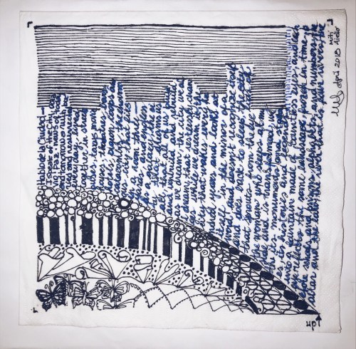
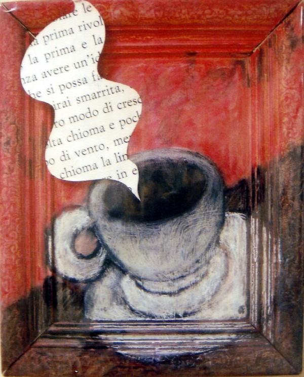
Napkin Sketch for fundraiser auction; poem La Ciudad by Octavio Paz. Fountain ink on Napkin paper. April 2018.

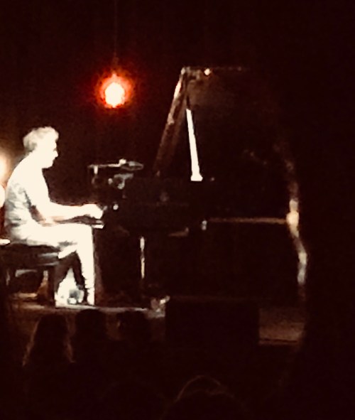
Yann Tiersen in concert at the Theatre at the Ace Hotel in Los Angeles, June 20, 2018.

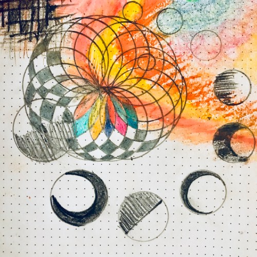
Quick sketch using colored pencil and pastels. June 30, 2018.

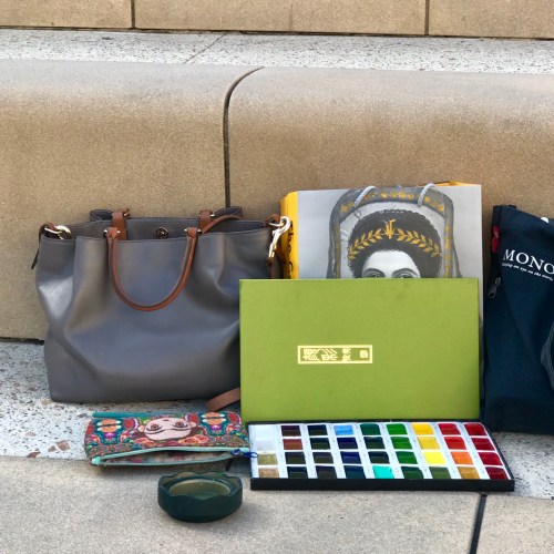
My corner in the plaza of the Getty Villa in Los Angeles. June 2018.

One more post before the month is done.

This Spring was filled with intensity in and outside of my University.. the final stretch of the school year. Accelerated timelines, accelerated heartbeat. Stealing time between deadlines to go up to LA once more for a life-changing Yann Tiersen concert ( of Amelie fame), participate to sketching and art+Jazz events and jot down few lines to be shared later (after all, poetry is emotion recollected in tranquillity).

Stealing time from time… to be and to feel alive. Sketching (almost) everyday is doing wonders for my spirit- and glow!

Single reader, I hope you have time to disconnect and renew. Happy Summer.

Read Full Post »

image

Hello Stranger!

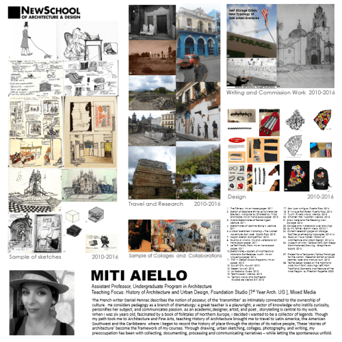
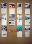
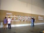
In case you are wondering what happened to me and why I’ve gone M.I.A during the month of February and most of March, the board above is one of the reasons. As it happened in 2010,
our school underwent an enormous accreditation visit, which meant preparing for months collecting, documenting and providing evidences.

One of the best things to come out of the work leading to the Accreditation was that Faculty was once more asked to prepare a record of what we have been doing – outside of teaching- the past five years.
It is a monumental task to audit, select and curate five years of life, work, art – yet I welcome the chance to take stock of where I have been, for it points to where I want to go. This process of self-evaluation is a privilege not afforded to many professions, and I was thankful for the challenge.
We were also asked to write a brief narrative. I worked on this more hours than I care to admit and I am happy to now share this with you: words, drawings and travel photography — some of which hasn’t been seen here yet! Hope you enjoy it.


“The French writer Daniel Pennac describes the notion of  the passeur, of the ‘transmitter’, as intimately connected to the ownership of culture.  He considers pedagogy as a branch of dramaturgy: a great teacher is a playwright, a vector of knowledge who instills curiosity, personifies her subject, and communicates passion. As an academic, designer, artist, and poet , storytelling is central to my work.

When I was six years old, fascinated by a book of folktales of Northern Europe, I decided I wanted to be a collector of legends. Though my path took me to Architecture and Fine Arts, teaching History of Architecture brought me to travel to Latin America, the American Southwest and the Caribbeans  where I began to record the history of place through the stories of its native people, These ‘stories of architecture’ become the framework of my courses. Through drawing, urban sketching, collages, photography, and writing, my preoccupation has been with collecting, documenting, processing and communicating narratives – while letting the spontaneous unfold.”


Miti Aiello, San Diego, March 2016

Writer Update:

My abstract on my research on Storage Cities has been accepted by one of the two main Architecture academic bodies here in the U.S for presentation at their International Conference! They are sending me to Santiago, Chile in June, and will publish my academic paper. Too excited for words. If you want to get a sneak peek and read my abstract check out my academia.edu page.

This is likely a hello/byefornow.
I wanted to update my blog now that classes have ended for the quarter, and before once again leaving for Mexico, this time in Baja California Sur for a week of volunteering. Faculty and students of my school are going to help build a healing center using natural architecture in a location that is three hours away by car from the closest road. It will be very remote, challenging and, I am sure, transforming. I will document everything.

Few weeks ago I wrote that, sometimes, we don’t have time to do art because we are too busy living a life that is art itself.
That is a true blessing, amidst the inherent challenges.

Although I have not posted here, I have not stopped taking photographs, seeing, collecting, thinking. My hope of hopes is to get caught up with my posts this summer…Promises we have heard before…

“You don’t need motivation.
What you need is discipline, young lady!”

Joe

Read Full Post »

The sacrificial lamb- an old leather jacket already repaired twice.

The sacrificial lamb- an old leather jacket already repaired twice.

image

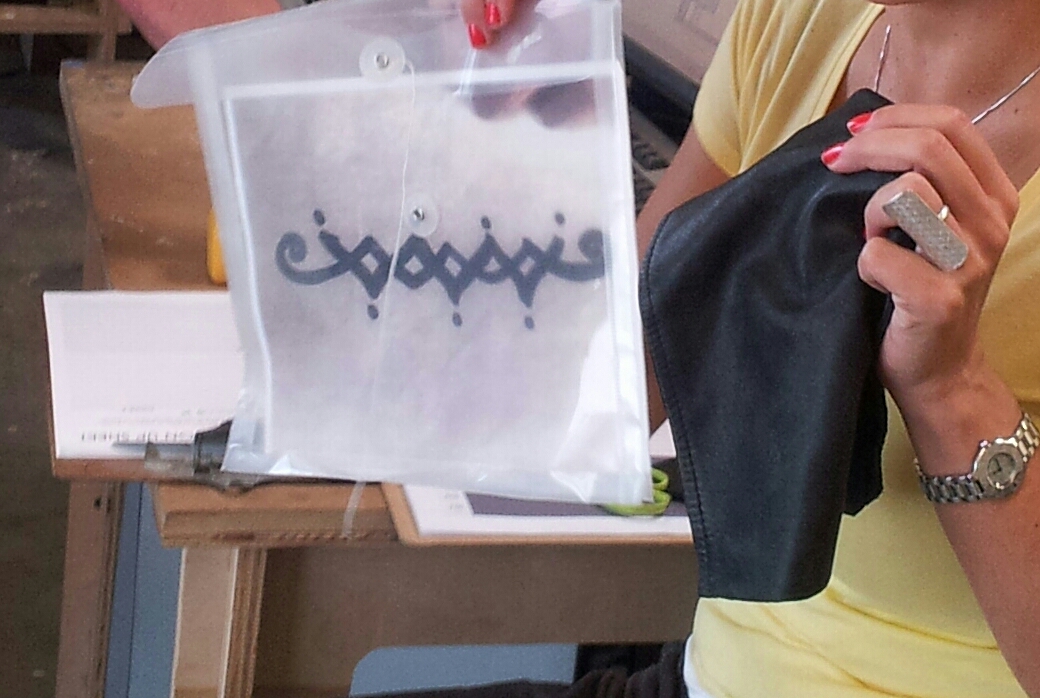
With my pattern and leather in the Materials Lab, to trace images in Illustrator and experiment with the laser cutting process. “The object feels good if the process feels good.”

image

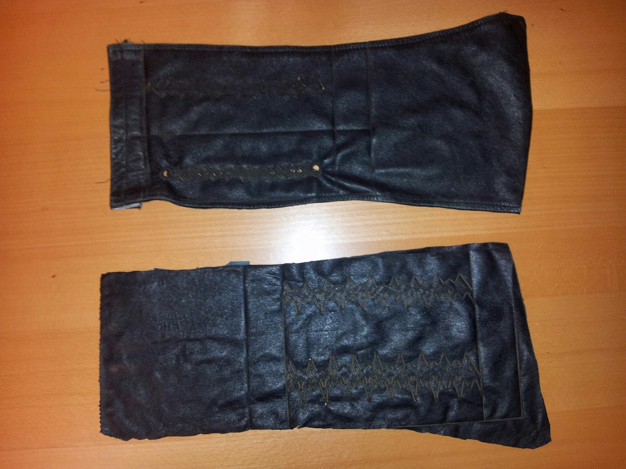
The laser etched leather swatches. Fire drawings…scars…tattoos and cattle branding.

image

Preparing for night surgical cutting, tailoring and riveting. And documenting. The whole project came about in three days (Friday to Sunday), but was months in the making (and in the thinking, and in the promising).


wpid-20140427_083037_2

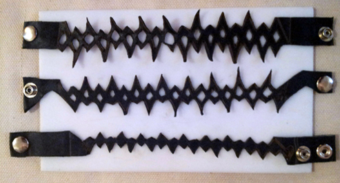
The prototypes are done!

image

Laying out this graphic board illustrating the process took longer than I would like to admit. In the end, it was a process of elimination…which is the secret to design, really.


wpid-20140428_213830

Exhibit time. Board layout #2 with Illustrator patterns :).

wpid-20140428_213835


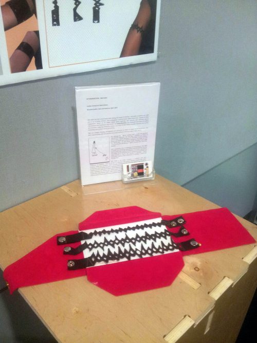
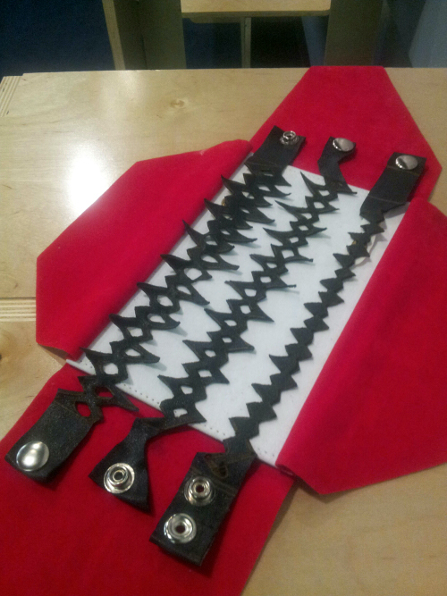
Project fini. Ready-to-wear, custom-made temporary leather tattoos....by yours truly.

Project fini. Ready-to-wear, custom-made temporary leather tattoos….by yours truly.


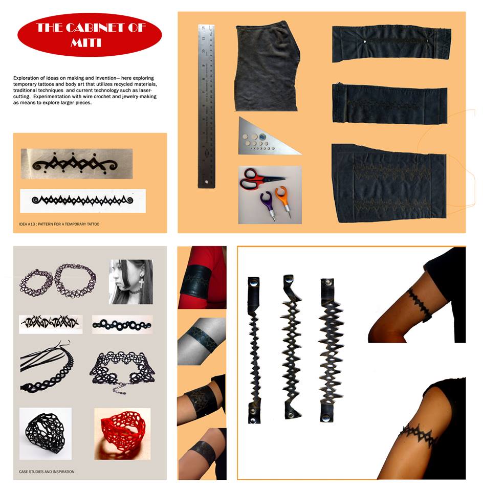
Idea #13: Temporary Leather Tattoos

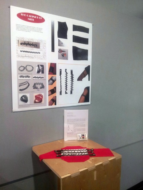
Experiments with recycled leather, tattoo patterns and the laser cutter in our Materials Lab for the Action/Reaction Faculty show, where students react to faculty work.

I chose to explore these tribal tattoo patterns I drew long ago and finally turn them into ‘temporary’ leather tattoos – since an actual tribal armband tattoo is out of the question (#italianmother).

In the process, I learned how to make leather-on-leather tattoos, used the laser cutter for the first time, hand-cut till my hands were sore, learned how to put rivets, and was taught about vector lines and patterns in lllustrator by my wonderful, patient students.
Thanks to student feedback/critique (which was extremely positive about the artifacts :)) the board could use one more ‘pass’ as far as fonts and background, but I wanted to post this now, as the show is coming to a close.

While researching case studies, I was astonished by the amount of cool accessories, arm bands and earrings made with recycled bike tires and inner tubes.

Etsy, here I come.


Here are some photos from the Action|Reaction opening, by Donn Angel Perez, the curator of the show (and author of the beautiful paintings shown), along with student Chuck Wilson

For the opening- in keeping with the recycled/sustainable theme, and to save time 😉 – I projected my board.


This slideshow requires JavaScript.


…….

littlescreenshot <<<and this, this little guy on my desktop just makes me happy.

Read Full Post »

1web


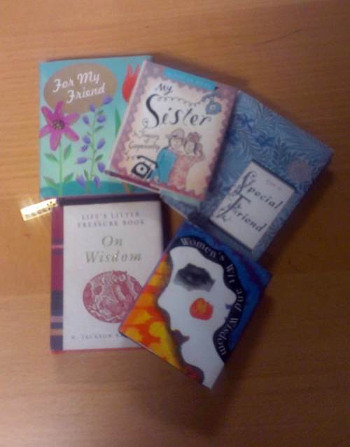
Above, my Christmas presents from my students.
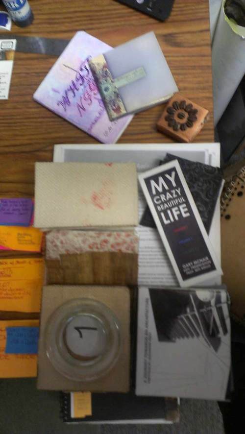
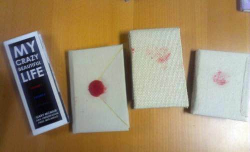
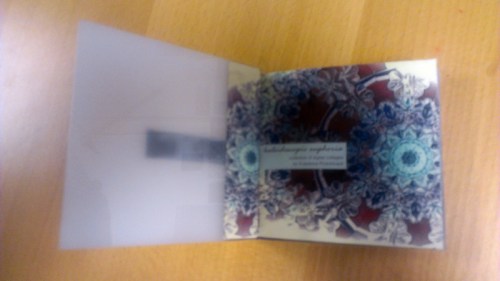
The ‘one hundred small books’ were a project for the Advanced Presentation course I taught.

To start the conversation on small scale binding, I brought some of my mini books to show.
How did I end up with these? 😛


IMAG4351(1)web


My students could choose their own narrative and learned how to bind books using different techniques and materials.
We covered layout through a discussion on portfolio graphics and blog and website design –and used some color palette tools–
so for the final project I wanted to do something different and strange, inspired by an artist in the 70’s who created one hundred little books.

Some of them are portfolios, some poetry, photography…a couple are on love and music 🙂


IMAG4354web

IMAG4357web

IMAG4353web


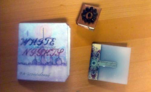
There is even Dostoevsky’s novella ‘White Night’ and a book entirely on coffee and quotes, both done by Anastasia, a fellow artist (someone knows me!).

You can follow her beautiful work here.

I will post more pages from the little books once school resumes. I also (shocking, I know) have a little book on coffee quotes at home, bought in Italy few Christmases ago. I’ve been meaning to write a post about it, and now I will share it with you – and Anastasia 🙂

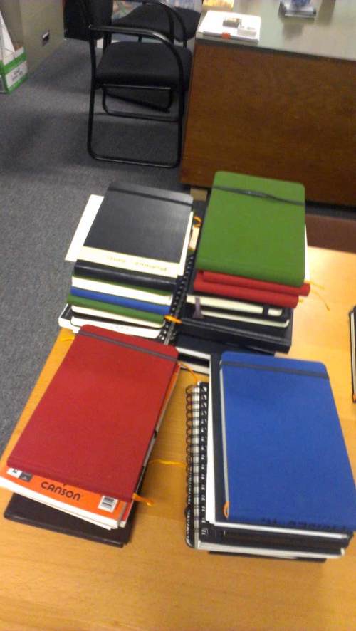
Also there were lots and lots of sketchbooks from my History of Architecture students (!).

IMAG4362web

I. love. them.


Before I go (get coffee), some coffee quotes from my little coffee book:

If asked: ‘How do you take your coffee’?
I reply : ‘Very Seriously’

Unknown


Coffee is a language in itself

Jackie Chan


Wake up!

Drink coffee…

Then think.

Unknown


Coffee is the favorite drink

of the civilized world.

Thomas Jefferson


Black as night,

Sweet as sin.

Neil Gaiman ‘Anansi Boys’


Deja Brew:

The feeling you’ve had

this coffee before.

Unknown Coffee


It is inhumane, in my opinion, to force people who have a genuine medical need for coffee to

wait in line behind people who apparently view it as some kind of recreational activity.

Dave Barry


Black as the Devil,

Hot as Hell,

Pure as an Angel,

Sweet as Love.

Charles Maurice De Talleyrand


IMAG4363web

My Bounty. Merry Christmas.

Read Full Post »

Drawing by Jackie McDowell.

I am posting the first of a series of samples of student work from the exhibit  History of Architecture: Analysis and Synthesis Through Visual Notes. Moving chronologically, today we start with the Beginnings of Architecture.  This body work was completed for the Graduate History of Architecture sequence, comprising of three courses, which i taught during the 2011-2012 school year.

I will also post some photos from the Exhibit.

These visual notes are by Jackie McDowell.

Drawing by Jackie McDowell.

Drawing by Jackie McDowell.

And here is the  paper abstract summarizing the project objectives and research purpose.  The full paper will be presented and published next Spring. 

History of Architecture: Analysis and Synthesis Through Visual Notes

Miti Aiello, Full-Time Faculty

NewSchool of Architecture and Design, San Diego, California

The need to update and make relevant the study of History of Architecture in an evolving profession and academic environment has never been more urgent: our discipline demands not only an expanded scope (mandatory inclusion of global or ‘non-western’ traditions and architecture of the vernacular), but new methods of delivery and course projects that are interdisciplinary, that bridge the divide between studio courses and history and that educate the young practitioner in reading history utilizing the same
methods learned in design practice.

Spiro Kostof, the legendary UC Berkeley architectural historian, advocated giving students “something tangible to carry away to the drafting table”.

It is possible to adopt an educational methodology that questions monumental architecture of the past and the traditional, vernacular “architecture without architects” in the same way as students approach a design problem in studio. Hans Morgenthaler’s “Chronology versus System: Unleashing the Creative Potential of Architectural History” – which served as this paper’s catalyst- denounced the inadequacy of relying on the chronological organization of history and suggested designing the History course as a series of design problems or buildings/events, illustrated through architectural drawings (the language of our profession) and not photos. History of Architecture instructors are encouraged to “occupy themselves simultaneously with the study of the past, with critique, and with invention”.

The argument for learning history through drawing, in this case in the form of student-generated visual notes based on textbook reading is related to the ‘invention’ mentioned above and supported by Morgenthaler: “This approach derives from the understanding that a drawing is capable of communicating information about buildings impossible through other means. In addition, as a subjective record, drawings could become part of the history of ideas, as opposed to photographs, which are only evidence. Moreover, drawings express the “belief in architectural precedent and typology which gave relevance to history.” Rachael McCann in her “Exploding the History Survey” also introduced ‘graphic summary pages’ as active inquiry in her course at Mississippi State University, breaking down her large lecture course in smaller sections which would investigate a question brought forth by a particular building, through visual analysis. It is clear that History of Architecture lecturers are seeking novel, more critical models to articulate the course, and better narrate “a story of architecture”.

Read Full Post »

For my birthday, my blogsister Ghadah dedicated a page to me

Read Full Post »


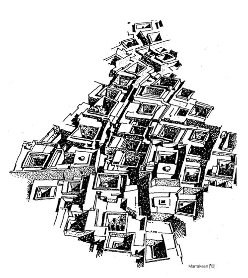
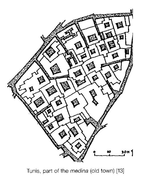
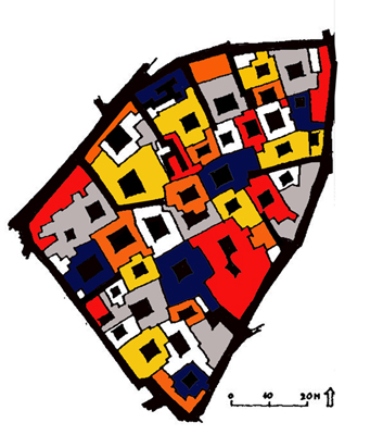
Marrakesh. From ‘Domestic Architecture of the Arab Region’.


From 'Domestic Architecture of the Arab Region"

Digital manipulation. Commissioned artwork.

Read Full Post »

The beginning of an urban scenario collage. Oct.19, 2010.

I have been thinking and wanting to explore collages again since this summer, when I was so inspired by Hector Perez and his students’ work with SoCal Ex–but not until today I finally acted on that impulse. I have two works done and one almost complete. Two to share, and one part of a larger, more ambitious project that will have to wait for a bit.

What I love about collages is their sustainability (this below was made for prints that were to be thrown away), and their serendipity. There is a magic about collages, finding enough materials or copies of subject to bring a piece to completion, or that sudden inspiration that constitutes the ‘aha!’ factor of the collage. I am referring to old-school paper, scissors and exacto knife collages, glue-messy ones….there is nothing like digging through your collage material container and unearth and reassemble a work you didn’t even know existed or could compose.  The root of the word collage is the same as the  French verb ‘coller’ or to glue (a latin verb, in italian ‘incollare’). Collages are associated the the Cubist and Surrealist art movements in the last century. Picasso and George Braques are said to have coined the term. In Surrealism, we find more three-dimensional assembly/collages that resemble nonsensical machinery. There is a very fine line between sculpture made of found objects and three-dimensional ‘collages’. The key being, in my opinion, the spontaneity and uplanned process leading to the finished product, which, really, is never meant to be finished.

The exploratory aspect is the most attractive component of the collage process to me, the element of surprise, play, even psychological discovery that all contribute to give life to a work. It is quite extraordinary how when the mind lets go the art takes over (you can call it soul), and such a welcome relief from too much art that is planned and executed like a project. Collages keep the wander, let us, like sketching, solve ourselves. There is no right or wrong because the destination is never known in collages. How utterly liberating.

Yet the best collages, like the best works of art, appear undeniable in the end, as if the piece just ‘made sense’;  they acquire layers of meaning with passing of time, age well, even acquire a certain patina. More than anything, they became more lovely or intense with each time your gaze falls on them. The personal fragments embedded in the collages will echo throughout the years; they will forever signify a time, place and emotion captured, crystallized, amplified.

In architecture, collages are extremely useful right-brain experimentation, and we see the Situationist using them to chart new maps of possible cities. We see collages in the 1960’s and 70’s in the works of  Archigram, Superstudio, Coop Himmelblau and others.  Richard Meier is a starchitect and collager. Whether or not you favor his brand of architecture I think that we all, as architects and academics, ought to have, like him,  a way and time  to let our innate sense of creativity develop, A time to use our hands (not the mouse, not the tip of our finger)and remember how to let our mind play and discover itself. Build something with our hands, an alternate reality, even if  paper-thin.  Collages are where we can dream, using pieces of reality. I suspect that regular collaging would open us (and our art/design)  to  inspiration, mental flexibility, maybe even brilliance. 

Richard Meier’s collages complement his architecture. Unlike his architectural drawings, they are nonrepresentational; like these drawings, they record process.  Like his architecture itself, they study relationships in space and seek difficult reconciliations of the opposed conditions of “found” discord and ideal order.

“A single collage is not begun and finished by itself,” says Meier. “On the contrary, works in various stages of evolution are left in notebooks and on the shelves of my studio, left sometimes for months or even years to await their own period of development.  A collage is often the result of many revisions.  Each must be seen as an element in my total work; they are, for me, an adjunct and a passion related to my life as an architect.”

“Meier has an eye, and a mind to use it,” the architect John Hedjuk has written.  “He doesn’t create all those collages at night at home for nothing.  The collage making is his midnight boxing ring.  It keeps the hand and the eye trained.”

This is what I have been working on, all material from extra pages from printing this blog for my mom in Italy (I send monthly installments via mail because she refuses to make friends with computers. Mamma, when you read this, know you killed a tree ;)).
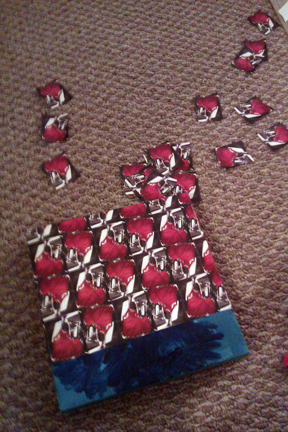
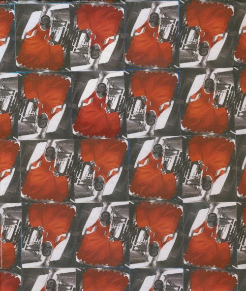
I applied an ‘antiquing’ crackling glaze to the glazed canvas so we’ll see how it develops. I dig the diagonal/chainlink texture which resulted from the juxtaposition of the pieces. The celling adds an architectural/design reading to the piece. What do you think?

Read Full Post »
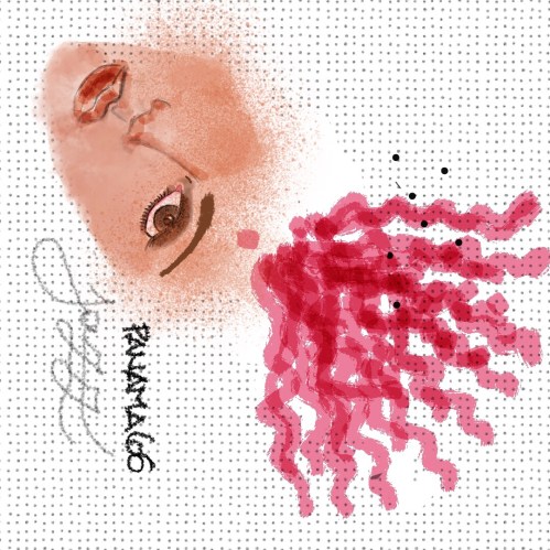
10 AM Roy de Vries- Learn to paint with Windsor & Newton Oil Bar

image

Roy was our first mentor, We started the day experimenting with oil bars, a mix between big oil pastels and oil paint. They allow for playfulness and immediate gratification, while lending themselves to interesting blending and the joy of an oil painting without all the cleanup and threatened muddyness.

image

First experiment with oil bars. Can't wait to pair this up with a poem.


11 AM Valerie Henderson- Hands on Monoprint Workshop

image

image

'Stretching' the ink onto the plexiglass.

image

Removing the ink, working on negative space and texture with toothpicks and cutips.

image

The result: the spent plexiglass, the image and its ghost. I love prints and textures. Ready to be a designer for Ikea now;)


12 PM Lisa Starace- Screenprinting Demo
image

image

1 PM Marcy Gordon- Water Color.

image

image

Learning new watercolor techniques: wetting selecting areas of the drawing, alternating petals in this case, allows the water to have 'boundaries' and results in more controlled bleeding and blending.

 3 PM San Diego Guild of Puppetry- Overhead Shadow Puppetry: Tips and Techniques.

image

image

image

image

image

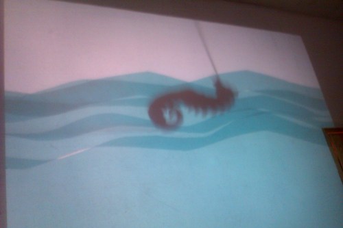
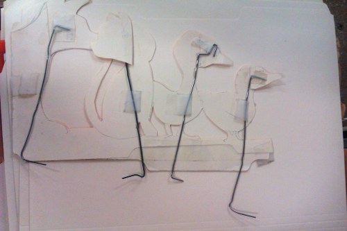
Shadow puppetry ...what a magical workshop. Here are my first movable 'puppets': a chicken and a worm/dragon. This was pure fun and I started thinking about shadow puppetry for architectural application (a city skyline to start a journey into form exploration).

The back of the puppets. Lots of work goes into making the moveable parts seamless and invisible.


4 PM Chris Warren- Laptop Musicianship.
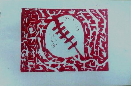
5 PM Jennifer Bennet- Collaborative Linoleum Print.

image

image

My first linoleum print since art school. Miss carving.


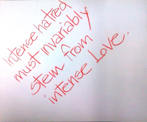
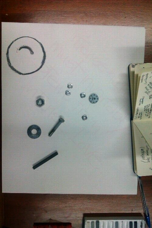
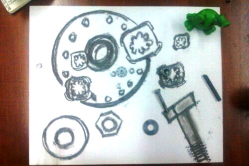
 8 PM Colette Plush- A Visual Interpretation of a Sentence.

My starting sentence.

We followed a pretty elaborate process in choosing various hardware and found objects from various mounds, according to the number of words, adjective , verbs, the color of our sentence...

The end product.

I attended these workshops two Sundays ago at SD Space for Art. It was incredible, a whole day of art, a sort of ‘intervention’ that every creative should undergo at least once a year.

I apologize for the delay in posting this, and for going a bit M.I.A.  Fall Semester has started at my school and while there is new energy and new purpose in the air — and I’m excited for the History of Architecture class– there just seemed to not be enough hours in the day lately.

Read Full Post »
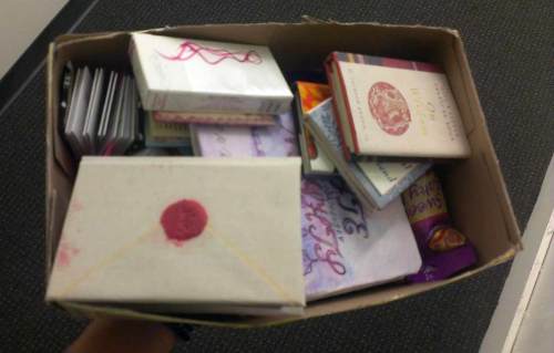
In the courtyard of Space For Art, Barri Logan, San Diego. Sept. 4, 2010.

Art installation by Curtis Bracher. Click on image to be taken to his website.

The studio of May-Ling Martinez. Click her to see her blog.

May-Ling welcomes us.

Some of her pieces. Like 3D drawings! There seemed a current of 'retro' inspired pieces at the Space for Art. May-Ling is drawn to black and white drawings, attention to lineweight and retro ads.

My friend/twin Richard (we are both born on Sept.12!) and one of May-Ling's works.

Gothic Cathedral. Crutches, Xrays, Pipettes, Test Tubes. 9'L x 7'W x 8'H Artist Statement: This piece addresses the 'illuminations'- the questions, convergences, and contradictions of spirituality and science...

Flying buttresses, crossing and apse.

Roof expression of the apse and crossing.

The nave and aisles, their paving beautifully detailed.

Another noir work by May-Ling, guarding the door to the courtyard.

Misgivings in Barrio Logans, ghosts stories, ominous hands that prey (still too close).

Misgivings II. The burnt witch.

Pardon the quality of the photos, my Panasonic camera is still out of commission, hope to get it back in working order soon!

Read Full Post »

Loose Rendering. Ink, watercolor, prismacolor pencils. August 2010.


Lately, I’ve favored the watercolor and pencil technique, but want to get back to working with markers.

I found these two great tutorials on marker renderings from my blog friend and Urban Sketcher extraordinaire Suzanne Cabrera at An [Open] Sketchbook: can’t wait to share them with my students!

{ Tutorial 1: Furniture/Fabric }

{ Tutorial 2: Interior Rendering }

As usual, the wonderful Color Drawing book by Doyle will provide a lifetime’s worth of lessons.


Share


Read Full Post »

Marker Test @ Queen Califia's Magical Garden

Initial Sketch. Felt tip on heavy bond (sketchbook) paper.

Felt Tip on Marker (Rag) Paper.

Applying Watercolor 1.

Applying Watercolor 2.

End of ession at site. 20 Minutes. Wanted to have a loose base of color.

Adding Pencils (Albrecht Durer- Made in Germany), texture, few days after.

Do you remember Niki St. Phalle’s ‘Queen Califia’s Magical Garden’?

Well, I went back with my students for some loose watercolor and pencil renderings.

Share

Read Full Post »

So you already know I heart Japanese Stationery stores.

Here are more lovely pens and things from Jetpens.

Some of these, like rubber stamps – or writing letters sealed with rubber stamps- don’t exactly fit my life right now, but isn’t it fun to imagine such settings?

Thanks go to my (enabling)  friend Andy who shared Jetpens with me.

Click on the images for more details.

Brush Pens

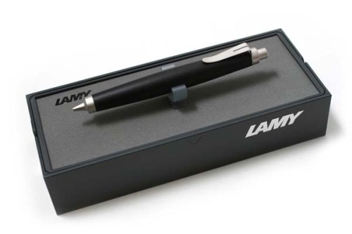
Lamy Mechanical Pencil

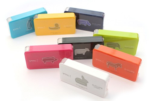
Midori Animal Shape D-Clips

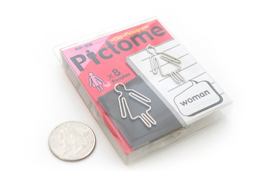
Woman-shaped clips by Sun-Star

Rubber Stamp by Kodomo no Kao Ouchi Mininature House : A Chair and Ciao!

The beautiful packages of Kodomo no Kao Ouchi Miniature House Rubber Stamps.

Round index tabs by Metaphis

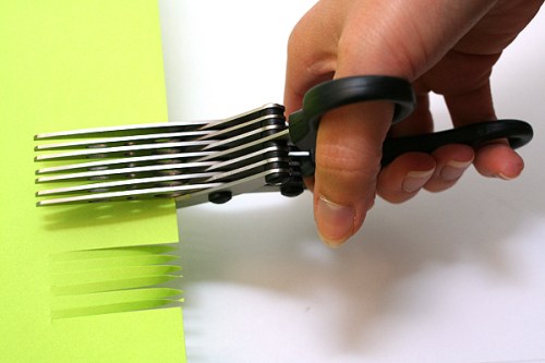
Sun-Star 7-Blade Shredder Scissors

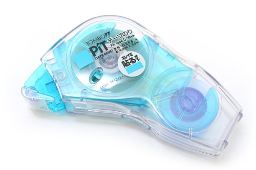
Acid-free, refillable adhesive tape from Tombow- for the gluing perfectionist (wow).

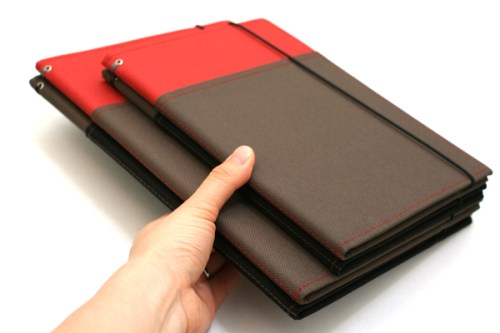
Kokuyo Systemic Special Cover Refillable Notebook

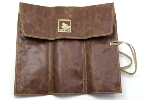
PlePle Choco Wrap Pencil Case

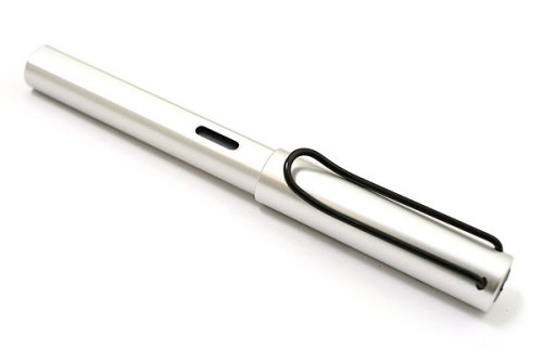
Lamy fountain pen, extra fine nib, aluminum body.

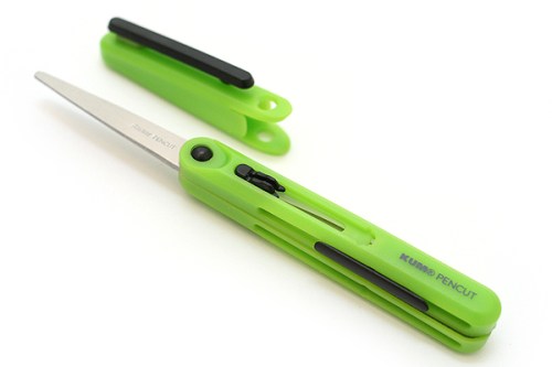
My favorite: Pen-Style Scissors.


Here are some photos of 
Jet Pens aficionados.


Share

Read Full Post »
Something eye-opening occurred at my school yesterday.

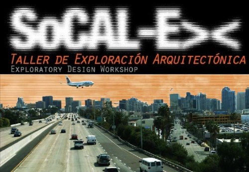
I attended the exhibit for SoCal -Ex : Exploratory Design Workshop, completed by Professor Hector Perez and his students.

Here are the specific of the Workshop:

6 Explorers

Andrea Benavides/Alfredo Melly/Henry Palomino/Charles Santamaria/Nancy Tariga

25 Days

July 12-August 5

10 Field Trips

San Diego/La Jolla/Del Mar/San Juan Capistrano/Los Angeles/Santa Monica/Culver City/Venice/Pasadena/Palm Springs

9 Progressive Practices

Daly Genik Architects/Eric Owen Moss/Estudio Teddy Cruz/Gehry Technologies/Luce Et Studio/Michael Maltzan Architecture/Morphosis/Sebastian Mariscal Studio/Smith and Others

15 Extraordinary Residences

Charles and Ray Eames/Craig Ellwood/Christine & Russell Forester/Albert Frey/Frank Gehry/Greene and Greene/Coop Himmelblau/Alberto Kalach/Ed Killingsworth/Sebastian Mariscal/Kathy McCormick & Ted Smith/Richard NeutraRudolph Schindler/Don Wexler

I spoke with Professor Perez and he told me that the analysis of the case study residences and projects were concentrated on the ‘crown’, ‘body’ and ‘feet’ of the aedifices.

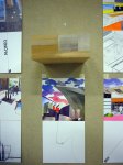
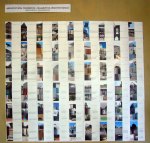
Through collages, reminiscent of Superstudio and Archigram, the field trips become a venue for envisioning alternative architectural and urban scenarios (Design Workshops). I hope you’ll enjoy these images just as much as I did; each collage read like a miniature work of art, and the juxtaposition of architectural drawings and bold hand-drawn colors created fantastic, detailed, abstract constructs.  What a wonderful way to illustrate architectural drawings, and bring to life photographs.  The collages, done by hand, using cutouts, colored pencils and paint had a physical presence, a texture that a purely digital (photoshopped) images invariably lack.

I am inspired to create some more collages of my own and…can’t wait for the book 😉

This slideshow requires JavaScript.

Click on an image to enlarge.

Share

Read Full Post »
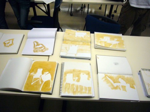
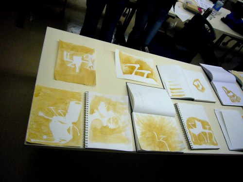
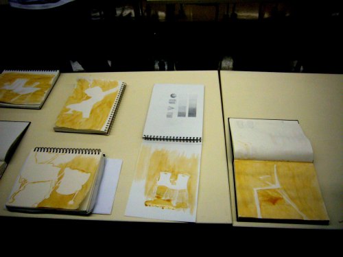
Freehand Drawing- In Class exercise. After rendering with Espresso, we use the leftover coffee to draw chair combinations, or rather, the void around the chairs, in a figure-ground setting.

Another exercise with  ‘Drawing on the Righ Side of the Brain’.  By drawing the space, not the chair, the proportions were incredibly accurate in all drawings.  The drawings can be read as Nolli Maps of imaginary cities, we can see piazzas, palazzi…we can see perspective, spatial configurations/plans, abstract paintings… I love the ambivalent water medium, the subtle, duplicitous, always multilayered  sepia tone.

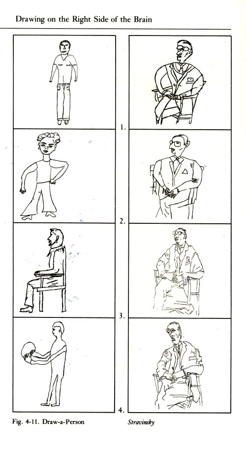
From 'Drawing on the Right Side of the Brain' by Betty Edwards

From Page 54:

Look at the drawings on the right-hand side of Figure 4-11. Studens 1 and 2 copied Picasso’s drawing right side up. As you can see, their drawings did not improve, and they use the same stereotypic, symbolic forms in their copies of the Picasso Stravinsky as they used in their Draw-a-Person drawings. In the drawings done by Student 2, you can see the confusion caused by the foreshortened chair and Stravinsky crossed legs.

In contrast, the second two students, starting out at about the same level of skill, copied the Picasso upside down, just as you did. The Student 3 and the Student 4 drawings show the results. Surprisingly, the drawings done upside down reflect much greater accuracy of perception and appear to be much more skillfully drawn.

How can we explain this?

The results run counter to common sense. You simply would not expect that a figure observed and drawn upside down could possibly be easier to draw, with superior results, than one viewed and drawn in the normal right-side-up way. The lines, after all, are the same lines. Turning the Picasso drawing upside down doesn’t in any way rearrange the lines or make them easier to draw.  And the students did not suddenly acquire “talent”.


Share

Read Full Post »
Happy August!

Ever the optimist, here is the first post of the month. I’m giving a shot at posting daily (again), we’ll see how it goes.

Here is the happy Nablopomo August Badge. The theme of this month is ‘Green’.  For me, it will mean renewal more than sustainability (a sort of spa for the mind), but I might find some interesting green homes to feature. Of course green is the color of envy, but we shan’t talk about that 😉 Here are couple of badges for good measure.

So as promised, here is my surprising discovery in the environs of Newport Beach (Costa Mesa): The LAB Anti-Mall.

I loved it! Local public art, local businesses and public spaces.

The Gipsy Den, which I covered in a previous post (it’s updated with photos now, yay), lies therein.

Enjoy, and I hope you get the chance to visit.
By the way thank you for all the views (dear readers :)), I am striving to post more often and it’s great to know this thing I do is being followed and shared.

This slideshow requires JavaScript.

Read Full Post »
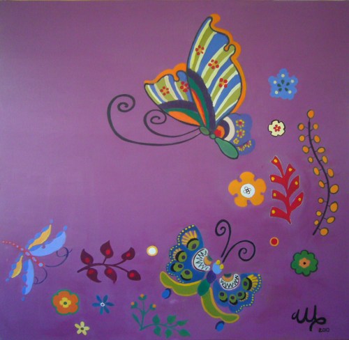
My client gave me this card and asked me to create a composition based on the flower/butterfly graphics.

I first mixed in the colors for the purple background my client wanted, then drew the graphic motifs with black grease pencil, went over with white pastels, only to realize that the black was not going to be easily cleaned at the end.              So I had to wash away all the black lines, and lost most of the white drawing.  I used the second drawing as a basis for the painting.

This slideshow requires JavaScript.

Floral Composition with Butterflies (3'x 3'). Acrylic on Canvas. June 12, 2010.

Read Full Post »
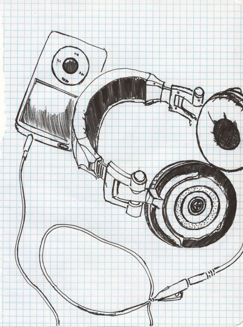
My beloved 120GB ipod and a new present, Aerial TANK headphones from Urban Outfitters. Ink on stolen notebook paper. June 2, 2010


NaBloPoMo writing prompt of today:

What is your favorite poem?

#1

By the Ionian sea

You pick fresh fruit and seeds

From orchard and underwood nearby

I fetch seashells

Starshaped

For you

I build a nest of leaves–

We spend warm nights with street artists

Flame-eaters and sages

Fall asleep with fire

Yours and mine

Gipsy ballads


I wrote this in 1999.

Read Full Post »
Diagrams from Graphic Thinking for Architects and Designers by Paul Laseau


The image above aptly illustrates the process behind diagramming, which is one of summarizing and and rendering a concept more abstract, more immediately communicable. Abstract in this sense is intended as ‘ reduced to the essential’.  Diagrams are, according to Joe Nicholson:

1. a simple drawing showing the basic shape, lay-out, or workings of something

2. a chart or graph that illustrates something such as a statistical trend

3. a line drawing that presents mathematical information

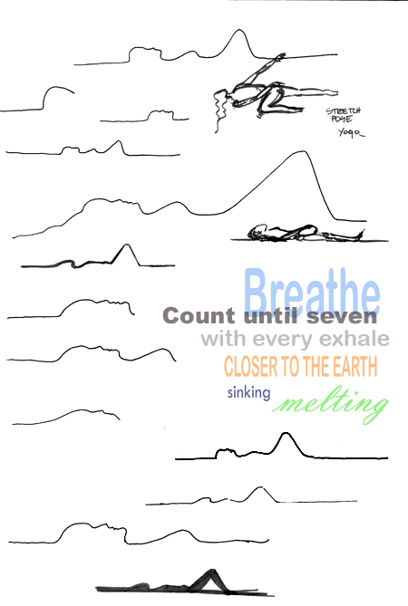
A leap of faith here, and some poetic license, can bring you from the diagrams above to these sketches, inspired by yoga poses.

The link? The day after my landscape /yoga explorations, Joe showed the above slide on a presentation. Serendipity.

Ink on Paper, digital manipulation. May 2010

At-one-ness. Ink on paper, digital manipulation. May 2010


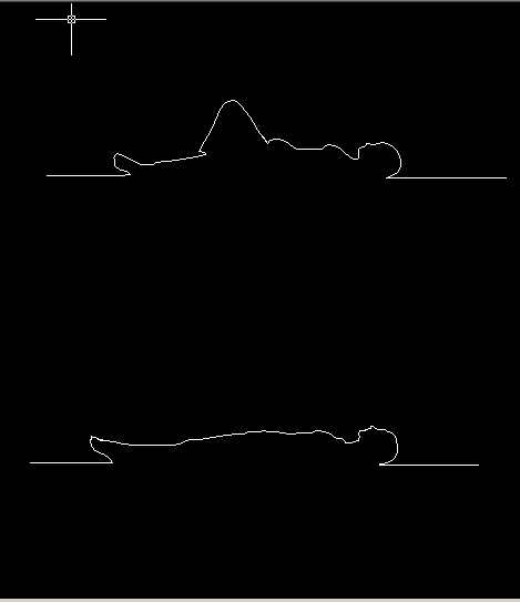
Using CAD as human landscape generator. May 18, 2010


Share

Read Full Post »

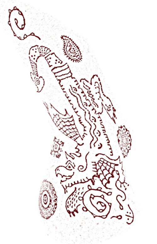
“I have a strong will to love you for eternity.” Milan Kundera. Earth Henna, Eucalyptus Oil. May 2, 2010.

Read Full Post »

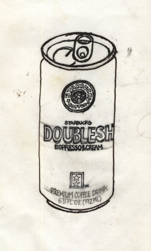
Starbucks Doubleshot can. Ink on trace. 2009

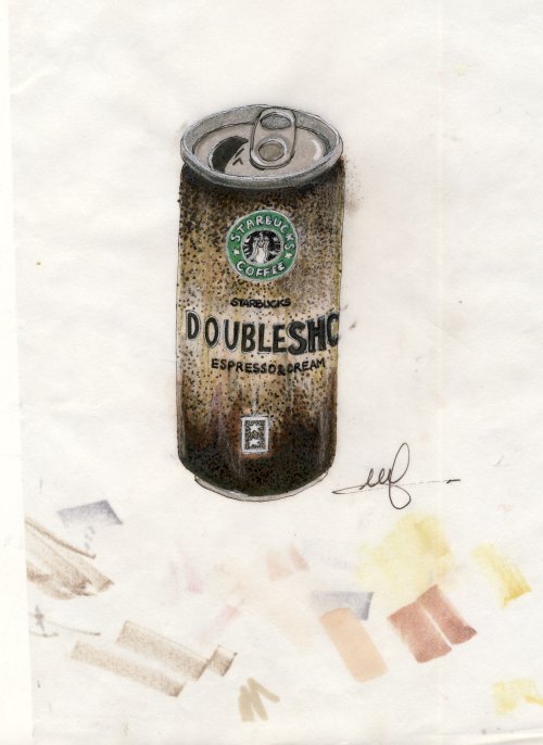
Starbucks Doubleshot can. Ink and markers on trace. 2009

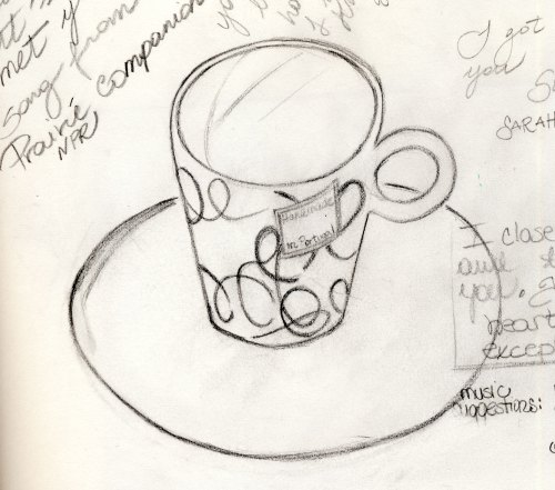
Espresso Cup at Martha's. Graphite on paper. 2009

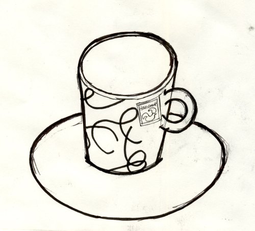
Espresso Cup at Martha's II. Ink on paper. 2009

I wanted to share some of the things that make life better:

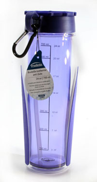
1. A  water bottle that makes you happy and keeps you cool for hours.

Trudeau Cool Down Sports Water Bottle in Purple. Image via cappojim.com

2. a coffee mug that offers you coffee at ideal temperature with new technology

The Brugo Travel Mug with Tip & Cool technology. Image via Amazon.com

… or just looks thermally  good (mine is orange)

Raya Polycarbonate Pink Travel Mug. image via salestores.com

3.  Beautiful Pantone Mugs to brighten your day.

image via yumsugar.com

Share

Read Full Post »

Happy San Valentino!

Here are some card designs I have been playing with, let me know if you would like a hi-res version, and  which one I should put in my future etsy print shop.

Finally, I have been listening to my Buddha Bar CD’s today, and in Buddha Bar II there is a Rumi poem recited by Deepak Chopra and Demi Moore, set to beautiful, haunting music. If you are interested in the CD, here you go. Here is the text, and may all your days, like this one, be filled with love.

A lover knows only humility,
He has no choice.
He steals into your alley at night,
He has no choice.
He longs to kiss every lock of your hair,
Don’t fret,
He has no choice.
In his frenzied love for you,
He longs to break the chains of his imprisonment,
He has no choice.

A lover asked his beloved,
“Do you love yourself more than you love me?”
And the loved replied:
“I have died to myself and I live for you,
I’ve disappeared from myself and my attributes,
I am present only for you.
I have forgotten all my learnings,
But from knowing you I have become a scholar.
I have lost all my strength,
But from your power I am able.
I love myself,
I love you.
I love you,
I love myself.”

I am your lover,
Come to my side,
I will open the gate to your love.
Come settle with me,
Let us be neighbors in the stars.
You have been hiding so long,
Endlessly drifting in the sea of my love.
Even so, you have always been connected to me.
Concealed, revealed, in the norm, in the un-manifest.
I am life itself.
You have been a prisoner of a little pond,
I am the ocean and it’s turbulent flood.
Come merge with me.
Leave this world behind us.
Be with me,
I will open the gate to your love.

I desire you more than food or drink.
My body, my senses, my mind,
Hunger for your taste.
I can sense your presense in my heart.
Although you belong to all the world,
I wait in silent passion,
For one guesture, one glance.

Rumi


Rumi’s words are often mysterious, yet often refer to his personal search and passionate, intimate connection with the Divine Presence within.

(via enlightenedbeings.com )


From: Love: The Joy that Wounds. Love poems by Rumi

PREFACE BY
Jean Claude Carriere

CALLIGRAPHY BY
Lassaâd Metoui

Everything – strength, joy and knowledge – comes to us through love.
Love burns and devours, love destroys life and it gives life.
Love is both secretive and revelatory.
This is how it was for Jelalaldin Rumi, the thirteenth-century Persian
poet, grand master of the Sufi tradition and founder of the brotherhood
of Whirling Dervishes.
Born in what is now Afghanistan, then settling in Konya, in Turkey,
shielded from the invading Mongol hordes, he was a venerated teacher,
an unrivalled scholar. People from everywhere came to listen to him.
Then one day he met a wandering dervish, a man who was very
sensitive to the cold, and older than Rumi was. He spoke in riddles,
was insolent and irritable, and his name was Shams al-Din of Tabriz.
Love blossomed between the two men. They stayed together, locked
away, for forty days and forty nights.
When they went their separate ways, Rumi was no longer the
academic whom everyone had known. He danced, laughed, made up
poems. He had been illuminated, as though from within.
In a lightning flash he had become a poet.
And for the rest of his days, he forgot his professorial chair and his
teaching, and, instead, sang of this metamorphosis to the whole world,
with unforgettable elan.
In all he wrote some 50,000 lines of poetry, much of it collected
together in The Book of Shams al-Din of Tabriz and in the Masnari, two
jewels in the world’s history of poetry.
Love is a grace, Rumi tells us over and over. It is a fire, it is
intoxication, an unceasing turning, a breath from heaven. It is a way
for all lost people and a cure for every fever.
And love is limitless, for it excludes nothing and no one. Here, lovers
are not alone in the world.
Quite the opposite. To love someone is to love the whole world.
Jean-Claude Carrière

The following poems were written by Jelaluddin Rumi in the 13th Century A.D.  His words are often mysterious, yet often refer to his personal search and passionate, intimate connection with the Divine Presence within.

The following poems were written by Jelaluddin Rumi in the 13th Century A.D.  His words are often mysterious, yet often refer to his personal search and passionate, intimate connection with the Divine Presence within.

Share

Read Full Post »
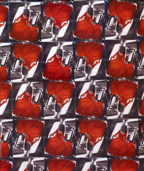
Turning into pattern/abstract thoughts. Digital collage. Original mixed media on glass. 2008/2010

Art is a wound turned into light.

Georges Braque

(Thank You Lamees)

Read Full Post »
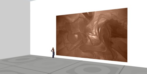
SketchUP Model. December 19, 2009

I have been observing and pondering the gossamer pieces, and more and more forms appear to be floating, swaying as if under water. A benign medusa of sort.

I would like to try my hand at creating a video with this images, and simulate motion. The only videos I’ve done are 3D animations, so working with stills should be interesting, the variety created by different scales, colors, and degrees of transparency/layering.

I also thought about these pieces being installed at such an overwhelming scale so that the image would encompass/engulf the viewer, and the illusion of being underwater or floating -or lost in a good way -could be more complete.

I had in the back of my mind to try out at some point a digital mock-up using SketchUP (since last time I used it I am simply astounded by the variety of resources available and realistic human figures- no more carton man). Then I thought, why not just do it now, and eliminate one item from the long list of ideas for my art and this blog. So here it is. How would it look in a club? It could substitute a whole wall and perhaps be lit from behind to preserve the luminous qualities seen on a computer screen. Perhaps these lights could change color and intensity with the mood, the time, the music.

You may say I’m a dreamer. But I am not the only one.

Read Full Post »

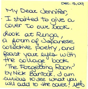
Do you remember this, my sketchbook exchange with Jennifer of Habit of Design?

I actually completed my ‘project’ last week, but wanted to wait till Jennifer received my sketchbook by mail so not to spoil the surprise!

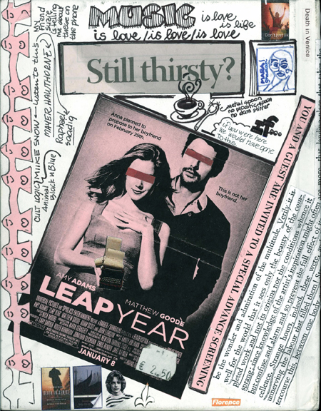
The cover, before and after….. (yes I was not authorized to operate on the sketchbook cover…I did it anyway):

A blank sketchbook cover...an invitation to mischief!

Front Cover- inspired by various things among whom (is this how you say it?) Death in Venice

Back cover

And who knows what it might turn thanks to this. (More on Renga)

I know, I am so demanding.

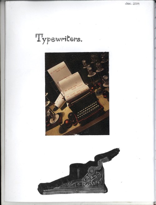
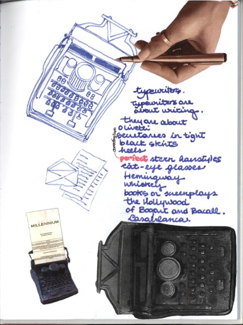
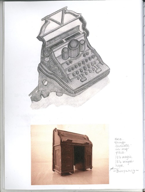
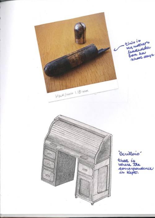
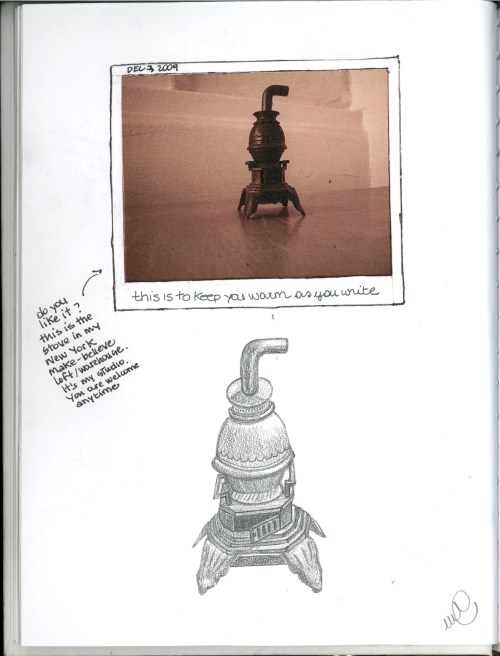
SO my assigment was Typewriters… Yes, these are all my drawings and photos! What do you think?

Typewriters - Page 1

Typewriters - Page 2...and that's why my fountain pen matters.

Typewriters - Page 3

Typewriters - Page 4

Typewriters - Page 5

This was a wonderful experience- to be soon repeated.

Thank you Jennifer for the Brilliant idea!

I have to thank Professor Booker…Back in my Undergraduate days @ NDSU, he introduced us to Renga Arts and the stunning, surreal, Moorish-inspired “Forgetting Room’ by Nick Bantock.

About Renga and Renga art…[and here it’s to future Renga poetry and art collaborations]

Renga Platform Contemporary forms of Renga in the UK
Renga Arts Functional Art.
Renga @ Wordshop.com (love the name! and yes, it does take two to renga)


Share

Read Full Post »

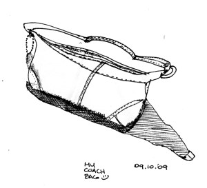
Ink and graphite on paper. December 2009.

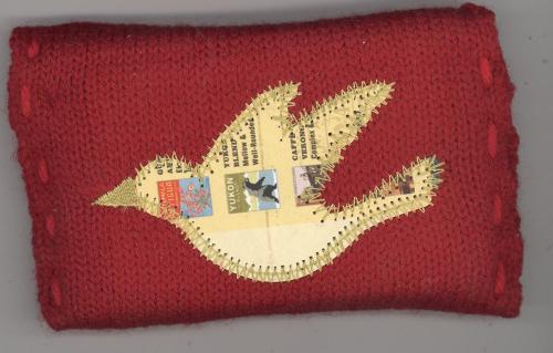
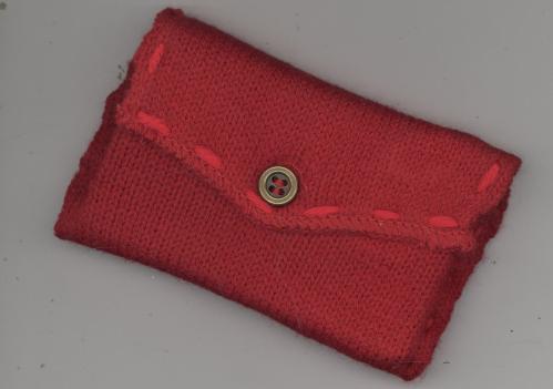
I stole took this beautiful knitted giftcard holder from Starbucks the other day.

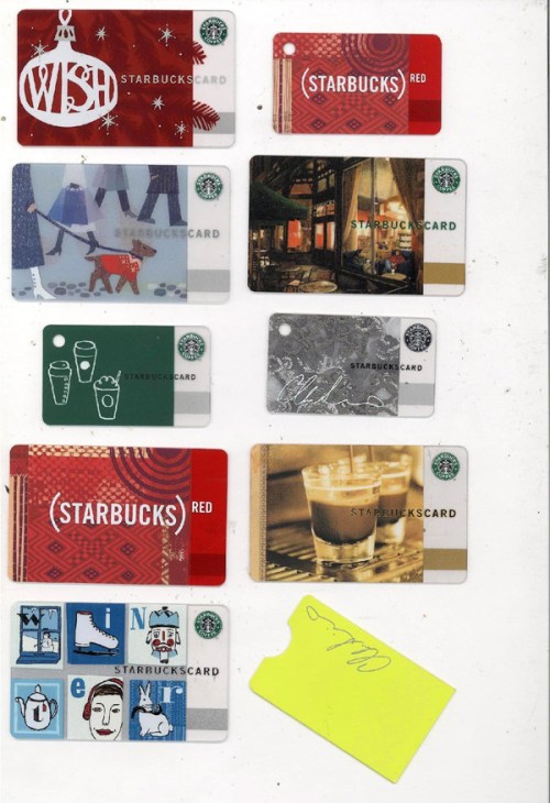
The cards are also art objects in themselves- i love the micro-cards and their micro-holders.

Starbucks Gift Card Holder- Back

Collection of Starbucks Cards

Share

Read Full Post »

Ink on Paper (original). November 2009


Influenced by my new find, Applied Arts – Canada’s Visual Communication Magazine I wanted to try my hand at product placing, color iterations and offsetting, a great Photoshop tool that I am sure all of you in Graphic and Interior Design know and love, but that is seldom used in Architecture applications (we specialize in skies, people and -yawn- cars).

The issue I perused was all about the winners of Canadian print, media and radio ads. This territory is completely new to me, but was fun to explore, in a sort of ‘provocative foreign art gallery’ kind of way. The creativity and innovation out there is astounding.  Some of these advert are pure genius. Go Canada!

So here are some things that definitely piqued my interest:

1. Insane Spots (for you yankees, ads) for Milk:
These are short (sometimes micro), irreverent and bizarre videos on the virtues of milk, each shot with a different animation technique and visual style. You can find them here and here.
Personally, i prefer soy milk, but wanted to share the artistic innovation.

2. Provocative campaigns
     I looove these ads:

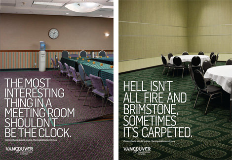
Campaign for the new Vancouver Convention Center. Images via http://www.underconsideration.com, and created by ddbcanada.com

I loathe thee, carpet! 

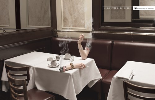
Cigarettes always win, in fact, "cigarettes smoke people". Campaign for the Canadian Cancer Patients Aid Association, created by bleublancrouge.ca

Cigarettes Smoke People II


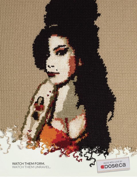
Amy Winehouse en crochet. Dose. ca campaign by rethinkcommunication, image via their website

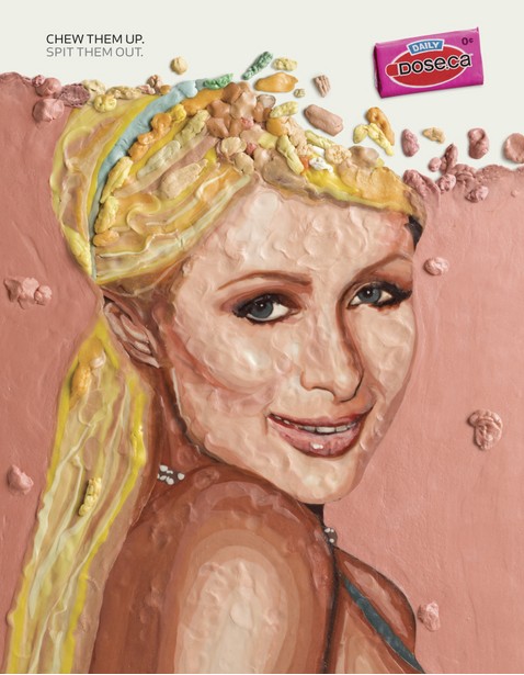
Paris Hilton made of chewing gum. Dose. ca campaign by rethinkcommunication, image via their website

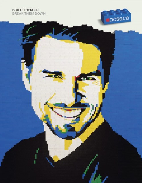
Lego Tom. Dose. ca campaign by rethinkcommunication, image via stillad.com

For a great commentary on this campaign, read here

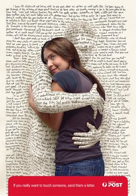
And lastly, this ad which I stumbled upon- a very dear message to me –as a lover of letters, books and all things paper.

Campaign By the Australian Post, by Saatchi Melbourne. Image via pixelpastahome.blogspot.com

It says “If you really want to touch someone, send them a letter.”

I am actually sending a letter to my mamma sunday, with some of my art, since she never saw my blog – and probably never will. She doesn’t have a computer and loathes the internet.  She does however, prefer texts to phone calls.  Please, Santa Web, come to my mother’s house!

Read Full Post »
Card Design 1 of 7- Fall 2009

Card Design 1 of 7- Fall 2009

I am always happy if my internet connection goes down for a bit. It is the time I can then dedicate myself to catching up with my offline (old school) reading. Books, magazines, San Diego weeklies…. things I find in the most disparate places.

I am an unapologetically omnivorous reader and that, combined with a respect for the written word I have inherited from my mother, results in knowing a bit about everything and being at constant risk of  being overwhelmed by paper at all times.

Well, the past few days i have had intermittent connection, and that combined with a very ambitious redesign of my little place and general reorganizing and putting away of things, plus the getting ready for the new school year  means that today I am definitely  stealing time and burning the candle at both ends– and putting up two posts that have been simmering for a week.

Being plugged into art and writing means that sometimes art just must BE, that is, I have been immersing myself in design inspiration (see the augmented blogrolls and site freshening up/networking!!) and seeing the amazing amount of creative output these talented souls put out almost daily inspired me so much to claim the time to post new discoveries, and sketch, and share.

In my dreams I would have time to be like a professional blogger and post everyday or at least every other day, but the reality is that writing needs time, and if I want to be more prolific, I ought to start alternating written pieces with art, and do I have lot ready to share (in my famous digital trunk).  Geez, I don’t want to sound like Julie from Julie and Julia, I am not cooking elaborate french recipes and waking up at five in the morning to post the daily progress . Clearing actual and digital clutter, ‘feng-shui’ing’  life to make ways to creative endeavours is invisible labor, but of immense consequence.

It seems like the work never gets done, and that one could always do more, or  re-do things using a finer comb, or to greater degree of perfection.  See, here is where my mom comes in with her ‘il meglio e’ cattivo del bene’ or ‘better is enemy of good enough’. I tend to perfectionism, and sometimes at results in over-ambitiousness. Hence, the effectiveness blogroll for inspiration!

I am aiming to making this website, my digital live-work loft, more inviting, more connected, like Making it Lovely , and that meant coding and learning a bunch of new stuff- like subscribing to networkedblogs- thanks for ALL the views :)! All of that was worth it (i have been a busy little bee since the last post) because the fans and subscribers and have been growing and I can only hope a year from now to be where my Design Inspiration gurus are.

Thank you for all the support!

Personal success has nothing to do with ordering others, but is a matter of ordering oneself. Nobility has nothing to do with power and rank, but is a matter of self-realization. Attain self-realization and the whole world is found in the self.
Happiness has nothing to do with outward wealth and status, but is a matter of inner harmony.”

Wentzu, Verse 4


Share

Read Full Post »